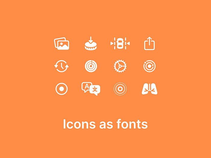
Icons as fonts: Why Google and Apple are embracing this approach
As product designers, we regularly work with icons in our design process. The most common and popular way to incorporate icons is by using icon libraries. These libraries — whether available as Figma plugins, standalone downloads, or custom icon sets — serve the same primary purpose: they typically provide icons in the form of PNG or SVG files.
While this approach has been widely adopted, Google’s Material Symbols and Apple’s SF Symbols have recently introduced another method of delivering icons: through fonts. This approach encapsulates the entire icon library into a single font file, which can be used just like the fonts we use for text. But why this shift? How is it better than using traditional PNG or SVG-based icon libraries?
Performance optimization
Fonts are inherently efficient to load and render, as they are vector-based and scale without losing quality. Offering icons as a font reduces the need for multiple image files, leading to fewer HTTP requests and faster load times. Additionally, font files can be cached easily by browsers, improving performance for returning users.
Scalability and responsiveness
Fonts scale seamlessly across different sizes without needing separate assets for different resolutions. Icons in font formats are resolution-independent (vector-based), which means they look sharp on all screen resolutions, including high-DPI displays like Retina and 4K screens.
Ease of use for developers
Fonts integrate directly into CSS via @font-face or through APIs, simplifying the workflow for developers. With fonts, developers can use simple CSS classes, Unicode characters, or even pseudo-elements (like ::before) to render icons.
Smaller asset management
Instead of dealing with a folder full of SVGs, PNGs, or other file types, developers manage a single font file. This simplifies version control, reduces bundle size, and streamlines development.
Dynamic icon styling
Since icons in font formats are essentially text, they can inherit CSS styles like font size, text color, shadows, and even transitions/animations. This provides greater flexibility in UI design. For instance, hover states or dynamic color changes can be easily managed without additional assets or code.
Accessibility
Icon fonts can include accessible labels via aria-hidden or screen-reader-compatible text. This makes it easier for developers to ensure that icons are properly accessible without additional effort.
While delivering icons as fonts offers several advantages, the choice ultimately depends on the specific use case. PNG icons work well for static or visually intricate icons with rich detail. SVG icons are ideal for modern, scalable designs, making them a great fit for most responsive and contemporary digital products. Icon fonts, on the other hand, are best suited for simple, scalable libraries where compatibility and widespread adoption are essential.