The phrase well-known all over the world and claiming that “…a picture is worth a thousand words” is still popular and actual nowadays, getting more and more shades of meaning with human progress. People still get attracted with visual images such as pictures and photos faster than with the copy, in lots of cases image is recognized and understood more quickly, and even more, it is able to satisfy not only informative but also aesthetic needs of the recipient. Taking this into account, today we would like to consider some functions of illustration in perspective of modern UI/UX design.
The essence of illustration
According to the definition of Merriam-Webster dictionary, the verb «illustrate» in its wide-spread and most recognized meanings means «to clarify»; «to make clear by giving or by serving as an example or instance»; «to provide with visual features intended to explain or decorate» ; «to show clearly». However, it should be remembered that initially it derived from Latin «illustrare» meaning «light up, enlighten, illuminate». Although it is the obsolete meaning now, it really adds much to all the diverse potential of illustration in digital graphic design, in particular for UI/UX projects.
Historically, illustration has a long and amazing path and perhaps could be included into the list of the most diverse directions in art. On the basis of its progress in print production like books, comics, magazines and newspapers, advertising materials and so on, illustration as the sphere of visual art found the new lease of life with the development of technology. The design tasks got even more challenging and therefore interesting. Digital illustration as well as the platforms for which it had to be created brought new horizons in this sort of art.

Anyway, no matter where illustrations appeared, how and for what purpose they were created, the basics were still the same: the aim of illustration was to enlighten, to clarify, to deliver the message by means of visual elements. In modern graphic design, therefore, illustration is an image which creates a visual message. To make the illustration functional, this image should be easily recognizable and preferably the information it transfers should be decoded similarly if not identically by different viewers.
Earlier we have already published the article about such small but highly meaningful visual elements as icons, their types, functions and vital role in creating efficient UI/UX solutions. As well as the icons, illustrations, mostly being more detailed and artistic images, also have important functions behind them and often become the effective way to boost usability and at the same way to present nice artistic elements.
Features
Illustration used as a part of the interface should become a working functional element. Making the decision in favor of using illustration of any kind on the screen or a webpage, the designer has to think thoroughly how to take everything possible from its broad potential. Illustration in most cases becomes the efficient way to provide the user with a piece of information faster and easier than it could happen with the text. Using illustration in layout, it is possible to fulfill multiple user needs that is why it is so popular in user interfaces of different kinds.
So, to become an efficient element of a layout, illustration applied in user interface should be:
- meaningful
- recognizable
- preferably straightforward and unambiguous
- clarifying
- attractive
- harmonic and corresponding with general stylistic concept of the interface
- improving usability and user experience in general
- not overloading the screen or page.
Considering these positions, let’s look at some practices of using illustration in design.
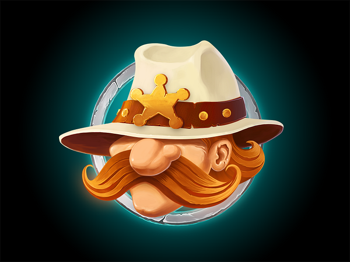
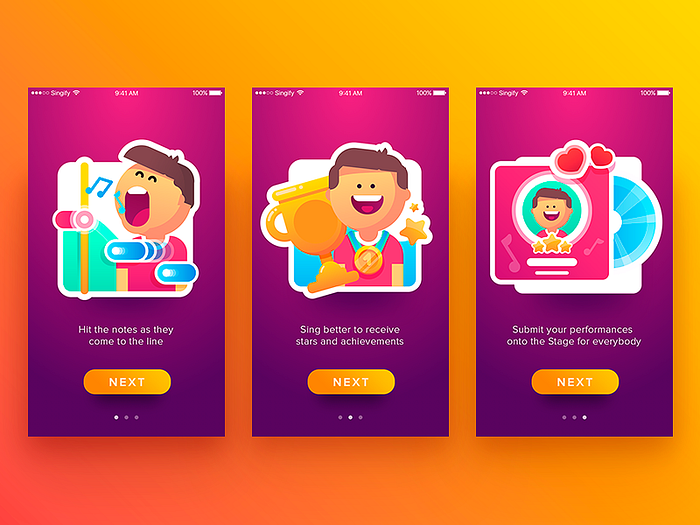
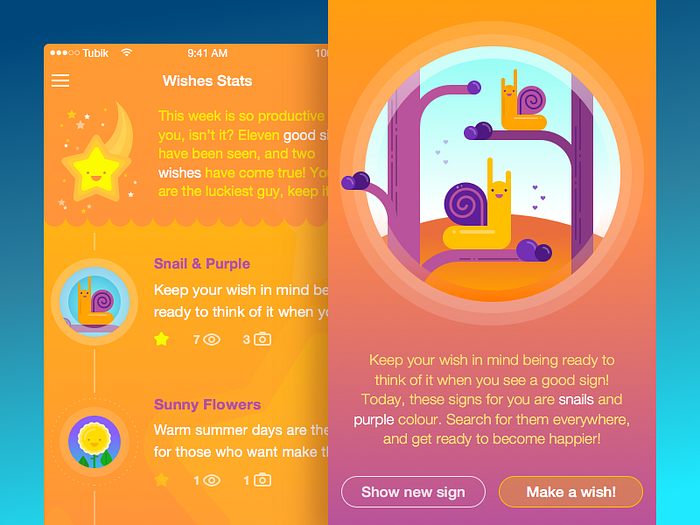
Mascots and characters
Perhaps, one of the most efficient ways to apply illustration techniques in design both as a visual and functional element are mascots of different types. Mascots are images, usually personified, which in most cases represent the brand, product or service identity and therefore become its symbolic convention via all the application or website.

Mascot as a graphic design object needs great attention as they have to represent the nature of the brand or product. Mascot becomes the element of identity and inter-connector between the user and the product. In many cases, mascot is the basic element of communication and interaction, therefore in different states it can become the basic way to deliver the message to the user.

Obviously, mascots are very helpful in interfaces: they liven up the general process, catch up user’s attention, become the memorable element, create important support for a stylistic concept and make the illusion of direct communication with the user. Also, wisely used in illustrations featuring actions or interactions, mascot can become a good way to avoid using too much copy on the screen and in this way save space for other important elements of layout or just more “air” also really needed to create good perception of data on the screen or page.
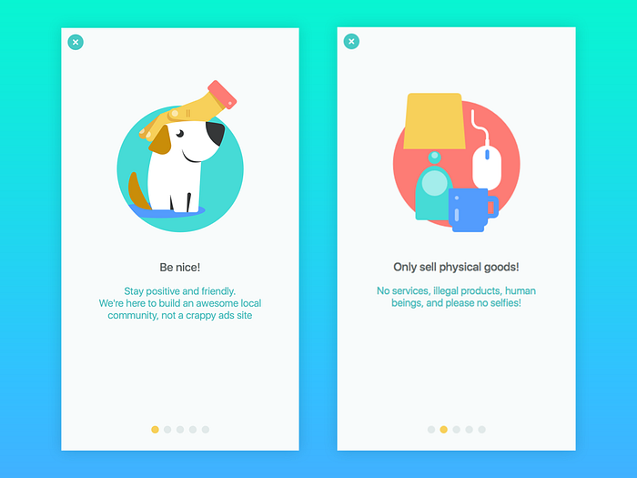
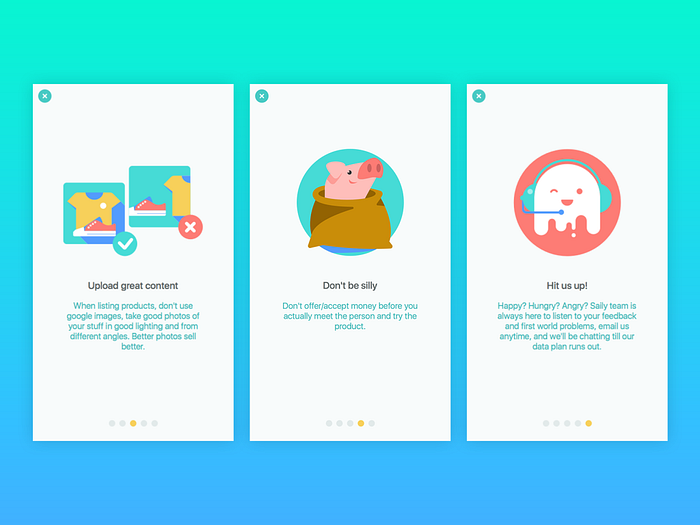
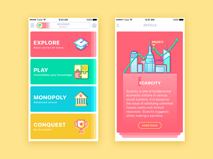
Tutorials and tool-tips
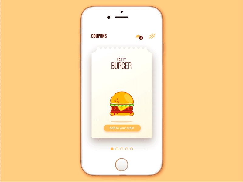
One of the good ways to use the illustration in UI are diverse tutorial screens and any kinds of tool-tips. In this case they fully reveal their potential in explanation and clarification. The options can be totally diverse from simple icon-like to artistic and sophisticated ones. Illustrations of this kinds become a good way to boost usability minimizing the necessity of using the copy on the screens. They are particularly efficient in apps for kids and youngsters as they usually feel this sort of explanations more user-friendly.

Rewards
One more good case when a designer could consider the option of using illustration in the interface is the case of various awards and rewards, with which the user marks any kind of progress in the app or website, sort of stickers, medals, signs, coins and the like. Again, the options can be extremely diverse, from simple symbolic shapes to elaborately drawn detailed images, but anyway, used wisely and accomplished in accordance with general stylistic decision of the whole app or website, they become one more step towards user-friendly interactions and positive user experience.

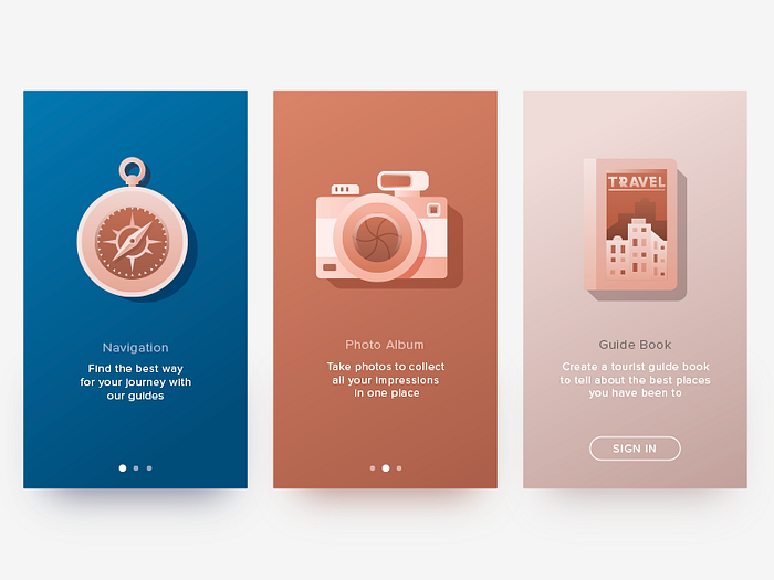
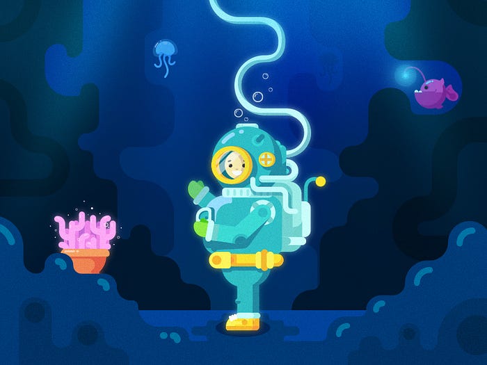
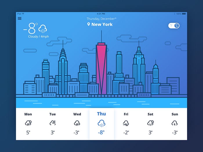
Theme and style illustrations
Illustrations of this kind are usually applied in a user interface basically to provide visual support of the general stylistic concept and perhaps the topic of the app or a website as well as events, seasonal features and so on. Their main purpose is to support all the functional elements of the layout with general harmonic and attractive appearance of the screen or page. It should also be mentioned that in some cases illustration of this type can add the element of gamification or more artistic feel to the whole product. In one of our previous articles, considering the points of creating potentially viral UI/UX design, we mentioned that one of the ways is to add some unique, custom and stylish visual elements so that people wanted to share them with the others as well as satisfy their aesthetic needs. Illustration have a great potential in this perspective.
Obviously, this article is only the start for the discussion of multiple and diverse functions of illustration in UI design and we are going to continue it in further posts sharing our studio experience. However, even the general basics mentioned today are still the strong support of the most important position about UI design process: any elements of the interface should be purposeful and functional, supporting the user, enhancing usability and providing the solid basis of positive user experience and problem solving. Illustrations are not the exception and their application in the interface should be thoroughly thought-out and accomplished with the target user in mind at every stage of the process.
Originally written for tubikstudio.com
Welcome to see the designs by Tubik Studio on Dribbble and Behance
Welcome to Tubik Blog