How to Improve UX with Bootstrap 4.2
Toast notifications, spinners and iOS-style switches
Good ‘ol Bootstrap has been around since 2013, but never before has it offered up some of the new UX features & components in the latest 4.2.1 release. These new components help improve one of the most important aspects of UX: Visual Feedback.
This isn’t the feedback the User provides like a suggestion box. This is the visual and contextual feedback provided by the UI, to keep the User informed.

Toast Notifications
The Bootstrap Alert component has never quite lived up to expectations. While the Alert does provide contextual feedback to the User, it doesn’t provide auto-hide, timing delay and animation as one might expect.
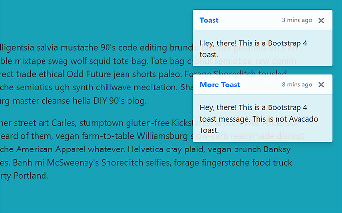
Horray! Bootstrap 4.2 finally introduces the Toast component which, IMO, is better suited to provide notification messages to the User. Here’s what it looks like and how it works…
Basic Toast

<div class="toast" role="alert">
<div class="toast-header">
Header content...
<button type="button" class="close" data-dismiss="toast">
<span aria-hidden="true">×</span>
</button>
</div>
<div class="toast-body">
Body content...
</div>
</div>The toast-header and toast-body are the recommended Toast structure, but neither is required. The Toast has a slightly translucent background color of rgba(255,255,255,.85) since it’s designed to overlay other page content. The background color can be overridden using any of the background color Utility classes.
Placement
According to the Bootstrap docs, you’ll need to “Place toasts with custom CSS as you need them”. However, I found that the Utility classes work nicely in most cases. For example, place the Toast in a position-absolute parent, and then use flexbox (d-flex) with auto-margin (ml-auto) to push the Toast to the right:
<div class="position-absolute w-100 d-flex flex-column p-4">
    <div class="toast ml-auto show" role="alert">
        ...
    </div>
</div>
Options: Animation, Delay and Auto-Hide
The Bootstrap Toast has a few simple options. The boolean animation option by default is true, and provides a basic fade transition. The delay option controls the delay in ms before the Toast hides, which defaults to 500ms.
The autohide option defaults to true. You must set autohide:false to programmatically call the “hide” method on the Toast. When using autohide:false, you should add a close button to allow Users to dismiss the Toast.
Initialize with jQuery:
$('.toast').toast();Just like all the other Bootstrap 4 components, the options can be passed via jQuery, or as data-attributes on the Toast element in HTML.
Use jQuery:
$('.toast').toast({delay:1000, animation:false});Use Data Attributes:
<div class="toast" data-delay="1000" data-autohide="false"></div>Additionally, Bootstrap 4 Toasts follow accessibility standards which you can read more about for use in screen readers and assistive technology.
Here’s the Bootstrap Toast example: https://www.codeply.com/view/6Y4bf3PKOF
Spinner
Also new in Bootstrap 4.2, is the CSS-driven Spinner to show User’s a loading or wait state. The Spinner mechanism provides just enough visual feedback to let the User know the app is busy “doing something”. This is a very important aspect of UX since users will quickly abandon pages that appear “frozen” or unresponsive.
While the Bootstrap Spinner can be constructed with HTML, you’ll need a little JavaScript to toggle its’ visibility. Spinner appearance, alignment, and sizing can be easily customized with the Utility classes.
The Spinner isn’t just for “page loading”. The Spinner can be used within micro layouts, buttons, progress bars or anywhere wait state needs to be conveyed to the User.
Bootstrap Spinner Example: https://www.codeply.com/view/4nNJBy0EQm
Switch
Switches are another new addition in Bootstrap 4.2. Functionally, they’re similar to a checkbox, but switches are better for UX that provides instant feedback to the User.
When deciding between checkboxes and switches, ask yourself if the User expects instant action when toggling the state. When you have several enable/disable options (A.K.A “settings”) followed by a single form submit button, most likely checboxes are better. When you have a reactive UI, where the User expects changes to take effect immediately, switches are the better choice.
The Bootstrap Switch has the rounded iOS-style look:

And, since the Switch is really a re-styled HTML checkbox, programmatically they function the same. They can be preset to on using the “checked” attribute, and the underlying value is bound to the “value” attribute.
Bootstrap Switch Example: https://www.codeply.com/go/gkOJEBJnkF
What Else is New in Bootstrap 4.2? 😎
There are a few more handy CSS classes that have been added in Bootstrap 4.2.1. While these don’t directly impact UX, they’re worthwhile to mention, and may save you a little time and CSS.
Height, Width and Viewport Units
Viewport units (vw and vh) are something I’ve wanted in Bootstrap for a while. Now you can easily create full-height layouts! These new classes are:
.min-vw-100 {
  min-width: 100vw !important;
}

.min-vh-100 {
  min-height: 100vh !important;
}

.vw-100 {
  width: 100vw !important;
}

.vh-100 {
  height: 100vh !important;
}
Negative Margin Utility Classes
You may know of the Bootstrap 4 Spacing Utilities for margin and padding. For v4.2 they’ve gotten even better with the addition of negative margins. Why would you want these? There are many layout use-cases, but here’s one example:

XL Modal
Also in Bootstrap 4.2 is the new, self-explanatory Extra-large Modal.
Modal sizing has been offered since the release of Bootstrap 4, and this additional size is handy if you need to display content that needs User focus front-and-center.

There you have some of the latest benefits to utilizing Bootstrap 4.2. If you want to learn more about Bootstrap 4 and improve UX, check out the free tools and resources at Themes.guide!
— Carol

