Improving the loan application & management on a lending platform — a UX case study

Background
Princeps Credit Systems Limited (aka Credit Wallet) is a fast- growing licensed micro lender in Nigeria. Based in Lagos, Nigeria. PCSL provides personal loans to salaried workers across the country through its innovative technology platform (Credit Wallet TM). Today we help low to middle income earners gain quick, convenient, and secure access to loans that they desperately need.
Role
I am currently the Principal Product Designer at Princeps and I am responsible for managing, planning, monitoring, and coordinating projects at Princeps. For this project, I was responsible for the User experience design and the Visual design. I also collaborated with the Frontend engineer on this project.
User Research
For the research, I already had enough data about who the users were as before my role as the designer, I have previously worked in the Marketing department where I got to be part of the process from letting users know about the product to them using the product. The marketer is also usually the first point of contact when users need any clarification or help as regards their loan. Here are the things I learnt:
- People have more confidence in a product when they know that there is an app in the App store where they can download and do all they want by themselves.
- Because of rampant online financial scams, people are usually skeptical of trying new products especially when they don’t have a physical office very close to them where they can walk in to complain.
- Users always like to be able to track their loans and do things by themselves instead of having to ask a third party all the time
- A good mobile app builds trust and confidence.
- Nigerians are very skeptical about trusting their money and personal information with people and it is very important to design something that feels comfortable and trusting.
Ideation:
Since I had a solid knowledge and experience of the product, I was able to come up with the following key ideas:
- Making the onboarding process easy and making users feel at ease from the beginning
- Adding features that existing customers used to have to call marketers or customer success representatives to help them with earlier. This includes:
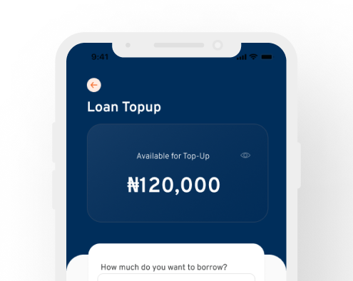
- Loan Topup application process
- Loan liquidation
- Manual Repayments
3. Made the entire process as straightforward as possible; remove all unnecessary steps.
User Flow:

Design and Implementation
Onboarding
Made the onboarding process simple and fast. Users don’t have to swipe to the end to pick an action they would like to perform. They can also swipe to the last slide to see what the product is about.

Loan Application Process
The loan application process was made simple. Choose and amount and put in all requested information and then the application automatically goes into processing. Our process is also tailored in a way that users can get their loans in under two hours!
Loan and account management
Users can manage their accounts from their dashboards, can see their loans, view repayments, contact support, request liquidation, apply for a new loan or topup, and other things they would typically have called customer support/marketing for before.

Key Problems solved by this design
- Users used to previously have to call customer support and wait for hours to be able to perform small tasks like checking loan balance, liquidation requests and topup. Now users can do this in just one tap.

2. Now that users can do a lot of things on their own, burden on marketers and customer supports staff was reduces and now they can put more time into marketing the product to increase visibility and giving customers the proper support they need at the shortest time possible
3. Users can now see the maximum amount they are eligible for as opposed to before where they just apply and then the system rejects its because of ineligibility therefore prolonging the process. Now users cannot request for more than what they are eligible for.
WHAT I LEARNED
Gaining users trust early on makes it easy for users to love and use a product and this starts from the beginning, when they first know about the product, what they perceive when they are on the website, or on whatever marketing medium they first heard them from.
More UI screens

NEXT
Once the app is available at the Play store and Apple store, I will share the link here. Looking forward to hearing from users and improving the experience from their feedback.
Thank you for reading.


