Instagram addiction and possible design solutions
What made me do this?
I recently had the chance to read the book Hooked by Nir Eyal. Though the book offers so many positive things to designers, it is impossible not to think of the negative implications. I learned how powerful and dangerous these technologies could be, if not used properly.
At this time, I was also very active on Instagram and spent most of my time mindlessly. Once I started applying the knowledge I gained, I came to realize that social media is almost always influencing our decisions, the way we spend our time, and the amount of time we spend every day. It was the realization that helped me break out of the loop. This is what BF. Skinner mentioned as a way to break out of the vortex.
Knowing you are being controlled by something is the first step towards breaking its grip.
However, I still believe that designers should take primary responsibility instead of blaming the users. So I thought to redesign Instagram in a less-addictive way by introducing more features to help in digital well-being. I am aware that Instagram has already made heavy strides and invested in user well-being in the last few years, but here are certain features that I believe could be added.
PS: This redesign is not to point out Instagram. It’s just my opinion and is purely hypothetical.
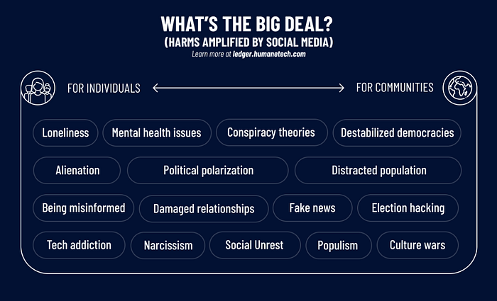
Social Media Addiction
Social media addiction has been a severe issue over the past decade and is also an area that people are constantly working on. To shed light on the criticality, here are a few ways social media addiction affects different demographics.

Foundational Research
I decided to analyze the current Instagram app and how it manipulates the user into becoming habituated. I also dwelled deeper into design ethics, persuasive technologies, and behaviorism to understand how these apps influence the user to spend more time on the app and how it can be tweaked to be more mindful of users’ time & agency.
Variable rewards
The most effective way of maintaining a behavior is not with a consistent, predictable reward, but rather with what is termed ‘variable reinforcement’ that is, rewards that vary in their frequency or magnitude.
— Dr. Tom Stafford
Derived from BF. Skinner’s experiments on Radical Behaviourism, where he controlled the behaviors of pigeons and rats through partial reinforcement, social media apps take advantage of human vulnerabilities and make use of social validation and reciprocity to extract as much attention as possible.
Behaviourism is based on the simple premise that we are drawn toward things that please us and refrain from unpleasant things.
Pull-to-refresh
Consider the ‘pull-to-refresh’ feature common to social media apps, where dragging the screen downwards makes the screen refresh. This action takes advantage of the innate human attraction to unpredictability. Psychologists call this intermittent reinforcement. When we check social media, sometimes there’s something exciting waiting for us (a ‘reward’), and sometimes there’s nothing. Sometimes we get 100 likes and sometimes 10. It’s the unpredictability that keeps us coming back.

Users keep pulling down so often with the hope that something new has popped up. Maybe a friend would have liked their photo, commented, tagged them in another photo, and so on. It also takes advantage of our social impulses and anxieties (including the Fear Of Missing Out).
“People started putting it in everything. In my mind, I did it because it was a more natural, ergonomic gesture. Some people likened it to a slot machine, which makes a ton of sense, in hindsight.”
— Loren Brichter, Founder of the Pull-to-refresh feature
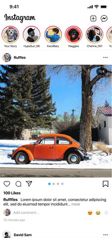
In Instagram, this feature is employed literally everywhere. Home feed, explore, notifications, profile, and even messages use this feature. It would make sense to include this in places where the user would need to see different content every time they pull this down. So the home and explore pages seem to be the only logical places to use this.
In other screens what if this was removed completely and the information automatically updates without having the users pull down every time?
The Infinite Scroll

The “dreaded” infinite scroll which exploits our Unit Bias, has got to be the most manipulative and persuasive feature of social media apps. By reducing friction in the interface to such a great extent, this feature has enabled people to scroll mindlessly without having time to think about whether it's actually benefitting them or not.
Unit Bias explains the human tendency to finish something we started. And when something doesn’t finish we continue to crave more and more without an end.
Instagram Offers 4 different infinite scrolls to trap its users- Home feed, Stories, explore feed, and reels.

Adding friction intentionally would be a plausible solution as it allows users to take a mindful decision of whether to continue scrolling or not. Though this might not be received well by users initially, I think that this would prove efficient in the long run considering user wellbeing.
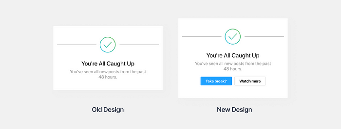
You’re all caught up
Though the ‘you’re all caught up’ feature seems to be a way of telling users that they are spending way too much time in the app, it isn’t efficient in actually making users take a break.
The current design just shows the message and allows users to scroll right past it. Instead, we can stop the feed here and have users make a conscious decision whether to take a break or to continue.
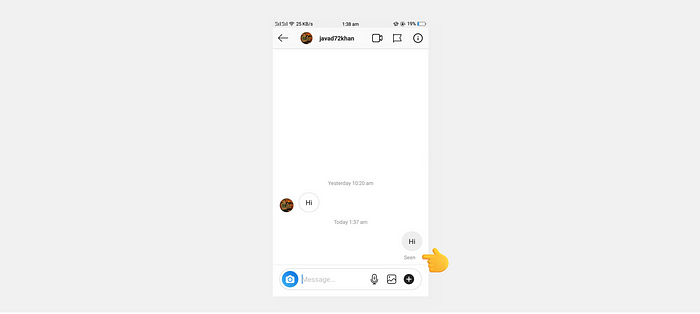
Read receipts
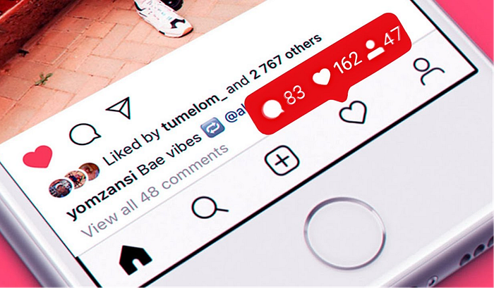
When our friend has done something, we innately feel the need to do the same thing to satisfy him/her. The same goes with chat as well. When a friend has texted something and we have seen it (thanks to read receipts), we feel obligated to reply even when we don’t really want to (called Social Reciprocity). Even if you want to get out of the chat before your friend types out something, the 3 ghost dots which tell that he/she is typing, builds up your anticipation and just doesn’t let you go.
It would make sense to allow users to turn this on/off (as in Whatsapp)
Notifications
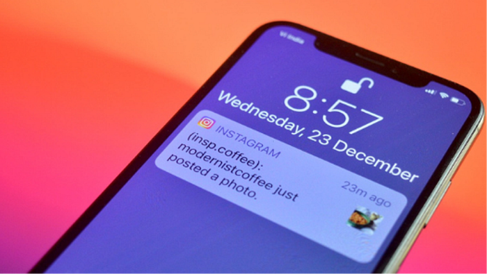
Push notifications bring you into the app with the implicit or explicit promise of social reward. Even the most intimate parts of ourselves, love and sex, are used as an emotional weight to get you into apps more often.
— Tony Butler
I’m not saying to remove notifications as that would be impossible. However, there could be tweaks made to them to make them less persuasive.
Once the user clicks on the notification, instead of showing just that specific post, it directs users to the home page.
Here many users forget why they opened the app and start scrolling mindlessly.
What if when the notification is clicked, instead of taking users to the feed, it takes them directly to the concerned post? Or what if it displays the post itself in the notification and allows users to interact with it?
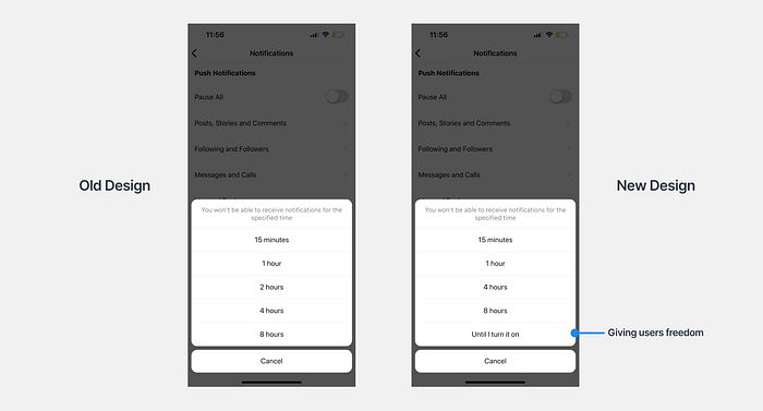
Pausing notifications
Pausing all notifications is a great way to circumvent all these issues and Instagram offers a feature to do so. However, the maximum time that users can pause notifications is 8hrs.
Instagram Suggestions
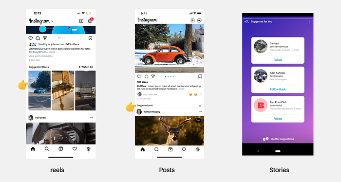
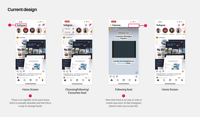
Instagram vouches that suggestions enable users to find more amazing content which they would have never found otherwise. However not all users like getting bombarded with suggestions everywhere. Moreover, there is a explore feed that does exactly this.
The following and favorites feeds were bought in to save users from this. However, there are a couple of issues with the way this is implemented.
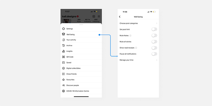
Well-being
In light of the above mentioned problems, I came up with a settings menu that gives users more control and freedom.
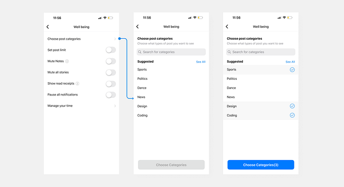
Choose post categories
This feature enables users to choose only the categories they like and want to see in the feed rather than getting bombarded with a variety of stuff.
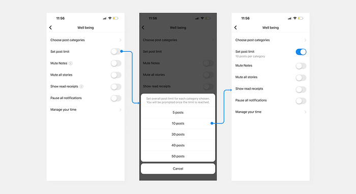
Set post limit
This feature allows users to choose a total limit for posts (could be extended to post categories). It allows users another way to have control over their screentime.
Other Considerations
Note that there can be a lot more improvements made to the app not only on the design but also on the algorithmic level to prevent several issues.
Case Study Template
If you want to build killer case studies quickly, check out this free case study template 👇.

Follow for more✨
If you liked this, consider checking me out on Instagram where I share useful tips and my thoughts on UI/UX, psychology, and design in general.
Stay tuned for more case studies and analysis on medium.


