UX CASE STUDY
Designing for personal care in Purplle Beauty
— driving business through product design

Context
I participated in a 48-hour product design challenge where I worked on identifying the right problem that could bring impact followed by designing the solution — for a given mobile app called Purplle with the goal of benefiting both users and the business.
To save time, I used ChatGPT to gain quick insights about the market and the users, keeping in mind its limitations*.
Purplle Beauty
Purplle is a top-rated online beauty and cosmetics app in India, ranked #3 in the beauty category**. It offers a mobile app with affordable options and a wide selection of popular brands like Mamaearth, Maybelline, L’Oreal, Sugar, and more.
Jump to solution (visual design, anatomy, more)

A curious kickstart
To discover a problem space, I began by conducting a thorough exploration of the given product to gain an understanding of its application. Additionally, I engaged with individuals in my team to better comprehend their experiences on the beauty and personal care front. This enabled me to identify the challenges they face in their daily lives. Also, I started learning about how the business is benefitting from its current design.
Problem space
Beauty and personal care routines are an essential aspect of daily life and individuals often struggle to maintain consistently. Irregularities in beauty and personal care lowers effectiveness of the what a skin or hair care product is meant to deliver, leading to dissatisfaction and more. This issue not only affects personal health and wellness, but it also poses a challenge for businesses within the beauty industry.
Helping users improve their consistency in maintaining their beauty and personal care routine.
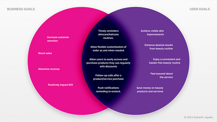
Thinking business
An important aspect of the design challenge was to address a problem that could have a positive impact on the business thereby improving key metrics
— increasing customer retention and boosting sales.
With these business goals to solve for, I thought it was crucial to address the problem of improving the consistency in beauty routine to support both user needs and business objectives. I found potential in this domain so I started to explore further on the problem.
Significant time was invested in discovering an impactful problem domain. Kudos to my friend, Shreya for assistance.
Constraints
I considered constraints at different phases of the design challenge to make informed decisions and optimise my approach — listed together below.
- Prioritise and manage tasks effectively within the 48-hour timeframe.
- Account for mobile platform limitations and performance considerations.
- Consider restrictions, dependencies, and security requirements when using third-party services or tools.
- Ensure the designed solution does not disrupt the existing product purchasing experience.
- Maintain compatibility with the existing framework of the application.
- Follow Purplle’s brand guidelines for design consistency.
- Design with inclusivity and adhere to accessibility guidelines.

Secondary research
Within the given time frame, I studied about market, users and associated behaviours around the problem space by exploring the web and analysing competitive businesses.
Research objectives
- Understand beauty industry landscape and trends.
- Identify user pain points and challenges in beauty routine.
- Analyze user behaviour and preferences in personal care.
- Explore reasons behind struggles in maintaining personal care routine.
- Investigate innovative strategies and technologies in beauty industry.
- Evaluate impact of consistent beauty routines on well-being.
- Analyze competition and their approaches to improve beauty routine.
- Use sales and retention data to identify improvement opportunities.
Market research
Following insights provide market statistics for the beauty and skincare industry, as well as user behaviour and lifestyle trends and concerns related to skincare routines.
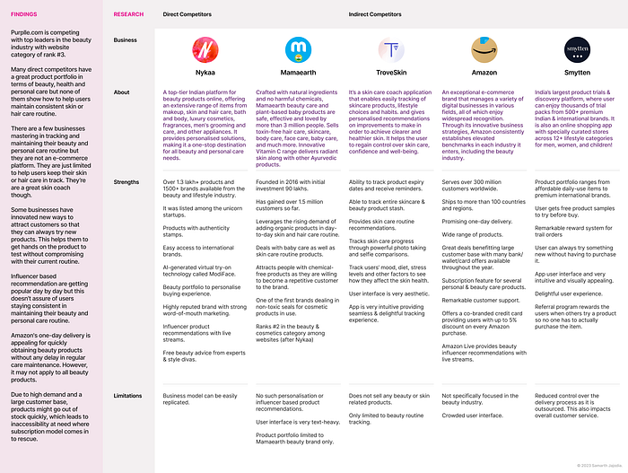
Competitive Analysis
I learnt about leading beauty & organic products businesses, top players in e-commerce and innovative enterprises solving similar problems to understand their strengths, limitations, and takeaways for inspiration and learning.
Research findings
- Users may not get desired results from their beauty routine, leading to frustration and dissatisfaction.
- Lack of time & motivation generally leads to irregularities in maintaining personal & beauty care routine.
- Improving beauty routine can lead to increased satisfaction and confidence.
- Users prefer buying in bulk to save time, money & efforts.
- Users struggle to find products that meet their beauty needs and preferences, leading to less brand loyalty.
- Maintaining a consistent routine can be challenging due to uncertainty about suitable products and busy schedules, potentially leading to negative effects on skin and well-being.
- Finding suitable products and services can be challenging as beauty and personal care routines are highly personal.
- High demand and a large customer base can result in products quickly going out of stock, creating accessibility issues.
- It is believed that when it comes to creating habits it’s important to have visual reminders.
- Businesses in the beauty industry rely on customer retention and sales to stay competitive.
- Some businesses specialise in tracking and maintaining beauty and personal care routines, but they are not e-commerce platforms. They just focus on helping users with their skincare and haircare, acting as excellent skin coaches.
- One-day delivery is convenient for acquiring beauty products promptly, but not all beauty items may qualify for this service.
Defining the user
Relying on the data gathered from secondary research and based on my friends, family and personal experiences, I established three user personas which represented my key audience thereby helping me to build my first hypothesis.
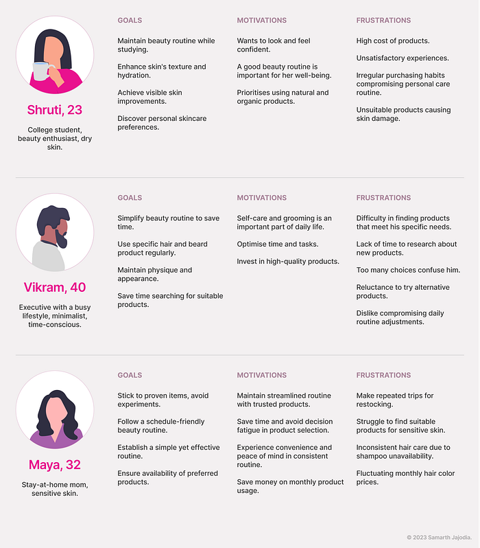
Users defined above shared similar drives, which enabled me to steer the design process and take well-informed decisions.
- Users usually prefer tried-and-tested products over experimentation.
- Users want convenience and peace of mind while managing their beauty routine.
- High product costs frustrate users and influence their purchasing decisions.
- Users are motivated to maintain a consistent beauty routine that suits their skin or body needs.
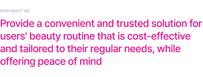
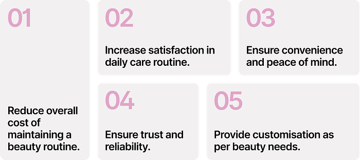
The beauty industry has seen tremendous growth, especially during and after COVID-19. Personal care is now a top priority, leading to the digital transformation of businesses. With increased awareness, innovative solutions have simplified consumers’ lives and improved convenience. Based on above insights & findings, the goal of the new feature is to:
Setting design parameters
To facilitate idea generation, I outlined specific assumptions for brainstorming. This focused approach minimised unnecessary effort while promoting innovative and impactful solutions.
Assumptions
Below are assumptions based on research findings, user understanding, market analysis.
- Users are willing to provide personal information for customisation
- Users expect accurate and up-to-date product information.
- Streamlining the system should improve operational efficiency and reduce costs.
- Users are more likely to make repeat purchases if they have a positive overall experience.
- Users are more likely to make a purchase if there are exclusive discounts/offers available.
- Technology and internet access affect e-commerce usage.
- Shipping costs increase online beauty product expenses.

Brainstorming ideas
Together with the help of a friend, we generated a wide range of diverse and creative ideas for each goal within the allocated time frame using Crazy 8 method.
To find unique solutions for the problem, I tried to exclude ideas for which a feature already exists.

Driving in balance
After generating a bunch of ideas, I tried to navigate the tension between designing for user needs and meeting business goals that would guide me further through prototyping.
Information & Interaction
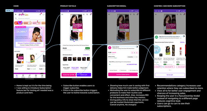
After understanding the current layout and site map, I noted key features, data points, and user flows within the app’s existing architecture. This informed my interface visualization. Given time constraints, I focused on specific goals for a Minimum Viable Feature (MVF), prioritizing Goal 1. It was essential as it laid the foundation, beginning with product purchase and extending to maintaining a consistent beauty and personal care routine.

In order to help myself consider important use-cases of a feature I thought it was necessary to think about Goal 2 as well.

Crafting a draft
I sketched out wireframes and performed quick paper prototyping.

High-fidelity prototyping
To save time, I used existing interface patterns and components for the prototype, following Purplle’s design language. Adapting their style guide, I efficiently created a testable solution.
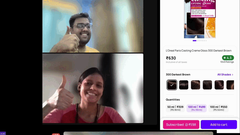
Usability Testing
I tested my prototype with a diverse group of six users, majorly female (four) candidates aged 23–32, representing various ages and professions.
Test Goals:
- Can the user understand the informations and actions on interface?
- Identify inconsistencies throughout the flow.
- Is the user interface self-explanatory?
- Can the user successfully complete the tasks?
- Do the users need help while completing the tasks?
Test Methodology:
- Connect on Zoom/Discord, presenting prototype over screen.
- Observe and pen down their reactions/commentary/expressions as they go through the product feature.
- Take a note of any obstacles they face whilst completing the task flow.
Success
I asked questions while I let my users navigate freely and complete the tasks to test the intended user flow. I checked users who are able to complete the task without help and those who answered when guided.
Affinity mapping
From the test responses, I synthesised the data collected and prioritised the feedback, helping me take informed decisions for my final design.
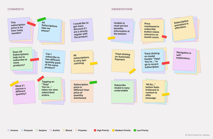
Test Findings:
- Most users were able to complete all the tests.
- More than 66.6% users were able to complete 80% of the tasks without any help.
- Price mentioned inside subscription button was confusing for more than 50% users.
- “All subscriptions” link inside the offer card was ambiguous to understand for more than 66.6% of users.
- Interface of the integrated feature was easy to understand with no such navigation issues.
Visual Design Guidelines
I established bare minimum styles/components adhering to Purplle’s design language.

Anatomy of final design
Incorporating the feedback, below are the final mockups stating every additional/changed UI element and the rationale behind the same.


Success metrics
Other than customer retention and sales, there are some other metrics that will indicate the success of the solution.
- Higher average order value from subscribed customers.
- Improved customer lifetime value.
- Expansion of customer base through referrals and word-of-mouth.
- Reduction in customer churn rate.
- Improved inventory management and forecasting.
- Increased cross-selling and upselling opportunities.
- Improved operational efficiency through automated recurring orders.
- Greater customer insights for product development and innovation.
- Increased customer lifetime value through long-term subscription commitments.
Next Steps
- Understand UX gaps in existing information architecture to see if there is scope of improvement.
- Design for use-cases where product is out of stock or there is limit to how much a user can order in a given period.
- Solve for other goals that the solution tends to accomplish.
- Design Manage Subscriptions flow.
- Consider other use-cases in detail that aims to enhance the overall user experience.
- Do the micro-interactions for prominent UI states.
- Refine UI components and patterns to improve visual consistency
*ChatGPT may produce inaccurate information about people, places, or facts. Every research data collected has been verified from trusted sources.
**Ranking data as of May, 2023.
The article above is my original narrative and structure. Thanks for taking this through. If you found value or gained insights from this study, I’d appreciate an acknowledgment. Welcoming your thoughts.
About Me
I’m Samarth — worked as UX Designer at HighRadius, designing AI-enabled B2B SaaS products and features. I’ve also freelanced, designing for various clients.
Tune in to my website to explore my work with a bit of magic 🪄 Let’s connect on LinkedIn and vibe on design, tech, art 💙

