
Natural color palettes for UI design
What is the most beautiful thing we can ever see in our life? For me it is nature. Oceans, rivers, mountains, spring forests, grassy fields, flowers and animals. There are lots of wonderful landscapes on Earth, that are more shocking and awe-inspiring than everything that has ever been created by man. There are of course great and amazing places, art and design that also give great inspiration to people. But all the best artists throughout history have looked at nature for inspiration, and tried to find the best colors for their work of art, whether it be a painting, a sculpture, or even a piece of furniture.
I want to share with you my idea on how to use natural color combinations for UI design. You can take a look at the cover photo of this article. There are so many great colors together and it looks pleasing to the eye without being disharmonious. It is good to keep color schemes in mind when you design something, but it’s also very rewarding to experiment with new combinations. So many flowers, birds and animals have bright and beautiful colors that we could take as an inspiration to make our design more natural and inviting. For example we can evoke positive feelings, using two shades of red to remind people of an apple. The possibilities of using colors to make people feel different emotions are endless. Colors aren’t just numbers of Red, Green and Blue that we can just put in a computer and get results. In fact, it is really hard to just find the right colors using a color picker. Pictures of nature were always a great source of inspiration for my work and it helped me to learn a lot about how colors fit together. I think it would be easier for everybody to find great color combinations, if they just closed their color picker and opened photos of landscapes, plants, flowers and the sky.
Material Design Palette
I love material design principles. It was created by really talented people. It inspired me a lot in my work with its great templates and shapes. Material design palette looks good too, but sometimes it is hard to put these colors together. Not all of combinations of colors work well. For example it is really hard to use material pallet for cards, because all colors are bright.
When I work on android applications I follow principles and guidelines, but I also choose my own color palette to make applications unique. As you know I have my inspirations in nature. We can review the basic combinations of nature palette.
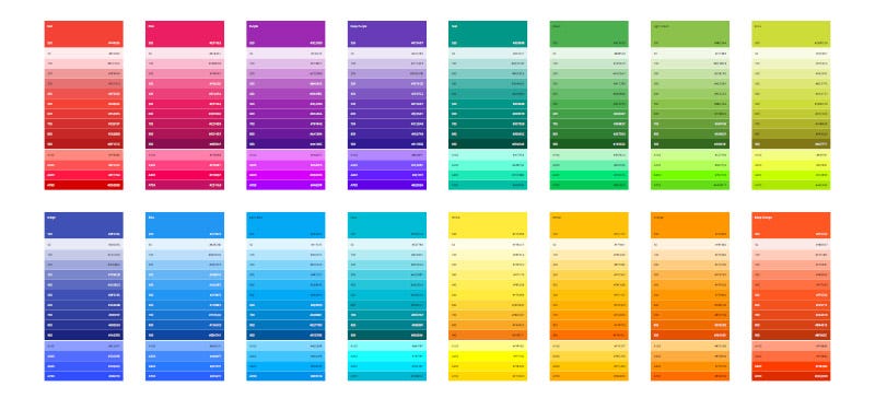
Basic colors

Everybody knows the 7 basic rainbow colors. Question is which colors fit together perfectly. I think you know green, combined with most colors works very well. Look at flowers for example: yellow, red, purple, even blue flowers look great. It needs different shades of green, for example dark green is really good with light yellow, olive green is good with bright red.
What about red and blue combinations? The shades are very important here. Everyone knows how beautiful a red sunset is in the ocean. Red and light blue fit together really well, you just need to find inspiration in the sunset. Look at nature closely and you will see many awesome color combinations.
Pastel colors

Bright colors are in trend now, but you should not forget about pastel colors. There are a lot of great examples of 19 century French design with pastel colors: textiles, wallpaper, furniture, paintings, natural ornaments. Colors shouldn’t be always clean and bright. I think it is big omission that pastel colors are not popular in design. These colors also really fit perfectly together and it looks very natural.
Combinations of colors

You can see incredible combination of colors looking at the photos of tropical birds, animals and flowers. All of them look really unique beautiful. In my opinion, it is a really good idea to follow natural guidelines for colors and try to create something interesting.
A unique combination of colors can make your application or web site feel memorable and individual. Color is one of the most important part of the product. It is what people most vividly remember about in design.
My challenge
I came up with the idea of using natural colors a year ago. This really helped me in my work, because of this I decided to write about it now. I will create some examples with natural color pallets and share them with you. It will help you explain how to use natural pallet in UI design and how to find inspiration in nature.
Part 1. Cards
I really like card template material design, it is a good shape and composition. Material design cards have a great balance with content and shape. I really love using cards in my design. But material design palette colors sometimes don’t fit together, because all of them are too bright. I have an idea to redesign cards using natural palette.

Redesign Notes
I want to start with notes app. It is a really good looking example, it just needs a better color pallet to fit together perfectly. I tried to recreate existing notes app and add natural palette. There is a problem with application like notes. You can’t use all bright colors together. For example if you pic up colors from material design pallet with 500 bright they won’t fit together. What can we do about this? I think we can look at a flower bed. It is really interesting to see how lots of different flowers fit together. Because their colors are not clean, some of them have grey shapes or imperfections, some more bright and some are darker.

You can see my redesign on the right side. I chose green color as main, because it fits perfectly with all the colors. Next I was looking at flowers and birds to pick up a natural colors pallet. Some of the birds have really fantastic color combinations that you would never think of by yourself. There is a lot of inspiration in nature. You just need to open your eyes and see it.

Christmas events
My next challenge was to create an event application using the cards template material design and a natural palette. I love Christmas and I really would like to have a Christmas event app for my city. As you know, sometimes you can’t use a standard palette for specific events, because it does not looks good. There is just one way to find colors that are great for Christmas.

I started with inspiration from some Christmas photos. Everybody knows the specific colors: dark green Christmas tree, red Santa-clouds suit, orange mandarins, chocolate cake with cheery and gold decorations. I combined all these great colors together and created some cards for categories. I also think that if you would just look at these colorful cards without the icons and title it would remind you of Christmas. I think it is a good solution to use them. There are always specific colors and symbols associated with certain events. Taking a minute to think about it can mean the difference between a great design and a mediocre one.

Summer events
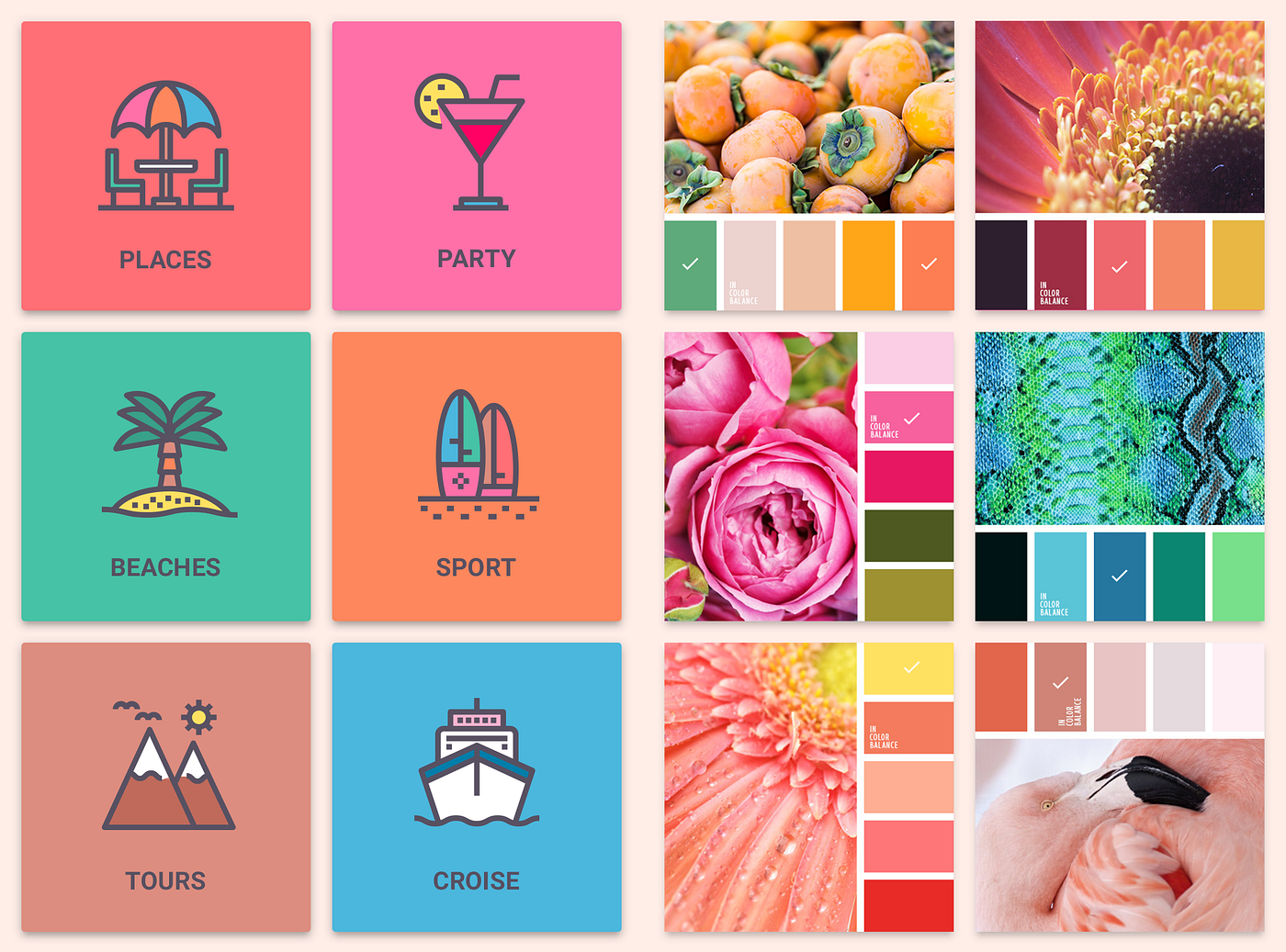
I know that we are all looking forward to Christmas and it is getting really cold lately, but it is important to remember that there is a hot summer now just south of the equator. I chose to create a summer event app for Australia, because it is a really great place to spend summer and of course this place has a lot interesting events: lots of beaches, cruises, parties and of course surfing, lots of flora and fauna that doesn’t exist anywhere else in the world.

The colors of nature are very different in different seasons. You would naturally assume that summer colors are very bright, but if you take look at photos or remember your last memory from the hot summer days on the beach, you will see a lot of colors that have yellow shade because of the sun and colors look muted, while during the winter, the snow and ice gives everything a white, almost bluish glow.
Summer palette is positive and warm. I chose flowers and fruits for my natural pallet. What are the colors of summer? When I picture it, I think of a green forest, blue ocean, orange beach(Australian), pink party cocktails and of course the yellow sun.
These are my ideas on how to make Design UI better for using natural palette colors. I hope it was fun for you. For inspiration please visit palette website:

