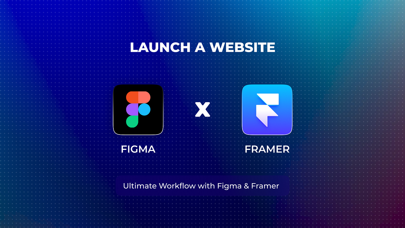
Launch Website : Ultimate Workflow with Figma & Framer
Launching a website is often common yet tedious task especially if you are not a developer and I am here to tell “You are past those days my designer friend”. Just follow my latest workflow and thank me later 🤙 . Let’s get started.
We start with Figma
First and foremost, it is important to design your website on Figma with properly naming your layers and using auto layout.
It’s almost compulsory to use Auto layout even if you are cutting short on naming the layers in figma else you will start having problems with responsiveness while working in framer.
Auto layout will help save time and ensure that your design is organised and easy to work with. Figma’s auto layout feature is particularly useful for creating responsive designs that adapt to different screen sizes and devices.
2. Exporting to Framer
Once your design is complete on Figma, you can use the official Figma plugin for Framer to import it directly into the Framer workspace.
This will save you the time and effort of recreating the design from scratch in Framer, and will ensure that your design is transferred accurately and efficiently.
3. Website editing stage (No code) in Framer
“Framer is just like you are building real responsive website in Figma.”
You can build, edit and iterate your site on framer with ease & for free, they just ask plan upgrade only when you want to launch the website. Prices are pretty genuine as well.
However, it is worth noting that sometimes minor issues can arise during the import process from Figma, such as gradients and images can get messed up.
In these cases, it is important to clean up any mess that may have occurred and make sure that your design looks as intended.
Hopefully because you have used Auto layout 👀, converting desktop website to tablet and mobile on framer will be very easy in comparison to any other method
Framer’s features and capabilities make it an ideal choice for creating websites that are modern, slick, compatible with essential plugins such as lottie files, typeform, built in sections, templates. Native website animations are also super smooth 😎.
To ensure that your website is SEO-friendly, be sure to go into the project settings and add all the necessary SEO information and keywords. This will help your website rank higher in search engine results and attract more traffic.
That’s it!
Once you have completed these steps, your website is ready to go live. With the right tech stack and workflow, you can create a modern and responsive website that is optimised for search engines and ready to be shared with the world.
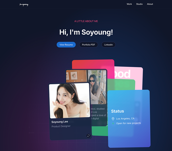
Sites that I have personally launched with this workflow recently :
Thanks for reading. Do share this workflow with your team and let me know your feedback on how this can be improved aswell. Cheers 🥂


