Member-only story
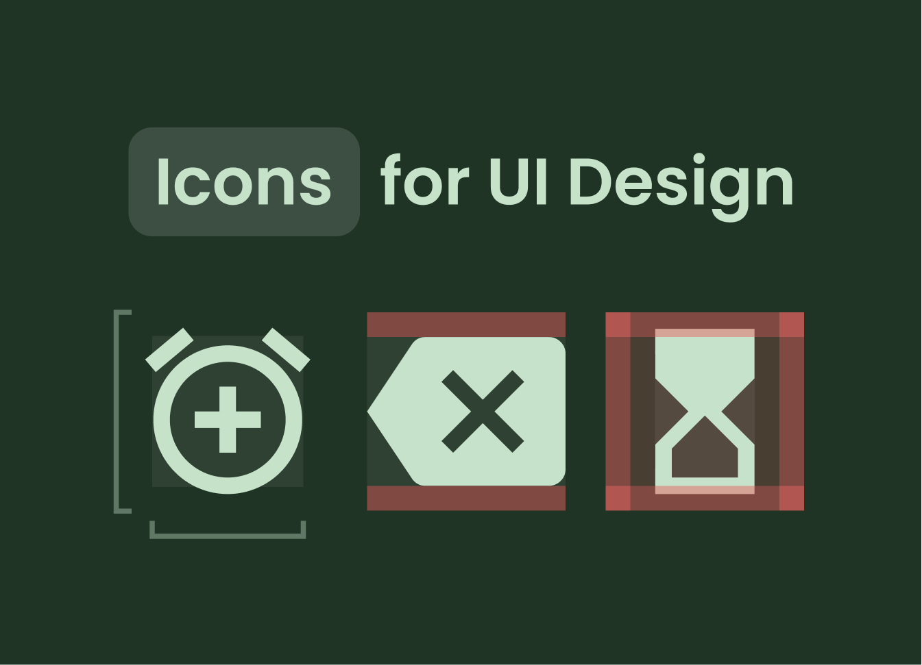
Learn How I Design Icons for UI
Learn what rules and sizes I follow for Designing Icons.
When I am creating UI design I mostly prefer borrowing icons from different websites or free Icon packs. Still, sometimes a client wants something unique or icons that match the brand personality.
That is when I design a custom icon while following the basics of icon designing. I follow the Material Design System while designing my icons.
Let’s see some of the basics You need to know to get started designing your custom icons for a better personality of your designs.
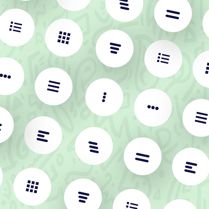
#1 Basics of Icon Designing
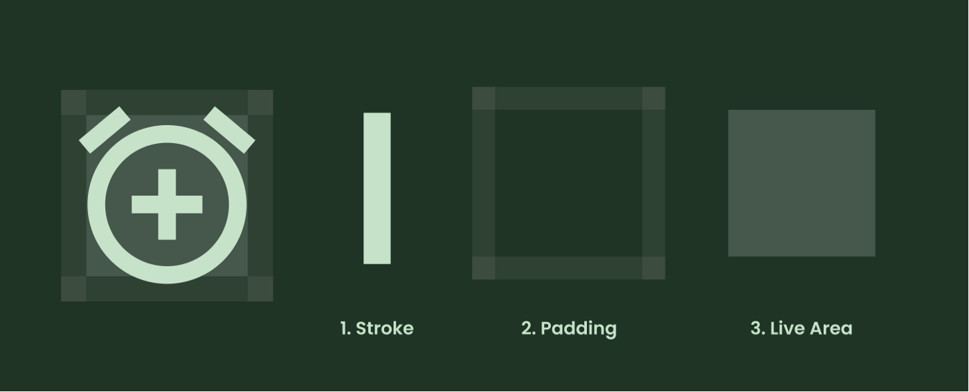
There is 3 most basic term you must know when you start designing your icons for UI, and those are Stroke, Padding, and Live Area, let me explain them.
- Stroke: The size of the line or icon, we can adjust the stroke according to the company’s or client’s branding need.
- Padding: This is the space around the icon that helps in defining the territory of the icon and some spacing also.
- Live Area: Live area is the area where you will be drawing your icon, sometimes there is an exception that icons can cross the live area but it’ll be better to design your icons in the live area.
#2 Sizes for Icon Designing
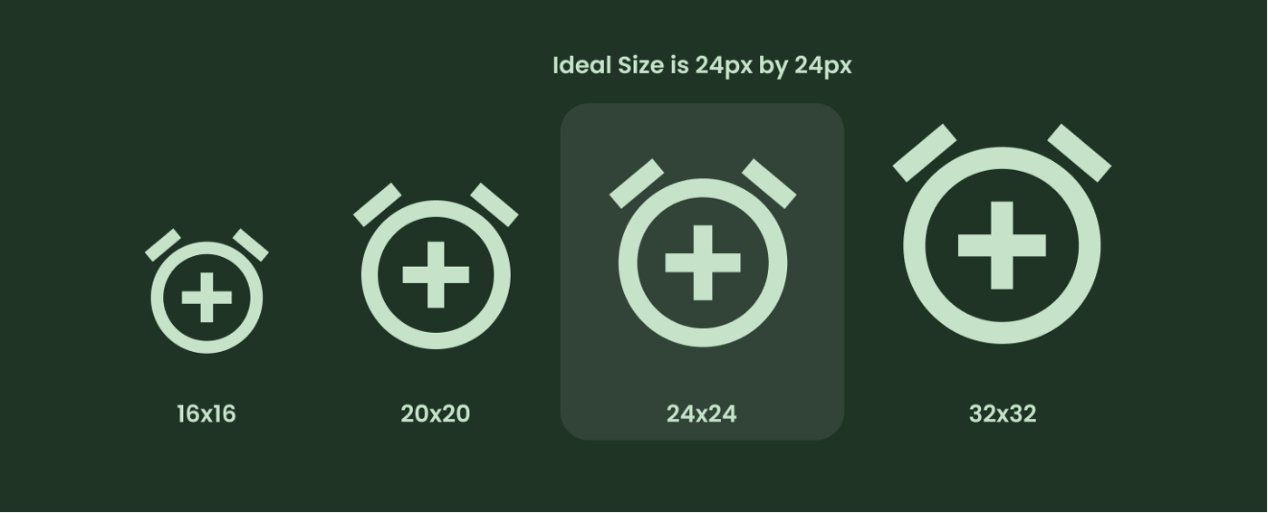
You can create various Icon sizes but the best recommendation for icon design by material design guidelines is a 24 x 24 px icon. with 1px grid.
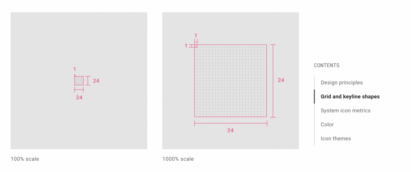

When designing the 24x24 px icon the live area should be 20x20px, and…


