
The news that Harvard University has put over 32,000 digitised Bauhaus School works online set the creative world buzzing recently.
In the 1920s and 30s, a period of increasing mechanization, Bauhaus teachers and students challenged the conventions of fine art, architecture and design by advocating a return to individual craftsmanship. They also rejected the flowers and frills that dominated the design language of the early twentieth century, and instead sought solutions that were simple, rational, and functional — an approach that remains dominant in design today.
In this article, we’ll explore what the movement was about, outline five lessons the Bauhaus School can offer to today’s designers, and demonstrate how contemporary web design continues to show Bauhaus influences.
What was the Bauhaus School?

The Bauhaus School operated in Germany between 1919 and 1933. As a school of thought, it advocated a new way of approaching problems in art, architecture, and design; and as a physical school in Weimar and Dessau, it hosted a succession of prominent course leaders. Teachers included avant-garde artists like Johannes Itten, Paul Klee and Vassily Kandinsky, while Bauhaus students included Josef Albers, Herbert Bayer and Gunta Stölzl.
After the rise of the National Socialists, who effectively shut down the school for its “degenerate” ideas, many members of the Bauhaus travelled to other European countries and the USA to continue their work independently. As a result, “Bauhaus” became a twentieth-century movement reaching far beyond the Weimar Republic.
What was it like to study there?
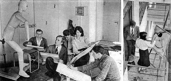
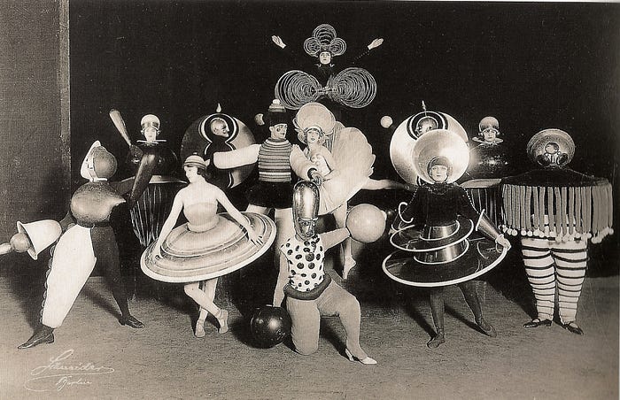
Education at the Bauhaus School was diverse and hands-on, spanning building theory, carpentry, ceramics, fine art, graphic printing, glass and mural painting, weaving, geometry, mathematics, business administration, metal, photography, printing and advertising, and plastic arts. Even parties and stage performances were part of the curriculum, with students encouraged to experiment in costume and stagecraft.
Whereas a conventional education for an artist might focus on brush technique and paint mixing, a Bauhaus teacher would direct the student to study the fundamentals of colour and form, and encourage experimentation across a whole range of materials and disciplines.
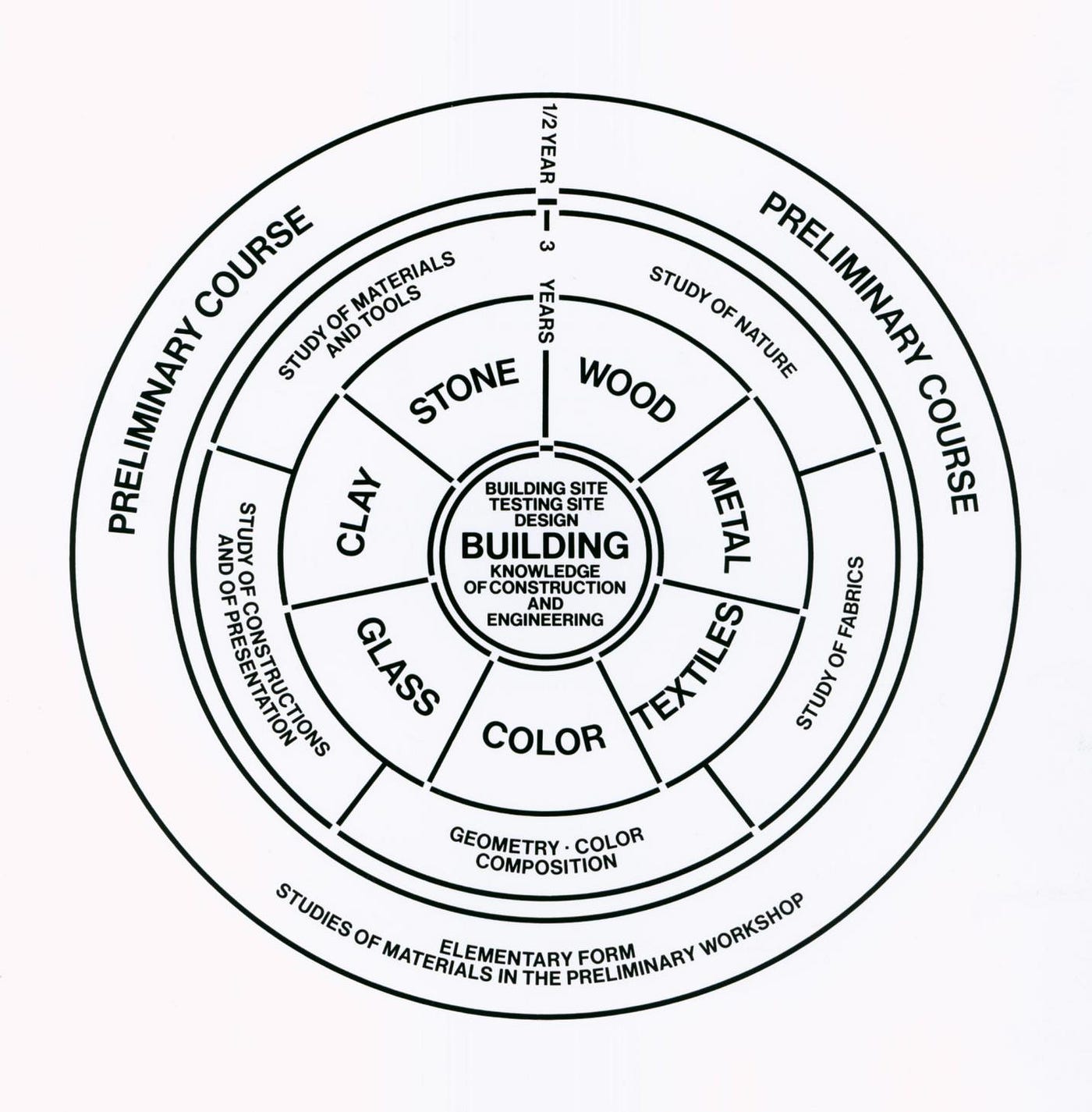
Here is a reproduction of Bauhaus founder Walter Gropius’ original diagram of the Bauhaus curriculum. Students entered the preliminary course, covering “elementary form” and basic “studies of materials”. Over the next three years, students were encouraged to experiment in many media, and only after this formation in the fundamentals were the best students allowed to enter the core architecture course (which wasn’t established until 1927).
What set the Bauhaus school apart, though, wasn’t so much what they studied, but their new ideas about how to teach and learn. The essence of this philosophy is set out in a brief manifesto by Gropius in 1919:
“The art schools […] must return to the workshop. This world of mere drawing and painting of draughtsmen and applied artists must at long last become a world that builds. When a young person who senses within himself a love for creative endeavour begins his career, as in the past, by learning a trade, the unproductive ‘artist’ will no longer be condemned to the imperfect practice of art because his skill is now preserved in craftsmanship, where he may achieve excellence. Architects, sculptors, painters — we all must return to craftsmanship!”
In his 1931 “Essay on Typography”, Eric Gill echoes Gropius’ manifesto, writing about the loss of craftsmanship that he felt had resulted from industrialism. He advocated a reunion of the artist with their craft.
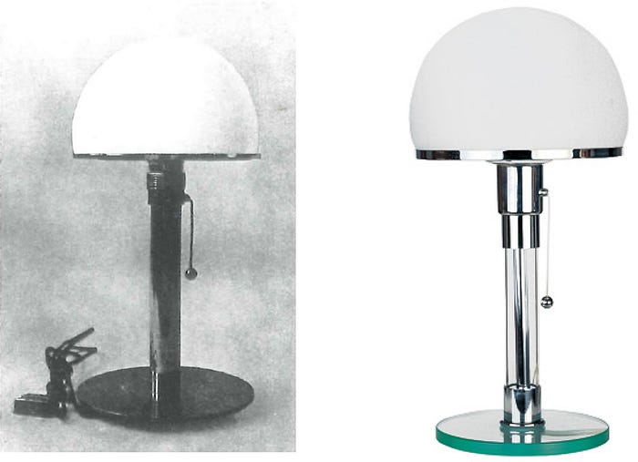
Some of the items created by Bauhaus students during this period have become iconic, and Bauhaus forms are often found repeated or imitated in today’s furniture and appliances. For example, here is Wilhelm Wagenfeld’s original 1923 lamp, created while he was a student at the Bauhaus, alongside a reproduction still available through retailers today.
Five lessons the Bauhaus School can offer today’s designers
1. Go back to basics

One of the great insights of the Bauhaus movement is to recognise that creative education is about more than passing on and refining technical knowledge or skills.
Google is full of brilliant answers to every “how to” query. Watching fantastic online content like Aaron Draplin’s logo design challenge gives us great insight into the design process, and inspires us to try for ourselves. But when it comes to solving our own design problems, we need more than a how-to guide.
By going back to the fundamentals of colour, form, and meaning in design, we connect with the basic elements of our craft, and free ourselves to be more inventive and to respond authentically to the design problem that we are called to solve.
2. Form follows function
“Form follows function” is now an article of faith for designers, but that wasn’t always the case. The Bauhaus School rejected the purely “ornamental” role that they felt the visual arts had acquired.
This feeling only became more widespread during the Bauhaus period: notably, in 1936, the early critical theorist Walter Benjamin wrote about how mechanical reproduction could rob art of its critical power.
Breaking with the widespread ornamentation and ornateness that characterised art, design, and architecture in the early 1900s, the Bauhaus strove for rational solutions to design problems.
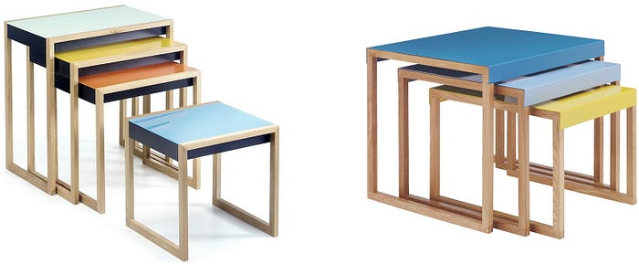
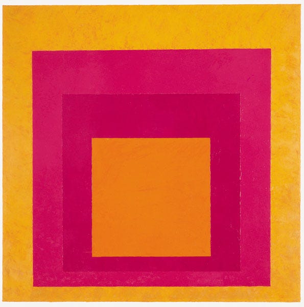
This meant stripping away the intricate and floral decorations of the late nineteenth century. In their place, the Bauhaus School required students to reflect and enhance an object’s function, without adding decorative elements for their own sake. We can see this simplicity and rationalism in Josef Albers’ geometrical nesting tables:
3. Break the rules
The Bauhaus-Archiv explains that “one of the decisive qualities that the Bauhaus possessed was an ability to see diversions or even unsuccessful experiments as potentially necessary lessons and to derive corrections in its course from them.”
The Bauhaus School’s learning culture encouraged experimentation at a fundamental level. They stand to remind us that rules and conventions are there to be learned, but not always to be observed. Some design problems call for radical solutions that nobody but you believes in. (Remember air travel?)
4. Think big even when your work is “small”

Right: Dietrich Lubs’ ET 66 Calculator for Braun, 1987.
The Bauhaus movement set out to change society, and it succeeded — by designing teapots, table lamps, and telephones. The Bauhaus-Archiv explains that, “starting in 1928, the college’s social aims intensified under Hannes Meyer; the solution was now summarized as ‘people’s necessities, not luxuries’”.
The Bauhaus anticipated a major theme of twentieth-century design — that the most serious site of design and transformation is not in grand projects (like designing an opera house), but in the stuff of everyday life. We see this in the domestic items designed by Dieter Rams and Dietrich Lubs for Braun from the 1950s onwards.
So even when our work as designers is “small”, we should still think big, even if we’re just doing a logo design for a friend’s hot dog stand.
5. Get your hands dirty
The Bauhaus School wanted to reunite the artist with their craft, and encouraged students to immerse themselves in the full range of materials and techniques available.
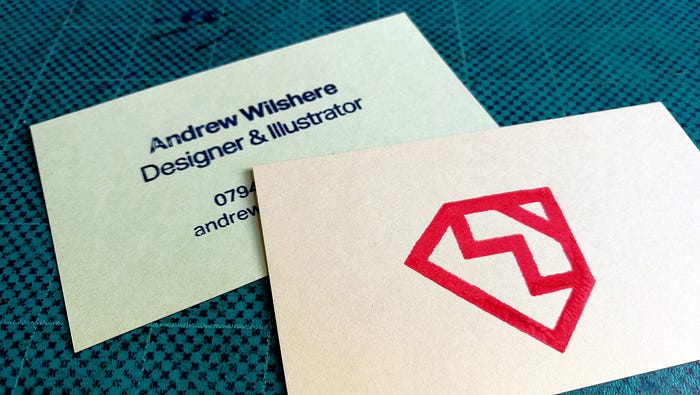
So, next time you need to print some business cards, before heading to an online print service, why not buy yourself a home screenprinting kit and do the job yourself? (Here’s a photo of some of mine, which I did with a Riso Gocco PG-11.)The quickest and most effective way to learn about the constraints and potential of materials like paper and ink is to get our hands dirty and work with them ourselves.
Five examples of Bauhaus influence in web design
1. Economy and hierarchy

On the left is Vassily Kandinsky’s “Severe in Sweet” (1928). This work highlights the relationships between dark/light, form/space, inside/outside, left/right, and small/large. Compare this to a contemporary website landing page on the right (this one is from Danish). It creates visual hierarchy with similar parameters to Kandinsky’s painting.
2. Color as meaning

Bottom: color palette for Brandts.com.
Josef Albers, a Bauhaus student, went on to write a seminal book on color theory, “Interaction of Color”. Today, the best websites are designed with carefully chosen palettes that respect their constituent colors’ intrinsic properties, as well as their meanings in culture and nature.
3. Rational, legible typography
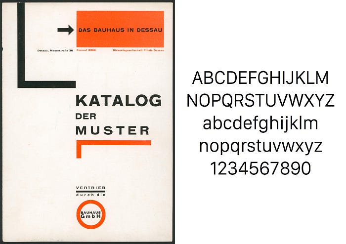
Building on the emergence of Akzidenz Grotesk in 1896, the Bauhaus School strove to create typography that was rational, clear, and legible. For Bauhaus members like Herbert Bayer, this meant doing away with decorative elements such as serifs, and imposing hierarchy on printed material using standalone uppercase and lowercase text.
It’s often said that web design is 95% typography. Recent innovations in web fonts show that our priorities are still those identified by the Bauhaus — that type should be functional and must primarily facilitate good communication.
We’ve recently seen this in Google’s redesign of their Android font Roboto, and Apple’s introduction of San Francisco. Both of these fonts are carefully constructed neo-Grotesks that optimise the user’s reading experience by incorporating large x-heights and low stroke contrast for legibility on small screens.
4. The Grid
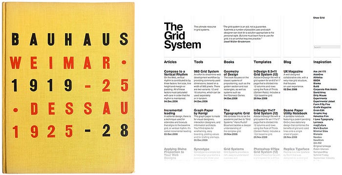
Right: Website design, “The Grid System”
Rational organisation of a visual field was a theme in the work of many Bauhaus exponents. Websites are often designed to a grid system. This allows designers to lay pages out consistently, organise text logically, and impose careful visual hierarchy on content.
5. Websites that respond to the user’s needs

By asserting the primacy of function over form, the Bauhaus School laid the groundwork for user-centred design, or as web developers call it, user experience (UX) design. Responsive websites change their size, appearance and functionality depending on the device and the user.
Want to learn more about the Bauhaus School?

You will probably be hearing a lot more about the Bauhaus over the next few years, as 2019 is the centenary of the School’s establishment. You can stay informed about Bauhaus100 events at https://www.bauhaus100.de/en/. The website of the Bauhaus-Archiv in Berlin also has masses of information about the Bauhaus School and the movement it inspired: http://www.bauhaus.de/en/. If you’re ever in Berlin, their museum is well worth a visit.
Want to learn more about design?
If you’d like to learn the fundamentals of contemporary design, Designlab offers a Design 101 course that combines online lectures, curated resources, hands-on exercises and expert mentor support. On the course you’ll learn about things like Dieter Rams’ Ten Principles for Good Design — where the insights of the Bauhaus School are clear. Find out more about Design 101.
Image credits: Bauhaus 100, Icon of Graphics, Topson Lighting, Dwell, Habitat, Rebrn, Powerhouse Museum, Met Museum, Norton Simon, Awwwards, Apple, 1stDibs, Muhsashum, John Polacek, Bauhaus Graphics, The Modern

