Lego design system
Creating and documenting a product design system for healthcare Products

January 25, 2023, Team- 3 Designers, 4 Front end developers (For connecting the outcome to the Repository)
Introduction
At 314e, we craft innovative tools to streamline healthcare workflows and enhance user experiences. 🚀 To unify our efforts and ensure consistency across our healthcare products, we created the *Lego design system* — a tailored framework for our core Products:
- Dexit- A document management system for HIM workflows
- Muspell — FHIR-native health data viewer
- Jeeves- an AI-powered Just-in-Time training platform for EHR users.
- Penknife- Healthcare-specific ATS for Hospital internal hiring
- Zsegment- Health Integration Platform

“Without water, flowers die. Without love, friendships fade. Without design, software bloats”
I’ve led the design, creative direction, and documentation of the Lego design system. It has been Built atop the existing set of systems required for complex native funtions and conventions, Lego is customized to meet the unique demands of our healthcare-focused products.
Step 1: Design Exploration 🔍
Our journey began with hands-on experimentation across Dexit, Muspell Archive, and Jeeves. By applying early versions of the Lego design system to these tools, we refined our style and component library, adapting to the needs of document management, healthcare data archiving, and just-in-time training.

The design direction reflects 314e’s brand identity, prioritizing simplicity — clean lines, clear visuals, and fast load times — to keep the focus on critical healthcare tasks.
— -
Step 2: Patterns and Components 🧩
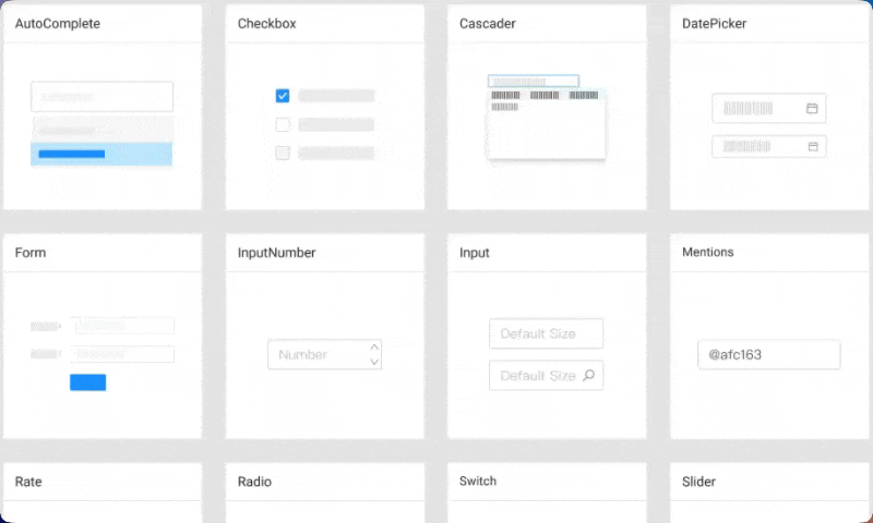
Once our style solidified, we crafted Lego’s backbone — a library of patterns and components customized for healthcare. Building on What we already had , Over a period of time, A rich ecosystem of over 50 high-quality components got created.
It included essentials like buttons, forms, Transfers, Complex lists, and Tooled navigation along with advanced elements like data tables, Complex modals, Filers and lot more— we tailored these to support Dexit’s document management requirements, Muspell Archive’s data clarity, and Jeeves’ interactivity. Lego’s modular, enterprise-grade approach allowed us to adapt components such as typography, grids, and dropdowns, ensuring scalability and consistency across our healthcare tools while meeting their specific usability needs.

Best Tool for the Job 🛠️
Figma was our tool of choice. Its symbols and styles enabled rapid iteration and a flexible, editable system. We are also documenting the same on zeroheight.com for everyone's convenience in organisation.
Let’s look at a few examples among some:
Forms & Tables📱


Buttons & Dialogues


Similarly every other component is modular , scalable and usable on the go!
On Responsiveness 📱
Lego adapts to any device. In Figma, we designed responsive UIs, ensuring components thrive in the fast-paced healthcare environment. It is developed the exact same way following the defined grid system where components, layouts and ui elements are responsive to pretty much any device.


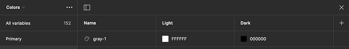
Step 3: Colors of the Design System 🌈
We have broken down color system into two levels:
System-level color system
Product-level color system.
The system-level color system mainly defines the basic color palette, neutral color palette and data visualizations.
The product-level color system is in the specific design process, based on the color of the system to further define the tone of the product in accordance with the requirements and function of the color.
Color is a powerful tool in design, and in Lego, It’s used purposefully to guide users and convey meaning. The design’s colour guidelines are made crossover between the brand design palette and the accessibility algorithm we wanted.


We adopted a functional palette got rooted in clarity and brand identity over the period of time. Neutral tones provide a calm backdrop, while teal serves as our primary accent color to highlight key actions, aligning with Product’s branding. Blue directs navigation, and red signals alerts, creating intuitive, healthcare-friendly interactions that enhance usability without overwhelming users.

Once done, we created all the variables required on Figma before handing off.
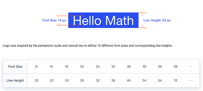
Step 5: Typography ✍️
For typography, we chose Inter, a typeface designed for digital clarity. Its clean, modern letterforms ensure readability across screens, from desktops to mobile devices.
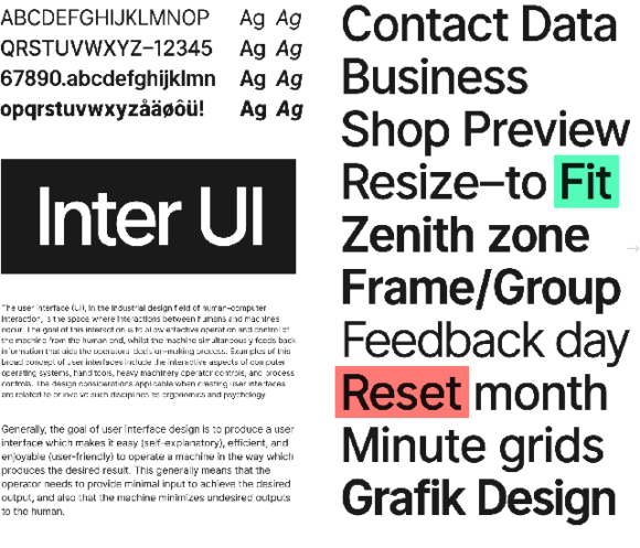
Inter’s open-source versatility supports fast load times and aligns with our performance goals, making text legible for all users — including those with visual impairments — while keeping our tools efficient and accessible.
Step 6: The Icons, and last layers of Visual design
Icons are the unsung heroes of our interface, and we turned to IconPark for its consistent, customizable library. Tailored for healthcare, IconPark’s icons — like document symbols for Dexit or data glyphs for Muspell Archive — offer visual clarity and reduce cognitive load.
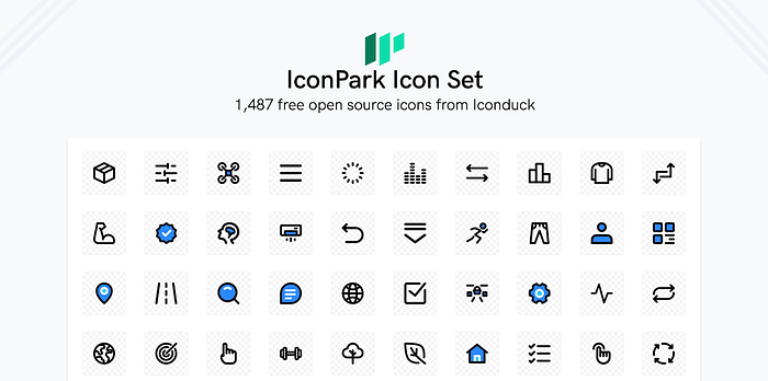
Their simplicity ensures quick comprehension, empowering users to act without hesitation.
Step 7: Dark Mode in Lego 🌙
we’ve integrated a dark mode option into the Lego design system to improve usability in low-light settings. This feature is especially beneficial for healthcare professionals who work in diverse lighting conditions, such as dimly lit hospital rooms during night shifts.
Dark mode reduces eye strain and enhances readability, allowing users to engage with Dexit, Muspell Archive, and Jeeves for extended periods comfortably.
Step 8: Maintaining Accessibility
Accessibility is non-negotiable in healthcare. Lego prioritizes inclusivity with:
- High contrast ratios for readability.
- Keyboard navigation for motor-impaired users.
- Screen reader compatibility for the visually impaired.
By meeting WCAG 2.1 standards, we ensure every healthcare professional — regardless of ability — can use our tools effectively. We’ve maintained recommended contrast ratios and color inversions to ensure our components remain visually clear and accessible, while staying true to 314e’s brand identity and healthcare-focused user needs.
Step 9: The Power of a Template 🖼️
For consistency, we built a Figma template with our styles and Lego’s components — a ready-to-use resource that frees our designers to innovate.
Now, Figma Libraries keep updates seamless, syncing changes across our files effortlessly.
Step 10: Some dependencies 📈
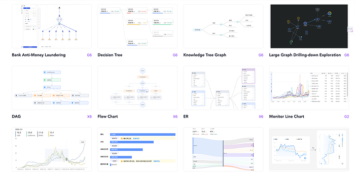
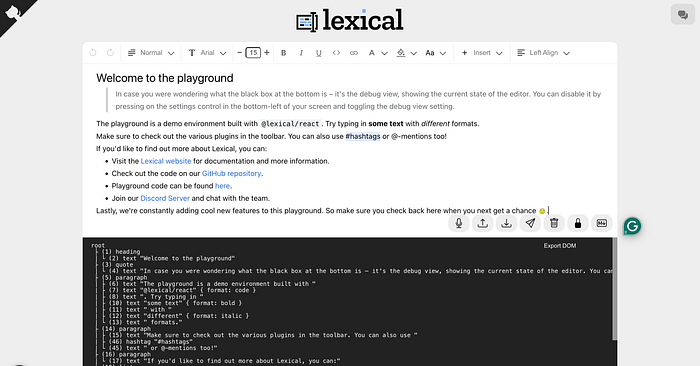
Though we have a lot of components and Consistent components and patterns, We are incomplete without some opensource elements for different use case such as Entire analytics uses ANT V charts (one of the moste xtensive set we have observed), Lexical for better rich text experience. Tables from AG grid.
Finally: Documenting a Design System 📚
Adoption drives a system’s success. We chose Google Docs for Lego’s documentation — simple, collaborative, and accessible. It’s a living resource for our team to explore and refine.
This guide empowers 314e’s team to leverage Lego fully, from quick lookups to detailed insights.
— -
The last one 😅: Engineering a Design System ⚙️
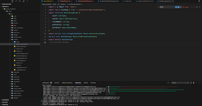
Lego is powered by React JS and Sass, extending Lego’s components to fit 314e’s needs. GitHub bridges our design and engineering teams, tracking every spec and code change. We have also connected our figma , storybook and git all at the same time.
Design and Code 🤝
Collaboration was our strength. Designers explored CSS & JS, and engineers embraced the vision, blending creativity with precision.🤭
Naming Conventions 📝
Consistent naming across design and development kept us aligned, streamlining the process.
This is Not the End 🌱
The Lego design system’s story is one of teamwork, creativity, and purpose. My gratitude goes to our team for bringing it to life. Though we have deep dived a lot but Lego is still evolving and will cover much more use cases in upcoming update.
Here’s 🥂 to tools that empower healthcare professionals — and stories worth sharing.

