UX Case Study: Redesigning LinkedIn Jobs


Overview
Project & Team Introduction:
A group of 4 UX/UI Designers connected on LinkedIn through Wonsulting’s Networking Sessions to create our own UX opportunities and internships for the summer. Collectively, we decided to redesign LinkedIn with a focus on the LinkedIn Job Search to help job seekers on the platform better organize and streamline a transparent job search process on LinkedIn.
Roles:
UX/UI Design, UX Research
Team Members:
Anuri Shah, Neely Lee, Pranati Rao, Leland Hsu
Timeline:
8 weeks
Tools:
Figma, Miro, Adobe Illustrator
Scope:
LinkedIn Job Search Feature and Platform Redesign
Constraints:
Time restrictions, Number of LinkedIn Features, LinkedIn Job Search Algorithm out of scope
Background & Context
UX Case Study: LinkedIn
Currently, LinkedIn job seekers have to use many third party resources and tools such as Google Calendar/Sheets, Excel, and Reminder Applications in order to stay organized and track their job application process. This inspired us to design an innovative way to add organizational features to create a seamless user flow on theLinkedIn Jobs platform. The goal of this redesign is to improve the job application process for professionals by incorporating a self-input job tracker and interview scheduling tool.
Our main objective is to redesign the LinkedIn Job Search & Tracking experience to increase transparency and accountability for job seekers by creating a seamless and integrated platform. Our designs were informed by Quantitative & Qualitative Survey Research, User Interviews & Competitive Analysis.
Design Solution: LinkedIn Jobs Redesign
Due to the importance of LinkedIn Jobs for professionals on the platform, our group wanted to focus on giving LinkedIn its own ‘external’ redesign, similar to LinkedIn Learning. Job Seekers value job transparency, organization, and ease of use when it comes to a job search platform. Our main focus was to completely revamp the LinkedIn Job feature and give it its own unique platform with additional features such as a job tracker and interview scheduling features.
APPROACH
USER RESEARCH
Research Methods
Our team used a variety of qualitative and qualitative research methods such as one-on-one user interviews, quantitative surveys, and competitive mapping. We conducted user research prior at the start of the design process to understand the user needs and requirements. We also wanted to understand user behavior and their motivations in order to ensure our re-design of LinkedIn Job Features are functional and intuitive.
The purpose of our user research was to broaden our understanding of any potential problem areas faced by current LinkedIn users. We also wanted to conduct benchmarking through competitive analysis to identify additional gaps in the market for this redesign.
Research Goals
During the discovery and brainstorming phase, our initial research goal was to identify which LinkedIn features were most commonly used. We identified user problems that we could work on redesigning to improve the user’s experience. We were looking to target all job seekers including college students as well as professionals seeking new opportunities to fulfill their career goals.
Our research goals were to:
1. Identify LinkedIn Jobs’ target users
2. Understand job seeker needs and motivations
3. Gauge problem areas and understand to focus our efforts and effectively improve user experience
4. Learn more about the job search experience to improve platform functionality & usability
Survey Research
An initial survey was conducted with our target users to learn more about how LinkedIn Job Seekers used the platform and what features they frequently use. We learned about their job search process and the types of tools and resources they used during their application journey. In addition, we gained insight into what user’s felt worked well with LinkedIn’s current platform and what could be improved for a better user experience. As a group, we decided the scope of this UX redesign would be on redesigning the LinkedIn Job Search platform.
Most of our research participants are full-time students and working professionals who primarily use LinkedIn for networking and job search. The Job Search feature is significant and relevant to these users, which resulted in our primary focus on this aspect of the platform.
Most participants tend to have busy schedules and expressed that they visit the platform 1–2 times a day and typically actively spend around 1–3 hours a week on it. Due to this, we wanted to make sure our redesign is as efficient and user friendly as possible to help these job seekers organize their application process effectively. These users do not have a lot of additional time to try to learn the features available on a platform so this redesign is more focused on optimizing their time spent and creating more value.
Survey results showed that most users expressed it was tedious and time consuming to apply on LinkedIn and then recording the tracking of their job application or potential interview on external platforms (Google Sheets or Google Calendar). This suggested a need for a centralized platform where job seekers could organize their job search effectively.
Affinity Maps
User Research
Through our one-on-one user interviews, we found a few common themes that we wanted to share as it was used to influence our redesigns in this case study. We found that users tend to use Easy Apply more than External Apply due to the ease of use and the easy tracking capability by viewing these applications under the ‘‘Applied Jobs’ tab. However, they found the External Apply option less valuable as they would be able to apply directly through the company’s website.
In order to track applications, interviewees mentioned they would use either Google Calendar, Google Sheets/Excel, e-mails, or a personal journal where they can organize their job applications, upcoming interviews and networking events. All interviewees had to use external tools to help schedule their professional events which they felt was tedious, disorganized, and time consuming.
User Flows
We split up our User Flow into three distinct sections to focus on three aspects of our redesign. The first is the LinkedIn Job Search Navigation to explain how the user will go through the updated Job Search Platform to view tabs such as Job Tracker, Applications, Saved Jobs, and Job History. You can also view your Schedule (Calendar), Job Salary, and Job Preparation through the sidebar navigation.
The second user flow is of the Job Tracker which walks through the Job Timeline Tracker Process from Application Sent, Application Received, Action Needed, Schedule Interview and Offer. The user will have to self-input this tracker and will also have the option to edit and go back to change their initial input.
The third user flow follows the process to schedule an interview where users can add their upcoming interviews or professional networking events to their calendar. This will allow them to have all job search information on one platform for ease-of-access.
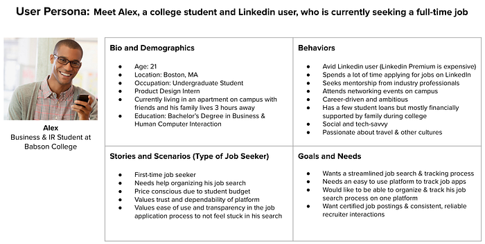
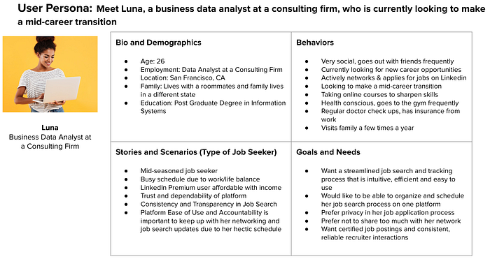
User Personas:
Competitive Analysis
LinkedIn Job Search has various competitors, particularly at a global scale. We have identified Indeed.com, ZipRecruiter, Glassdoor, Google Jobs and Handshake as close competitors. Below, we have created a Competitive Map based on four key attributes identified during our user research. The four attributes that we used to compare these competitors:
- Ease of Use
- Quality of Job Postings
- Number of Job Postings
- Application Tracking
LinkedIn was seen as relatively easy to use with high quality of job postings. However, they also tended to have a greater number of postings which can sometimes impact the job search process for users by showing job postings that were not applicable.
Google Jobs was easy to use and typically had high quality job postings with filters that allowed job seekers to narrow their job search to their exact qualifications and interests.
Glassdoor, which focuses on corporate transparency through reviews and ratings of companies, has its own job search and application platform. They have a self-input, job app tracker with a good quality of reliable job postings.
ZipRecruiter and Indeed.com tend to have a greater quantity of job postings, however the platforms are not as easy to use and do not have a fully-integrated job tracker.
Handshake is used pretty frequently by college students and has a large number of job postings, which may not always be high quality if they do not meet certain student specifications. However, it is easy to use for students as it is connected to the university, contains your school, GPA, and other extracurricular activities already inputted into your profile.
DEFINE:
Initially, we held brainstorming sessions and came up with the organizational aspect of the platform using rough sketches.
When working on mid-fidelity sketches, our main focus was to make sure the information architecture made sense to LinkedIn users. We wanted to make the Job tracker & schedule function more streamlined through modals for new tags, cards to organize information user needs, and icons to indicate different stages in the job tracking process. We also focused on making the main sidebar easier for users to navigate different pages. The mid-fidelity sketches incorporate existing features LinkedIn provides to job seekers (job description, home search) and new features (schedule, calendar, job application tracker).
Color Theme:
Our decision for using LinkedIn Blue was to ensure staying close to what LinkedIn is providing to users currently. We wanted to keep the LinkedIn Blue to ensure that the redesign is user friendly and intuitive for job seekers. Users find the job search and application process tedious, and they also tend to have really busy schedules. Therefore, in deciding what colors to use, we wanted to ensure that the colors were simple, comprehensive and easily digestible to the user.
UI STYLE GUIDE:
DEVELOP
Usability Testing:
We conducted usability testing on our key screens with 5 users to identify any user problems and potential areas for improvement. We used these findings to further iterate on our final prototypes to create high fidelity screens.

Usability Testing: Job Tracking Improvements
- Make icons clickable
- The confirm boxes need to be bigger
- Remove unnecessary icons and colors
- Add a more intuitive Back and Edit button on the Job Tracker
- Moved Filters (External and Easy Apply Jobs) to the top left of the screen above the job listings as users found it more intuitive there
- Interactive modals for pop-up boxes on the job tracker timeline

Usability Testing: Scheduling Feature Improvements
- Separate Tab for Completed and Upcoming Interviews (List Mode)
- Rename Dashboard & Calendar to Schedule
- On Calendar, make it clear that the company logos are clickable
- Event Name vs. Logo
- Create a List & Calendar View
- Move List to Default
- Add Job Description Page
HIGH FIDELITY WIREFRAMES
The LinkedIn Jobs redesign is focused on giving users the tools necessary to efficiently organize their professional job seeking or networking tasks. We were able to create high fidelity prototypes through usability testing by iterating on our initial prototypes through design solutions.
1. LinkedIn Jobs Home Page
Navigation:
First, users will click on the LinkedIn Jobs Home Screen, where they can navigate through the following functions:
- Search functionality: Simplified and recommended search queries have been expanded below for more breathing room
- Dashboard: A convenient left-side dashboard has been added for users to quickly access various features. The basic profile settings include Profile, Views, and Connections. Below this, we have placed the side navigation bar that includes the following functions:
- Schedule: Leads to an optimized calendar and event lists that displays all upcoming and completed interviews, professional or networking events.
- Job Tracker: The job tracking tab has been reorganized to include an application tracking system. Under the Job Tracker, there are some sub-components:
- Application: View all job apps
- Saved Jobs: View saved jobs
- Job History: View applied jobs
- Job Preparation and Salary: For the scope of this case study, these two elements were not part of the re-design.
2. Job Tracker Screen Overview:
All applications that a user has applied via LinkedIn’s Job Application Portal will appear here including features:
- Sort by: Users can filter jobs by LinkedIn Easy or External Apply
- All Jobs: View active or recent jobs
- Action Needed: View jobs with an action that requires the user to respond to move forward in the job tracking process
- Interviews: Populates all jobs with upcoming active interviews
Job Tracker Functionality:
A self inputted and updated timeline to help LinkedIn users keep track of the job application process and how far they progress for each of their applications. As LinkedIn does not provide a tracker function for their in-site application process, this integrated component is intended to be a simple system for job seekers.
Decision Pop-Ups:
Along the job tracker timeline, there are decision modals that pop-up which the applicant can update in order to progress forward or backtrack in the tracker. These are editable, and users can update each step of the tracker based on their unique circumstances and schedules within the recruitment process.
Timeline Point Definitions:
The job tracker timeline contains five essential points for each listed job: Sent, Confirmation, Action Needed, Interview, and Offer.
Sent: When a job application is sent, it is automatically marked as completed within the timeline. This is to verify that an applicant’s job application was sent to the company/recruiter.
Job Tracker Timeline
A. Application Sent
When a job application is sent, it is automatically marked as completed within the timeline. This is to verify that an applicant’s job application was sent to the company/recruiter.
B. Application Confirmation
This point in the timeline is for the user to verify if they received a confirmation email from the company or recruiter stating that their application was received. Depending on if the applicant has received a response from the recruiter, they will select “Confirmation” or “No Confirmation”.
C. Action Needed
This point in the timeline is for the user to update whether or not the recruiter will be moving forward with their job application. “Action Needed” is pending until the applicant makes an update. When an applicant has been contacted by a recruiter, they will either move forward by scheduling an interview or end the tracking process by clicking ‘No Interview’ to close the tracking loop.
D. Schedule Interview

The interview stage of the tracker allows users to add a scheduled interview to their LinkedIn calendar when a recruiter has requested for one. “Interview” will be pending until the applicant schedules an interview or decides to end the application process.
Link Interview to Schedule/Calendar

When an interview is scheduled, the applicant will select the “Schedule” option. In order to schedule an interview, a pop-up modal will allow the user to input the interview name, company, date, and time. This will link to the scheduling system for the user to add an event to their personalized LinkedIn calendar.
Users also have the ability to initially decline scheduling an interview or before/after an interview has been linked to the Scheduling system.
E. Job Offer

Once an interview has been completed, the “Offer” point will be pending until the applicant has updated their final offer status. If users receive a job offer, they can update the tracker by clicking on ‘Offer’. If they do not receive an offer, they can select ‘No Offer’. Both selections will complete the tracker.
Applicants can also go back and edit the self-input tracker if the status of their application changes. Once the job tracker has been completed, the job application will automatically move to the Job History Tab within 24 hours.
3. SCHEDULE FEATURE
We designed the schedule feature and wanted the users to have both a ‘list’ and ‘calendar’ functionality based on their preferences to view their events.

We included filters for completed and upcoming events so that users can easily track their professional events.

This screen shows a job description screen where a user can learn more about the role and company prior to applying or interviewing for that specific job.
We created a Schedule Tab to allow job seekers to organize their professional events (interviews, networking events, etc.) and created List and Calendar view for users to choose from when viewing upcoming or completed events.
Retrospective
What went well?
- As a group of UX Designers and Researchers who had never met or worked together before, we collaborated extremely well remotely as a team
- We agreed on key design elements and the LinkedIn features we wanted to focus on after reviewing our user research insights
- We conducted extensive one on one interviews, quantitative survey research and competitive analysis at the start of the design process
What could be better?
- Ensuring that all design and UI elements (such as a UI Toolkit) was created at the start of the UX design process to avoid additional work when polishing high fidelity prototypes
What would we do differently or add onto if we had more time?
- Widen the scope of the project to redesign more LinkedIn features that users brought up during interviews and survey research
- Conduct additional usability testing to further optimize our high fidelity prototypes
- Potentially work on new features and changes related to the back-end of LinkedIn’s platform and algorithm such as Job Search Results and a two-way Interview Tracking Process including companies and recruiters
Conclusion:
Overall, our LinkedIn Jobs redesign displayed the key user need expressed by LinkedIn job seekers. Job seekers wanted an integrative hands-on tool that allowed them to navigate through their job applications stress-free. For the purposes of this redesign, our hopes are that LinkedIn can continue to optimize and dominate as a superior professional networking platform.

