Summary: Design your product with a longterm relationship between the user and the product in mind. This approach will allow you to build a truly great user experience and keep customers in love with your product. That matters.
All Product Designers first of all should worry about questions like:
- How to build strong relationship between the product and the user?
- How to increase Customer Retention Rate (CRR)?
- How to enhance the user onboarding process?
In this article I would like to reveal possible solutions, we, designers, could (or even must) resort to design better UX in long-term perspective.
The relationship between the user and the product should grow as the relationship between the couple — from the first date to a happy marriage.
— Rahul Sen, Product Designer, Spotify.
First Date
The first date in design world is a First Time User Experience. It’s a process of involvement to a new product and learning of what-and-how the user can solve with this product. In case, you do not explain what-and-how on the first date, will not make it gently and carefully, or rather overload him with the unnecessary information — the user would be lost. If not on the registration step, then after. Therefore, bad user onboarding rate and the upcoming CRR.
The First Time UX can be divided into two parts: visible and invisible to the user. Roughly speaking:
- the visible one: the walkthrough screens, contextual tips, tutorials, Getting Started guides, etc. So, all of those things for directly help to start with the product.
- the invisible one: the analysis by the product itself of the user data; a first-time app tuning and searching for the relevant content.
Let’s take a look at a simple example. On the first entrance after the registration in some good social network, the feed (or the timeline) will be full of relevant content specified exactly for you. It’s based on your email, contacts, sometimes even photos at your Camera Roll, etc.
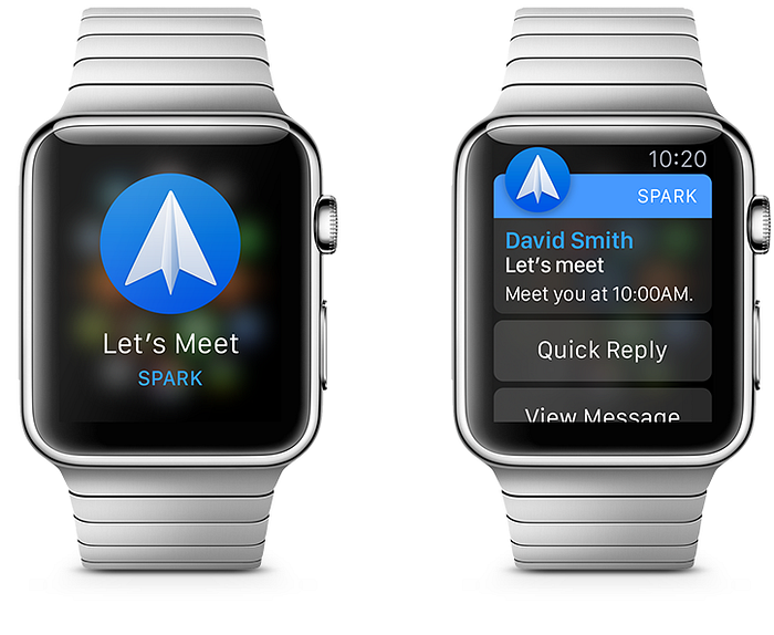
Another example — Spark Mail by Readdle, I’ve been working on for the last 18 months. Here are some simple things we at Readdle can learn the user registered:
- archives or immediately deletes the read mails;
- uses GMail folders or Mailbox lists;
- power user or a regular one, based on the number of mails per a day.
So we can adapt the interface and the flow to a specific user.
Okay. The first few dates take a short period in the relationship. Right? So, what’s next? How to keep the user for longer? What should we do? Here comes the Long-term User Experience.
Longterm Relationships
As the First Time UX the Longterm UX can be divided in many parts. But in this article I would like to dive into one of them. The design of possible solutions we, designers, should implement into our products to make the user-product relationship stronger through the time. I’m talking about the “self-learning” solutions, based on the usage auto-analysis, made on the product side.
To be clear let’s take a look at the few existing examples.
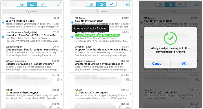
Mailbox
Auto-Swipes
The Mailbox itself can recognize what you do with your emails. If you are archiving or deleting or listing the emails from the same sender pretty often, Mailbox will suggest you to setup the auto-swipe for that action.
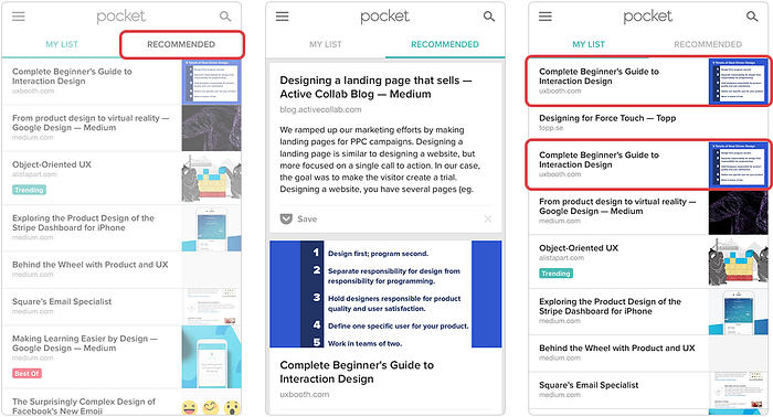
Recommended Section
In the Recommended section you will find the articles specifically selected for you. They are based on the keywords from the article titles and tags already added by you and the articles added by other people. But they have one problem right now — they do not check the list for duplicates. Anyway, it’s another case.
Of course, there are many examples in other products. But these two I have quoted just to make you understand the point. Now, let’s dive in.
Let’s start with Spotify and their Activity section and related Friends’ feed.
Spotify
Activity Section & Friends Feed
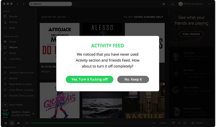
For the past 3+ years of active usage, I have never used Activity section and never followed anybody. Therefore, I have a simple question: Why do I still see this section? As well as the Friends Feed column, which takes a lot of place on my screen? Why do I still get some Friends suggestions?..
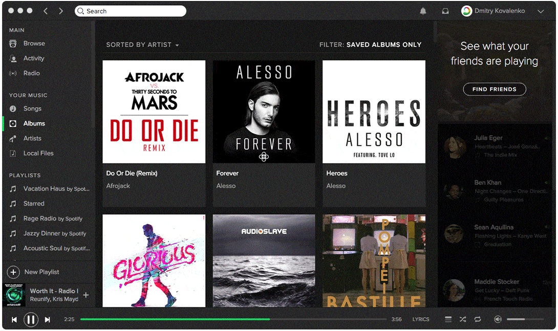
Yeah, yeah, I know. This is a part of the product itself, of Spotify network or whatever it is… BUT, if I didn’t use it at all for past 3 years, do you still believe I will start to next time?…
And Yeah, yeah, once again. You may say: “Damn, man, don’t be stupid. Go to the Settings, find the right item and turn this section off. That’s easy!”
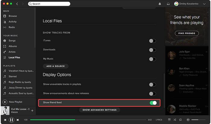
And I will reply to you: “No. This is not a simple way! First of all, you make me think (have you read ‘Don’t make me think’ by Steve Krug?, please do this!), then I should go to the File > Preferences or hit (Cmn+, in case I know this shortcut), then I should read ALL the items in the Settings menu till I all-in-all find the right one. And I don’t even know exactly whether this item exists there? I should spend my time and strain my brain. I don’t want to do that…”
Nobody wants to spend their time and strain the brain, if it’s not a necessary.
Okay, so what is the possible solution here? The designers at Spotify could cover this case with just one simple dialog. It could be shown just right after 2 months of usage, for instance.
Spotify
Stream Quality
After you have paid for the Premium Account you are able to change the streaming quality on Extreme (it’s just a 320kbps). But! The only place where you will be notified about that is… Settings. Firstly, you should get there first. Then you should go Settings > Streaming Quality > and in Stream (why not Streaming already?) Quality hit Extreme. Then you will see a popup with a message that this feature is available for Premium Account only.
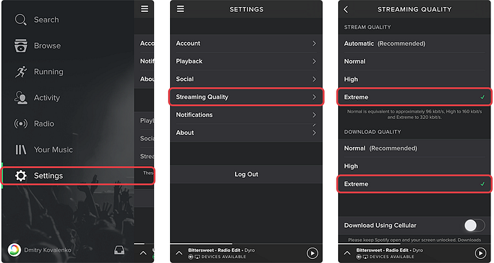
So, the dialog below could be a possible solution. It can be shown just right after you became a Premium user. Of course, it’s a rough design and just a quick implementation, but the idea is clear.

Yes, I do understand in this case a lot of people would choose Extreme one and the load on the Spotify’s servers will increase exponentially. But I would like to remind the fact we are talking here about the possible solutions only. That’s it.
Anyway, it would be nice to hear any feedback by Spotify Design Team, Tobias van Schneider, Stanley Wood.
Let’s move on.
Photoshop
Third-level Items
Let’s say you frequently use Gaussian Blur Filter. For each single case, you should go to Filters > Blur > Gaussian Blur. In that case there are two possible solutions of how we can help to the user.
- Obviously, we can make the ‘Frequently Used’ section to shift Gaussian Blur or any other third-level item just one level higher to make it more easily accessible. Yes, you may tell me: “Wait, but it’s almost the same as the Recently Used… So, what’s the point?”. The point is the Recently Used is the ever-changing list which isn’t designed for the Longterm usage. Each item at the Frequently Used list based on the mount of use. So, if Gaussian Blur used 800 times and Trim only 320 times, then obviously the filter should be on the first place.
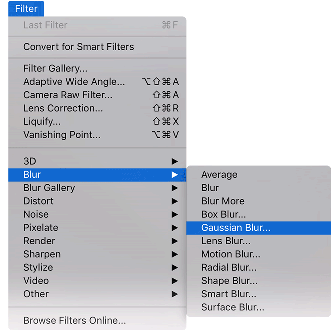
- Or/and a more complex for designing and implementing solution, but much more convenient for the user in Longterm perspective. Give a choice: a shortcut from the list for this filter just right after he used it once again. Would be awesome, right?

Photoshop
Combination of Actions
Now let’s dive even deeper. Who remembers the following combo at Photoshop?
Cmd+A > Cmd+C > Cmd+N > Enter > Cmd+V > Cmd+Shift+Alt+S > Enter
Yep, copy-past-Save for Web. Longtime ago I made this combo hundred times a day!
So, let’s imagine the ideal world where Adobe has implemented a tricky way to track the combinations of actions you use often during the day. And in case you have repeated the same combo, let’s say, for the tenth time per last 2 hours, Photoshop will show you the following dialog. It could suggest setting up an action on this combo and on the next step — suggestions with possible shortcuts for this action.
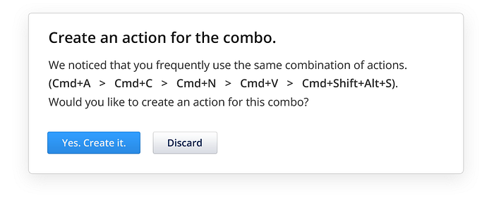
Andrei Herasimchuk, Bradee Evans, Anirudh Sasikumar, Stephen Nielson what do you guys think about that?
Animations
AppleWatch Notification
Now let’s speak a little bit about animations. The animations can be:
- educative — to teach the user (e.g. how objects moves);
- decorative — to enhance the emotional effect of UI;
- systematic — to hide the system processes (loading, fetching, etc.).
This year I have been on the private preview of AppleWatch at AppleLabs, London. My mission was to test Spark Mail AppleWatch extension and the watch itself. The notifications, in particular. Even then I have asked myself: “Goddamn, every time a get a new notification why I should watch this animation for 1.5sec?”. I got sick with it after 10–15 notifications. Moreover, your eyes are constantly moving because they follow the application icon automatically. It is not right…
Therefore, the possible solution here is to avoid the Short Look Notification (on the left) and show the Long Look (on the right) immediately.
Animations
Games
Now, animations in games.
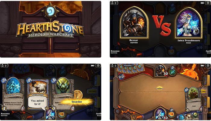
The Hearthstone. No worries, fans, I like this game too! :) But I don’t want to see how nicely the card is flying away from the stock, how the sparks are shining around it, etc. on my every single move. I want to fight! I want to make the next step right now. I want to kick out my opponent asap… I think you got my point.
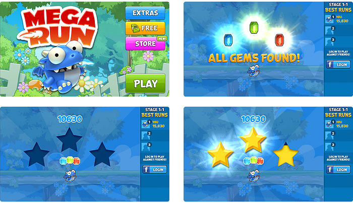
The same problem is in other games like Cut the Rope, Megarun and many more. They all have the same screens with the scoring points and gained stars. Everything on this screen is moving, jumping, pumping, booming and so on… Some of these animations take 4–5 seconds or even more till the gamer gets the final result and is able to go on. Yes, some games have implemented the option ‘Tap to skip’. But not all.
Anyway, the possible solution here can be in decreasing the duration and increasing the speed of the animations by-and-by till some limits.
Workflow automation
Fluix
One more complex example is taken from our B2B product called Fluix. I will tell you about it in brief so that you can understand what the example is about. I started working on the 2.0 version 6 months ago already. Damn, time goes fast…
Anyway, this is a SaaS project at B2B sector which allows to automate the workflow within the company. Here is a simple workflow example.
A finance manager from Company A need to approve the capital allocated for the services of Company B hired on a one-time maintenance of the wind towers. At the same time, this document has to get to the accountants in Company A for the approval of the amount > then it should be signed by the chief of Company A > then to the accountants of Company B > then to the finance manager at servicing bank of Company B > then return to accountants of Company B for approval > then on signing by the head of Company B > and only after return to the finance manager from Company A with two signatures and approved capital to give the green light to finally start the work…
Fluix allows to automate such workflows. After a one-time setup, everything will be carried out by pressing the button after each stage. One button, Karl!
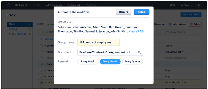
Okay, now let’s go back to the example. Let’s say the administrator should send the same contract to 124 employees to sign it quarterly. He takes the contract on a certain day, renames it by adding a date-prefix, hits Send and a composer in the field TO starts listing the emails of all 124 employees separated by commas… Or marking them by checkboxes in the contacts list. Awful drudgery…

So the possible solution here can be the dialog below. It should be shown to the admin as soon as he sends the very first contract. This dialog will suggest to create a group for all of employees, name it, set a specific reminder and set a path where the contract (file itself) should be taken.
iOS
Special set of apps
The last simple example and we finish. I promise.
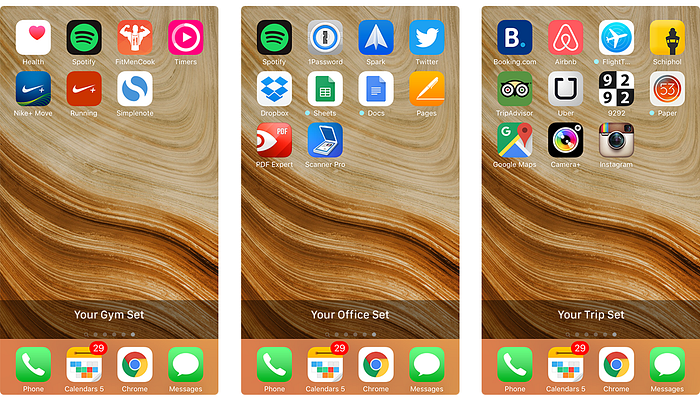
Your iPhone (Android) always knows where you are geographically. So, let’s say every week you visit the same Starbucks at least 5 times, Gym at least 3 times, office at least 5 times, some favorite restaurant at least 2 times, and so on… At each of these places, you use the specific set of applications. Starbucks — News, Facebook, Twitter. Gym — Nike+ Runner, Spotify, Strava… And so on.
I think you’ve caught already what I’m driving to. Yes, determine your current location and give you a certain set of the apps on one separate screen which you always enjoy at this place.
Conclusion
Yes, of course, such solutions should be designed really cautiously. Here we must take into account the user privacy and security. Don’t cause irritation. Don’t disrupt the workflow. Be consistent and apropos.
But if we want to improve UX permanently, build a really strong relationship between the user and your product, then we must design UX in Longterm perspective! Besides, with such solutions we can not simplify and improve the user productivity, save the user time and hassle, but also make the interface cleaner and get rid of unnecessary noise and elements. Thereby reduce the cognitive load on the user’s brain. Also, these solutions are easily scalable.
And guys,
The very USER is the real human. It’s You and me! Be responsible.
Thanks for reading. I do appreciate it! Clap, Clap this article, so more people who care about #UX design might read it. 👏🏼
— —
Read More: