Making a great first impression in product design
“Meet by clothes, see off by mind” is an old but wise proverb. The first impression about a person is formed based on his appearance and behavior. The moment we see a person, we already have some initial impression about them.
The first impression is more than just a moment; it can affect how users perceive your design.
This article discusses creating a great first impression in a digital product design.
Why do first impressions matter?
Apart from common wisdom, do we have any scientific proof that the first impression is important? Yes. Primacy effect states that when we experience something before other things in a sequence, we remember that first thing better. If your users have a negative first impression of your product, it will stay long-term.
When do people form first impressions?
Interestingly, the first impression forms before we start using a product. For example, when we buy a new fragrance, even before we try it on our skin, we already have some initial expectations about it. We notice the design of a bottle, we test it in our hands to understand what material is used, and at that moment, we imagine what it feels like to use the fragrance.
When we buy a new car, we typically visit a car dealership. The moment we enter the showroom and see cars, we already have expectations of how it feels to drive them.
The same approach works for digital devices. That’s why companies like Apple invest so much effort in creating nice packaging. No wonder why unboxing products from Apple feels so good.
First impression in digital products
Okay, we’ve talked about physical products, but what about digital products. Are rules applied to them? Absolutely! The first impression is created by small elements like the app icon and launch screen.
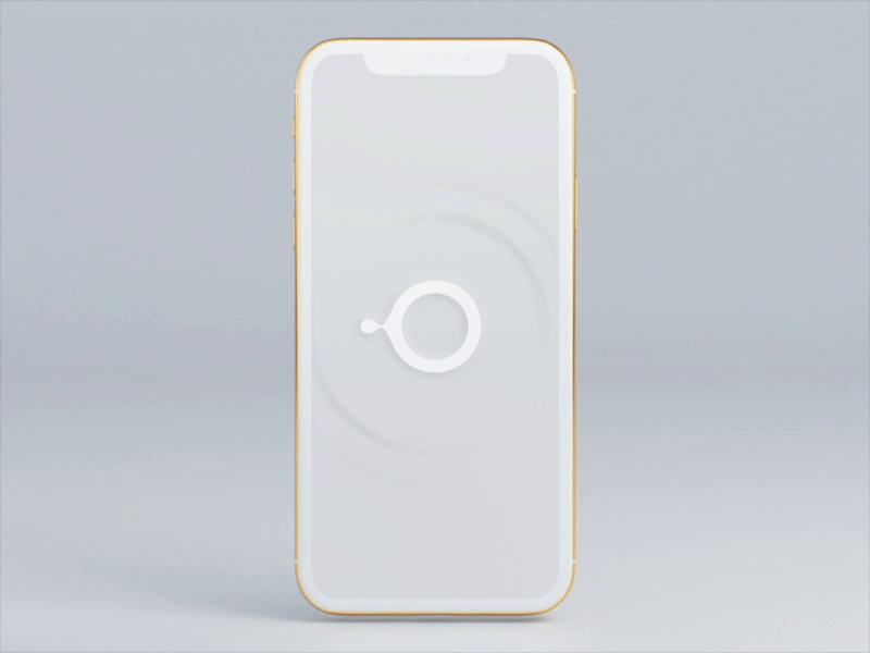
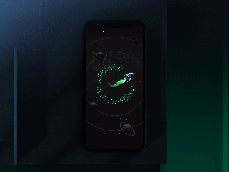
The launch screen sets the scene for the rest of the app
You probably think that building a launch screen is an easy task. All you have to do is place an app logo at the center of the screen colored in a branded color, right? No.
Think of a launch screen as a book cover. You need to present the app to first-time users in a visually engaging way and, at the same time, keep the launch screen simple and focused. The screen should feel inviting and convey a sense of fine craftsmanship.
Here are three magic design tricks:
1. Try to offer a seamless transition between the launch screen and the home screen of your app.
Ideally, the launch screen should transition gracefully into the app’s first screen. By doing that, you will immerse users in your app.
2. Try to make it short
10 seconds is the limit for keeping the user’s attention focused on the specific thing. Don’t make users stay at the launch screen for more than 10 seconds.
3. Don’t use too many animated effects
It’s better to avoid the temptation to show all your creativity right from the start. If you want to use animated effects, make sure they don’t overwhelm users.
Okay, but what Human Interface Guidelines?
There’s a lot of debate about the necessity of a launch screen these days. Here is what Apple’s HIG guidelines say about the launch screen:
“The launch screen isn’t an opportunity for artistic expression. It’s solely intended to enhance the perception of your app as quick to launch and immediately ready for use.”
Initially, the launch screen was introduced to help product designers mitigate the app’s slow loading. No wonder why Apple suggests designing a launch screen in a purely functional way — it should create the illusion that the app starts instantly. And I agree with this approach, except for one thing — context. If we show a screen full of fancy effects every time users launch the app, we will quickly annoy our users. Any regular user will quickly get frustrated if they have to wait for an app to open for more than a few seconds. But our first-time users can be delighted to see these effects.
That’s why it’s better to design two versions of the launch screen. You show the one on the first start and another for regular users. Since your app should be optimized for fast loading, ensure that the second version of the launch screen is visible only for a couple of seconds.
Follow me on Twitter
This article was originally published at whitelight.co
Want To Learn UX?
Try Interaction Design Foundation. It offers online design courses that cover the entire spectrum of UX design, from foundational to advanced level. As a UX Planet reader, you get 25% off your first year of membership with the IxDF.
This post contains affiliate link(s)