
Why isn’t the digital press being profitable? Design Sprint takes action. For 5 days I have been working in collaboration with seven other Ux designers, in order to find a solution to the huge problem that both printed and digital press is facing today: its lack of profitability.
Problem
An extensive analysis of the current situation of the press as we know it has indicated that it is headed towards a loss of readers and consequent loss of profit.
After analyzing the causes, several determining factors have been singled out:
- Media agencies and advertisers are only looking for volume and inventory at a gradually lower cost, dynamics that only large multinationals can sustain. One of the main triggers of this phenomenon are programmatic sales where advertising space is decided and bought without knowing the final recipient.
- Absence of Anti Fake News protocols. The reader is confused by news not confirmed as true.
- Lack of attractive commercial and editorial supply when making a subscription that distinguishes a public with “free” access from one with “premium” access when facing a paywall.
- A slowdown in digital advertising revenues, which prevents large newspaper publishers from compensating for a paperless world, together with the fact that most company digital advertising investment goes to Google and Facebook, which attracts at least seven out of every ten euros, leaving very little room for gaining a market share.
- Young people prefer to get information through social networks such as Twitter and Instagram.
- Lack of interest segmented by age. There is no aim to attract young readers, the press focuses on reader loyalty, not on investing in attracting new users.
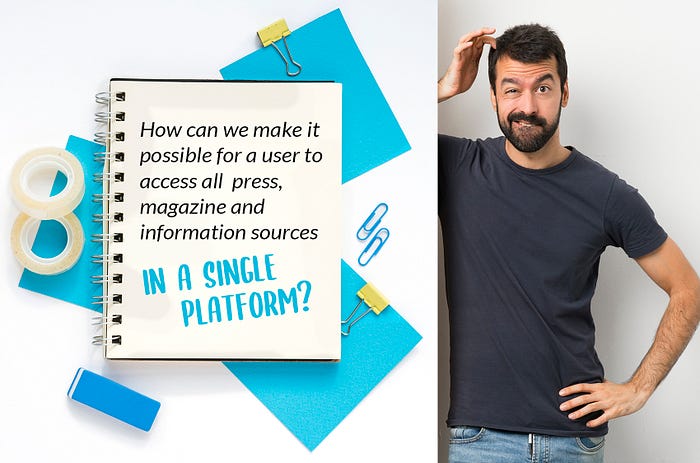
My personal challenge has been to improve user experience by creating a single platform that brings together different information systems, allowing you to organize your content on demand and customizing it by chosen profile. This is how I did it.
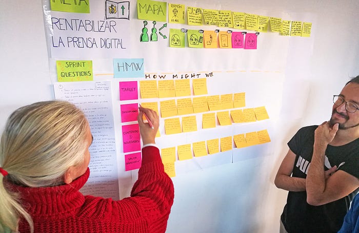
Design Sprint, a methodology to test new ideas in just 5 days.
To begin with, I followed the methodology created by Jake Knapp.
Monday: Define and research
Tuesday: Outline of proposals
Wednesday: Decisions
Thursday: Storyboard prototype
Friday: User testing

How we can help the user
Throughout the Design Sprint process, a lot of answers were offered on “how we can help a user get something done” in relation to a set goal , the famous How Might We questions. And the result was amazing, a lot of solutions came out that could answer the problem raised.
Our chosen objective to reach the goal
The following involved our achievement of the chosen goal :
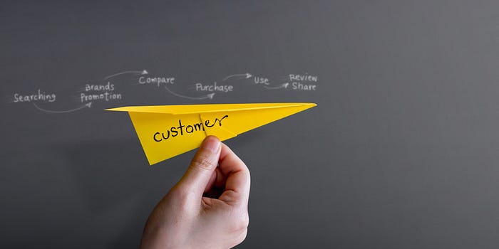
We did research through the Customer Journey to locate points of contact between users and the press and several pain points emerged:
. Restricted access via paywalls to your favorite content.
. Complex records with many time-consuming steps .
. Access to just one type of content when subscribing, no packs with two or more contents.
. Undesirable advertising with advertising blockers.
. Little interest from younger people to pay for general information media.
. Problems amongst the over-60 population to relate to technology because they believe it is complex and prefer to read hard copies.
Creation of the prototype: Information content platform
Based on all of the above, I moved on to create a prototype following certain guidelines, in order to make the application user-friendly and comprehensible.
After a benchmarking process, I took inspiration from working elements in other multiplatforms, such as Netflix and HBO, and took it to a wireframe.
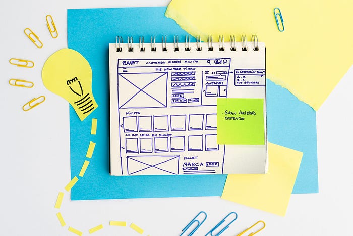
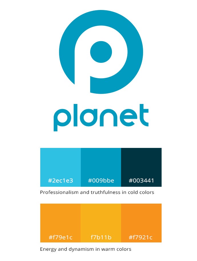
I created a functional and easily recognizable logo that differentiates us from other platforms with a name that encompasses world news. I also thought of a name, it had to be simple, clear, and in itself encompass what I wanted to convey, all the news in the world. That’s how Planet was born, a blue planet that encompasses all information systems. I also liked the idea that our network, which has us all connected, would end up on Net.
I also thought of a name, it had to be simple, clear, and encompass what I wanted to convey: news all over the world. That’s how Planet was born, a blue planet that encompasses all information systems. I also liked the idea of the name ending in Net, the network that has us all connected.
The typeface chosen was Smooth Circulars, a very compact sans serif typeface created by Darrel Flood, founder and director of Hawtpixel, a small design studio based in Nara, Japan.
Less is more. Create what you need to understand the idea and see how it works. A prototype must be explained in just a few steps. We want to test an idea, see if it is interesting and intuitive, devoting little time to it.
Pixel Perfect. Any design must follow the rules of balance and composition. Attention to detail will create differentiation and added value in our design.
I created a functional and easily recognizable logo that differentiates us from other platforms with a name that encompasses world news .
Functional animations. Animations must make sense. We must ensure a transparent user interface and make the prototype come to life.
This resulted in a professional platform, with informative and dynamic content, aimed at a consumer public that uses a variety of information.

Interaction decisions
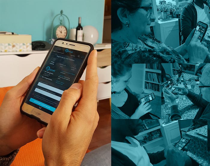
· I created an onboarding with a welcome phrase explaining what Planet is, how to use the platform through a video demo; the same page explains what kind of devices may be used. We invite the user to enjoy all free content for a month without any commitment by showing them a selection of interesting content.
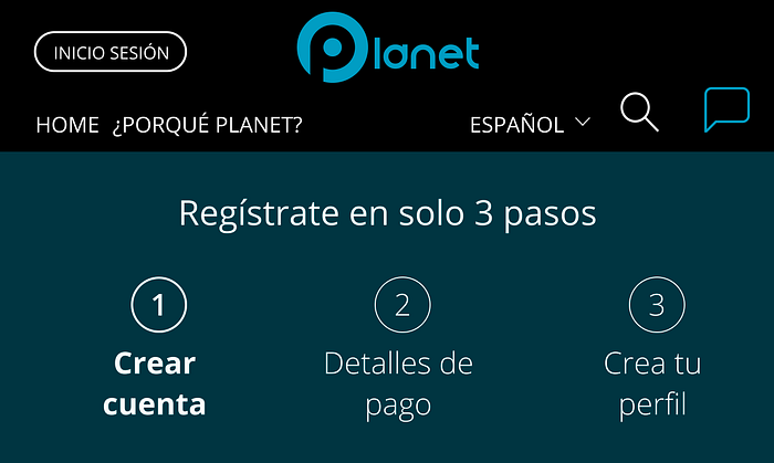
· After a simple and clear login in three steps, the user is registered and can create four profiles at the beginning of the registration process or fill it in later.
· Once the user accesses the home page he can configure, through a selection of interests, which will be “his list”, the set of content he wants to see most often.
· And once he scrolls we show him a selection of content clustered into Planet’s most-read , national and international press, magazines, etc.
· At the top of the page there is a carousel of the most relevant daily cover news from various national newspapers for you to “read more”, add it to “your list” or simply agree to read it. This is a section of your own content that will be displayed according to your selected interests and preferences.
· Once you access one of these highlights, or another newspaper or magazine, you will enjoy the newspaper as we know it today. I thought it was important not to standardize the design of each medium, but rather to keep the actual format, typography and design and communication standards. You are navigating inside the newspaper, as if outside the platform, just as you would do through its own domain.
· Of course, each newspaper will have its own news search engine, as well as access to all newspaper sections , apart from the platform’s search engine, which is more oriented towards finding newspaper names, magazines or specific content.
· At any time from the hamburger menu the user may access and manage his user profile , configure his account or log out.
Testing with users
It’s time to see if my decision-making was adjusting to the real needs of potential users. I chose several archetypes of people, trying to get as close as possible to the profiles selected in the Costumer Journey. These were my choices:
A 63-year old retired woman, a consumer of free information, who regularly used her Smartphone daily. She likes to be well informed about what is happening in the world through television.
44-year old working woman, consumer of free physical- and sometimes digital- press .
65-year old retired man, consumer of information in the physical press, has never used a Smartphone, and is not interested in using technology.
39-year old man, without a Smartphone, using an outdated model, with Internet at home and consuming information via desktop, he likes the world of sports.
35-year old man, very informed through any device about what is going on in the world, he is interested in on-demand content and uses content managers like Feedly.
I gave them a test run of the prototype to see how they interacted with it and collected all the information that would help me know what they thought of the idea.
I asked them to describe what they thought they had in their hands, what it was for, if it was easy to understand, if they found the content interesting, if they liked the aesthetics and design, if the information was useful, if they found the registration easy and quick.
I also asked them if they would add or remove anything and why. These were some of the answers:
· I would include the price on the second registration page, when I pay I want to know how much I am paying then.
· I would pay a higher fee if a newspaper library was included.
· I would include a browser by date.
Conclusions: the idea is welcomed!!!
We saw that people are very willing to pay if they receive quality content, exclusive news and research content in return.
People who are regular press consumers would pay for this and find it very interesting to have four registration profiles, in order to share information and pay for the subscription. They even suggest an option for places where people seek entertainment at a given time, with more profiles, so people may use the service for free.

They see the application as intuitive and simple, even for people who are not very familiar with the digital world.
They appreciate its quick three-step registration , and the way the content is organized and accessed. They put special emphasis on having a personalized list.
Low-income consumers who do not usually pay for subscriptions would like more affordable subscription plans, which is another interesting idea to take into account when proposing this type of platform for underdeveloped countries. They suggest different types of payment methods according to the content offered, for example 5€ per month for 3 media, 10€ per month for national media only, and 50€ per month for unlimited access to all national and international information.
Users who usually consume digital press also stressed that it would be interesting to have a newspaper library to consult previously published news , they would not even mind paying more for this service as a “Premium” service.

My 5-day learning
I have been able to create, present, expand and provide quick solutions so that users my access all information media through a single platform, accessed through a multi-device distribution.
I managed to obtain actual feedback from potential users. The idea is to satisfy users en masse, whilst also ensuring individual and personalized consumption. The benchmark is no longer a single target, but the general public.
I gave users the opportunity to read their favorite newspaper or magazine at any time, subject to quick access and registration, offering a new service that is highly valued by users. In short, I believe that I have managed to turn this informative content platform into a positive experience for both users and advertisers, by offering a new and effective channel for their brands.
As a next step on, we may consider its execution process, the time that would be invested and the economic investment and benefit involved, in order to be able to transfer the product to the market. If this project were to attract Alphabet’s attention, it may be the way in which digital press is rightfully repositioned in the world.
How Alphabet makes money, the absolute king of advertising.
It has been proven that Design Sprint is effective in testing ideas that provide innovative solutions. I recommend it for all companies that wish to solve major problems and try out new ideas in 5 days, empathizing with the user and taking advantage of the synergy of a heterogeneous group. If you are still not convinced, please follow the link below for more explanations from the creator herself:
Thank you very much for reading my article, I hope it was interesting and sheds some light on the huge problem faced by today’s press.
Coming soon: new challenges in search of solutions to improve user life by creating Medium business.
All images including the prototype are in Spanish because the project was developed and aided by a Spanish team in Madrid. I would like to thank Raul Marin, who taught me during this incredible Ux adventure, for his help and dedication.

