Material Dark 101 and Designing Snapchat Dark Mode
In this article, I breakdown the Material Dark theme and design Snapchat’s Dark Mode based on those principles. Let’s get started!

First things first — Why is dark the new favorite?
Ever since Google announced the launch of the Dark Theme in its Google I/O 2019 conference, almost every Mobile Application, Web App, Website is going dark. What is it about the Dark Theme that people love so much? Well, here’s the thing —
- Dark themes reduce the luminance emitted by device screens — With most of us stuck to our screens for more than 5–6 hours a day, having to look at the screen while it’s blasting out so much white light might be the worst possible thing. Especially when you have to check your phone when the lights are turned off. The Dark Mode improves visual ergonomics by reducing eye strain, adjusting brightness to current lighting conditions, and facilitating screen use in dark environments.
- Conserves battery power — The Dark Theme conserves battery life by reducing the use of light pixels. Especially in products that require efficiency (such as devices with OLED screens). Who doesn’t love some extra battery life, ey?!
- In harmony with TrueTone or Night Mode — With Apple introducing TrueTone for its devices and Google doing the same with Night Mode, devices these days are expected to live in harmony with time-of-day color temperature. Dark Theme facilitates this and ensures that the user experiences the best at various times of the day.
You can read about the Material Dark Theme from the original Google Documentation where you can get an in-depth understanding of not just the dark theme but the fundamentals of Material Design. But I’m here to try and make your life easier. I’ll be breaking down some of the most important properties of the Dark Theme and then showcase how I designed a Snapchat Dark Mode Concept using these principles.
So, how do you design a UI in Dark Mode?
1. Dark Grey — The Standard Background
The Dark Theme in Android uses Dark Grey (#121212) as the primary background color in contrast to using pure black (#000000). This is to allow any material, text, or card to express a wide range of color, elevation, and depth. And also because it’s easier to see shadows on grey (instead of black #000000).

Grey surfaces also make it easier to create a gradation between shades, which results in surfaces that look ‘elevated’ — a key element in any Material Design interface.
2. The science of Elevation — Cards and Components
Now when it comes to showcasing cards or components on the Dark Grey background, the simple rule is —
Lighter the surface, higher the elevation
Imagine that the Dark Grey Background is the surface on which the card is placed. Now imagine a light source above the card. When the card is elevated from the surface closer to this implied light source, the lighter the card becomes. Here’s a look into how it works:
So the simple rules to keep in mind while working on elevation in dark mode (As defined by the Material Theme) are —

So what does this mean to the UI you are building. Let’s see that in action.

In the above image, we have used the standard dark grey (#121212) as our background and for the search bar component, we gave an 8dp elevation with an overlay of 12% — Overlays clarify the elevation difference between components.
Material Design always has Menu Bars (Top, Bottom, and Side) highly elevated from the base background — implying that these components contain tools that help you engage with consumable content on the screen.
3. Dark Primary for Brands
Certain brands like to project their brand’s primary color on the Dark Mode. Like how WhatsApp in its latest Dark Mode for the App did not go with a Grey and Black approach, instead, it chose a Dark Primary approach. This creates a visual identity for your brand and lets you create a consistent UI across apps and platforms. Creating a Dark Primary for your brand is simple. Here’s how:
- Take the primary color of your brand — in this case, I took #3172ed.
- Set it up at 8% opacity.
- Now overlay this over our standard material Dark Grey (#121212).
- The resulting color is your new Brand Primary color for the Dark Mode.
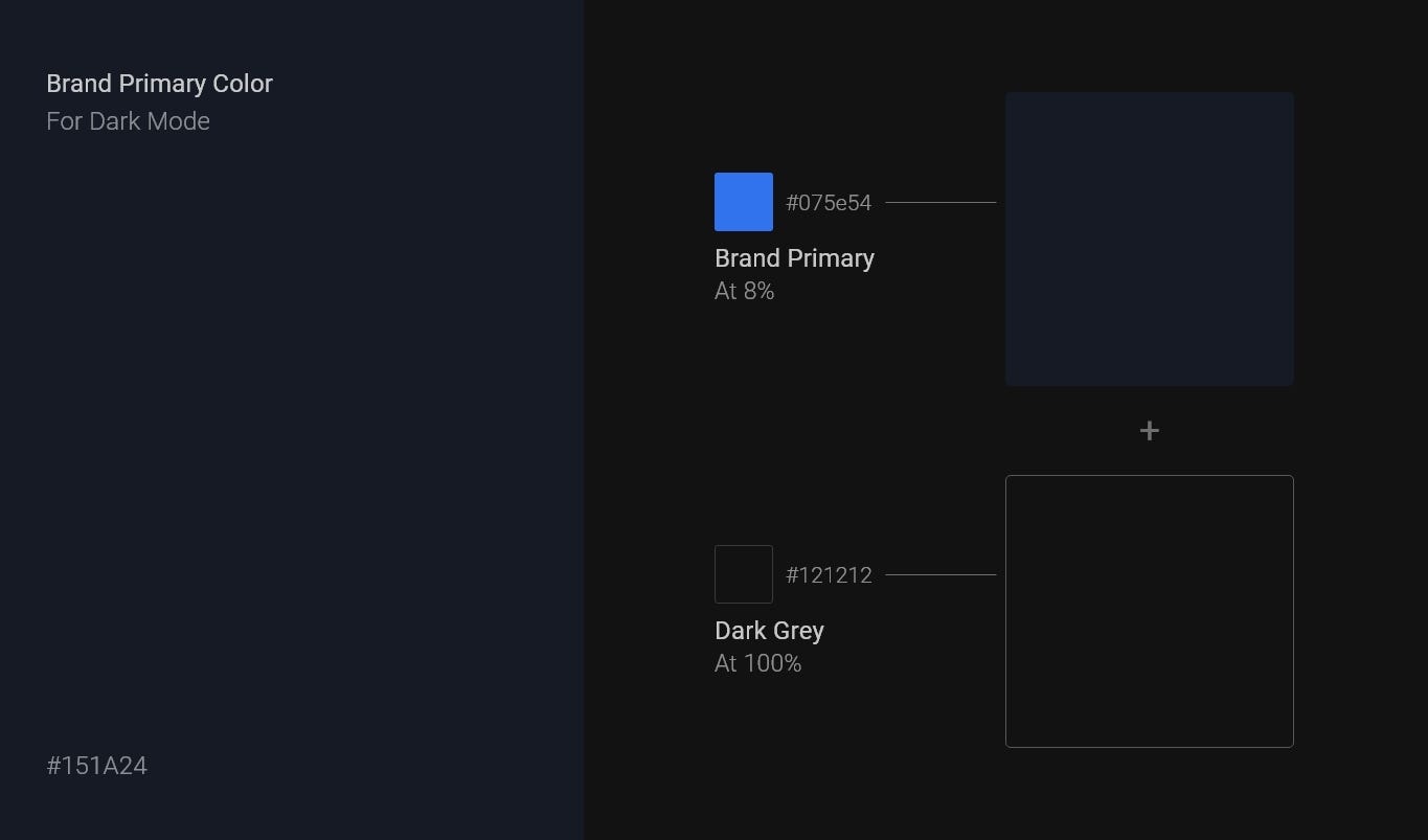
As easy as that. Note: You can always play around with these colors. You could also choose to use your secondary color as the prime color for Dark. Choose whatever suits your brand and, think long term.
Here’s how WhatsApp used this approach to create it’s own branded dark theme:

The Next Big Step
Ok! Now that you are familiar with the two major fundamentals of the material dark theming — The Dark Background and Elevation, it’s time to move to the next big thing.
4. Accessibility and Contrast
It is super important while designing in dark mode, to make sure that things like text, icons, and other elements are legible to your users. There are certain principles you could follow to make sure this happens.
P.S: This part of the article, bear with me, is going to get a little technical. But hey, I know you’re awesome and I know you’re here to learn everything about the Dark Mode. So don’t give up ;)
So — ‘All dark theme colors should display elements with sufficient contrast, passing the WCAG’s AA standard of at least 4.5:1 for body text when applied to all elevation surfaces.’
Didn’t really understand what WCAG’s AA Standard is? Or confused on how to calculate the contrast ratios to make sure that your designs pass this standard? Well, it’s easy.
Let’s just say you are designing a UI in Dark Mode and have everything together as per what we have covered earlier in this article (Dark Background and Cards/Elements as per their elevation). Now, if we have a card on which you want some information to be put up, here are simple steps you could follow to pass the 4.5:1 or the 15.8:1 rule:
- Select your Card Background Color and Text Primary Color. In my case:

2. Head down to this super color Color Contrast Checker tool and put in both these values.
3. And if the ratio you get is more than 4.5:1 then you did it! You successfully passed the WCAG’s AA Standard rule.

When to check for 4.5:1 and when to check for the 15.8:1 contrast ratios?
Like in the example above, if you are using White color text on the standard dark grey background or the brand primary - you need to check for the 15.8:1 test. However, if you are using any Other Color Text on the dark grey or brand primary — You need to check for the 4.4:1 test.

5. The last step — Colors
The material dark theme recommends you to use low saturated colors (with tones between 50–400). This is to make sure that elements are properly visible on surfaces. Whereas, for light mode, you could use tones beyond 500.
Here’s everything on the right color tones to use in one picture:

Let’s see how this impacts accessibility on a dark UI-

In the above example, we have used a saturated Primary Blue with tone 700 on our UI. Using saturated colors on dark surfaces usually creates optical vibrations which can induce eye strain to the viewer. And remember, dark mode is all about reducing eye strains. We love our eyes, don’t we? So, by going with a low saturated color from the palette, we can solve this problem:

Hence, the right tones are super important when it comes to colors for elements on the UI. It can massively affect the overall experience of your product.
Now that we have covered most of the important fundamental principles of building a Material Dark Theme, let’s just sum everything up:
Step 1 — Choose your Theme. Whether you want to use the Standard Dark Grey for your design or a Brand primary color on your UI.
Step 2 — Use the right elevation while you’re putting together all important components/elements on your UI. Navigations Bars, App Menu, Cards, Media, etc. All of these have to be placed with the right elevation as we have defined earlier.
Step 4 — Accessibility and Contrast. Every text, icon, and element you use on the UI needs to be legible and clear to the user and needs to aid in reducing eye strain. For this, you need to use the right tonal contrast from the color palette. Remember- The magic number for tones in Dark UI is between 50–400.
And also remember the magic ratios of 4.5:1 and 15.8:1 and when to use which.
Step 5 — Be mindful of other material principals. Like the Button States, Layout grids, Typography, Icons, etc. You can always go through the detailed documentation by Google here.
That’s it! That pretty much sums up everything you need to know about building a Dark Theme keeping Material Design in mind.
In the next part of this series, I will talk about how I used these principles to design a concept for Snapchat Dark Mode.
Meanwhile, do try redesigning an already existing app or create a new UI with these principles in mind and let me know how it goes for you in the comments below. I would love to check them out :)
Here are some resources that you might be interested in-
- Google Material Design Files for Sketch: https://storage.googleapis.com/material-design/downloads/material-design-stickersheet.sketch
- Google Material Design Files for Figma: https://storage.googleapis.com/mio-assets/resources/Material%20Dark%20Theme%20Design%20Kit.fig
- Google Material Design Files for Adobe XD: http://download.adobe.com/pub/adobe/xd/ui-kits/xd-resources-material-design-ui.zip?promoid=98SH4RH2&mv=other
- Dark Theme Material Design Official Documentation: https://material.io/design/color/dark-theme.html
- How to design a Dark Theme using Material (Google I/O’19): https://www.youtube.com/watch?v=9NDLR3COU7Y


