
Mobile App UX Design: Making a Great First Impression
by Nick Babich
Did you know it takes only three to five seconds for someone to form a first impression? And while you might wish that opinion were based on person’s intelligence or experience, most studies show that first impressions are shaped by what can be seen or heard in those initial few seconds. And this portrait most likely won’t change.
It’s no surprise that first impression is a big deal for mobile app. Just like a person, your mobile app doesn’t get a second chance to make a first impression. There is only one chance to sway someone into becoming a user, because if you disappoint the first time, you can bet (with 80% confidence) they won’t be back.
In this article we’ll see what happens in those first few seconds (or minutes) even before the actual interaction with an app takes place, and why you should be obsessed with making a great first impression.
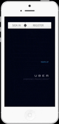
Splash Screen
The splash screen or launcher image is there to give the user immediate feedback that the app has started and is loading. Both Google and Apple suggest to use the splash image to improve the user experience by simulating faster loading times.

How It Works?
The system should display the splash screen (or launch image) instantly when the user starts the app and until the app is fully ready to use. This screen should be visible for a small amount of time (less than 10 seconds) while the app is starting or loading some resources in the background.

If your app has a time-consuming initial setup phase, which takes more than 10 seconds, consider using progress indicators to show that loading is in progress. Keep in mind that uncertain waits are longer than known, finite waits. Thus, you should give your users a clear indication of how long they need to wait.

Takeaway
When a user launches your app, the last thing you want to do is tell them to wait. And if they should wait, figure out ways to engage them. A splash screen solves the waiting problem and gives you a short but vital window to engage a user in your proposition. Remember, you should set good initial expectations even before users actual interact with your app.
Onboarding
Onboarding should’t be generic or interruptive, instead it should be beneficial to the user. Think of onboarding as building an entry ramp for people to use the app. It can include a variety of techniques to keep users engaged during their first time, but it should only be employed if it’s really essential for first use.
How It Works?
The trick with onboarding is to show just what users need to know to get started — nothing more, nothing less. Thus, it should only surface the highest priority points a user will need for first use. If you’ll keep onboarding light and simple, you’ll see an increase in usage.
When To Use Onboarding
If users don’t understand the concept of an app or app’s key feature, they won’t return. Rationale for using onboarding would be:
- App is empty and requires user to input to populate it for first use
- App requires personal input for first use
- App has complex functionality such as in a productivity-type app
- App relies on bespoke gestures unfamiliar to most users
- App has been updated with new features
Check Analytics Regularly
Once you design what you feel is the ultimate onboarding experience, how do you know whether your techniques are working? The answers to this question can be found with a mobile analytics tool. If your app use onboarding sequence you should measure:
- Percentage of users that complete onboarding screens and progress to home screen
- Percentage of users that chose to skip onboarding
- Time elapsed between onboarding screens
You should use analytics from day one in order to optimize your onboarding experience and increase your app’s retention rate. If you found that the flow isn’t working, remove it and consider another design approach.
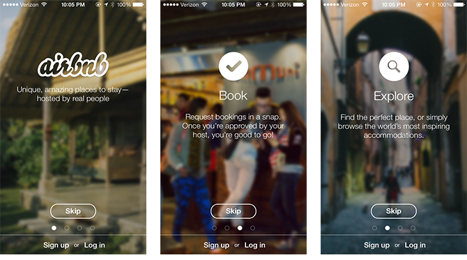
Provide The Option To Skip Onboarding
Users should be able to skip the onboarding sequence if they wish not to be interrupted by it or do not perceive a benefit in swiping through it. You should put the user in control of their time and initial experience of the app. And a simple ‘Skip-button’, like in the Airbnb app, makes it possible.
Break Sign-In Wall
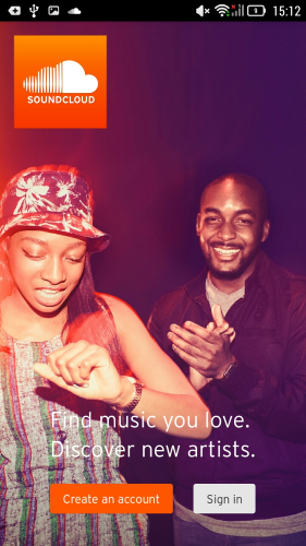
Registration is a road-block to adoption. The sign-in wall is shown when users are forced to create accounts before they can use any part of an app. Demanding that users register or log in before they can try the app has high interaction cost. Forcing registration too early can cause more than 85% of users to abandon the product.
SoundCloud app, for instance, asks users to create or log in on a first launch. There is simply no other path for someone to take.
But before users offer up that kind of requests they usually want to see what the service or app is offering. And you should give the user what they came for as quickly as possible.
Try Before You Buy
Try before you buy strategy is about giving new users the ability to experience your app so that they’ll personally interested in signup. People are more likely to sign up and provide real personal information if they just knew what sort of product and experience they receive.
A try before you buy pattern doesn’t mean you can’t ask a user to create an account. It just means you ask for that conversion after delivering value for the user. But before that you build trust with your users. To provide a user experience with the least barriers to conversion, mobile apps should:
- Provide non-signed-in journey
- Request sign-up “only” when it is dependent on providing value, and then request minimal data
If App Requests Sign-up, The User Can Choose To Continue As a Guest
Users should be able to choose to ignore registration and continue as a guest, where they can assess app’s value to them. This is especially important for apps from unknown brands, or apps that provide engaging content and require users to try it before they can make a decision about registration.
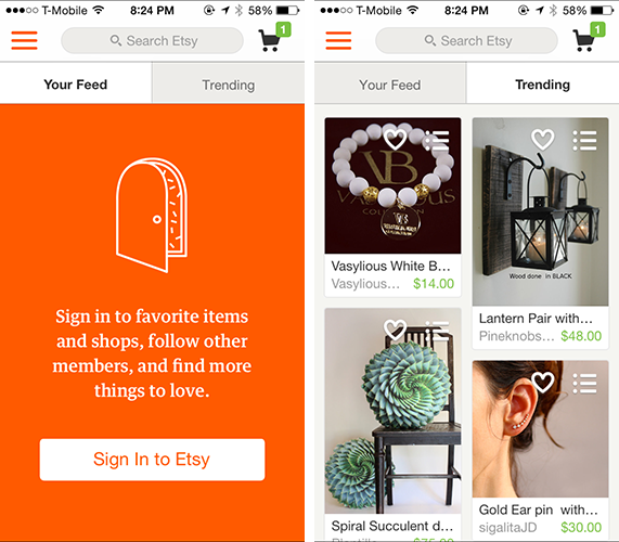
Etsy knows how to get a user hooked before asking for personal information. When users first launch the app they have two options: sign up for an account or start searching the store. And they only asked to sign up for an account once they are ready to make a purchase.
Conclusion
While there is no magic bullet for creating a perfect first-time experience, one thing is for sure — the first impression is all about your users. Make your users feel like the center of attention by removing all roadblocks to usage. Invite them to stay. Because turning first-time users into active and engaged ones is at the core of creating the great first time experience.
Thank you!
Originally published at babich.biz

