
Mobile eCommerce: How to Design UX Search
by Nick Babich
You can’t sell a product that your customers can’t find. Search is a fundamental mobile activity and a critical element of building a profitable app or site. Users expect smooth in-app experiences when finding and learning about products and they typically make very quick judgments about app’s value based on the quality of one or two sets of search results.
An excellent search facility should help users find what they want quickly and easily. In this article we’ll figure out how to make it possible.
1. Placement Of Search
Users often move fast and furiously when they’re looking for search. They typically scan a page looking for “the little box where I can type.”
Goal: Design search bar to be clearly visible and quickly recognizable.
Prominently Display The Search Field
Search is a primary function for eCommerce apps/sites and should be displayed prominently, as it can be the fastest route to discovery for users. Apps that do not have a prominently placed search box can cause user frustration and slow the user down.

Ecommerce apps should feature search at the top of their home screen (and if the home screen is long, repeat it at the bottom). For apps with huge inventory, displaying the search field by default would ensure it is both obvious and fast to use.

Accompany Search Box With Magnifying-glass Icon
There are a few icons that enjoy mostly universal recognition from users. Magnifying-glass icon is the one of such icons. Users recognize a magnifying-glass icon as meaning ‘search’ even without a textual label.
You should use a schematic icon, the simplest version of the magnifying glass, because fewer graphic details speed up recognition:

Scope Bar (Apple iOS Only)
In iOS, search can have an accompanying scope bar, which enables the users to quickly select the scope of their search, i.e. with clearly defined criteria or category.

However, it’s better to improve search results so that users don’t need to scope their search.
2. Interpreting The Query
Search forces users to work more because not only they must come up with a query, but they also must type it. Typing is error prone and time consuming activity (especially on a mobile screens).
Goal: Try to reduce users data entry effort and provide immediate results.
Auto-suggestions
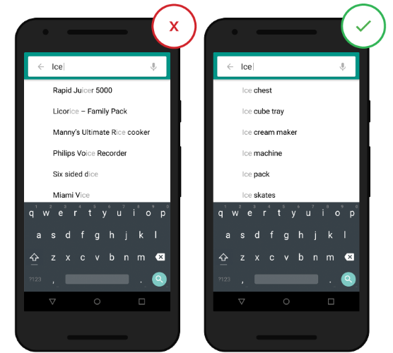
Typical users are very poor at query formulation: If they don’t get good results on the first try, later search attempts rarely succeed. In fact, they often give up. Auto-suggestions mechanism helps users to find a proper query by trying to predict it based on the entered characters. When autocomplete suggestions work well they help the user articulate better search queries.
Auto-suggestion mechanism isn’t about speeding up the search process but rather about guiding the user and helping them in constructing their search query.
But ensure that auto-suggestions are useful. Poorly designed auto-suggestions can confuse and distract users. So use a spelling auto-corrections, recognition of root words, and predictive text in order to improve the tool.
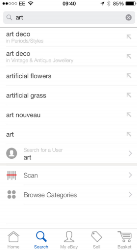
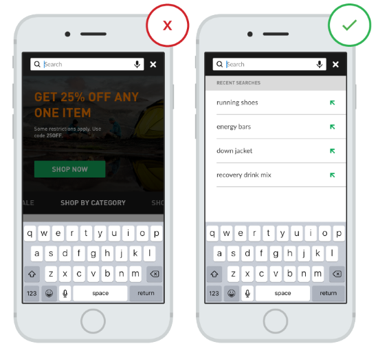
Recent Searches
Apps should store all interactions, including recent searches and recent purchases, in order to provide this data to the user the next time they conduct a search. It benefits the user in saving them time and effort in searching for the same item again, and improves the UX.
3. Search Progress
Ideally when the search results are displayed immediately, but if it’s impossible you should provide a proper visual feedback. However, keep in mind that slow load times can frustrate users and risk loosing their attention.
Goal: Help make the user perceive that searching times are shorter than they really are.
Search Placeholders
Normally, no special feedback is necessary during delays of more than 0.1 but less than 1.0 second. But if search takes longer, you should at least try to make the wait more pleasant. And it’s a right time for temporary information containers.
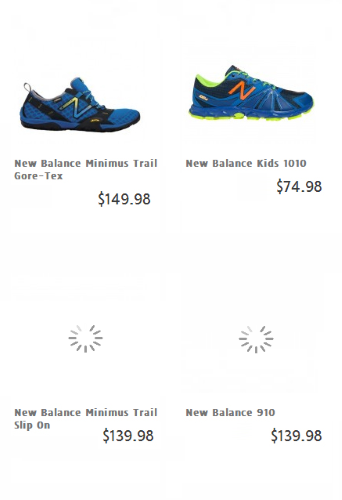
Lazy Loading
Lazy loading is a common technique to use so that some results will be displayed while the rest are being loaded. This way, pages load quickly because very few products are loaded initially.
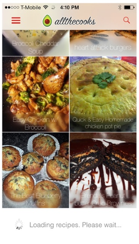
For lazy-load of products, it’s good to show the text of the products first, so impatient users can scan for target products without waiting for all images to load.
4. Presenting Search Results
Goal: Ensure that search results are useful. Speed up the search process and keep users on-task toward conversion.
The First Few Search Results Are Highly Relevant
With mobile screens being so limited in the number of results they can display without the need for scrolling, ensure the user sees a set of highly relevant results (e.g. 3 or 5) by default; and only after that do they need to scroll.
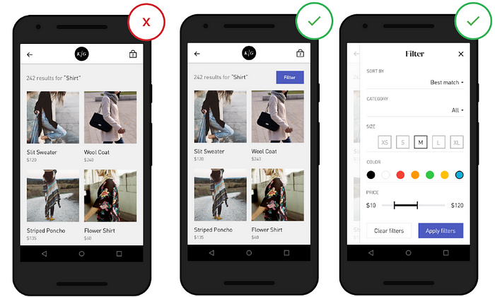
Filter and Sorting
During mobile e-commerce usability study Baymard Institute observed that more than 50% of users tried to “search within” their currently navigated category path, in an attempt to “filter the product list on my screen with a search query”. However, 94% of mobile e-commerce sites and apps do not support such behavior.
Users become overwhelmed when their search terms result in seemingly irrelevant and/or too many results. Filter and sort options can help users narrow and organize their results, which otherwise requires extensive (and excessive) scrolling or pagination on a small screen.
‘Search With’ Field
This option has the benefit of encouraging users to “search within” instead of applying traditional filters, which can provide your users with incredible control over the product list. Below you can see an example of dedicated ‘Search With’ field:

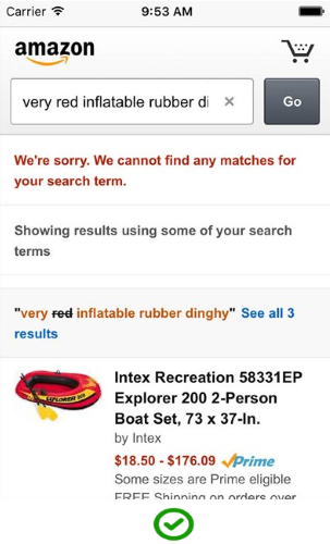
Useful “No results” Page
When users search, some will inevitably end up at a “no results” page. Poorly designed ‘no result’ page can be a dead-end for the user.
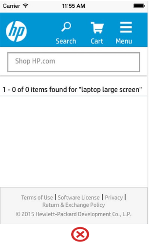
You should avoid giving users dead-ends in their experience when their search produces no matching results. Provide valuable for user alternatives when there are no matching search results, such as products from the similar category. To assist the user further you could employ an ‘intelligent search’ feature that covers singular, plurals and misspellings, etc.
5. Guided Navigation (Product Categories)
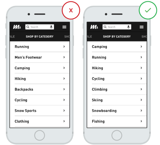
User-friendly Menu Categories
Users struggle to interpret and distinguish menu categories that do not align with their expectations for categories. Menu categories should be clear with no overlap. This is particularly important when a user turns to a menu as a last resort after exhausting options through search.
Conclusion
Given that 30% of all online shopping purchases now happen on mobile phones, the stakes have never been higher for eCommerce apps and sites. Your app/site must accommodate all types of searches and return relevant results for categories, products, and product characteristics. When mobile retail experiences are frictionless, consumers are more likely to not just search but buy on their phones.
Thank you!
Originally published at babich.biz

