
Mobile eCommerce: Product Details
by Nick Babich
There is no section on site or in app that is more critical for conversion than the product page. The ability to see and understand product information easily is critical to users when they’re making a product decision.
There are a few ways you can improve your page and get visitors to buy. Here’s what you need to know:
What product details do we need to show?
Comprehensive product details allowing users to quickly assess the product. Users appreciate it when app or site shows the following information:
- Product description
- Product availability (in stock, out of stock)
- Available sizes
- Available color choices
- Product photos
- Delivery terms & options
- Customer reviews
Product details should be clear and useful
Product description should be easy to skim (get a general overview of a product) and read (find a specific info about a product). Take a look at the following example:
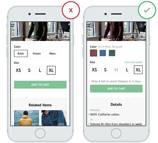
In the first screen user can be frustrated by incomplete product details:
- No information about product details.
- Product availability: It’s not clear whether certain sizes temporary or permanently unavailable;
- Measurements: It’s not clear what is size ‘XL’ means in terms of actual measurements.
- Color: microcopy doesn’t provide enough information about how the color looks like in a real life. Users want to see a visual representation of the color options;
- Delivery: no information about stock availability and delivery options.
While it’s true that providing all required information about a product can be hard due to small screen sizes, yet many retailers solve this problem in a very elegant way:

Minimize User Typing Effort
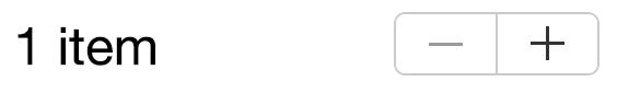
Typing has high interaction cost; it is error prone and time consuming on desktops but on a touch screen its twice hard. Ideally, product details page shouldn’t have any fields that allow users to enter a raw data. By doing that you will prevent users from making errors. For example, when your users need to provide the number of items you can use steppers for that.
Product Images
The product image sells the item. Regardless of your product, whether it be computers or T-shirts, it’s the most important element on the page. Good product image does two very important things —they inform users and create great first impression about a product even before users have a chance to interact with it.
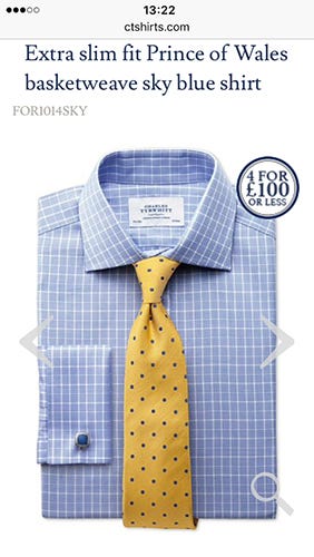
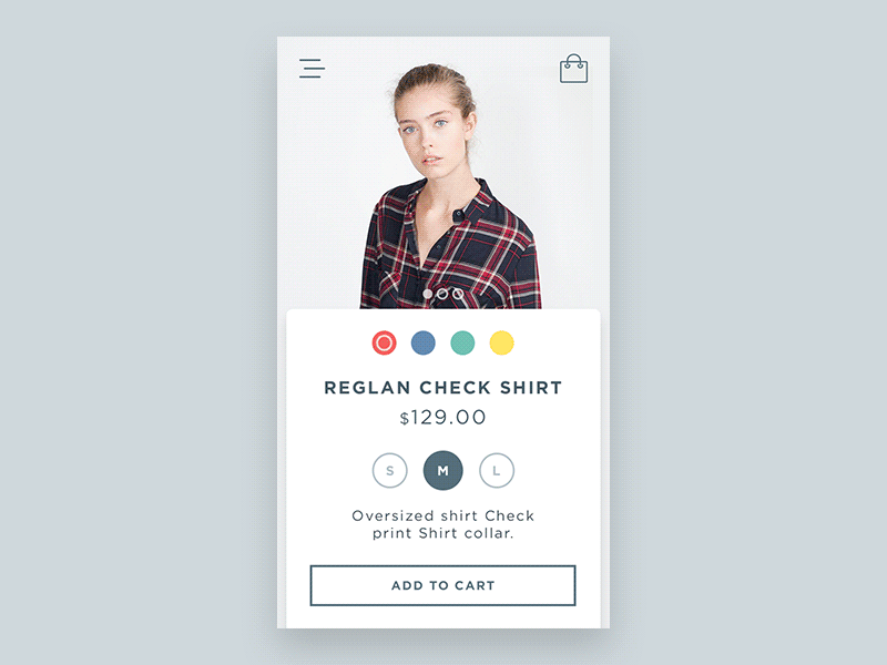
Use Large and HD Images
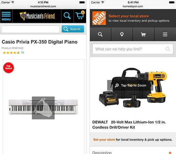
For the image to be effective it needs to be both large and high quality. This is especially important for clothing and accessories because consumers will more concerned with specific detail (i.e. they might want to explore a pattern on a T-shirt). The image below illustrates how this rule applies to apparel product page.
Make sure the assets don’t appear pixelated. Not only original image should be good but the zoomed-in images also need to maintain high quality. So make sure that your images implementation fetches a higher-resolution version of the product image when users begins zooming.

Below is a clear example of zooming problem. While the zoom-in is supported at Overstock, the product images are of a very low image resolution and they are simply unusable due to their low quality.

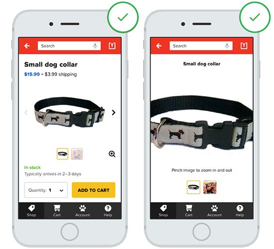
Let Users Control the Level of Zoom
Since users usually rely on the product image to assess features and details, they can become frustrated if the apps allow them to zoom-in only a specific part of a product at one time.
You should put users in control by allowing them to zoom in as they prefer.
Offer a Gallery of Product Images
Generally speaking, the more product images you have within your product screen the better. But in practice, in order to optimize usage of the gallery photos try to use images associated with the product details highlighted in the product description.
Here are a few tips for image gallery:
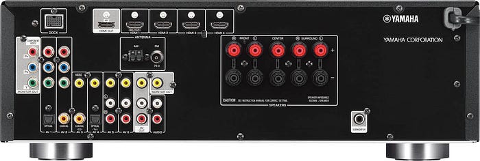
- You may also show practical shots that show detail and features of your product. For example, if you’re selling an AV receiver show the input ports at the back to help the user understand what this device is capable of.
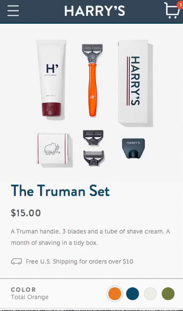
- Contextual images can be also helpful for your users. For example, Harry’s uses images to tell the brand’s story in a mobile setting.
Support Horizontal Swiping for Image Gallery
Design for thumbs. Allow users to quickly swipe through product images horizontally, and not have to scroll down to view a series of images.
Support Pinch and Double-tap Gestures
Users rely on pinch and double-tap to zoom-in images on mobile. Yet, not all mobile sites support zoom gestures. If you plan to support double-tap or zoom-in you can indicate this in your mobile UI to help users to take advantage of this feature.
Product Price
Price is a very rational thing and you should take some time to get your product pricing strategy right. As a rule of thumb, place the price front (right after the image and product name):

Product Availability and Delivery Options
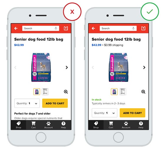
One of the biggest reasons for product page abandonment is that many product pages don’t list the delivery options and hide extra costs. Lack of shipping information forces users to search for it on other pages, and as a result many users abandon the purchase process.
Do not hide shipping costs
Provide shipping costs and delivery timing right on the product details page. It helps users make a decision whether they want to purchase this product or not.
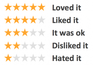
Helpful Product Reviews
Online shopping is about trust and people tend to trust the opinion of others. Customer reviews are used in three different ways by users:
- Reviews help to assess the quality of the product.
- Reviews help to assess level of your service.
- Reviews help users find answers to questions they have about a product that might not be listed on the item page.
Allow User Reviews to Be Filtered
Some users want to read only 1-Star reviews. Give them this opportunity by offering a filter option for user reviews.
Don’t Hide Negative Reviews
If all the reviews are overly positive people tend to doubt the quality of reviews.
Offer additional useful options
Users appreciate relevant product recommendations on product pages. Thus, provide an information about related items and most popular products. Offer the options at the bottom of the page.

Thank you!
Follow UX Planet: Twitter | Facebook
Learn how to design better products
Interactions between computers and humans should be as intuitive as conversations between two humans. Interaction Design Foundation will help you to learn how to design for efficiency and persuasion.

