
Mobile UX Design: List View and Grid View
by Nick Babich
In spite of the modern trend towards larger-screen phones, what makes mobile phones so convenient and portable is their small size. Compared with desktop screens, phone screens accommodate a lot less content. Users can only view a small amount of content at a time before they need to scroll to view more. But designers still need to find ways to provide content in the most effective way.
Today I would like to overview two basic patterns for content presentation — list view and grid view, and to provide use-cases for each of them.
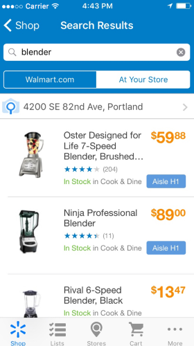
List View
Lists present multiple line items vertically as a single continuous element. It’s text heavy and usually have only small icons with text. List view items require less vertical space than an image would, allowing more list items to be displayed on the screen at a time.

Content Scanning
List view provides users a format that follows their natural reading patter like the F-shaped pattern

Lists are best suited to presenting a homogeneous data type and optimized for reading comprehension. List view prevents too much scrolling by making pages shorter. The exclusion of images (list view has only thumbs) allows you to fit more options per screen.

Last but not least, when dealing with the list view, the attention of users decreases from top to bottom.
Decision Making
Users rely primarily on reading the text to make their selection.
Pros and Cons
Comparing with grid view, list view has following advantages:
- List view follows a natural reading patterns.
- List view prevents overscrolling by providing more options in a visible area.
But it also has a few disadvantages:
- List view is very modest in case of visual appearance.
- In the list view user’s attention decreases from top to bottom.
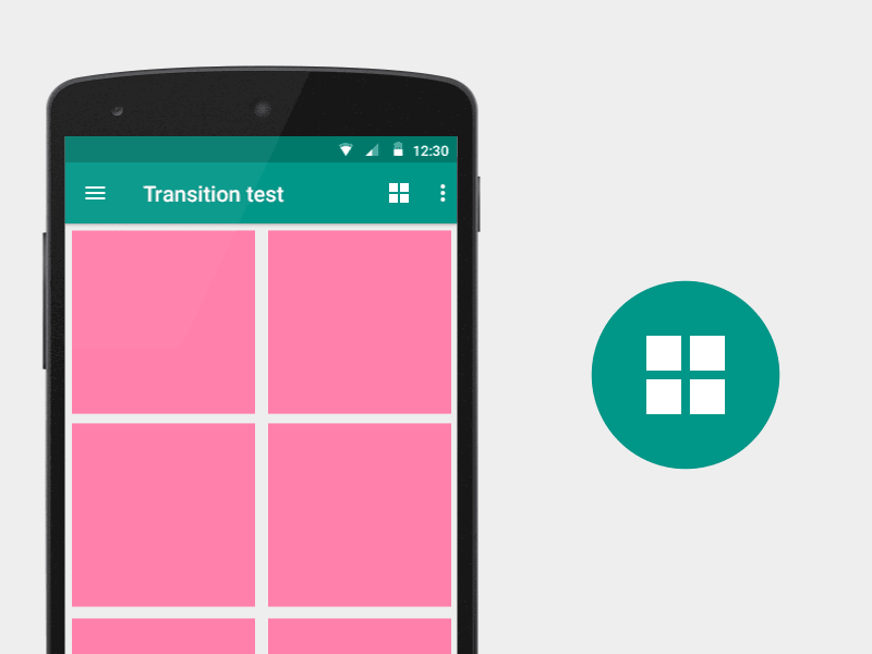
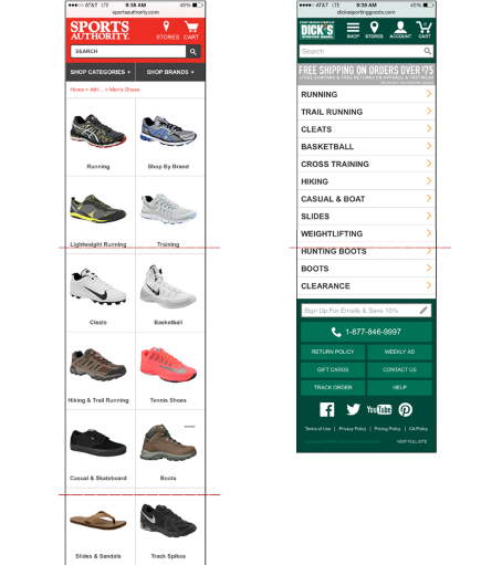
Grid View
Grid views are an alternative to standard list views. Grid lists are distinct from grids used for layouts and other visual presentations. A grid list consists of a repeated pattern of cells arrayed vertically and horizontally within the grid list.
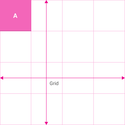
Content Scanning
Grid view provides users a little more interruptive scanning format, making it best suited for visual content. Usually the images dominate most of the cell space.
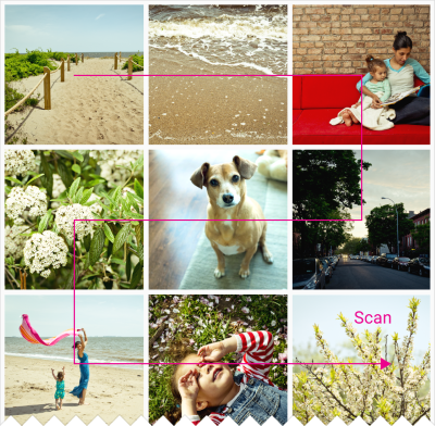
Users attention tends to be spread more evenly between each grid cell. Grid view is optimized for visual comprehension and differentiating between similar data types.
Decision Making
Users primarily rely on the images to make their selection. One important moment here — the user often sees only 4 or 6 grid items at a time.
Pros and Cons
Grid view has following benefits:
- Grid view is more appealing to the eye.
- Grid view helps users when they’re examining visual distinctions between items.
- In the grid view user’s attention is spread more evenly.
But it also has following major downside — grid views create longer pages and force users to scroll more. In example below you can see the difference between list view and grid view.
A General Rule of Thumb
What is the most efficient layout for viewing content? Should you use a list or grid view? The right answer is: it depends on the nature of your content.
A key factor in selecting list view versus grid view is how much information a user needs in order to choose between items. You should choose the layout that suits the type of content you’re displaying.
Details in Lists, Pictures in Grids
Product pages are great example of the rule. Product’s specifics is very important moment. For products like appliances where details like model numbers, ratings and dimensions are major factors in the selection process — the list view makes most sense.
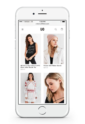
A grid view is a good option for online shops that sell goods that require less product information or for similar products. Grid is good for goods like apparel, where users don’t often read much details and the process of decision-making is based on the visual appearance of the product. Users compare different goods visually in attempt to find visual distinctions between different items, and would rather scroll through a single long page than repeatedly switch between the list page and product-detail pages.
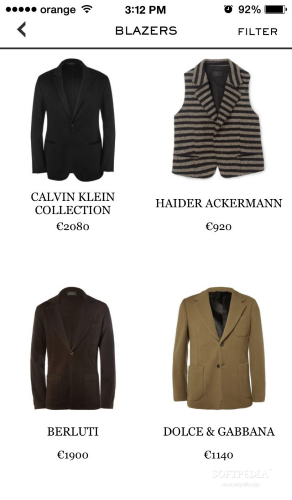
When designing these layouts, pick the right size of images so that they are large enough to be recognizable, yet small enough to allow more products to be seen at a time.
Originally published at babich.biz

