
Mobile UX Design: User Errors
by Nick Babich
‘Errors’ happens. They happen in our life and in products we use. Sometimes they happen because we made mistakes. Sometimes because a system failed. Whatever the cause, these errors — and how they are handled — can have a tremendous impact on how users feel about your product. Bad error handling can fill users with frustration and make them stop using your app. A well-crafted error handling, on the other hand, can turn a moment of failure into a moment of delight.
In this article we’ll examine how to create good error messages.
What is Error?
Errors (or error condition) occur when an app fails to complete certain operation, such as:
- The app does not accept user input
- The app fails to complete a certain action
- A user attempts to execute incompatible operations
Every error, regardless of who is to blame, becomes a point of friction for your users. Luckily, a well-designed error handling can help reduce that friction.
Preventing User Errors
If you design app, you should be familiar with constraints. Take constraints into account in order to minimize errors by designing app that make it easy for users to use it. In other words, it’s better to prevent users from making errors in the first place by utilizing constraints and offering suggestions.

Make Error Message Informative and Consistent
One of the 10 Usability Heuristics advises that it’s important to communicate errors to users gracefully and clearly. An effective error message provides following information:
- Clearly communicate what is happening
- Describe how a user can solve the problem
User Input Errors
User input validations are meant to guide users through the difficult times of uncertainty. The output of this process is emotional—whether users feel good or bad can have a huge impact on UX.
The primary principle of input validation is this: “Tell when users what is wrong!” Generally speaking, there are three important elements that good form validation consists of:
- Right time and place for informing about errors
- Right color for the message
- Clear language for your message. Prevent confusion.
Right Time and Place (Inline Validation)
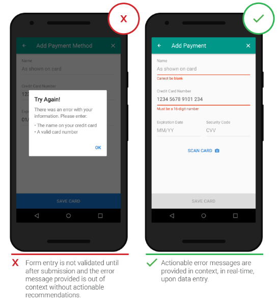
Users dislike when they go through the process of filling out a form only to find out at submission, that they’ve made an error. The right time to inform about the success/failure of provided data is right after the user has submitted the information. And it’s a time when real-time validation comes into play.
Real-time inline validation immediately informs users about the correctness of provided data. If you are performing inline form validation, and the field with the error is clearly marked, the submit button may be disabled until the error is corrected. It allows users to correct the errors they make faster without having to wait until they press the submit button to see the errors.
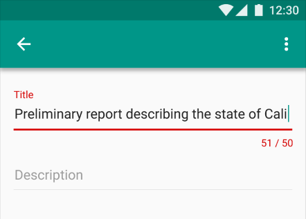
Below are a few examples of inline validation:
- Incompatible values

- Over/under character or word count
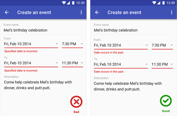
Right Color (Intuitive Design)
Color is one of the best tools to use when designing validation. Because it works on an instinctual level, try to use red for error messages and yellow for warning messages. Ensure that all colors in your digital interface are accessible for your users. Error text should be legible, with noticeable contrast against its background color.

Clear Message (What Happened)
Make sure your error messages sound like they’ve been written by humans and for humans. Try to speak the same language as your users—avoid using technical jargon, express everything in the user’s vocabulary. Your validation message should clearly state:
- What exactly went wrong and why.
- What’s users should do to fix the error.
System Errors
System errors often occur independent of user input.
Sync Error/Failure To Load
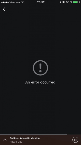
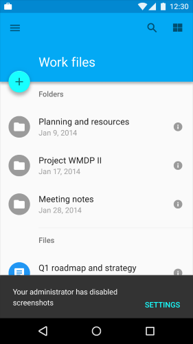
When sync or connectivity is down or content has failed to load, the user should know that. Tell them upfront. Since you don’t have a data, you can use empty states to fill this gap. Sad fact that most empty states often look… empty. In example below, error screen only states “An error occurred” and doesn’t provide any helpful information.
Think of your error message as a conversation with your user. Use friendly and helpful empty states in a moment of failure. Assist users by providing the basic required information, and encourage users to solve the problem.

If appropriate, present a link (or button) to help a user accomplish their task. But you should only offer options that you can actually support. For example, don’t offer an option like “Try again” when you know that this action won’t solve the problem.
Never Show The Raw Error Message
Technical error codes (Messages like the example below) look cryptic and scary. They don’t tell much to your users.

Don’t assume that all your users are tech-savvy, always try to tell them what’s wrong in simple words.
Incompatible State Errors
Incompatible state errors occur when users attempt to run operations that conflict, such as making a call when a phone is in airplane mode. You should help prevent users from putting themselves into these situations by clearly communicating the states they are selecting. Simply, don’t let people start something they can’t finish.
Conclusion
The best error message is the one that never shows up. It is always best to prevent errors from happening in the first place rather than try to solve something that arise. But when errors do arise, a well-designed error handling helps to teach users how to use the app.
Thank you!
Originally published at babich.biz


