Mobile UX Design: User-Friendly Search
by Nick Babich
Search is a fundamental mobile activity. Many mobile apps are used mostly for finding stuff. And an excellent search help users find what they want quickly and easily.
This article helps you create a really good user-friendly search for your app.
Search Bar
If search is important part of your app you need to design search bar to be clearly visible and quickly recognizable.
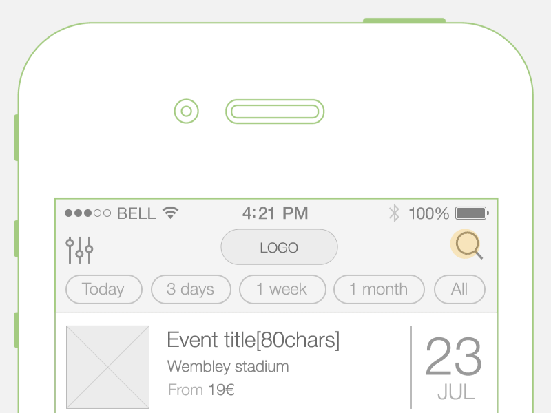
Display Search Bar Prominently
If you have enough space for search bar— use it to display full open-text field, because icon-only search increases the cost of interaction (they user needs to tap icon first and only after that type a message).
Bad: Icon-only search hides context. From a UX point of view, users shouldn’t have to take an action in order to find out what other actions they can take.

Good: No need for extra action from the user’s side.

E-commerce apps should feature search at the top of their home screen.

Use Magnifying-Glass Icon
Icons are, by definition, a visual representation of an object, action, or idea. There are a few icons that enjoy mostly universal recognition from users. Magnifying-glass icon is one of them.
Always accompany search box with magnifying-glass icon. Users recognize a magnifying-glass icon as meaning ‘search’ even without a textual label. Use a schematic icon, the simplest version of the magnifying glass. Fewer graphic details speed up recognition.

Search Input
Search forces users to work more because not only must they come up with a query, but they also must type it. Typing has high interaction cost; it is error prone and time consuming even with a full keyboard (and even more so on a touch screen).
Our goal for this point—make search easy to use.
Choose Good Defaults
Good default can reduce user effort. Especially when users have to perform repetitive actions, or in situations where they need to use precision, start by offering reasonable defaults that are likely to fit their real-world goals
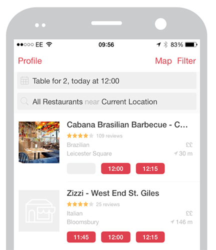
Automatically pre-populate data in a booking form (e.g. booking a table in restaurants, bookign room at hotels) with suggested data (i.e. date, time).
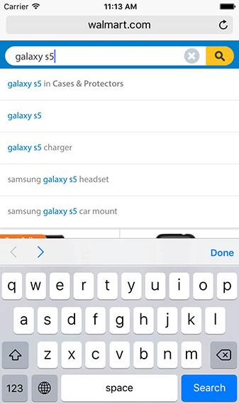
Auto-Suggestions
Auto-suggestions are probably the most useful search pattern that emerged in Web 2.0 because they help to reduce user effort for data entry.
Try to provide auto-suggestions as quickly as possible, such as after third character is entered, to provide immediate value.
Recent and Saved Searches
Even when users are familiar with the search space, search requires them to recall information from their memory. To come up with a meaningful query, a user needs to think about attributes that are relevant for his goal and describe them in a search query.
Successful mobile interfaces follow a basic usability logic— respect the users effort. That’s why apps should store all recent searches, in order to provide this data to the user the next time they conduct a search. It benefits the user in saving them time and effort in searching for the same item again.
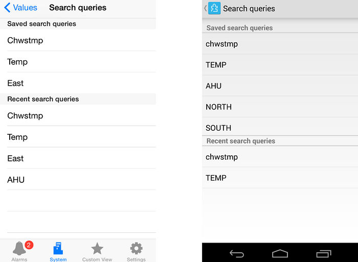
This option works especially good for apps where users often repeat the same searches. This small detail could significantly improve the user experience.
Voice Search
Typing on the phone is hard and error-prone. The idea behind voice search is simple: same query inputted via on-board microphone is used as input for searching instead of a keyword query.

Pretty much any app that has a search box, can also use the voice search pattern. This pattern is especially good for apps that are often used “on the go”. Another reason why you should choose to use voice search pattern is the context in which people use mobile apps—voice search can be helpful druing multi-tasking activities such as driving.
Search Progress
Ideally the results will be displayed immediately, but if it’s not possible — a progress indicator should be used as system feedback for user.
If search takes too long you can use good animation. Animations can distract your visitors and make them ignore long searching times.

Takeaway: Uncertain waits are longer than known, finite waits. You should give your users a clear indication of how long they need to wait.
Search Results
Our goal for this point — apply the principle of least effort. Users beings naturally prefer to use a system which require less effort.
List or Grid
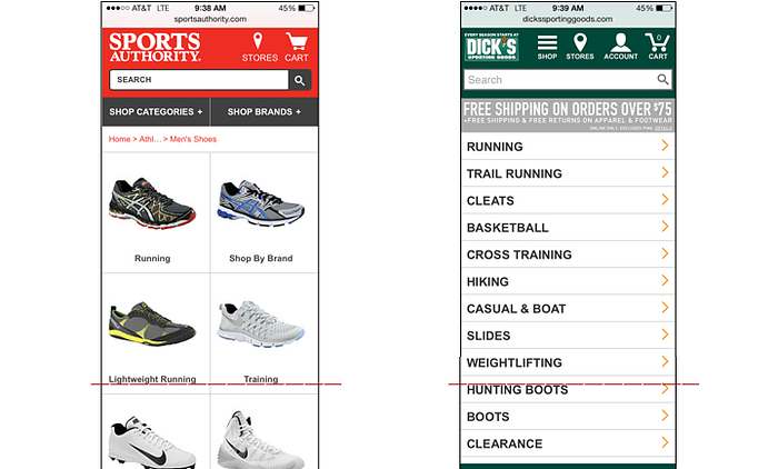
Once a search is performed the results can be displayed in the same screen or on a dedicate results screen. List and grid are two typical layouts for search results. List allows you to show more items without scroll. Example below shows the difference for grid vs. list for search results. On the Sports Authority site, the lengthy grid layout meant that users went through about 8 scroll gestures (down and up) before selecting a product type. Try to choose the appropriate layout based on your product or service.
Lazy Loading
Lazy loading is a common technique to use so that some results will be displayed while the rest are being loaded.

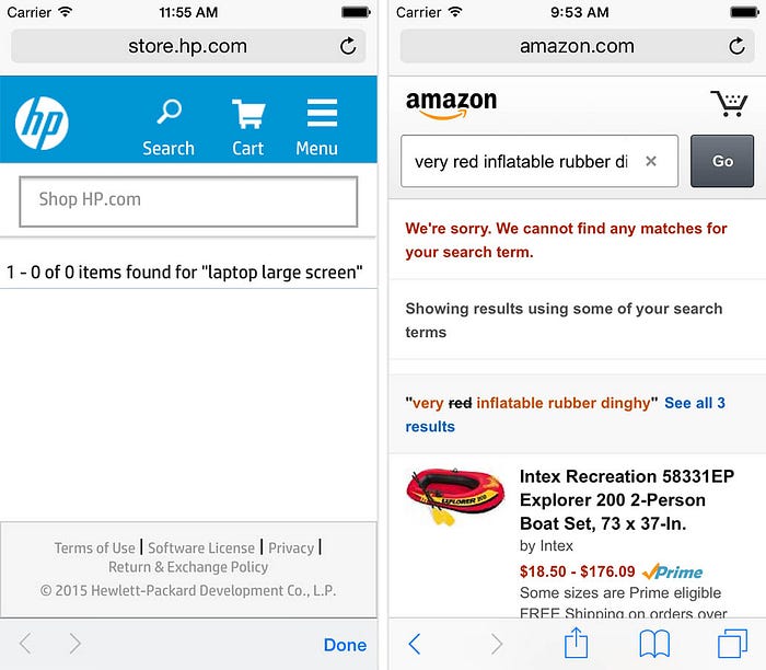
Blank “No results” Page
Avoid giving users dead-ends in their experience when their search produces no matching results. Provide valuable alternatives for users when there are no matching search results. For example, online shop can suggest alternative products from the similar category.
Sort and Filter Search Results
During mobile e-commerce usability study Baymard Institute observed that more than 50% of users tried to “search within” their currently navigated category path, in an attempt to “filter the product list on my screen with a search query”. However, 94% of mobile e-commerce sites and apps do not support such behavior.
Provide the user with filtering options that are relevant for their search, and enable them to select multiple options each time they apply to filter results. Do not hide the sort feature within the filtering feature — they are distinct tasks.
Search Microinteractions
Search is a perfect place for microinteractions and animation. Microinterations is one of the best techniques for giving delightful feedback. Searching microinteractions:
- Communicate feedback or the result of an action.
- Enhance the sense of direct manipulation.
- Help users visualize the results of the operation
- Prevent errors
Follow UX Planet: Twitter | Facebook
Originally published at babich.biz