
Mobile UX: Great Typography Enables Clear Communication
by Nick Babich
Communication plays a vital role in design. Whether you design sites or mobile apps, your products have to clearly communicate their intent and purpose. And designers use words and visuals to communicate the message. The purpose of text on your site or in app is to help your users accomplish their goals. And typography plays a vital role in this interaction.
But how do you choose the right type for a site or app? Find out in this article.
Font Size and Line Length
The size and layout of your text can make a huge impact on the experience of reading something on screen. It takes the user much longer to process smaller text, small leading and paddings. As result, the users are skipping most of the information especially on mobile, where tiny type on a small screen can be a cause eyestrain.
Two of the most important considerations when designing type for mobile devices are size and space. Type must be large enough to read easily and there should be enough space between lines so that text does not dense.
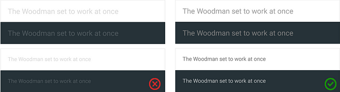
Having the right amount of characters on each line and proper font size is key to the readability of your text. A good rule of thumb is to use 30–40 characters per line for mobile.
Below is an example of two sites viewed on a mobile device. The first one uses 50–75 characters per line (optimum number of characters per line for print and desktop), while the second one uses the optimal 30–40 characters.

Space
Good spacing aids readability. By adding a little space to text you are helping users better interact with the words. A good place to start is in the 10 to 20 percent range.

Color
Finding a proper color contrast for text can be tricky when you design for mobile. What looks good on designer’s monitor could appear much different on the user’s screen simply because users might be outdoors with low contrast on the screen because of lighting.

WC3’s Web Content Accessibility Guidelines are a good place to start. They set minimum standards for contrast so that users with moderately low vision can read your text. According to the WC3, the contrast ratio between a color and its background ranges from 1–21 based on its luminance, or intensity of light emitted. The W3C recommends the following contrast ratios for body text and image text:
- Small text should have a contrast ratio of at least 4.5:1 against its background.
- Large text (at 14 pt bold/18 pt regular and up) should have a contrast ratio of at least 3:1 against its background.
But once you’ve made your color contrast choice, it’s absolutely necessary to test it out with real users on most devices. If any of the test show a problem with reading your copy, then you can be sure that your users’ll have exactly the same problem.
Prioritize Content When Responding To Text-size Changes
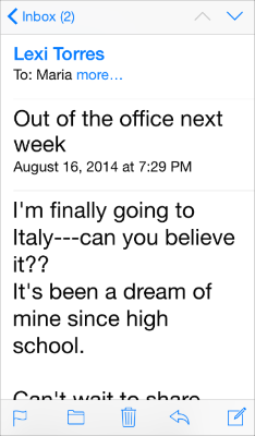
Not all content is equally important to users. When users choose a larger text size, they want to make the content they care about easier to read; but that doesn’t automatically mean that they want every word on the screen to be larger.
For example, when users choose a large accessibility text size, Apple Mail displays the subject and body of the message in the large size but leaves the less important text — such as the date and the recipient — in a smaller size.
One App, One Typeface
Use a single font throughout your app. Mixing several different fonts can make your app seem fragmented. When designing an app think about how can you make the typography powerful by playing with weight and dimensions, not different typefaces.

A safe bet is to rely on the platform’s default font. Apple uses the San Francisco family of typefaces to provide consistent reading experience across all platforms (the San Francisco font for iOS 9 is called SF-UI). Roboto and Noto are the standard typefaces on Google Android and Chrome.
Conclusion
As Oliver Reichenstein states in his essay “Web Design is 95% Typography”:
Optimizing typography is optimizing readability, accessibility, usability(!), overall graphic balance.
This statement is relevant not only for web, but for all UIs. Because text directly related to the communication. So by optimizing typography in your product you also create better visual language that you use to communicate with your users.
References and related articles:
- “Typographie”, E. Ruder
- Tips for Designing Better Mobile Typography
- WCAG 2.0 (Color Contrast Section) and WebAIM Color Contrast Checker
- Choosing the Right Font: A Guide to Typography and UX
Thank you!
Originally published at babich.biz
