Most common color in Design
Why people love to have blue color in their applications

The color is one of the most complex components in this world. I believe that you already know the topic that I am going to talk in this article. The color is a beautiful topic to be discussed. The color is a way of generating emotions and create meaning for objects. The colors have been in the human communication from the beginning of the time. The colors have shown values which are different to each other in different cultures. I have explained it in one of my articles.
The color blue has a significant value in design. I read through different articles that talk about the color blue. The common fact is that we write about the same things. The color psychology as we know differs from location to location, culture to culture and society to society. Most of the theories which we see are base on researches done on the different part of the world. There are some universal theories and some nonuniversal theories when coming to color. Let’s take a deep dive into understanding the color blue.
The color blue

The color blue is one of the most visible colors to the human eye in this world. The blue color is everywhere in this world. The sky, the sea is the most visible objects to humans. Both elements bring calmness and happiness to our mind. The color blue is considered a cool color. The blue color which is reflected by the objects enters the eye of the human retina. The eye muscles don’t have to strain and make an extra effort to deal with the color blue. That is the first emotion of the color that the human mind gets. It is quite easy to look at the color. When it is easy to look at objects with the aspect of color, our mind we feel comfortable to look at them. The body produces chemicals which can calm our mind and body when interacting with the blue color. The color measurement can explain this scenario better.

It is quite difficult to describe a specific color spectral energy distribution because of the human eye perceives only a single color for any given energy distribution. Measuring the color has to be done in a perception manner. The diagram I have shown here was also a perceptive view of color measurement. This diagram is based on the values of x, y, and z (where x = X/(X+Y+Z), y = Y/(X+Y+Z), and z = Z/(X+Y+Z)). Furthermore, because x + y + z = 1, if two values are known, the third can always be calculated and the z value is usually omitted. The blue color wavelength stays at ~ 490–450 nm making it more pleasing to the eye.
Most of the people don’t come to terms with gender being a valuable asset when coming to the understanding of color psychology. There have been many investigations into understanding the gender preference into the color. Early studies of the color psychology have tried to show the connection between the human gender and the color. St. George (1938) ) maintained that blue for men stands out far more than for women. An even earlier study by Jastrow (1897) found men preferred blue to red and women red to blue. Eysenck’s study, however, found only one gender difference with yellow being preferred to orange by women and orange to yellow by men. This finding was reinforced later by Birren (1952) who found men preferred orange to yellow; while women placed orange at the bottom of the list.
Previous research has indicated that subjects perceived warm-colored environments as less attractive and less pleasant than cool-colored environments (Bellizzi & Crowley, 1983). However, according to the evidence gathered from this study, subjects in this study appeared to be more affected by the combination of color properties such as hue, value, and chroma, than by the coolness or warmth alone. In other words, the subject’s impressions of color seemed to be more subtle and affected not just by the coolness or warmness of the color palette, but also by the calibration of value, chroma, and contrast used in the interiors.
The researches conducted on the color and gender are mostly done in a closed environment related to one single culture or area of the world. There is still room into understanding the connection between color and gender.
The color blue is considered to mention different aspects when coming to culture and countries.
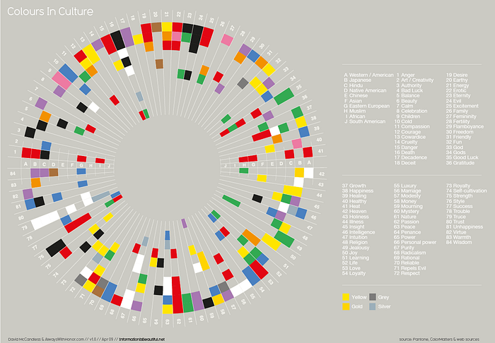
The graph is taken from Information beautiful website shows that there are some differences and similarities on cultures when come to showing color and its meaning. A simple dive into the values of a few major religions can explain how they use the color to express the core value of the religion.
The color blue is universal for designers
As a designer, when you design new libraries or designs you have established meaning for colors such as red, green and yellow to show specific information such as error, notification, and caution. That makes the color blue much more suitable color for designers.
Blue color and color blindness
The color blindness is one of the common accessibility issues when coming to product design. The color blindness can be in different stages with a different disability to see the color. More than 99% of color blind people can actually see color. The color blindness has different types of visual deficiencies.
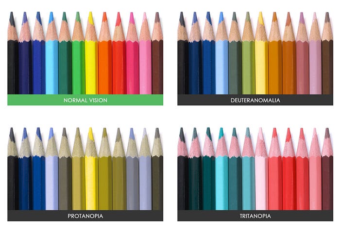
In most of the visual impediments in vision the blue color is much more visible to the human eye. That is why most commonly the blue color is being used in many applications.
Conclusion
The color blue is one of the colors that can create a better interaction when comparing to other colors. It does not mean that it is the best color and you have to use it in every application. You have to think about the product branding, target groups, and the message that you are telling by the application and use blue color meaningfully.
I am my own research into understanding color psychology and hope you can support me in it. I have added the link below.
These are the resources I have used.