My Personal Experience as a Visual Designer
Enough with the generic graphic design concepts? Here are some hands-on tips for you.

What’s the problem?
You are either an enthusiast of graphic or make a living out of it. You find yourself stuck in a bottleneck and cannot deliver satisfactory graphics / visuals. Despite that you have flipped through online and offline materials, you desire something more than generic concepts.
Who am I to give you suggestions?
I am like you. In the past 5 years, I have been dedicating myself to visual and product design. And on top of that, I find it rather appealing to me. I started as a techy industrial designer, and trust me, I have been through bottlenecks one after another and I know along this path there is never a finish line. You will always be improving. I took courses and read books regarding graphic design and found it’s actually the experience that matters more than those terminologies.
Contents
The main content of this article is very simple. In short, it’s divided into 3 sections: typography, color and graphic, all based on my first-hand experience.
Typography
This section includes typeface, size and style. In short, it’s all about the text.
- Typeface
There are mainly 2 typeface styles: Serif (I put Slab Serif under it) and Sans Serif. “Serif” is a word originally from Dutch and means “a small line attached to the end of a stroke in a letter or symbol”. This kind of typeface all has additional parts besides the letters themselves. These additional parts, or “serif”, are reproduction of human’s natural handwriting. They can be found in most languages. While “serifs” are usually smaller in size, they can be equal in size as the base letter, and such typefaces are called “Slab Serif”. A typeface without “serifs” are called “Sans Serif”. “Sans” is a French word meaning “without”. Each typeface has a number of representations which are called “font family”, or “font” in short. The most common font is Times New Roman for serif and Arial for sans serif.


Back to business. What I really want to share here is not these concepts, but the choice of font. Influenced by their history, Serif and Sans Serif fonts are used in different occasions. Since Serif is a mimicry of handwriting, serif fonts are most common at novels, journals and academic institution websites, etc. expressing a traditional and formal sense. Sans serif fonts however, are simpler, more direct, expressing a modern and scientific sense. They are often found in digital product commercials, etc. What I found quite interesting is recently such balance is being broken — serif fonts are used on modern entertainment websites. This sometimes creates a chemical reaction.
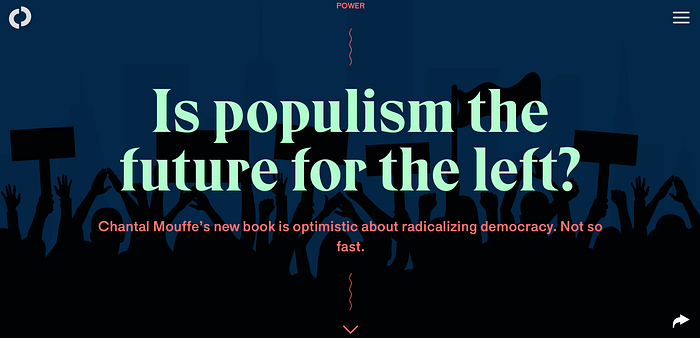
I don’t want you to be refrained by where font is commonly used — I encourage experiment. The bottomline is contrast. If you cannot decide which font to use, it’s simple. If the background graphic is complex enough, try using a simpler typeface like sans serif.

2. Size
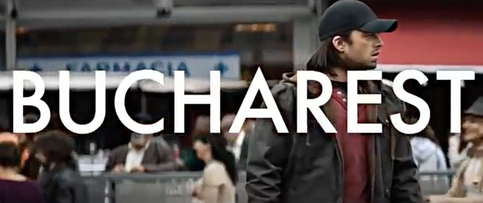
There is one rule about font size that I find worth following, from my experience: the busier your backdrop is, the larger size you should choose for your text.

3. Style
I will leave out italic, kerning, alignment and other stuff and only focus on weight in this part.
First, in terms of legibility, the smaller your text is in size, the bolder you should make it in weight. By doing this, you will also be able to make texts in different sizes look uniform in style.

Another thing to bear in mind is that the bolder the text is in weight, the less legible it become. Therefore you do not want your small text to be too bold. This issue also becomes more apparent when the graphic is in color.

Color
So much for typography, let’s talk about color — the most challenging yet also most engaging aspect of graphic design in my opinion. Many designers have tripped in playing around with colors. What makes color hard is that it’s rather subjective and besides accessibility concerns, there is not enough criteria for you to follow, at least not in the book. Below is some patterns from my work experience that may be worth your attention.
- Saturation and brightness
First, let the graphic explain the notions.

Second, here goes pattern 1: Decrease saturation as you increase brightness. What this means is that these are your safe spots to play around with colors.

Feeling doubtful? I reiterate that color is a rather subjective topic, but I list two graphics down here for you to feel the difference.

2. Hue and contrast
Hue is somewhat synonymous to what we usually refer to as “colors”. Red, green, blue, yellow, and orange are a few examples of different hues. The different hues have different wavelengths in the spectrum. — Colorsontheweb.com
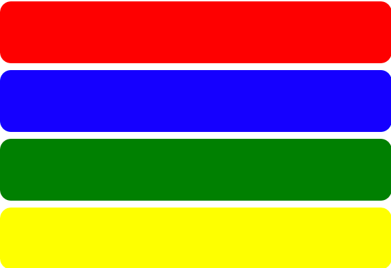
Contrast is what actually matters. We use hue only to enlarge contrast. The ability to control contrast within a satisfactory range is art. If the contrast is too much, your graphic becomes repellent — that’s why we do not pair green with red. In a UX perspective, excessive contrast tires the optic nerves and causes fatigue. And on the other hand, insufficient contrast makes your graphic illegible.
To create appropriate contrast with hue, you need to know color temperature and complementary color.
Align the secondary colors from red, the color temperature is defined as decreasing from red.

Bend this line and you get a circle which is called a color wheel. Complementary colors are pairs of colors that are opposite to each other on the wheel.

If you pair complementary colors together, the contrast will be too strong; if you pair adjacent colors together, the contrast will be insufficient. There are some ways to create appropriate contrast.
First, pair colors that are far away from each other on the color wheel but fall within the same color temperature range. Take red for example, do not pair it with green or blue, try pairing it with yellow.

However, if you are looking for something frenzy, it’s not really a big deal to break the above rule. Actually, it’s not uncommon that designers even pair complementary colors together. But what they do is to differentiate the brightness or saturation.

Besides complementary colors, one trick I use quite often is to extract a color from the graphic and give it to the text. This allows you to give your graphic a more “harmonious” feeling in whole.

Graphic
I was once asked “How do you create an organic backdrop?” I think the answer to that question is the main idea of this section: Go back to nature and use actual objects. For example, photography. You can create a backdrop from it but I would not suggest generating CGI graphics out of thin air.
For instance, below are two graphics that share the very same theme, but the left one is way less visually compelling.

I will keep this article updated if anything comes across my head. If you find this article useful, please leave a clap-clap👏🏻. Also if you have a different point of view, feel free to leave a comment. There is no uniform answer to graphic design questions since aesthetic is subjective, but still we can improve ourselves by learning from each other. Cheers!
Find me on LinkedIn: https://www.linkedin.com/in/darrench
My website: https://darrenchang.myportfolio.com


