Member-only story
Netflix’s UX Flaws Everyone Stopped Noticing
I tried Netflix for the first time in 2023 and I’m not amused.

Don’t judge: I’ve never used Netflix before. Double-don’t-judge: I write for a popular streaming service, and I’ve never used Netflix before.
I wanted to see the MH370 documentary (not worth googling — it’s no good), so I bought a subscription. Three weeks of daily use later, it’s time for a UX review.
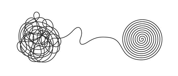
The goal of this article is not to show off my skills as a “design critic” or a UX writer but to point out the flaws of the platform so popular many of us have no choice but to use it.
Mind that I’m reviewing the desktop version.
The “vibes” and style
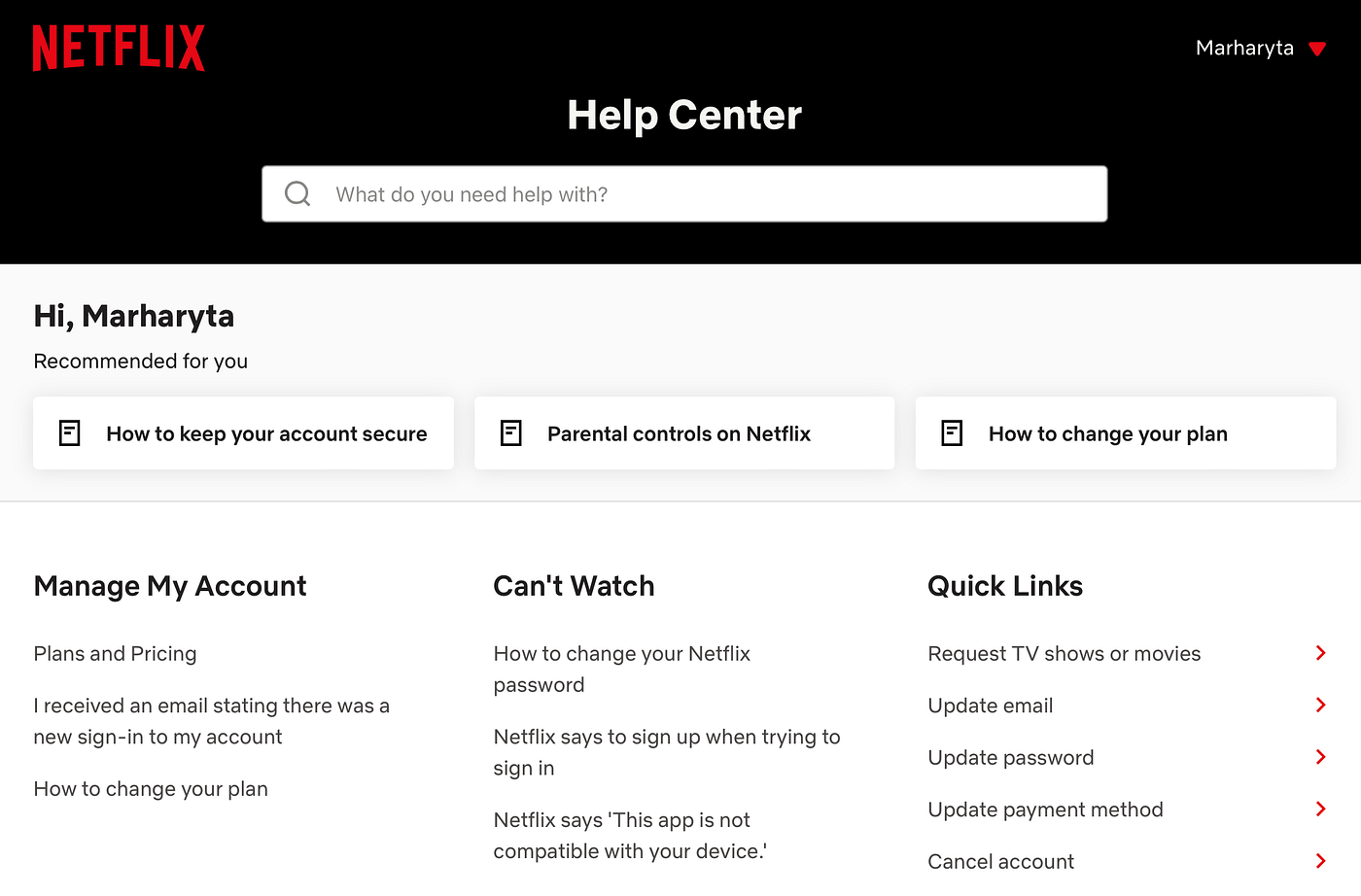
Netflix is one of those platforms that don’t really have a “style”. Rather than that, they have 2 dominant colors — black and red, and the streaming content takes the rest of the space. To see how truly minimalistic and simple Netflix is, it’s enough to go to their FAQ page:
Netflix creates a non-intrusive, seamless vibe by dissolving its own style in the content, which works just fine for the final goal — to keep the user consuming.
The scarlet logo reminds me of the Hollywood grandeur and that crisp, newborn-like perception you get when you exit the cinema after a movie. The “N” icon for their mobile app looks like a Hollywood red carpet, which is ultra cool:

The platform’s dark color palette is purposeful, of course. The background is black, so you don’t go blind when binge-watching Korean dramas at 1 AM. With the dark background, however, comes the arch-enemy of many UX writers — the white font. I’ll discuss it in more detail below.
First impression
My first impression? A bit overwhelming. So many different covers are staring at me at once, with a trailer already playing in the website’s…