Neumorphism Design: The Future of UI/UX Design?

Neumorphism is a design trend that blends skeuomorphism with flat design to create a soft, minimalist, and realistic visual style. Buttons and other design elements in neumorphic UI designs sit on top of the background surface in a raised form. Since neumorphic elements appear slightly elevated from the background surface, they feature shadows and textures.
This type of arrangement adds depth and texture to the design and gives viewers a sense of three dimensions. Neumorphism was created by designer Alexander Plyuto in 2019. The following design was an image that popularized the concept of neumorphism.

Once this image went viral, UI/UX designers from across the world started making their own renderings of what neumorphic design should look like. The term “neumorphism” was coined by anonymous users in the comments section of designer Michal Malewicz’s article on the topic. The idea behind the name was simple:
New + Skeuomorphism = Neumorphism

You see, the only reason why Alexander Plyuto created neumorphism was because he felt that the design world was treading away from skeuomorphism. His idea was to create an interface design where modern apps were presented through the lens of skeuomorphism. So, is neumorphism the future of UX design?
To answer that question, we need to better understand Plyuto’s reasoning behind creating neumorphism. And to do that, we need to take a deeper dive into the world of skeuomorphism.
What is Skeuomorphism?

Skeuomorphism is a commonly used term in the world of graphical user interface design. It refers to any design element/interface that simulates real-world items. A famous example of skeuomorphic design is the recycle bin icon on Windows. This icon resembles a real-world object that everyone’s familiar with: a trash can. And so, PC users associate this icon with discarding files and folders that are no longer necessary.
In terms of design psychology, skeuomorphism is related to the concept of “affordances,” which was termed by ecological psychologist James Gibson. The term “affordance” refers to the action potential of objects in a familiar environment. For example, just by looking at the designs of different door handles, you can tell whether they’re meant to be pushed, pulled, or rotated.
Here’s a visual representation of well-designed doors that offer affordances:

Skeuomorphism in the world of UI design is the practice of integrating affordances in digital interfaces. Skeuomorphic design elements fit with our natural, preconceived understandings of objects, but in the digital world. Skeuomorphism had its moment under the sun when the first iPhone was launched by Steve Jobs.
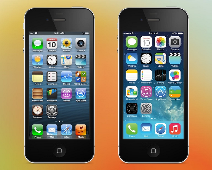
According to Jobs, unless UI design elements mimic or simulate real-world objects, new users won’t feel a sense of ease on digital interfaces. That’s why the Notes app on most of the earliest iPhones and iPads looked like an actual notepad:

In fact, almost every app icon on the earlier versions of the iOS interface featured skeuomorphic design elements:
The Fall of Skeuomorphism
As users familiarized themselves with the iOS interface, Apple’s design team understood that users no longer needed to be reminded of real-world objects to feel at ease. That’s why when they unveiled iOS 7, the interface featured little-to-no skeumorphic design elements. Here’s a comparison of iOS 6 and iOS 7 UI designs that demonstrate this transformation:
No more shadows. Fewer textures. Reduced presence of skeuomorphic icons. That’s what happened when UI designers decided to focus on decluttering digital touchpoints with the sole intention of increasing loading speed.
The Rise of Flat Design
When you strip away shadows, textures, and affordances from skeuomorphic designs you get a minimalist, two-dimensional design style. This style of UI design is called “flat design.” Other core traits of flat UI design include grid-based layouts, minimalist typography (e.g., sans serif fonts), white space, and the use of design elements as functional tools, rather than aesthetics.
Flat Design Meets Skeuomorphism

Between 2013 and 2019, flat design established itself as the perfect minimalist UI design style that’s centered around user experience. Even today, flat design is widely recognized as an effective UI design style for creating engaging yet functional interfaces that facilitate higher rates of user engagement and conversions.
But, in 2019, UI designers like Alexander Plyuto and several others lashed out against flat design. It’s true that apps/websites need to be fast-loading. But the overuse of simple, minimalistic design elements had started to make many interfaces feel “FLAT.” That’s why when a new, cooler design was on the block, several UI designers switched allegiances.
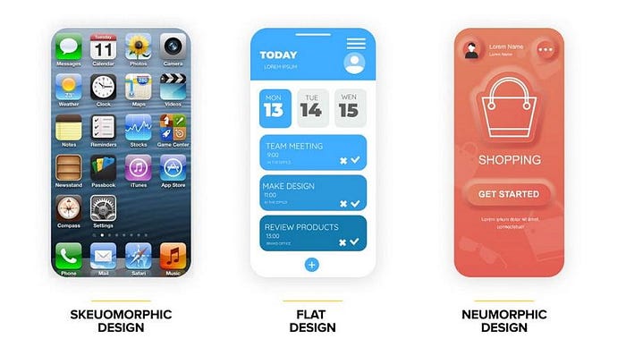
This new kid on the block was the child of skeuomorphism and flat design: neumorphism. Neumorphism sought to combine the floating-like effect that skeuomorphic designs had with the soft aesthetics of flat design. Neumorphic design has three core characteristics:
- Low contrast
- Monochromatic color schemes
- Subtle shadows
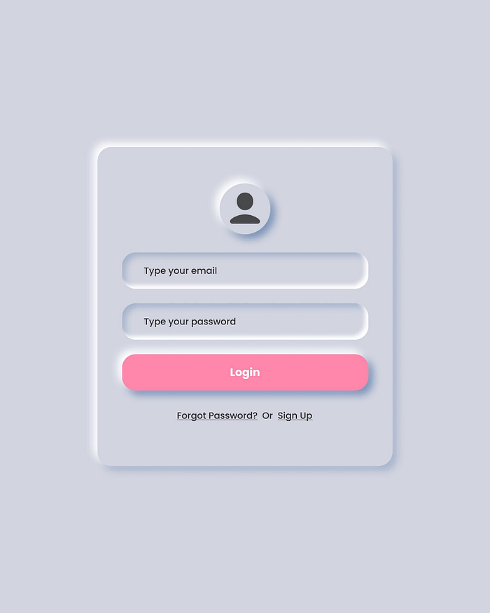
Giving design elements these features is enough to achieve the desired three-dimensional, neumorphic visual effect. Here’s an example:
The Pros and Cons of Neumorphism

Every UI/UX design trend has its own plusses and minuses. Before we can judge whether Neumorphism is the future of UI/UX design, we need to go through its pros and cons:
Pros of Neumorphism
Fresh Look
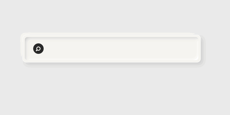
If your app or website’s UI has been flat for a while, adding neumorphic design elements can make it look fresh and eye-catching. For example, here’s what a simple search bar looks like when it’s given a neumorphic update:
A Decent Balance Between Realism and Minimalism
Neumorphic UI design falls somewhere in between the realism found in skeuomorphic designs and the minimalism in flat designs.Neumorphic designs feature shadows, colors, and textures, just like skeuomorphic designs. But, they’re not over-saturated with too many realistic visuals.
As you can see from the image above, the visual hierarchies in neumorphic designs are similar to flat designs. Both of these design styles feature bright colors and strong contrasts as well. These features help users instantly distinguish the main interface content from the background.
When done correctly, neumorphic designs can strike the perfect balance between realism and minimalism.
Consistency
Do you want to “neumorph” your interface by adding shadows and light contrasts to the design elements? Great. You can easily apply these design tricks across all design elements. Using and applying the same shadow, color, and contrast features to a UI design is easy. Hence, designers can maintain both consistency and speed during their projects. But different types of elements may need different adjustments to their shadows and lights. Just make sure to keep an eye on that.
Cons of Neumorphism
Too Much Subtlety
Overuse of subtle colors can make your interface hard to visually assess at a glance. Such issues can lead to users not being able to distinguish design elements from their backgrounds. For example, if your app features a neumorphic CTA button, users may not see it at all.
Even worse, they can press it and not realize that they’ve pressed it given that the button itself is not easy to visually assess. That’s why UI designers must always use different button colors or more robust margin contrasts whenever they incorporate neumorphic CTA buttons into their apps.
Not for All Designers
To create an accessible and visually appealing neumorphic interface design, UI designers have to test their creations over and over again until they create eye-catching color and shadow combinations. This process can be extremely time-consuming.
Neumorphism: A Timeless Design Style
Given that the UI/UX design world is inundated with new trends and developments, it’s hard to say whether neumorphism will increase or decrease in popularity in the future. But, this visually compelling UI design style will always be around. Just like skeuomorphism and flat design, neumorphism is a timeless UI design style that will always be appreciated by consumers.
The benefits of neumorphism far outweigh the cons. So, if you’re planning to create a neumorphic design for your project, go for it!
Originally published at https://www.design-studio.io.