Next Episode? The Design Patterns and Flows of Netflix.
What are design patterns?
If you’d asked me this question two years ago, I might have pointed to a tablecloth with a recurring floral pattern, making the rookie mistake of writing off design as appearance.
Design solves problems and by extension, design patterns solve recurring problems. Just as artists, scientists and mathematician draw inspiration from and build upon the work of their predecessors, design patterns are beneficial to designers. There’s a lot of time for other things when you don’t have to reinvent the wheel.
This is of help to users as well, since they don’t need to spend extra time figuring out how a certain UI element does. Design patterns define standard layouts, flows and interactions.
Some examples of design patterns are:
Forms
Input fields containing text fields, checkboxes, radio buttons, file uploads. Login/sign-up pages are a common type of form.
Navigation elements
These point a user to important parts of a website. They may comprise breadcrumbs, search field, icons.
Cards
Cards allow the user to view a lot of content at once, without having to go back from the current page.
Netflix Design Patterns
It’s no surprise that the streaming giant employs some solid design strategies to keep you binge-watching into the wee hours of the morning. The examples below are from Netflix’s desktop website.
Search
Clicking the magnifying glass icon on the top right brings up the search bar. While it doesn’t auto-complete whatever you’re typing, it presents many search results which constantly get updated as you type, leaving you with the most relevant picks. These results are easy to consume since it displays them as cards with images.
For those who know what they want to watch (if these people exist?), Netflix has a powerful search feature that digs up content even if the user types only a related word and not the name of the movie/show.
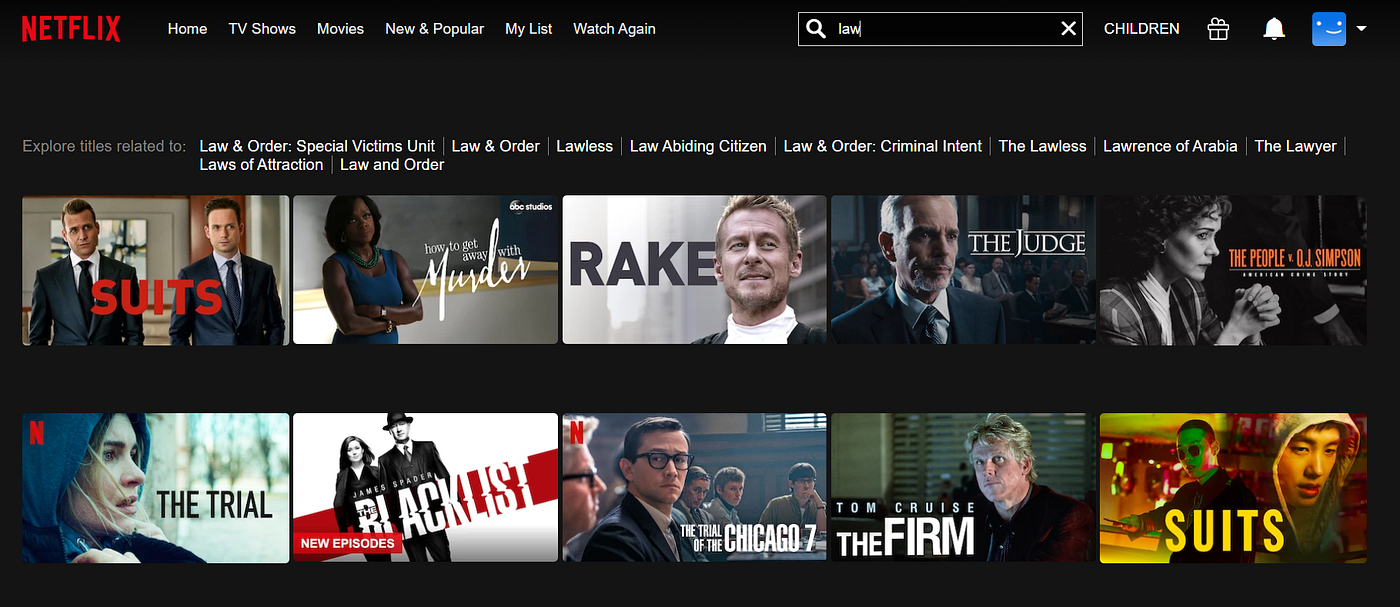
Like here — I simply typed in “law” and the system pulled up legal and courtroom dramas that don’t even contain the word in the title! This even works with character or actor names, in case that’s all you remember of the show.
One annoying downside of the Netflix search is that often, the suggestions in “Explore titles related to” aren’t even on Netflix.

Navigation
Netflix has a rather standard sticky navigation bar on the top left. With just six items, it keeps the screen clean enough to make the slew of oncoming content seem less overwhelming. The text turns bold on the selected item. Although quite subtle, it is effective in letting users know what they’re browsing.

The Account section on the top right follows web conventions and doesn’t take the user by surprise. Everything is where you’d expect to find it, no exceptions.
Player
The centre of the streaming service, the content keeps viewers glued. The media player controls are simple and visible even from a few feet away. On the left, there’s the play/pause button, 10-second rewind and forward, volume control, and the title of what’s playing.
The progress bar spans the length of the screen, indicating the watched portion in red and the rest in grey. The buffered portion is a slightly brighter grey. A timer on the far right counts down to the end, easily letting the user know how much longer the programme will last.
On the right — These are the common controls such as next episode, audio and subtitles, playback speed. The stacked rectangles bring up a list of episodes, and there is a support button too. The user can perform all of these actions without ever having to exit the player.

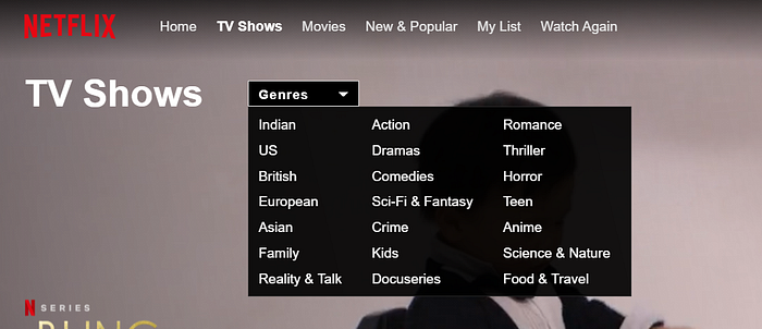
Filters
Deciding what to watch might still be difficult, but Netflix at least helps you narrow down the plethora of options by letting users filter by genre.
An interesting aspect here is that the main navigation also functions as a filter for movies or TV shows, allowing the user to narrow down choices further.
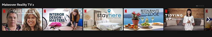
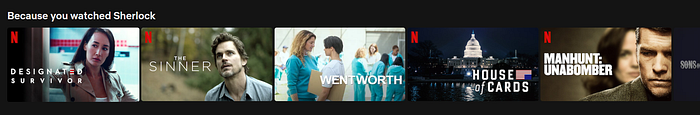
The Carousel
Another intuitive pattern used by Netflix is the carousel. To minimize overload, it groups content into categories, with a carousel for each. This system acts as another filter if you think about it.
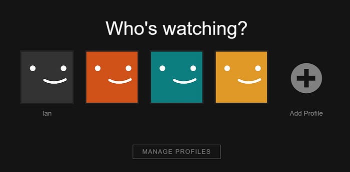
Viewer Profiles
Until Amazon Prime Video rolled out user profiles, this was what truly set Netflix apart.
The moment the user launches Netflix, they need to select “Who’s watching”, personalizing the viewing experience right from the beginning. The algorithm tailors recommendations to each user’s preferences and viewing history.
User Flows
First, what is a user flow?
While interacting with a product, there are multiple courses of action a user can take. A user flow maps these paths or flows visually — using a flowchart or diagram.
The example below illustrates a likely path taken by a user to watch something on Netflix
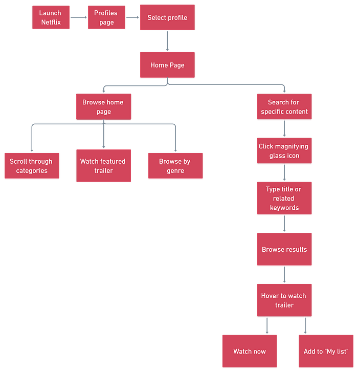
User flows are non-linear and explore various system outcomes or choices a user may make.
Netflix has made consuming content easier than ever, with the next episode or trailers loading so quickly that it’s actually more effort to exit. By skipping the end credits and immediately jumping into new content, Netflix has eliminated the need to decide whether to continue watching.
Binge-watching hazard aside, there are serious design lessons to learn from Netflix. So give yourself a break and watch that next episode. It’s educational!

