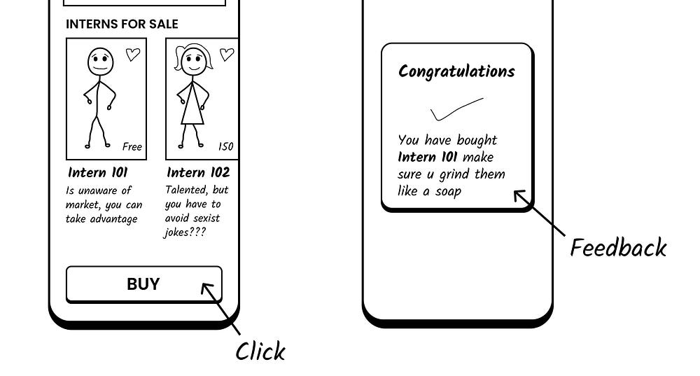
There are no endings without Feedback.
--

Inspired by true events.
While applying for a UX design internship in a Design studio, I came across a problem with their application page, Which resulted in an embarrassing story for me to tell. Which also helped me solidify an important UX principle into my brain- ( at least got something positive out of it).
So I am here to share that.
What Happened
So while applying, Like every other candidate, I filled out the Internship form name, email, Number etc. I even lied and forced myself to write why I want to join them.
Once I was done, I scrolled down to submit the form.
I clicked it once, nothing happens
I clicked it again, nothing happens
I clicked it multiple times in a row …
Nothing Happens.

Now, remember I had forced myself to write why I wanted to join them, so I was determined to submit this application. I thought of emailing it to them.
Opens Email

You guessed it. I had sent the application eight times consecutively within 12 minutes.

I felt so embarrassed by it. Some part of me said, “they might not see it as desperation but as a sign of determination” (Told ya! Embarrassing stuff this).

Why did this happen
In short- Lack of Feedback.
But before we get into lack of feedback, just for people who don’t know- what feedback is ( in this case of course ).
According to Santa Claus of Design
“Feedback is the principle of making it clear to the user what action has been taken and what has been accomplished. Many forms of feedback exist in interaction design, including visual, tactile, audio, and more. The key is to design the experience to never leave the user guessing about what action they have taken and the consequence of doing so.”

More on this topic — Here.
Also, just in case you want to know why the door is crying, Here is a Video of Santa Explaining it.

Now you have an idea of it? Okay, let us get back to the story.
So, when I was clicking submit button, It won't react or give me any feedback. Which lead me to click it multiple times in hope of some sort of feedback.
Which I did receive just in the form of an email. Feedback through Email isn’t a bad thing, but if it is Secondary feedback (that is to assure the user for the second time that their order is completed).
But it should not be your primary feedback. As no users jump to mail after buying something. Unless you tell them to check their email ( which is also primary feedback ).
Hence you need primary feedback(feedback that pops up on your screen the moment an action takes place)

Why you should get feedback right
First of all, for the sake of proper usability of the application or the website. This should be a good enough reason. But for people who need more convincing here you go
Think of how it could make your users feel,
It would frustrate and make your users angry, which will result in eventually drop in the use of the product.
I mean, look at my example. I was frustrated when the button won’t work and felt embarrassed when I saw it did. Now every time, I would apply, I would check my email. That shouldn’t be the case.

My case was still manageable. Imagine the same for an e-commerce site that involves buying.
What if a person buys the same item multiple times because of the lack of feedback?
What if a person buys multiple tickets to a concert or a flight?
These are the example that creates a peak frustrating moment for users. Things like this make sure that users would never use your application again, even if you give it for half the price.
Example of the effects of bad Usability- Here
Conclusion
When next time you are designing a flow please make sure every action has feedback. Overall the moral of the story is -
THERE ARE NO ENDINGS WITHOUT FEEDBACK!!!
If you liked the story you might like this one too —
