Nordic UX: What Minimalism Looks Like Scandi-Style
Scandinavia has never been more chic. From Nordic noir to hygge hype, Scandi is in. This is equally true when it comes to UX — in the minimalism so characteristic of the Scandi style. Minimalism is the soothing solution to the plethora of loud, cluttered designs that repel so many users.
But what constitutes true minimalist Nordic design, and how can you give your brand a hint of that simple Scandinavian style?
Simple color schemes
Perhaps the most striking element of Scandinavian minimalism is its color scheme — specifically the simplicity of it. The use of pale or monochromatic colors creates space in a room, as well as providing a sense of calm and serenity. It is this sensation that you want to recreate in your brand’s UX. When a user navigates to your site, you want them to feel at ease, not overstimulated. It is this that will keep them locked into your website or app.

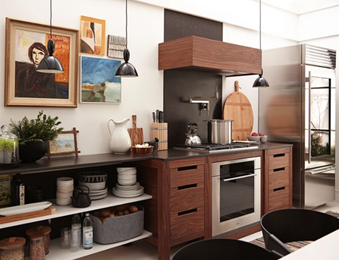
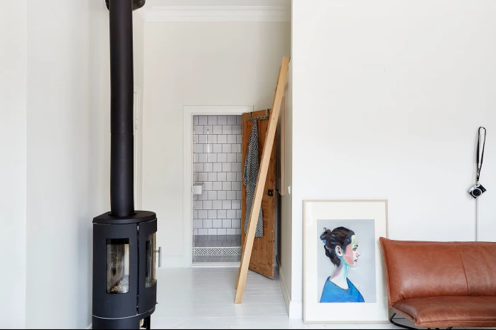
Just as someone walking into the room above would feel that sense of tranquility, so too can they experience that same sensation online. A neutral or basic color palette can create a world of difference in a room — and a website…
Take, for example, Danish creative agency Hello Monday’s website:

A pale charcoal aesthetic creates a neutral, stripped-back feel, uncluttered and unbusy for the user navigating the site. This is used in conjunction with a grid layout for the site copy, aligning the text in a neat visual lattice. This delimits the information — in turn making it easily digestible for the viewer.
If you want to bring this Scandi aesthetic to your brand, you’ll need to select colors that contrast, but keep it to a minimum. Any more than three different colors will feel loud.
If you do use three, try to keep them analogous (that is to use colors that are next to each other on the color wheel). Use WebAim’s contrast checker to quickly spot check what colors work well together.
Minimalist typography
Simplicity in Scandi-style minimalism doesn’t just apply to its color schemes — it applies to its typography as well. Clean, plain typeface is a must when it comes to implementing minimalism to UX.
First and foremost, keep it consistent: using more than one type of font is just messy, and not in keeping with the minimalist aesthetic.
Instead, you should play with weight and size to create emphasis on your copy. For instance, a large, bold font works for key information, while a more subdued typeface serves longer text. And stay away from overly decorative text: a pleasing, readable typeface is crucial to Scandinavian design.
The Swedish entertainment company Spotify does this perfectly:
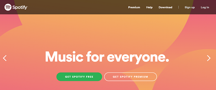
Their font (while admittedly not consistent throughout) is simple and uncomplicated. They, too, use size and weight to create emphasis and to draw attention where it’s needed.
Their value proposition of “music for everyone” is heavily bold and appears front-and-center of the page, spotlighted for the visitor. This serves as the hook for the further detail such as subscription methods and download information, drawing the viewer deeper into the site.
Functionality over form
Nordic minimalism is renowned for its functionality over form. It embodies a wholly utilitarian vibe, the design suiting its purpose down to the ground. The superfluous knick-knacks that serve no real purpose are jettisoned in favour of its ultimate function.
So how to bring this to your brand? From a UX perspective, superfluous functions such as line dividers between copy, images and similar can create visual clutter and a negative user experience. Instead, use the natural space provided to delineate between the individual elements of a website, email or app.
A great example of this in action can be found in Finnish network operator Nokia’s website:

Rather than adding a needless feature to the landscape by dividing image links with a visual element such as a line or border, the neutral space afforded by the page creates one naturally.
Creating functionality across your website output is vital, particularly when it comes to email or newsletter communications, as this is where your audience’s attention can falter. Here more than ever, you need to focus on adding value and function in the utilitarian world of the modern inbox. Look through and familiarize yourself with existing niche email templates and see what works well, and then work out ways of stripping down your down your design to its core components.
Embrace the negative space
Finally, the minimalism of Scandinavia is marked by an abundance of negative space. Just as the region itself features vast swathes of wilderness untouched by man, so too is their design characterized by unblemished tracts.
No article about Scandinavian style would be complete without mentioning the Swedish-founded retailer IKEA. Instead of focusing on their furniture though (which of course embodies the Scandi style beautifully), let’s look at their website:
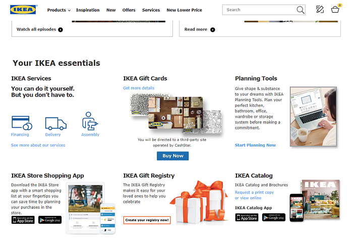
Throughout the site, they use white, negative space as a foundation upon which they display their images, copy, and so on. This creates a sense of light and openness, as well as making their products the focal point of a page. You can also embrace the same principle with a darker UX — the key here visual simplicity, not the individual colors chosen.
While you might not want to use white as part of your brand’s aesthetic, another color would serve just as well in your design. You want your viewer to focus on your content, not the background upon which it is laid.
The popularity of Scandinavian minimalism is still at a high. Its emphasis on functionality over form strikes a chord for many, and not just for interior design. Your UX too can benefit from a Nordic overhaul — from a simple color palette switch to a reassessment of your typography. Give your website the Scandi look today in order to remain on-trend.
About the author:

Half-Finnish, half-British, Nordic-lover. I love to write and explore themes like storytelling and micro businesses. I’m passionate about dynamic new startups making their way in the world.