8 Tips for Designing Inclusive Notifications and Alerts
The number one principle in Jakob Nielsen’s 10 Heuristics of usability is ‘The visibility of System Status’
By securing the first place on that list, It shows how crucial it is for an application to communicate the various system states and user action feedback in real-time!
I have been working on redesigning the notification banner component in our design system (State Street Design System) for a while and stumbled upon a few interesting aspects during my research. I will try my best to share few of them through this article :)
What is a Notification Banner? 🤔
These names can be confusing, so when I say ‘notification banner’ I’m talking about a message which is placed on top of a page or a section that informs the user of an important change or condition with optional actions or links.
Sadly there is a lack of naming standards in the world of design. It is chaos!
Categorization of banners based on functionality
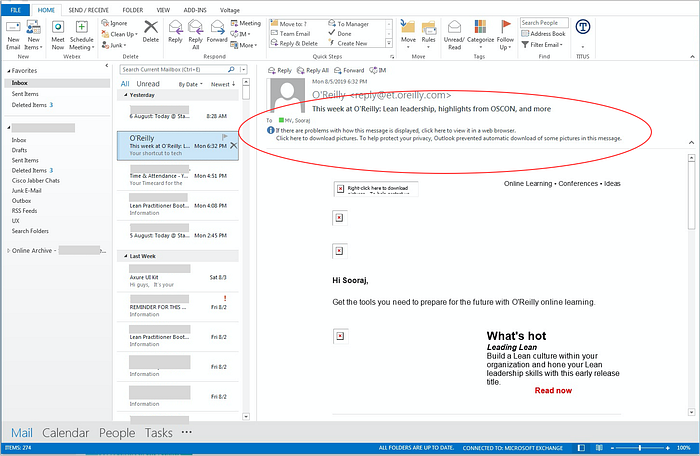
Banners can be broadly put into four categories based on their place of appearance: Global, Sectional, In-line and Toast Messages.
Global Banners are used for application critical issues that should be conveyed with prominence. Usually, they are placed on top of a page above everything else or below the global navigation bar.
Sectional Banners can be placed on a particular area of a page or top of a component they correspond to. These messages may contain a variety of content types including errors, information, attention, etc.
Inline Banners are non-obtrusive messages that address the issues inside the content area. These messages can be placed inside cards, dialog boxes, etc and provide additional guidance to the user.

Toast Messages are low priority event-driven feedback which usually doesn’t require any user interaction. They appear for a set time and disappear automatically. They are appropriate for informing the user about action confirmations without being intrusive or infer unnecessary attention. eg: Message Sent or Changes Saved.
PS. Here is an interesting read on Toast Message accessibility by Sheri Byrne-Haber: https://medium.com/@sheribyrnehaber/designing-toast-messages-for-accessibility-fb610ac364be

Usability of Notification Banners
Now we have an idea about different banner types, Let’s take a look at a few usability aspects of the component.
The utility and usability will determine the usefulness of the banner. Utility refers to the functionality of the component, whether it does what user needs or not. And the usability comes from different qualities such as learnability, efficiency, etc. (You can find more info about usability here)
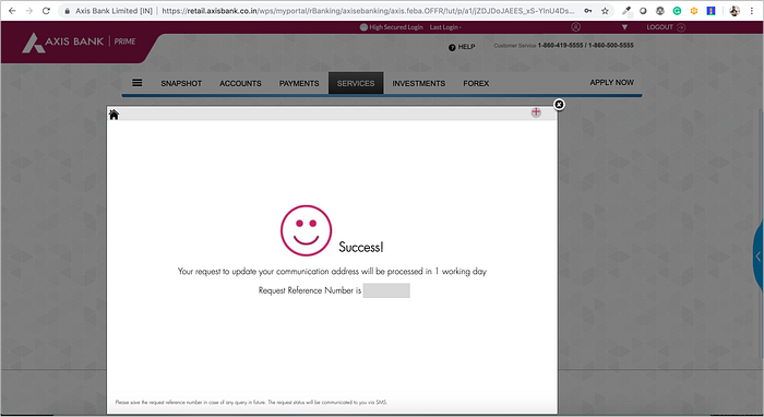
Usability-01: Avoid using Toast Messages for errors!
One of the common pitfalls in applications is to use toast messages for showing errors. These messages will disappear even before the user can understand what went wrong!
🤦♂️
So instead, use a banner without a close icon and it should summarize what went wrong, options to recover from the errors and it should persist until the issues are resolved.
Usability-02: Use proper signifiers to trigger a meaningful interaction
If the banner contains a link, make it look obvious with an underline. If it contains buttons make sure it looks like it can be clicked.
Users will not play find waldo with the interface. It’s the responsibility of a UX professional to provide appropriate signifiers in the interface to make it easy to interact with.
Usability-03: Stop disrupting the user with modal dialogs
Modal dialogs are the most intrusive way to communicate with the user. It interrupts whatever user was doing at the moment and grabs the users attention by cornering them with this dialog window. Always use toast messages or other banners that don’t interrupt the user-flow for low priority feedback and confirmation of task completions.
Modal dialogs are incredible tools to communicate the most critical and time-sensitive actions, but unfortunately, also the most overused and abused method by developers around the world.
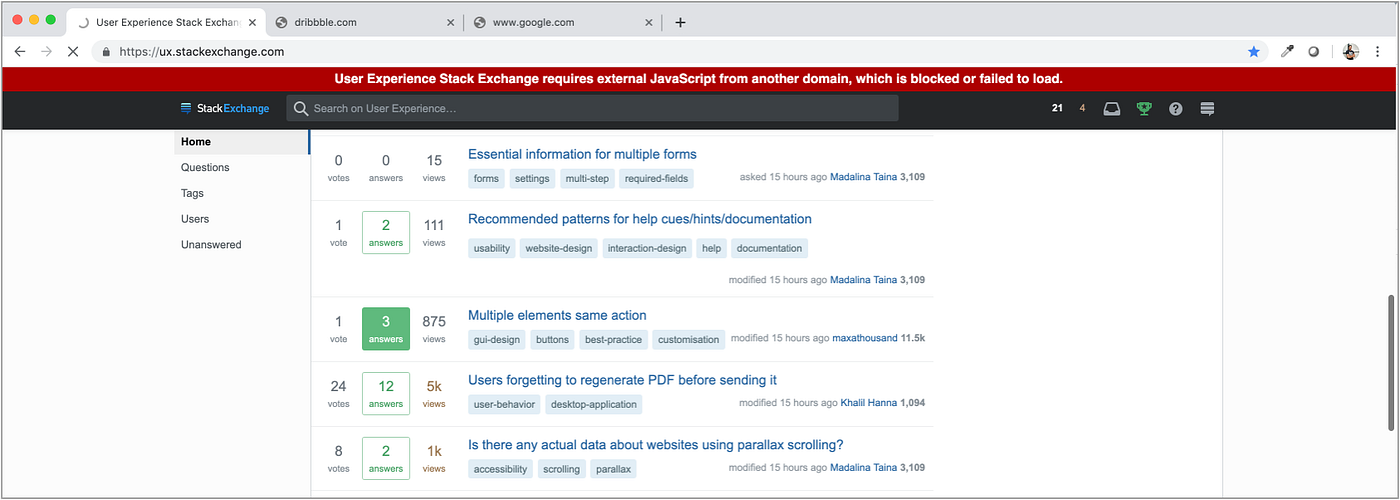
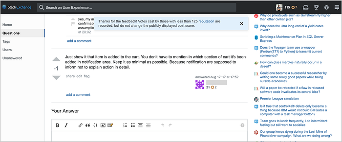
I found an interesting read on this here: https://ux.stackexchange.com/questions/40172/is-pop-up-always-bad

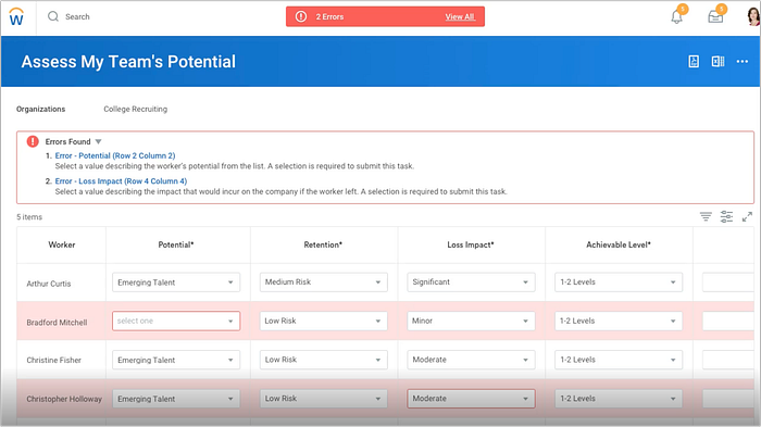
Usability-04: Summarize the errors at one place in a logical order
Acknowledging that there is a problem is a first step towards helping users recover from errors. ‘The worst error messages are those that don’t exist’ This is a quote from Jakob Nielsen’s article on error message guidelines.
UX Methods for handling errors and exceptions can be a subject for a research paper or even a book! However, I want to cover a few aspects of error recovery using banners and inline validation messages.
Charles Kettering, an American engineer/inventor once said ‘A problem well stated is a problem half-solved’ This is absolutely true when presenting an error message to a user during an interaction. Consider a scenario where there are multiple input field errors on a page or over a few pages of a complex task. The optimal way to address this issue is given below in steps:
• Summarise all the errors in a page inside a banner in a logical order
• Clearly state what went wrong with each error and what needs to be done to correct it
• Make each error message hyperlinked to the respective erroneous field
• Use inline validation message in each erroneous field in tandem with the top error banner
• Make sure the banner persist until the issues are resolved
Steps to make the Notification Banner Inclusive
Accessibility should be built-in from basic elements to complex experiences in a design system.
Regrettably, various departments from developers to product managers disregard this aspect out of ignorance or over other priorities. Here I have included some tips to make the notifications banners accessible.
Incidentally, while I was doing my research I found this blogpost by Heydon Pickering who has some excellent points about designing inclusive components.
a11y-01: Start with the basics, provide enough contrast and text size
This is a no-brainer, yet astonishingly the often messed up part even for the fortune 500s! 😐
All text in banners should provide the minimum required color contrast ratio of 4.5:1 to pass the AA conformance of WCAG 2.0 and provide a suitable font size for readability.
though I couldn’t find any specific requirements from WCAG 2.0 for minimum font size specifications, I would recommend using at least 16 pixels for body content. If there are any interactive elements inside the banner, like a close button, make sure it has at least a 3:1 contrast ratio to pass the AA conformance of non-text contrast requirements as well.


a11y-02: Avoid action items in Toast Messages
When an auto disappearing toast message pops up on the screen, the screen reader will announce the message instantly, provided that the message had an accompanying ARIA live region value. When this happens, actionable elements like links are announced as part of the message and will not make sense to screen reader users.
Consequently, it’s best not to include actionable controls inside a toast message.
a11y-03: Avoid lengthy blocks of text
Some users with reading or vision disabilities may find long lines of text excruciating to read and follow along. Use a CSS ‘max-width’ property to contain a continuous reflow of text on large screens.
According to WCAG SC# 1.4.8, It’s advised to use an average of 80 characters per line.
a11y-04: Avoid placing dynamically generated banners on right side corners
The proper placement of banners on-screen is directly proportional to the visibility of the component. Fitts’s law states that corners are easier to reach due to the pinning action of the screen, which is one of the reasons that some banners are placed on the corners.
But some screen magnifying users may fail to notice time-sensitive information due to the right side placement.
Bonus Tip: To make copy comprehensible for screen readers, write out dates completely, such as September 1, 2019, not 9/1/2019
Thank you 😊
This is my first endeavor on Medium, hope you like it! 🤞🙏🏻 🤞

