One-handed Use of Tab Bar/Bottom Navigation — Best Practices for Reachability

This story will highlight 5 best practices to take into consideration in order to meet the criteria of Reachability with a single thumb set by modern phablets when designing for the tab bar/bottom navigation in iOS and Android.
Long gone are the days when the Hamburger menu was a hot topic of discussion for optimal app navigation. The menu is situated at the very top of the screen, making it impossible to hit with your thumb on a phablet-sized display.
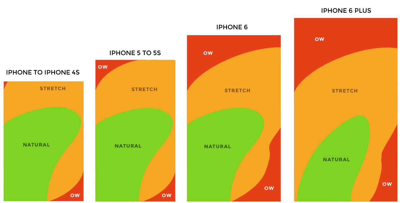
In fact, 49% of the time we use our right thumb to interact with our handheld devices, and given the growing market of phablets, your best bet is to design for Reachability at the bottom of the screen.

Using bottom navigation instead of a Hamburger menu drastically increases the use of your core app features, which if situated there are made visible for the user and are a single tap away.
Obvious always wins. Hiding critical parts of an application behind menus could negatively impact usage.
— Luke Wroblewski, Product Director at Google
1. Put search at the bottom nav to facilitate app exploration when it is core to your app
When the data from user testing or the value proposition of your app show that the search functionality plays a key role in your app, placing a search icon at the bottom nav is your best bet.
Examples of apps where searching content, ratings and questions take place are IMDb, Quora, TechCrunch, and Medium.
From the abovementioned, IMDb meets the criteria of thumb reachability the least. A redesign with the navigation at the bottom will help to meet the user’s primary expectation from the app without stretching their thumb, which is searching for movie ratings.
Currently, clicking the search bar, albeit big enough, requires a stretch, and given that users will use your app more than once a day, slowly it will be perceived as hard to use, especially when on the go.
The picture below shows where the search icon/field is currently situated in some of the leading content discovery apps.

2. Taking it a step further: Making double tap on the search icon bring up the keyboard
Building on top of the previous best practice, when data of users’ activity in the app shows high use of the search functionality, you can work on removing the second obstacle in the way: requiring users to stretch to reach the search field at the top and press it to bring up the keyboard as in IMDb’s app.
Currently, users tap once to open the search tab. Then, the search field appears the very top of the table list and we have to stretch to reach it. To solve this issue, different interactions in some of the leading apps automatically highlight the text field and bring up the keyboard. The interactions per app are the following:
Spotify & Soundcloud — the latest update of the music streaming platforms allows users to double tap the search icon to start writing search terms right away
Instagram, Twitter & Tumblr — users can hold the search icon to start writing search terms right away
In Shutterstock, a single click on the search icon brings up the keyboard and you can start typing right away.

3. The More tab/destination, a better alternative to the Hamburger menu for Reachability and feature discoverability
First of all, it is helpful to clarify that you should never use more than five destinations at the bottom navigation according to the Google’s Material Guidelines.
Additionally, do not combine tabs and bottom navigation:
Combining bottom navigation and tabs may cause confusion, as their relationship to the content may be unclear. Tabs share a common subject, whereas bottom navigation destinations (tabs for iOS) are top-level and disconnected from each other.
Google allows the combination of bottom navigation and navigation drawer. One app that follows this proposed solution is their Google Photos.

Let’s discuss this proposed combination. First, as an old tradition, the Hamburger menu, hard to reach, will hide additional features and you give the user less chance to explore your app. Second, you introduce two navigation modes to the app instead of one. So, is there a better solution?
Try adding a More icon tab (destination for Android). When the Information Architect (or a designer with this skill) has failed to group all the content behind the limited number of icons (up to 5) at the bottom navigation, or there are various features that cannot be combined in a single destination, you can consider a More tab. However, you have to take into account one consideration: whether to display the tab with an icon or only with text.
Comparing to the Hamburger menu once again, an A/B testing run by James Foster shows that simply labeling the Hamburger menu as “MENU” leads to more engagement compared to using a symbol of three lines.

Apps such as Wish and Facebook follow a bad practice of using an ambiguous icon as the lines icon shown above, which in their case strikingly resembles the Hamburger menu, with no text underneath as a backup hint. Users will press the icon without recognizing what they will find behind it (text hint will solve the recognition versus recall dilemma here), and to their surprise, a table list of options including user’s profile and Deals will appear.
So for ambiguous buttons such as Menu and More, the best practice according to James Foster’s A/b testing is to simply put text without an icon. There are two possible scenarios: when you supplement all your bottom navigation icons with text, a three lines icon with the text More underneath as in Shutterstock and Dribbble could be considered.

However, when none of your icons have accompanying text as in the example below, then refrain from using an ambiguous icon for the More tab and simply use the text More.

Lastly, you are free in choosing how to show the content inside the More tab: whether as draggable icons (Dribble), or as a table list (Wish, Shutterstock, Facebook). The rows of the table can be separated into labeled sections (plain) or displayed in groups (grouped).
For now, some additional testing is needed, but you’ll already be a step ahead of the competition in making the destination more self-evident.
4. Move the Notifications to the bottom nav bar to increase engagement when it is core to your app
Another feature that could be moved to the bottom nav if it is part of your app value proposition or is one of the most used features is Notifications. Often placed at the top of apps built around community activity, such as being followed in and sharing with the community, app developers are now starting to move it to the bottom for increased app engagement and reachability.

For example, the photography app 500px and social apps such as Behance, Instagram, Facebook and Twitter all fall into this category and have moved Notifications to the bottom, as they have it as a core feature.

5. Replace the bottom navigation/tab bar with an “X” button to close a popover & move the Back arrow to the bottom to navigate back in the popover
You can gain inspiration for this practice from Pinterest. Their app opens related articles in a popover, and this popover can be closed by tapping an “X” button without stretching your thumb.
They took this interaction with the reading content a step further by allowing users to go back to a previous article opened in the same popover by clicking the Back arrow at the bottom, instead of the top where we will find it in most iOS apps.
Yes, you are breaking Nielsen Norman’s rule of putting menus in familiar locations (putting UI elements such as a back arrow at the top where users expect to see it from using other apps), however you are keeping new rules set by phablet-sized phones: reachability by thumb, faster app navigation, and thus ease of use and user satisfaction.
If more apps implement the practice of confining the key sequential interactions to the bottom navigation, this thumb interaction will get familiar to users faster.

I hope my story inspired you to design a bottom navigation/tab bar for increased reachability! Giving some claps will be much appreciated! 😍👏🏼 👏🏼
Follow me on Medium for more articles like this! 🙌🙌
Let’s connect on LinkedIn! 🙌

