UX CASE STUDY
Oneclick | Simplifying WiFi authentication at VIT University
👋 Say Hello! to Oneclick


Oneclick is an android-based wrapper app built for students of VIT University which focused on improved accessibility, User Experience, and speed of authentication process. The app gives the power of managing multiple WiFi accounts, data usage, and authenticating with a single click, along with some cool features like Incognito Login, Sleep timer, and the Dark mode!
🎈 What’s so special about Oneclick?

It was a fun-filled 1-year journey of making Oneclick possible! This app is my dream come true for being a part of Oneclick from scratch till production 😍. Since the WiFi portal of our University was changing along with the changing requirements from our users, it took a longer time than we thought.
🤹♀️ My Responsibilities
- All the Illustrations, Visuals, Animated prototypes were created by me from scratch 😁.
- And, Multiple Design iterations were performed to reach the Final Design with lots of patience 🐌.
- I was responsible for the entire UX process, Micro-copy writing, Icon Design 🔁.
- I was also responsible for Content Strategy and User Flow optimization 🎮.
- Finally, Lots of learning • Lots of research • Lots of collaboration and teamwork!
🔁 The design process
- (Understand) Observed the users & their problems being faced very closely.
- (Qualitative data collection) Talked to users about their experiences, personally used the existing solution, traveled along with the users for around a week to know them better about their usage behavior.
- (Quantitative data collection) Interviewed the WiFi service providers to get some numbers about the users, devices, data consumed, traffic volume, etc.
- (Make sense out of) Analyzed and collected important data points from the Research & also the existing solution.
- (Get inspired) I took various real-time applications and their methods of solving as my inspiration, and dribbble for my visual inspiration.
- (Mind Sketch) Get started with some initial ideas and sketching in mind.
- (Design-Test-Iterate) Start with the UI design prototype and test it with users ASAP — Repeat until a fully satisfied & optimized solution is obtained. For me, it was 4 iterations.
- (Developer Hand-off) Export and share all the required assets, measurements, values to the Developer after testing the final iteration once with him.
- (After develop — Usability testing & iterate) Once the product is ready to deploy, test it various devices and users to know how your designs speak and behave to user’s interactions. Once the testing is over, I listed all the pain points and bugs, redesigned the UI slightly and deployed once again. I followed this iteration process until we achieved an ideal app.
🎯 Design goals
- Reduce the time taken for WiFi authentication.
- Provide 3–4 modes of authentication to cover every type of user.
- Design a wrapper Android application with improved UX.
- Solve almost all the problems faced by the Target audience.
- Integrate additional features for improved productivity.
🎬 Pre-credits
Vellore Institute of Technology, Vellore in India is one of the top private institutions in India. There are around 31,000 hostel students inclusive of boys and girls, and every hosteller is given a WiFi credential to access the internet(10GB/month). Students can use the WiFi services which is provided by Vellore Online systems both on laptops and mobile phones, they just need to enter their WiFi credentials on the authentication page and it’s done!
To manage this heavy crowd, they use routers with multiple antennas and also dual bands (2.4G and 5G). WiFi services will be shut down from 12.30 AM to 4.00 AM as per college rules.
👨👨👦 Target users
We are solving for 31,000 Hostel students of VIT University.

🤔 Problematic
Let’s get to know the existing solution to get better insights about the problems being faced,

🌊 Existing User flow

😐 Problems faced by Target users

- A lengthy and tiring login process which almost takes 20–30 seconds.
- Every user has to remember his/her login credentials every time— an increase in cognitive load.
- Users cannot manage multiple WiFi accounts.
- Users cannot keep a track of their monthly WiFi renewal date and their data usage since it’s just 10GB/month for a student.
- Frequent signal drops during peak hours.
- Due to the high-speed internet, there is no hassle in using Netflix or any other online streaming service which causes addiction and a decline in academic concentration.
🤩 Getting inspired
Let’s explore how Google & RailTel has solved a similar problem and for a larger audience!
RailWire is a retail Broadband initiative of the RailTel, RailTel extends broadband and application services to the masses through the RailWire platform. RailWire leverages RailTel’s considerable infrastructure and presence pan-India.

The project is called Railwire — The Railway WiFi is a free 30min WiFi service provided to every Indian Railway (IRCTC) passenger during the time of boarding.
🤔 What’s the problem?
The problem is almost the same, how do we authenticate passengers to provide them the Free WiFi service without taking much of their time (Because they are already in the mood for travel and we don’t want to ask them for signup and other stuff).
😎 How did they solve?
They solved the problem with a simple OTP (One time password) which does not involve any signup or remembering password.


🧐 But, how did they monetize this?
Every passenger who is trying to use the WiFi service is shown a 30-sec advertisement during their authentication process which keeps them engaged and also generates revenue out of it.
Many digital posters of other Google products are also shown during the authentication process.
🔍 Researchy Insights

- The total number of WiFi users in the University hostels is 31,000.
- The average WiFi authentication count,
Between 8:00 AM — 6:00 PM is 1,500/hour
Between 6:00 PM to 12:30 PM is 800/hour - Possible reasons for authentication failures,
a. Incorrect password
b. WiFi account has expired
c. Network failure
d. Concurrent sessions/Multiple session - Data usage limit was 10 GB (Before Jio was released) and 200GB (After Jio was released).
- Average monthly data usage 10 GB (Before Jio was released) and 25–50 GB (After Jio was released).
- College hostels are equipped with High-end Dual-radio access points,
Motorola — AP650, AP622, AP7532
Ruckus — R7962, R7372, R7363, R500, R510, R600, R610, R7982
Mojo — C65
Cambium Networks CNPilot — E600 - The average number of users using VIT WiFi service,
Before 9:30 PM is 8,500 to 9,000 users
After 9:30 PM is 11,000 to 12,500 users - The highest number of users using the WiFi service at the same time is 14,500.
- Device demographics,
60% of the traffic comes from Mobile/Tablet devices
40% of the traffic comes from Laptops and PCs
🕶 Understanding the plot
This project underwent 4 design iterations considering better Information Architecture, UI stability, Accessibility, and many more factors. As I learned more about the problem and also improved my design skills, the User Interface with its unique experience also improved. In addition to this, I did not find any online inspiration to support this kind of problem-solving in the field of WiFi authentication, which encouraged me to create some magic!

🌈 More visuals
- Check out Iteration 2’s extensive User Interface,
Onboarding: http://bit.ly/Oneclickv2onb
App UI: http://bit.ly/Oneclickv2app - Check out Iteration 3’s extensive User Interface,
App UI: http://bit.ly/Oneclickv3app
🧬 Anatomy of the Final design

😀 Onboarding users
📳 4 Modes of login
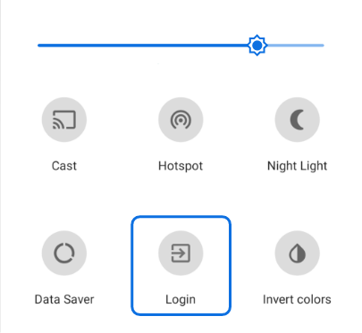
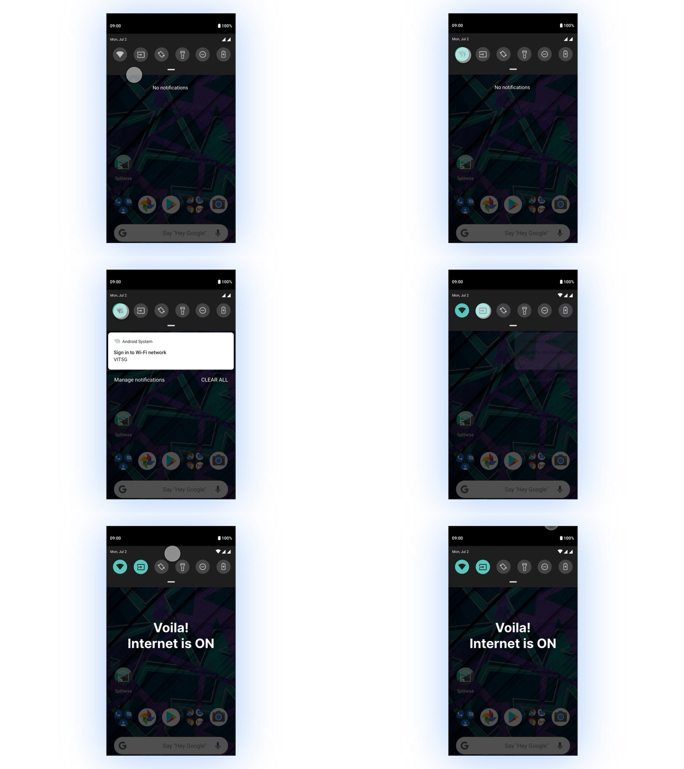
#1 Quick setting tile
Quick Settings Tile is a fairly new API, introduced with Android 7.0 Nougat (API 24). It enables developers to add custom Tiles in the Quick Settings menu in addition to the existing ones such as WiFi, Bluetooth, Airplane Mode, etc. which can be seen while pulling down the Notification drawer.
This enables users to save time and effort to login.
#2 Homescreen widget
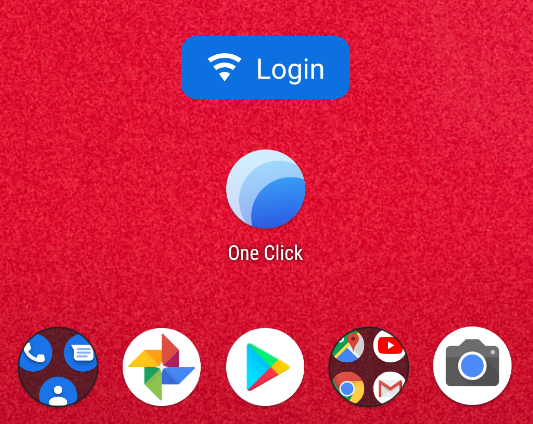
App Widgets are miniature application views that can be embedded in other applications (such as the Home screen) and receive periodic updates. These views are referred to as Widgets in the user interface, and you can publish one with an App Widget Provider.
This just behaves like an app that is as quick as Quick setting tile.
#3 Auto Login
This feature is the solution for frequent connection drop-outs which monitors the WiFi signal and initiates the login process as soon as the connection drops. Whenever the user turns this feature ON, it’s magic begins to follow your WiFi.
#4 Normal Login
This is the Retro-style of logging in within the app, that’s using a button. Here, the user can open the app and log in to their favorite account without changing them to the primary account, this feature comes handy when there are multiple accounts stored in the app.

😎 Explore some new features
🌑 Incognito mode
Generally, to log in to VIT WiFi network the user has to save his/her credentials into the app and then try logging in. This is a feature inspired by Google chrome, where users can log in to the WiFi network without saving any of their credentials.
Incognito mode comes in handy when a student wants to log in with his/her friend’s login credentials.
💤 Sleep timer
Sleep timer is a feature that disconnects the WiFi after a specific amount of time. When the user feels to limit his/her internet usage during exams or at any point in time, they can just set a timer for a say 30 mins and then start using the internet. Once the timer runs out, the WiFi will be automatically disconnected.
🤹♀️ Multiple accounts management
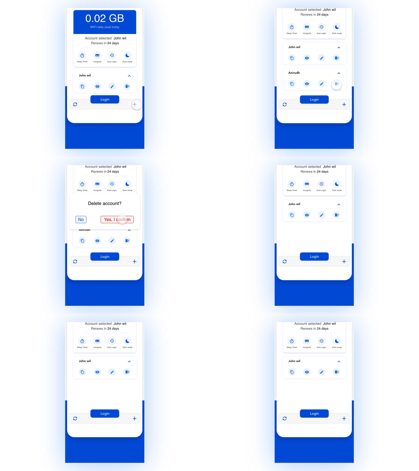
Giving the ability to add and delete multiple accounts helps to reduce the cognitive load of password remembering for multiple accounts. Thus, improving the overall UX.
#Add account
#Delete account
⚫ Dark mode
Dark mode plays well on the user’s eyes. In recent times, dark mode is also one of the most loved features in every app.

🙈 Insights of Usability testing
[Oneclick was created as a part-time project during my Undergraduate studies]
Due to the Dynamically changing requirements and telecom industry we had to spend around 5–6 months for user research, UI revamping for better UX and testing. Later on, Yaswant Narayanan (Our Android developer) started developing Oneclick (Android app) which took another 4–5 months to update our app’s UX and Usability by solving some new problems which arose after deploying the app on 15 smartphone user’s phones.
Before Usability testing,
- Jio did not exist with its revolutionary data plans.
- The monthly data usage limit for VIT WiFi was 10GB/student.
After Usability testing,
- Jio entered the telecom industry in India, data prices were reduced drastically.
- The monthly data usage limit for VIT WiFi was increased to 200GB/student.
- More pointers were gathered after deploying the app on 15 smartphone user’s phones.
- Data usage analytics and WiFi renewal date no more required — The only purpose of both the features was to keep track of one’s data usage and make sure the data is used wisely. After the data limit becoming 200GB/month for a student, this feature made no sense.
💥 Crank it!
We planned to roll-out the beta version of our app with minimum features and observe the user engagement with the app.
- Make it simple! Remove Onboarding slides
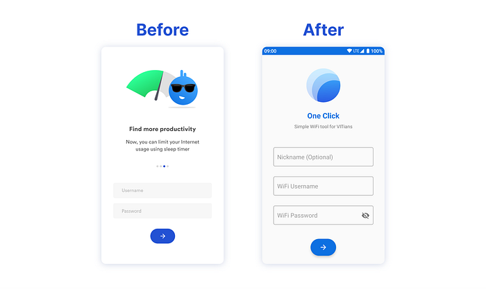
Even though Oneclick was new in this arena, the users were already familiar with other Chrome extensions and Python scripts to perform the same authentication functionality for Windows and Mac. This helped us in not teaching much about How to’s? to the users and instantly sign them up.
But the challenge was, How do we explain our new features to the users? which eventually got solved when we reduced the number of features to be rolled out for the first beta version and also we introduced Info screen filled with How to’s?.
We followed Adobe XD’s strategy to roll out features — New features will be rolled out every month, but we planned to roll out every 3 months.
We created an Info screen just like FAQs in most of the websites and mobile apps which explains the major features of Oneclick.
This helped us reduce the app size and get the user signed up into the app Instantly.
- Introduce Info screen

Since most of the users have no idea about adding a custom tile to their notification drawer, and Info screen was a solution to it.
This screen acts as an onboarding screen + FAQ since this screen contains How to’s? and also explains about some cool features of Oneclick.
- Repositioning loading animation

In recent times, most of the smartphones have lengthy screens which make the user hard to notice the essential state indicator — loading/progress animation. So, I decided to change the position of loading animation from bottom to top, which makes it more visible and also user need not tilt his/her head up and down.
- Replace Android Snack bar with custom indicator
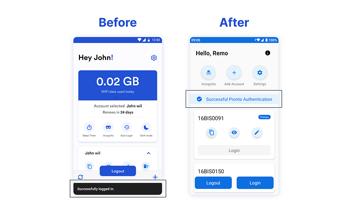
The same reason for lengthy smartphones applies here too. Some important messages like Invalid password, authentication confirmation, and Network failure are to be noticed by the user. Since the snack bar is in the bottom-most place, I repositioned it to the top order.
- Improve Information Architecture and micro-copy
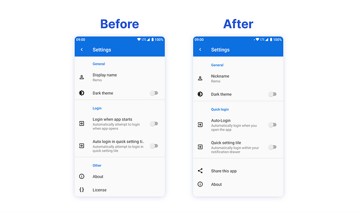
Users were feeling confused when they opened the settings screen, I restructured the Information architecture which resulted in easy scanning of information and quick responses. I also brought Share this app option to the front which was hiding inside About option.
- Change the button behavior
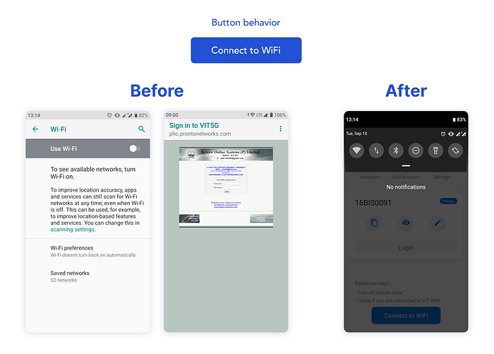
Initially, whenever the users click on Connect to WiFi button the users were redirected to the WiFi settings screen where they can connect to VIT WiFi, but this was disastrous because the users were automatically redirected to original authentication page which made no sense.
To solve this problem, I changed the button’s interaction. Whenever the user clicks on the button, the Android notification drawer will be pulled down which helps the user to instantly turn WiFi on.
- Adding some important instructions

There were some technical problems while logging into VIT WiFi with Moblie data turned on, and when the device is connected to other WiFi networks/SSID. To convey this instruction was a bit challenging, but I put a small text note just above the action buttons which is noticeable.
- Informing users about privacy concerns

After usability testing, users were worried about their credentials being stored on Oneclick’s cloud since data and privacy breaches are possible. But, we never intended to exploit our user’s privacy and decided to store all the credential details locally in the user’s mobile phone.
🔗 Challenges
- It was quite challenging to come up with a satisfying UI that delivers the best possible experience for our users.
- The actual challenge was to redesign our app according to the changing requirements and insights from Usability testing.
🥇 Learnings
- Design Hand-offs and teamwork with a developer while building an actual product and also learned the importance of User Research and Usability Testing.
- Community-based learning and building was the most important part of this project, where we learn, help, and grow mutually.
- Patience until success, I almost spent a year on this project without giving up which played a crucial role in finishing the project.
- During this journey, I improved a lot in the aspects of design, collaboration, and strategic planning which is really helping me as a Designer.
Feeling curious about Oneclick?
Let’s connect on LinkedIn and say 👋 at k.s.somesh11@gmail.com
Can’t wait to know your feedback and thoughts, comment below👇


