Practical Guide To Icon Design
Icon design is always a balance between clarity, simplicity, and visual appeal. This article shares key practical UX and UI recommendations to help guide the icon design process.
UX design recommendations
- Functionality. Use icons to enhance usability, not for decoration.
- Simplicity is key. Icons should be easy to understand at a glance, even at smaller sizes. Avoid unnecessary details that could make the icon hard to recognize.
- Uniform style. Use a consistent style across all icons, such as stroke weight, color scheme, and corner rounding. This helps build a cohesive look and feel.
- Avoid ambiguity. Be cautious of icons that may be misinterpreted. Test them with users to ensure they can easily understand the meaning of icons.
- Readable at small sizes. Test icons at different sizes to make sure they retain their clarity and are easily recognizable.
UI design recommendations
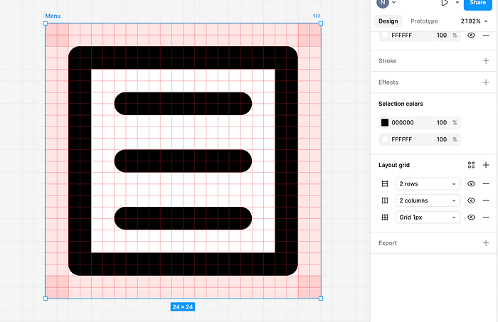
Always align objects to the pixel grid to stay consistent
Use 8-pixel as the basic unit for your grid. This will ensure consistency and balance of icons you create for different mediums.

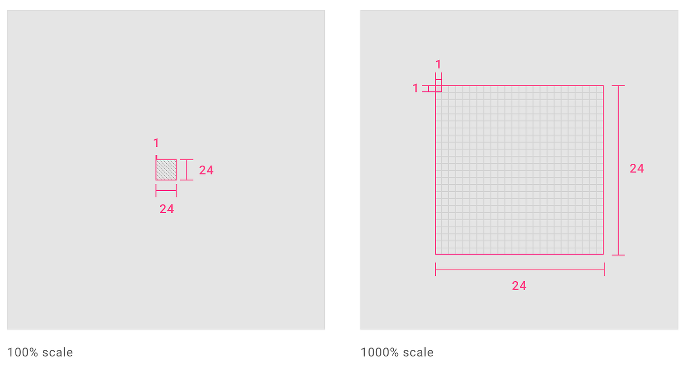
Create icons for viewing at 100% scale for pixel-perfect accuracy
It will help you design pixel-perfect icons.
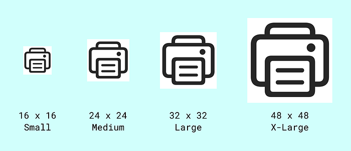
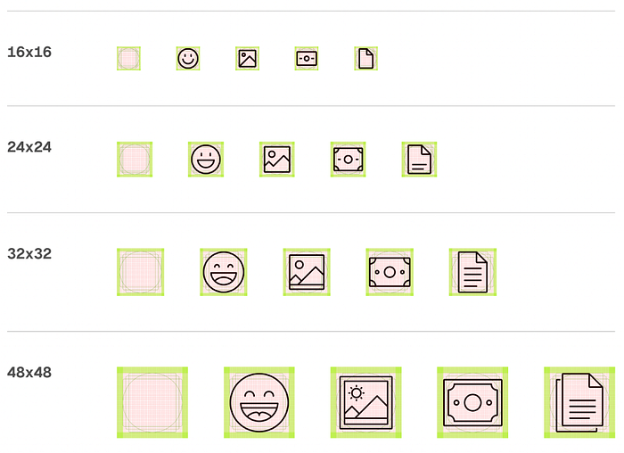
Design icons in 3 different sizes
- 16 x 16 px. Commonly used for smaller elements like status indicators or compact toolbars.
- 24 x 24 px. Standard size for most modern web and mobile apps; it’s large enough to allow for detail, while still small enough to fit comfortably within UI elements
- 32 x 32 px. Size is used for larger UI elements, such as desktop toolbar icons or touch targets in mobile apps, where you want the icon to be more prominent.
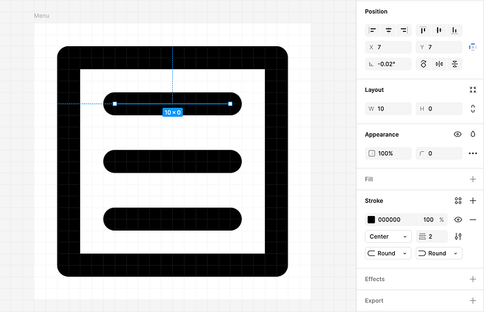
Use consistent stroke width
The stroke width should be consistent across your icon set to maintain a uniform visual style.
Design icon within a live area
For the optical grid, add vertical & horizontal padding = stroke weight. It will allow the creation of a live area. Icon content should remain inside of the live area.
Choose proper border radius for icons
- 16 x 16 pixel icons: 1–2 pixel radius is typically appropriate for smaller icons to avoid overly rounding them, which could make them look less sharp.
- 24 x 24 px icons: 2–4 pixel border radius is commonly used for rounded corners. This provides a subtle roundness without compromising the clarity of the icon’s shape.
- 32 x 32 pixel icons and larger: 4–6 pixel border radius works well for larger icons to give them a more pronounced rounded effect.
Platform specific for corner radius
- iOS (Human Interface Guidelines): Icons often use a slightly larger radius for a more fluid design. A border radius of 4px for a 24x24 icon is commonly seen in iOS designs.
- Android (Material Design): Typically follows a more angular and sharp approach, so the radius is often smaller, around 2px for a 24x24 icon.
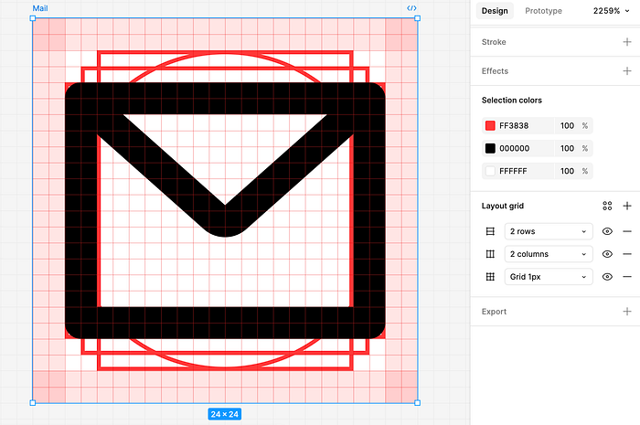
Use a keyline (key shapes) when designing complex icons
Keyline is a combination of simple geometric objects — ellipse, square, and two rectangles — that make it easier to achieve visual balance when positioning individual elements of the icon.

Simplify small icons
When working with 16px icons, reduce the level of detail to maintain clarity. It’s okay to add more detail for larger icons, but ensure consistency in the overall style.
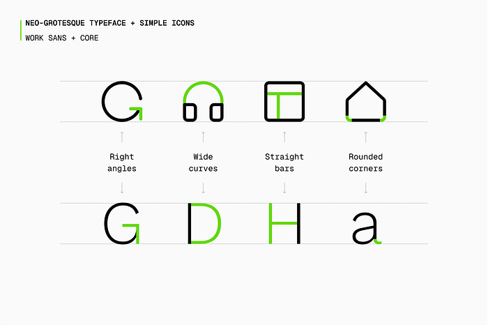
Match the style of the icons to the typeface
If your typeface is geometric (like Helvetica or Roboto), your icons should have geometric shapes and sharp edges. If your typeface has a more organic, humanistic feel (like Avenir or Gotham), your icons should have smoother curves and a softer aesthetic.
Want to master your UI design skills?
Whether you’ve been working as a designer for years or are completely new to design, Designlab has programs and courses to help you take the next step in your design career. Check Advanced Figma courses to master your UI design skills.
This post contains affiliate link(s)

