
Practical Tips for Creating Smooth Website Navigation Experience
Explore 5 key areas for improvement
Published in
6 min readDec 1, 2020
Navigation is one of the most critical aspects of product design. People rely on navigation to find content and features. Helping users navigate should be a top priority for every app or website. After all, no matter how much time you invest in crafting good content and features, all this work will be useless if the visitor won’t be able to find them.
1. Design navigation that matches user mental models
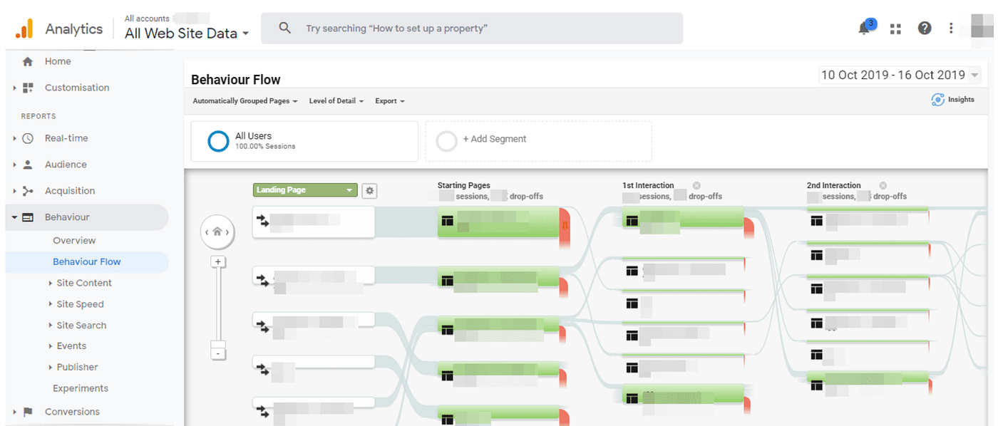
- Figure out how people navigate your website. Use web analytics to learn what visitors are looking for on your website. Review user sessions to find key user flows and understand what types of tasks visitors complete on your website.
- Design consistent navigation. Inconsistency creates confusion. Don’t move the top-level navigation controls to a new location on different pages or modify the navigation options.
- Evaluate your content categories. Conduct closed card sorting to ensure that the content categories you defined work fine for your visitors.

- Test your menus with users. It can be difficult to evaluate your own work objectively. Remember, you are not your user. Conduct usability testing sessions to see what problems people face when they navigate your website.
2. Design for good discoverability
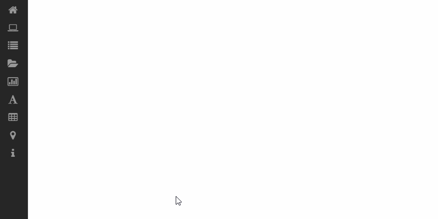
- Do not hide menu. When a menu is hidden under a hamburger menu button, people must think to look under that button to uncover the menu. This negatively impacts discoverability. Exposing the navigation options favors recognition over recall. For smaller screens such as mobile, it’s also better to avoid the hamburger menu and use priority+ pattern to show navigation options based on their priority level.

Image by Guardian via Brad Frost
- Ensure that menu has enough visual weight. The visual styling of your menu should distinguish it from the rest of the page design. Use whitespace + color contrast for navigation options to separate the menu from the rest of the page.
- Use icons to communicate meaning. Well-selected icons can help users comprehend the menu options without reading text labels. However, do not replace labels with icons. When icons are used for navigation by themselves, with no accompanying text, visitors might have a hard time decoding their meaning.
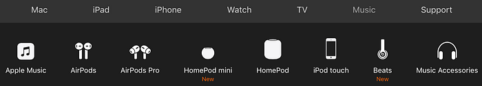
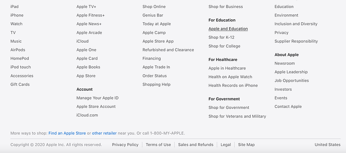
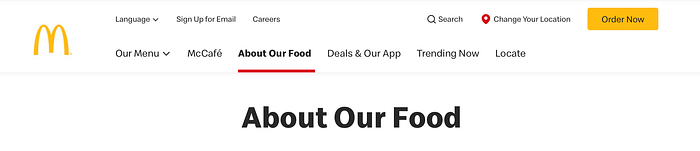
- Put menus in familiar locations. Remember that people spend most of their time on other sites. And they expect your website to work like other websites. Thus, put a menu to the areas where users expect to find it: top of the page, left side panel and footer.
3. Put visitors in control
- Use clear labels. The website navigation design should be predictable. The visitor should be able to predict the meaning of every navigation option before interacting with it. For that very reason, it’s better to avoid using jargon for labels. Use simple terms that are familiar to everyone in all areas of your website, including menu labels.
- Make menu links look interactive. Visitors may not even realize that it’s a menu if the options don’t look interactive. Offer good visual signifiers, such as contrasting colors, to give visitors a clear signal of what is clickable versus static.
- Design properly-sized navigation options. Navigation options that are too small or located too close to each other can lead to incorrect actions. A touch target of a physical size of about 9mm works well for most groups of users.
- Communicate visitors’ current location. Help visitors determine where they are within your site’s hierarchy. Highlight the currently selected navigation option within a menu and ensure that page titles describe the topic or purpose.
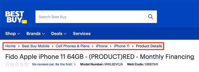
- Offer breadcrumbs. Breadcrumbs help orient people within a website, and they are beneficial for complex websites (websites that have a hierarchy with multiple layers).
- Use sticky menus for long-scroll pages. With a regular menu, visitors who have reached the bottom of a long page have to scroll up to the top of the page to navigate. On the other hand, sticky menus remain visible at the top of the viewport all of the time, which reduces interaction cost.
4. Design for fast scanability
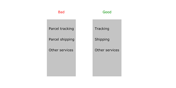
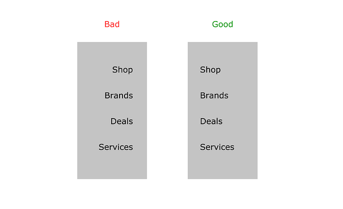
- Aim for 2-words labels. Each menu item should start with the one or two information-carrying words. Why? Because visitors typically see about 2 words for most list items when they scan it.
- Avoid using the same words to start list items. Because it will impede the scanability.
- Use left-justified navigation items. People in western countries read from left-to-right (F-pattern). Using left-justified navigation items, you improve scannability.
- Be careful with ALL CAPS. THIS IS A SENTENCE WRITTEN IN ALL CAPS. You can see that readability is reduced with all caps because all words have a uniform rectangular shape. ALL CAPS might work for one or two word menu items, but it’s better to avoid it when many menu items are 3+ words.

- Limit the number of top-level navigation options. Cognitive psychologist George Miller found that the number of objects an average human can hold in short-term memory is 7 ± 2. Stick to this number when you design a menu. If you design a complex website, you can provide a limited number of top-level navigation options and offer sub-menus for each option.
- Mind the order of navigation options. Not only does the number of items matter but also the order of those items. The Serial-position effect is the tendency of a person to recall the first and last items in a series best. According to this effect, items at the beginning and the end are most effective because our brains recall them much easier than the middle items. For this reason, the options we put at the beginning or end of our navigation becomes more prominent. For example, if you design a landing promo page for a product, you might want to show a link to the product details page first, and “Contact us” or “Purchase” as the last option in the navigation.
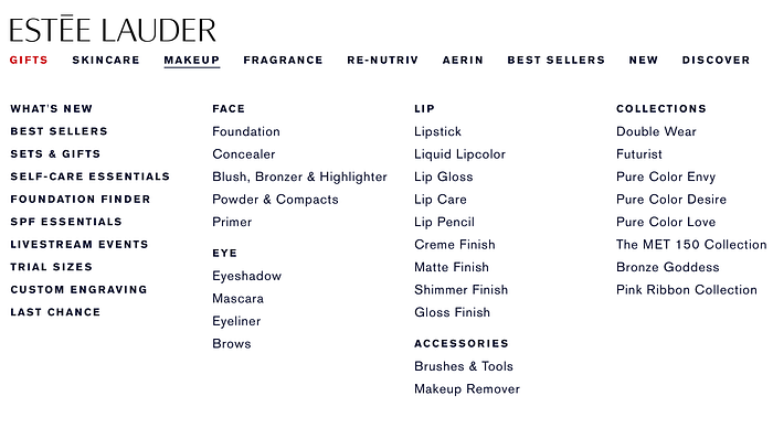
- Use mega-menus to let users preview lower-level navigation options. Mega-menus are large drop-down menus that include several levels of links at a time. They can save visitors time by letting them skip a few levels.
5. Minimize visitor’s cognitive load
- Strive for flat navigation. Flat navigation is a navigation system where the visitor can access the deepest nested page in the site within one to two clicks. Try to limit the number of levels without introducing confusion.
- Avoid fancy animated effects. Navigation isn’t the best place to experiment with animation. It’s safer to avoid adding purely decorative effects for menus because they might distract visitors.
Want To Learn UX?
Try Interaction Design Foundation. It offers online design courses that cover the entire spectrum of UX design, from foundational to advanced level. As a UX Planet reader, you get 25% off your first year of membership with the IxDF.


