Previse — Industry Safety Observations App — A UI/UX Case Study

Hi, This is my personal project inspired by true life safety incidents that happen in industries with heavy equipment.
What Kind Of A Project? (Inspiration Behind..)
For a long time, I had ideas and concepts of how safety in industries can be drastically improved. When I first started learning UI/UX, I thought to myself very well how design is about solving problems. So, a thought went through my mind, is there a possible way of enhancing safety in an industry with an App?
This project is hugely inspired by the idea my Dad had for a long time. He works at a Power Generation cum Desalination Plant that obviously has huge machinery around working 24/7. I personally visited one day with a visitor pass to witness the huge industry to get a first-hand idea of how everything works. But as I entered the plant, the very first thing that happened was the safety induction. Safety is the topmost priority for any individual or a company operating huge industries. Failures can pop up any moment without notice.
I had a big chat with my dad and he mentioned that there is an online portal that can be accessed via desktop on a browser where all the employees can record the malfunctions and accidents as an observation and share it with managers or assign to other people. This was interesting. Not only will it prevent future accidents, but clearly shows the overall view of what’s happening and why.
However, the website wasn’t easy to access from a field where accidents happen most frequently. The user must remember to record it once he gets back to his laptop. There is no mobile solution. On the other hand, the webpage was cluttered and just didn’t have a good look. The statistics were not clearly shown. So I decided to make a beautiful and welcoming app which shows all these while adding the flexibility to be quick in taking the observations.
The Problem Overview
Let’s now go through the detail of what I am actually trying to solve and how.
Why?

The accident triangle, also known as Heinrich’s triangle, is a theory of industrial accident prevention. It shows a relationship between serious accidents, minor accidents and near misses.
He commenced a study of more than 75,000 accident reports from the insurance company’s files as well as records held by individual industry sites. From this data, he proposed a relationship of one major injury accident to 29 minor injury accidents, to 300 no-injury accidents.
The theory was developed further by Frank E Bird in 1966 based on the analysis of 1.7 million accident reports from almost 300 companies. He produced an amended triangle that showed a relationship of one serious injury accident to 10 minor injuries (first aid only) accidents, to 30 damage-causing accidents, to 600 near misses.
In any industry recording “Unsafe Acts or Conditions” and “Near Misses”, taking preventive/corrective actions to mitigate these risks has a significance in controlling the minor and major accidents/incidents as well as maintaining good Safety Culture at workplaces. These observations are termed as proactive indicators in SAFETY performance of any organization. This signifies the importance of safety observations (Unsafe Act, Unsafe Condition and Near Misses) at the workplace. The data reveals the problematic areas or behaviours and management can act in time to keep control over the issues and improve the SAFETY of the workplace, thereby increasing the morale of employees and overall individual performance.
What?

This is a Health, Safety and Environment (HSE) observations reporting app that allows personnel to record safety observations, take appropriate actions and close the issue on completion.
This app provides insights to managers on what type of behaviours and conditions are effecting the Health & Safety of personnel at the workplace. Employees can readily view the actions assigned to them. Tracking is simplified by presenting the status of open and closed issues. A leader board will encourage employees to have more observations thus improving the SAFETY culture at the workplace.
The issues the app tries to address are:
1. Raise a SAFETY observation as quickly as possible through the app.
2. Reviewing the observation by superiors for a decision on further actions to resolve the issue.
3. Assigning the actions to people responsible for fixing the issue.
4. Tracking the progress and closing the issue once it is fixed.
5. Provides insights of recorded information to managers through Dashboard.
This simple process of Recording, Reporting and Reviewing an observation can bring a huge change in the way safety functions in an industry and impacts the SAFETY culture positively.
Challenges I Faced
Making this app definitely came with a lot of challenges. The very important one among those is my poor knowledge of the Industry Safety terms and measures they take. Safety Observations can be of many types and forms. This created a hurdle while building the app.
The App must be solely designed for such people who spend time on the field and know the technicalities of an issue. And the app must be able to address their needs accordingly.
The solution to this definitely came from my father who constantly thought me the process of safety, environment and health across the plant. Every word, image and icon used in the app are made accordingly.
The Process Of Design
For any design I make, there are three over the head steps I follow. They are:
- Non-Visual Process
- Semi-Visual Process and
- Visual Process
So I started by understanding the whole scenario. This starts with understanding the whole strategy which includes the target audience, User and Client Needs, etc. Doing this gave me a good look at what can be done in the later stages. This helps us build the app’s foundations which are the most crucial part.
The Non-Visual Design Process (Strategy)
Target Audience
1. All staff of an industry or a workplace who needs to observe and report the finding of unsafe conditions of any Health, Safety and Environment related observations.
2. Supervisors who get notified about the observations raised by their staff. They also include people who set actions to a particular staff member.
3. Personnel with assigned actions who will take appropriate measures and updates the concerned section of authority.
4. Supervisor/Manager who is responsible for dealing with accidents.
5. Managers and all other staff who monitor the dashboard for various issues & performance indicators which helps them to make the right decision.
The User Needs
The user or the employee who uses this app expects some very important things from it. Understanding what exactly the user needs, will help us prioritise the elements of navigation suitably. User’s expectation can be the following:
1. Quickly Login using Microsoft Exchange accounts.
2. Report an Observation quickly.
3. Review Observations assigned to him/her.
4. View/manage previous observations via a common dashboard.
5. Check the reported observation status.
6. View User Profile and their status with issues.
The Client/Company Needs
Similar to the user’s needs, the client who wishes the app to be useful has a few things in mind too. Before we proceed any further I want to point out that this app is an intra network app which means it will be accessible to only the employees of a particular company. It isn’t available to the public. And since the app is provided to employees to enhance safety measures, there are not any financial benefits aimed with it. The needs of the client/company which they wish to achieve with this app are as follows:
1. Get things resolved quickly.
2. Assigning tasks to particular employees improve their engagement & responsibility levels.
3. Show in a clear view all the observational reports assigned to the user.
4. Provide good filtering options to allow for a better viewing experience.
5. Allow the user to have a quick and smooth experience while creating a report.
6. Show the app’s privacy policies in the profile section.
7. Give options to adjust the notifications and alerts.
Personas
Kevin
Kevin is a 45-year-old industrial worker at “Total Group” working as a frontline engineer. He is constantly around large scale machinery and industry-grade equipment. With a lot of things happening around him, he also noticed many failures and safety compromises around during his career.
He recently was shocked to see his close friends on another site facing severe injuries due to simple man-made errors. He always dreamed of having a quick flexible system to report his findings to respective staff to fix the issue quickly.
Kevin considers safety to be the top priority and was also promoted as a “Safety Assessment Engineer” recently. After that, he thought of quickly implementing a reliable solution.
Arun
Arun is a middle-aged 35-year-old manager at one of the world’s largest Oil & Petroleum company. He works at the head office in the city far away from the actual plant. His daily responsibilities include monitoring the status of plant and keeping every important thing in check.
Recently his company is facing a lot of criticism on the issue of employee safety in the field. Since he isn’t on the site frequently, he can’t get a quick image or video showing damage or accidents in the plant which are causing injuries and loss of equipment. He also doesn’t have a good understanding of actual things going on at the site that can be changed to prevent accidents. This in-turn in resulting in a bad reputation.
Now the responsibility lies in his hands to turn the situation around. He must be able to work closely with employees and on-site staff even when staying at the office far away. He must have an overhead look into what’s happening and who’s responsibility is it to fix a particular problem.
The Semi-Visual Design Process (Outline Of Scope and Information Architecture)
This stage will help me decide and plan the actual content and functionality of the app. This lays a foundation to Visual Design process of mockups and wireframes.
Outline of Scope
Content of the App:
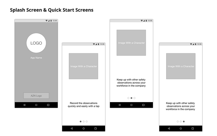
1. Splash Screen (3 screens showing 3 most important app functions).
2. Dashboard (Showing the old and latest reports).
3. Overview of reports and graphs on the dashboard to show company-wide progress.
4. My Reports section to show the active reports assigned to the user.
5. Profile sections showing user’s progress with the reports and status of old ones.
6. Privacy Policy for the usage of the app.
The functionality of the App:
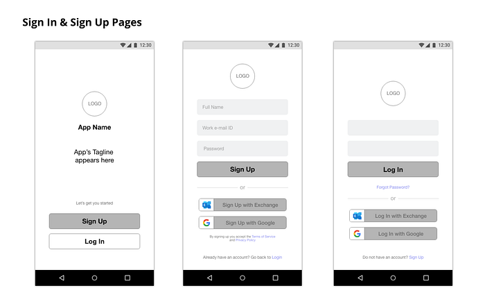
1. Sign up and log in the process via Microsoft Exchange or Email.
2. Creating and Submitting a Report.
3. Viewing and editing the progress and status of a report.
4. Assigning additional people to the report.
5. Sending alerts and warnings when needed.
6. Changing alert and notifications in settings.
Information Architecture of the App

The Visual Design Process (Mood Board, Wireframes and Visual Mockup)
Moodboard

Wireframes
The wireframes are later made keeping all the content and functionality in mind. The three major processes of the app which are, Creating a New Observation, Dashboard and Actions are clearly highlighted. Check them out below:

The app screens gave me an idea and a chance to discuss with the client the change that can be made to further improve the app’s user experience. One thing I noticed during the wireframes stage is the poor icon fits for Dashboard and Action Tabs. So later I changed them in the final design to reflect consistency.
Visuals
The Dashboard and Action Screens. Notice that the Tab Icons are changed.
Other important screens:
The screens maintain a constant colour scheme. The dashboard and actions have totally different things to be performed. While the dashboard highlights the content of the observations, the Actions tab shows the functionality that can be done on those observations.
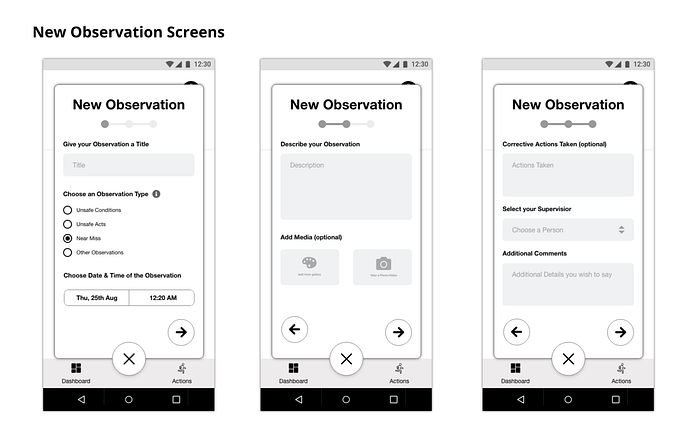
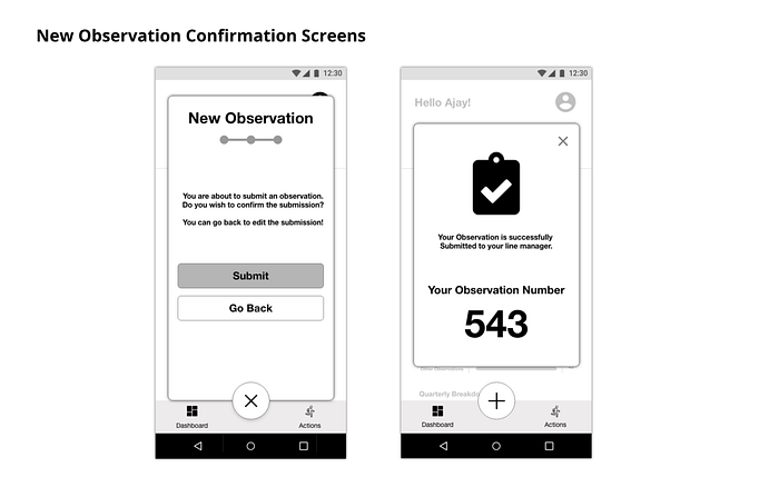
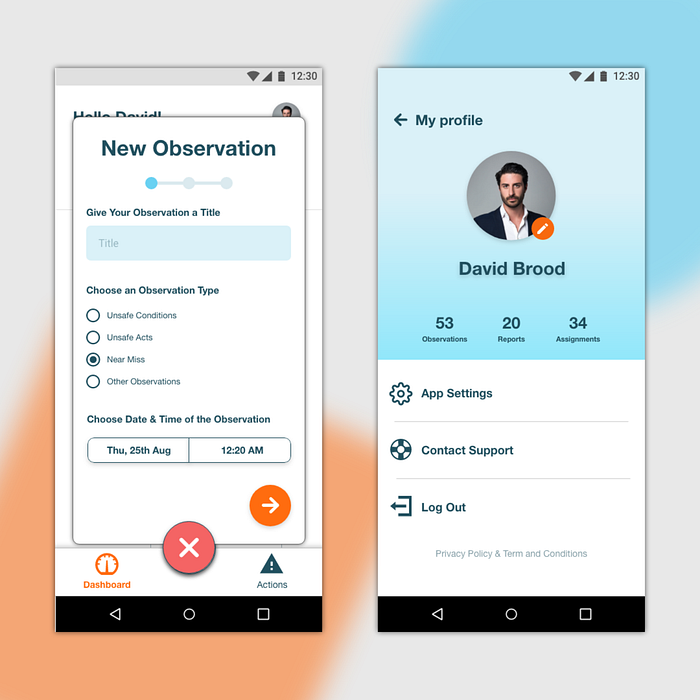
Recording the Observations:
The new observation recording is the most important part of the app’s functionality. Some of the important things I wished to achieve with these screens are:
- The Plus icon must be the centrepiece where the user immediately goes to record an observation.
- The top bar should show the progress to submission using blue circles.
- The Cancel button is the same plus button which is turned by 45 degrees and now gives the ability to discard the observation.
- The user will have the chance to go back and edit the observation before the submission as shown in the final screen below.
- After the submission, the user will have the ability to copy the unique code generated for the observation.

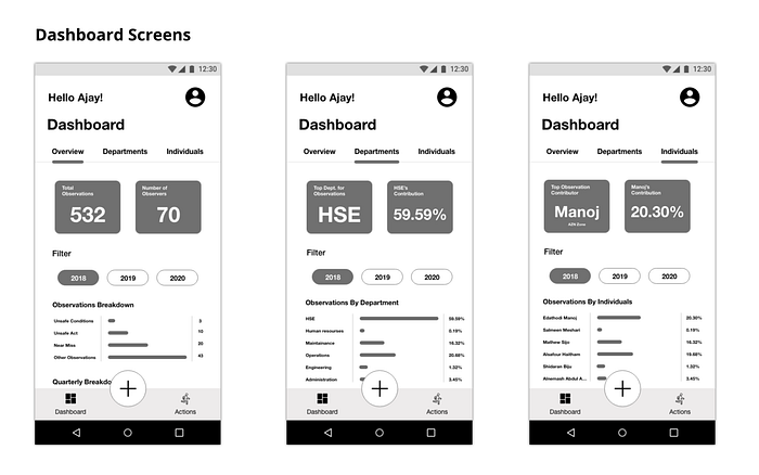
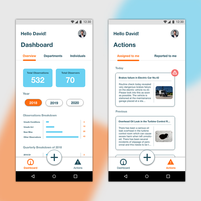
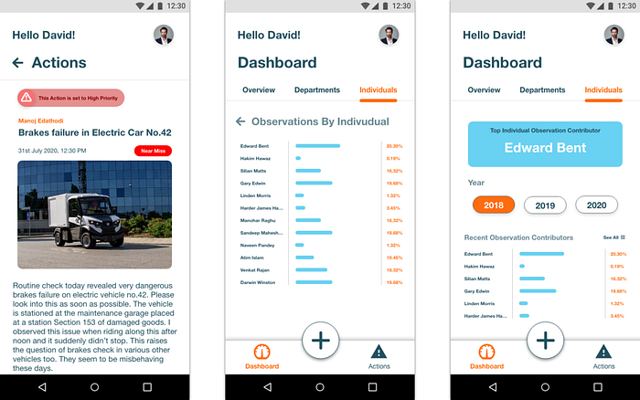
The Dashboard
The dashboard which mainly focuses on showing the public data has three separate sections. The Overview, Departments and Individuals. As the sections are named, it makes it clear to filter the data of observations accordingly. Some of the dashboard’s features are:
- Show the important details in blue boxes in the top part of the section
- Swipe to navigate between the sections
- Focuses on Content with no Functionality
- Gives an Over the head view of all the data accessible to everyone
- Can filter the data based on part three years as shown

The Actions Tab
Actions tab is responsible to provide functionality for both employees and managers alike to take actions on particular observations which are either assigned or reported to them. The features of this section include:
- Contains two sections, Assigned to me and Reported to me
- Assigned to me section shows all the observations that are assigned to this particular user and he/she is responsible to solve it. He /she will have the options to Mark it as complete once done.
- Reported to me section includes all the observations that are reported to this user and he will have the option to edit it and then assign it to the responsible person to solve it.
- Both the screens have Warning symbol against high priority observations which then will help the users to address them soon.

Check out the video below to understand the flow of the app
Conclusion
Here, I understood the entire process of how an app can be of use to an employee working in the field and get the observations to the specified person in no time.
Many lives are lost to small missteps made. This app has the ability to avoid a huge number of those and enhance overall safety.
And so this is how the “Previse” app came to life.
I hope you enjoyed this Case Study. Clap if you liked the app. Hold the Clap Button to show support 😇😇😇.
Catch up with me on Instagram.


