Product Design Case Study — Diario
‘ I will not be impressed by technology until I can download food ’
Although, I find it a bit unusual to imagine this kind of device in the near (or any) future, but we are indeed, a step closer. You cannot download, but certainly, Order food online :)
This Case Study is about the process of developing and designing an online Food Delivery Application — Diario
Brief
The last decade saw a tremendous amount of digitization, with every domain of service getting itself registered on the online platform. Online food ordering trend has spiked and a number of restaurants/cafes/outlets are getting connected to these online platforms everyday.
People like the idea of receiving meals at their doorstep instead of going through the hassle of actually driving to the place. Hence, this is an area of great potential.
This research was held over 16 countries and can provide you with further insights to this trend.
This case study primarily focuses on the Design Research and other aspects of creating a Brand Identity of this application.

View the Behance project — here
Analysis
There was no hard limit on the age, gender or economic background of the target audience.
Everybody loves food :)
Hence, the User Interface of the application had to be simple, intuitive, uncomplicated and offer effortless navigation.
Nevertheless, the interface was a little skewed towards providing ease of access to the millennials as those were the ones who contributed majorly to this market.
By ‘skewed’ I mean making assumptions such as the user is familiar with the traditional function of a hamburger menu, meaning of the magnifying glass at top of the screen (search bar) and other common conventions.
Design Process
Let’s talk design!

Splash Screen
Nobody wants to be bombarded with irrelevant information just after opening the app, right?
Hence, the splash screen of the app is kept minimal with the least amount of elements possible. As can be seen from this screen, the application mainly uses 2 colors, the blue shade (primary color) and the yellow shade (secondary color).
Here, the user is given the option to Login or Sign up
Low Fidelity Wireframes
The initial wireframes that were produced of some key screens

The screens are modeled to be intuitive as outlined in the previous section.
Cluttered screens often do not provide a good user experience, hence care has been taken to provide enough breathing room for the elements in the UI.
Information Architecture

The Information Architecture lays out the complete flow of screens presented to a user while interacting with the UI.
It outlines the primary paths that a user follows as he/she navigates to reach the end goal. In this case, the goal is to successfully place an order.
Note: The steps after sign up are one-time only, i.e. they are shown only once when a user registers for the platform.
Hence, the routes that will be navigated frequently (those after the login step) are pretty straight forward and uncomplicated (which was one of our goals).
Introduction screens
The designs of the introduction screens that the user encounters after registering on the application.

The witty designs ensure that the user does not abandon your app soon after sign up, aids in building a physiological connection and makes them feel native to your product.
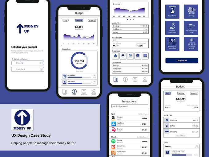
High Fidelity Wireframes
Remember the hand drawn wireframes?
Well, they grew up to look like this

There’s nothing more relaxing and soothing than seeing your design come to life, gradually.
Each and every layout decision is taken with great care and has its own story rooting from the basics of User Experience theories.
Details of some principles can be found on this amazing website.
Icon sets used in this product were diligently selected such that they do not appear out of the overall architecture and were colored according to the theme of the product, which leaves us at another important aspect of product designing — Branding
Branding your product
The key of promoting your product is not just to notify the user of your product, it is to make them remember your product.
There are a couple of ways to achieve this
1. Be consistent with the nature of the design elements you use with your product.
2. Use the same combination of colors that represent your brand.
3. Use Motifs
What are Motifs?
Motifs are small, recurring elements, patterns that define your brand and tie your design together. These pattern can be reflected in your logo, the fonts that you use, your website and other aspects of your organization.
You can learn more about Motifs here.
The final goal of branding is to associate a certain set of elements, color schemes or components with your product, so that the consumer will be reminded of it whenever he/she comes across such patterns.
Now, time to analyze one of the pages that was designed

The profile page provides a concise view of all the information most relevant to the user, while keeping the design lightweight (again, one of our initial goals).
Switching tabs design (Settings and Order History) has been adopted to present more information in the limited space. The page provides basic information that you entered and an option to update that information as well.
An Order History tab has also been provided, in case if one wants to repeat a previous order.
Conclusion
This is just a glimpse of the journey from the initial idea to the final prototype of the application. In the final product, we were able to incorporate all of our initial goals in the design while keeping the interface minimal and easy to use.
If you feel you have something more to add, feel free to comment or connect with me over LinkedIn!
You can view the original project on Behance here.
Thank you for reading!