Product designer’s story- Part 02. The design of Mobile applications

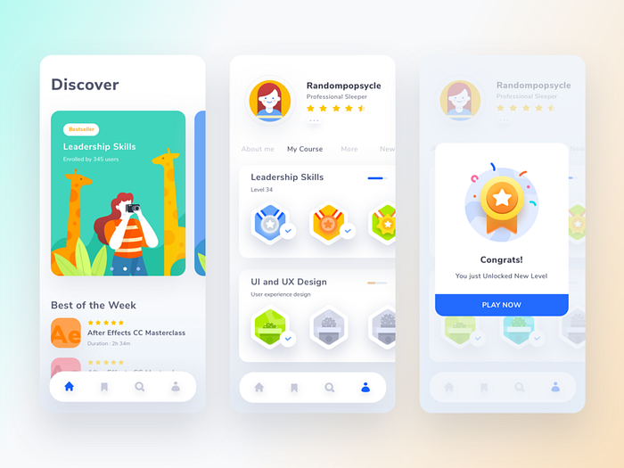
I love mobile devices. I like to look at them, use them, and design for them. Designing for mobile devices are quite challenging. That is one of the reasons I love designing for mobile. Today I am going to talk about the design principles for mobile applications. These are some practices I keep with me all the time.
The question why and for whom?
The most important question is to who are we designing for and why we need this application. The designers tend to design applications when given the requirements without asking these two important questions. The main reason for the apps to fail is that we forget who we design for and why we design. If you ask who are we designing for, many will tell we are designing for the client. They are partly correct. If the client doesn’t like what you did, others will never see what you have done. A product designer’s job is not to say “Yes” to whatever the client tells you. A product designer guides the client by understanding, empathizing the needs of the client. He or she should not forget that they are addressing a specific problem encountered by a specific user group or groups.
The other most important thing is why we are developing the application. Designers are caught up in the emotion of creating beautiful and cool designs. The designers forget to create meaningful, understandable, and discoverable product designs. The designers have to remember that they are addressing a specific problem. The design does not necessarily have to be cool. The ability of the design to create a wonderful interaction with the target audience will create a better user experience.
There is a difference between what you think what you actually do. To mitigate the gap between these two different worlds, the designer can use user testing.
The use of UX design principles

Aesthetic-Usability Effect

The Aesthetic-Usability Effect tells that humans tend to forgive applications has high aesthetic value over minor usability issues. Mobile applications have a high demand in the market. Every organization wants to have one. People have a strong connection with the application when they are attracted to the application design. Aesthetic designs, in general, look easier to use and have a higher probability of being used, whether or not they actually are easier to use. If the product is attractive people create a good first impression towards it. This does not necessarily mean that you only need to look into the beautifulness of the website. The beautifulness or aesthetic value can hide minor usability issues. Not the pressing issues that you have to address in the application.
Jakob’s Law
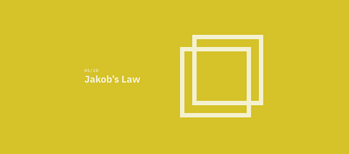
This law is one of the key laws I follow as a designer. Jakob’s Law says that people spend most of their time on other sites. This means that people prefer your application to work as the same as other applications. We need to understand that mobile application users have many choices when come to using them. If the people have to learn something new every time they use your application, the tendency to walk away from the application and never returning is very high. Creating the design patterns similar to other application can help users to work, navigate, complete the process of the task will help retain and make new customers to the application.
Law of Proximity
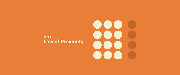
The law of proximity is one of the gestalt principles of how human eye preserves information. The principles say that when humans see that when the objects are near to each other, tend to be a single group. This principle is based on the cognitive tendency to perceive the objects close to each other as related, especially in comparison with those which are placed farther. Having the urge to organize a variety of data and objects around, people often group them this way automatically, much quicker than they start really thinking about it. So for designers, this is another good prompt for how to organize the interface along with natural ways the brain absorbs and classifies data. The simple scheme by Andy Rutledge, given below, visualizes the principle of proximity.
Let’s look at an example of how to achieve the law of proximity. The target of this design is to create three groups on the same page.
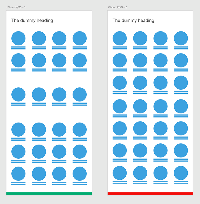
The human eye preserves information and creates groups.
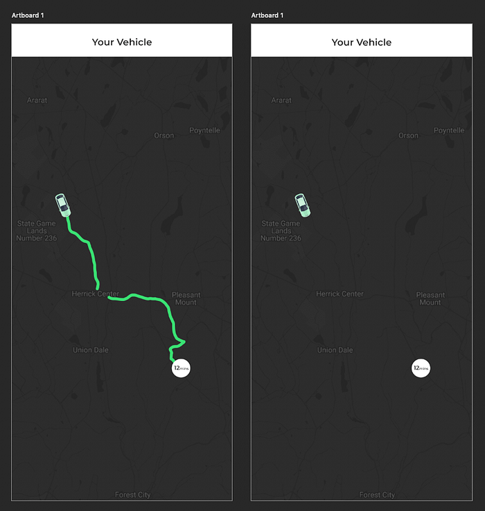
The law of Uniform Connectedness
I think every one of you is familiar with the famous taxi application called the Uber. I assume that you have used the map functionality. The map function can be shown in two different ways. In this principle, it talks about group functions of a similar nature so they are visually connected via colors, lines, frames, or other shapes. This is one of the key principles that designers have to consider because the scientist believes that the human brain naturally preserves objects as organized patterns and objects. This is why we need to see a connection between elements which has different shapes.
Let’s take a small breather from the UX principles and have a look at small details now.
Don’t fill out your design

Filling your design means adding something to every nook and corner of your design. We need to understand that we are designing for mobile application, not a grocery store. You have a limited time to give the first impression to your client. If you overload the information on your application, that would increase the cognitive load of the user and they will quit your application. You have to think carefully about every element, text and, image that you add.
Don’t add multiple key functionalities to the application. Keep a single key functionality to a page that has a real value to the user. That makes the users learning curve for the application easy and fast.
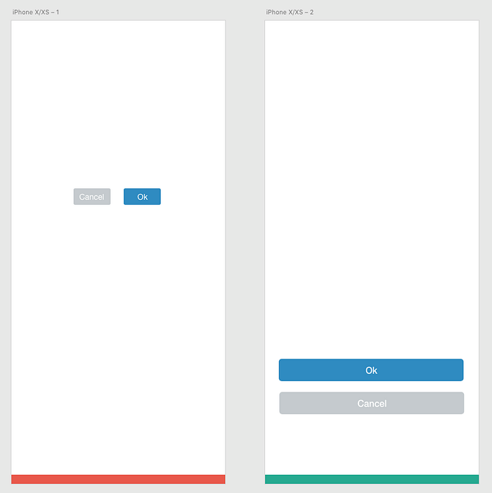
Create actions that can be touch by the human finger
This is all about designing for humans. I have seen many designers forget that and try to add all the buttons in the world into the design which are hardly clickable by the human fingers. Small action buttons are harder to target on a mobile phone. The human can easily make errors while trying to tap a small action button. In order to avoid it design controls that measure have a size 7–10 mm so they can be accurately tapped with a finger. That makes the users see the edges of the controls and visible when the user taps on it.
I can go on and on about the design principles but I thought of not talking about everything in one article. I wanted to talk a few things on how to properly design for mobile. I will speak more on this topic in my next article.