Product & UX design for enterprise — setting up design workflow, process, and language.
Right Design Approach, Observations, Learnings, Suggestions & lot more
Introduction
There is a lot of fuss when it comes to the difference between Enterprise and B2C UX Design. Where to work? What to gain expertise in? What is the difference between the two? How to design when you are the sole designer in the company or have a very small team? How to start and set the design workflow, from scratch?
I have addressed such thoughts, suggestions, Learnings & Tips about these topics in this read. last year after joining 314e Corp. I transitioned completely into enterprise UX design. As I was also exploring B2B UX for the first time, As a team we explored a lot of aspects, Headscratchers, and challenges. The aim of this read is not just about knowing various tips and tricks for designing but also knowing the difference in mindset, Psychology, and design strategies, Especially when you have a very small team.
About Enterprise Softwares & Products
Let’s look at a very simple definition, B2B SaaS refers to companies that sell software to other businesses as a service. In Simpler words, Enterprise SAAS Products help organizations to run more efficiently or to automate internal functions. Many businesses rely on these services to optimize their marketing, sales, customer service, some specific functions, and operation efforts.
These businesses create, develop, host, and update the product themselves. They have immediate access to an unrestricted global market and can be scaled without increasing product delivery capital.
Now, When it comes to the planning & Designing UX of these products, My observation says Enterprise Products or UX is split into two types —Enterprise’s Internal Solutions & Pure Business-to-Business products.
The term “solutions” does not necessarily imply a service that comes with terms and conditions and is provided by an agency, nor does it imply functional, technical, or other support by some third-party company. Solutions can be vast. A particular solution provider platform can be a product of its own, and such small solutions can have humongous opportunities in this digital era.
Right Mindset to work for an enterprise
The fundamentals of product design will always remain the same. But one potential common problem could be; Moving the users away from a group of legacy (sometimes manual) workflows.
Designing for such users involves a deep understanding of user goals, and multiple systems, mapping them out, identifying redundancies and synergies, and then grinding it with all the edge cases possible to see what way is the most efficient one. The idea is, to know whether it can reliably produce the same (if not better) outcomes than the current way of doing things.

There are huge companies like Microsoft, Salesforce & Adobe along with the masses of new B2b Digital products which include Canva, Jira, Slack, Shopify, Figma, etc. Which has millions of Company level users.
All of these software programs look and perform fundamentally one of a kind from the legacy Approaches but we should also know that currently Most of these are getting re-oriented and optimized from a design & UX point of view in the future. According to us, the Right mindset is; To be in the User’s shoes at every instance or requirement. We should know that enterprise tools have more of a problem solving, Simple and to-the-point approaches along with direct communications.
When we work for b2c apps, Our requirement might want us to look into aspects beyond, just problem solving, Ex- Being salesy, having ads, too much focus on Retention, Attrition & conversions, making addictive products, content feeding to the user, Typical E-commerce tricks or maybe how to sell more and more holiday packages to people, etc.
My opinion says that when we design for B2B or enterprise, We get to focus more on actual problem solving, Task executions, productive Product vision, and upgrades.
Its all Business
IT Business is done differently in different countries, and the design of such products reflects the same. B2B IT Industry has been the largest and fastest-growing market segment for the past few years. Revenue in the IT Services market is projected to reach US$1,114.00 Bn in 2022. People involved in the creation of the design process for these businesses have to consider the types of relations chosen for the particular project. The type of business scheme initially defines the target audience and nature of interactions which are key factors for efficient and user & business-friendly design solutions.
Role & Importance of Design
The aim of a B2B or any enterprise Product design is not to grow a huge flow of traffic chunk but to engage and direct leads that belong to the target Users.

As a designer, it’s important to think beyond apps and websites. Even if we are working primarily in the digital space, remember that we’re surrounded by design. From architecture to fashion, right down to the simplest everyday objects like a hairbrush or toothbrush, Similarly even virtually, everything has been designed for human use.
“People ignore design that ignores people.”
Designing for an enterprise should supposedly involve methods of visual and content presentation, which might differ from the one presented directly to end-users.
Neglecting the aspect of business relations increases the risk of creating a design that will not provide a high conversion rate even being sophisticated, stylish, and attractive visually. The psychological background behind design solutions has to support a particular business scheme or strategy. By this, we can also conclude that not everything is supposed to be designed according to the user. Sometimes Users have to adapt as well.
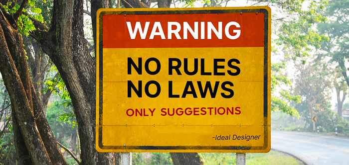
Design Process, Rules & Laws: Take only Suggestions, Create New
Many enterprise organizations need to follow a strict set of policies and are usually bound by various governance requirements.
Each one of these rules comes with subject-matter experts, a checklist of sorts, and also a series of situational best practices that depend on specific scenarios and use cases. While more and more consumer apps are being regulated, the monetary value of the sensitive data is held by many companies which paves a way for more regulatory scrutiny.
There are various laws of UX out there, such as Jakob’s law, Miller’s law, Doherty threshold, etc. You can read more about most of them on this website by JON YABLONSKI.
We believe that these are great suggestions to design better for user needs, but when we talk about enterprise, It’s not just about user needs and expectations. It’s a bridge that paves a structure for business needs and while designing, Usability has to be taken care of more. Sometimes, Many of these laws can’t be considered at all.
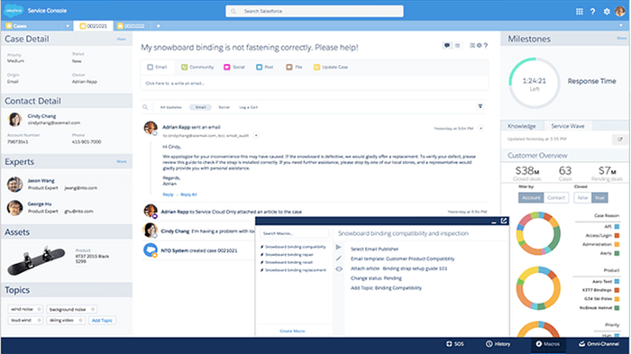
Here is an example.- Miller’s Law states that an average person can only keep 7 (+ or -2) items of information in their working memory at a time. Now following the law, the ideal solution is not to overwhelm the user with too much information but sometimes you just can't afford to follow this because of specific personas, Requirements, etc, There will be instances, where need might demand more than 15 objects on a single UI. Here is an example screenshot from a very famous enterprise giant Salesforce. Its multi-facet layout with more than 3 navigations, 6 tabs in middle with further subtabs, Something like this would confuse anyone but does that make the design flawy? No, Not at all.
So the right thing to do is; Know all the laws and rules but everything can not be applied everywhere. Sometimes To fulfill business and user needs, we have to tamper with such laws. Also, one big pro is, Your users will have to adapt to your UX Plan. In every organization, they are trained before using such internal products.
Design Thinking
Design Thinking is an approach for breaking down a large problem into small, manageable chunks and then solving them individually To get the ideal solution for the overall problem.
This method is versatile and is not just used specifically for design. Architects, Designers, Engineers, scientists, and other thinkers use the design process to solve a variety of problems.
Design Process
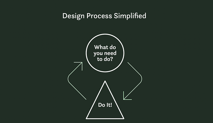
Let’s have a look at this Simple and generic definition of the design process
The design process is a way of figuring out what you need to do, then doing it. Along the way, you might solve one or more problems, try to achieve a goal, and/or create something specific.
While all designers use similar steps, I believe the design process is malleable. Every designer should modify their process to suit their own skills, tastes, and purposes. or just to adapt to their current work culture.
Another importance of this process for.
- The process helps designers to be reliable and creative without depending upon inspiration.
- It provides checks to ensure creative concepts don’t steer off course.
Now the question is; what process to follow? Here is what I think about Which design process to follow.
If someone is saying that a particular design process is the most ideal one & can go well with every problem out then they are super wrong!
Just because some particular approach or Design process has worked well for any organization at a specific point in time, that same doesn't need to work out well for your company as well.
Let's look at another great example, the sprint method followed by Google Ventures.
which slightly claims that all design problems and product roadmap can be planned within a week (certain tasks a day). Now, this is for sure working well for google because of the large segregated teams present in different countries. If we think we can also deal with our problems and product plan similarly, Then we are so very wrong, Though there will be some productive outcomes but this has the potential of messing up the entire product.
So the smart thing to work on or to do is to analyze your existing working environment, Observing what ways of design approach will add more efficiency to the existing process along with design additions and input to the team.
MAKE ONE OF YOUR OWN
There are no constraints in the Design world, No one can define any stereotype, boundaries, or rules. Here is quick info and a glimpse from the organization I work at, It's an example of how we have come up with our Design process.
About 314e

How we have come up with 314e’s Design process (Our way of designing here)

In 314e, We follow these methods while Researching:
- Context study
- User interviews
- Business stakeholder interviews
- User shadowing
- Competitive analysis
- Reviewing past user activity logs
- Ecosystem mapping
The usage of these methods depends on the requirement of insight and project-specific data. You can always pick the one which aligns better with your product/ Task goal. We don't research for amazing presentations, Generally, We only pick one or two out of these methods that are also when. there are no existing metrics & insights.
When and how to use these methods? We will be explaining these with our use cases in design individually in our next read.
When we believe we have enough insights, metrics, & pretext, We proceed to the “Define” Phase. This is the phase where we decide on specific pain points we are going to solve and how we are going to organize and structure our ideas concerning our persona & user stories.
In the “Ideate” phase we explore all the possibilities of problem-solving. Generally, we combine this phase with “Paper prototyping”. During this phase, we always know the list of tasks, intent, and objectives which has to be aligned with the user. We sketch several wireframe variations or alternatives to the same objective. We then try to evaluate each option by listing out out pros and cons of each frame. As there can be thousands of ways towards the same approach. so for us, “critical thinking” plays a very important role in design.
Till the time we reach the “Testing” & “Deliver” phase, Generally we (Designers, Product managers & stakeholders)are all on the same page and we look forward to listing out the flaws, Fallacies, and biased errors. Sometimes we don't have the exact TG for testing. For such instances, we choose users belonging to the same demography and provide them a brief context before showing them designs to get the right feedback.
Our Process is slightly inspired by the Double diamond design method of solving problems.
The double diamond is based on the frame innovation approach coined by Kees Dorst, Professor of Design Innovation at the University of Technology. In his approach, the design process can be divided into problem space and solution space. The problem space is when designers explore the problem, including its complex nature, and end with a clear definition of the problem.
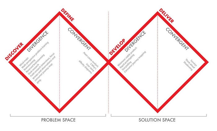
The frame innovation is applied to the Double Diamond framework as the first two steps (Discover and Define) present the first stage (problem space), and the third and fourth steps (Develop and Deliver) represent the second stage (solution space).
Now, Again to make it clear, This process worked well for our organization, Because we have a little agile and fast working environment. we are a very flat company where everyone’s stake is equal in the product.
Feel free to shuffle things up, Don't hesitate to change your layouts, Mix different research methodologies, Try Micro-interactions and animations that no one has attempted before if you think it’s impactful enough, and Come up with the most amazing visual languages. We believe decommissioning a Legacy approach is a tough job but as long as your new approaches and way are better justified and more efficient, there will be no roadblocks in any organization.
So, You need to figure out what way and approach work best in your organization concerning no. of people and the size of the team. Whatever work structure makes it easy for the team to work together to come up with an impactful project or product can eventually become your Design Process.
Generic Suggestions, Design Highlights & Strategies
1. Make value proposition noticeable
Getting to the website, the visitors should immediately understand why it is beneficial to them. Don’t make them search for the reason to cooperate with this B2B service — they won’t do it. Use a catchy slogan or tagline which will express the value proposition briefly and clearly, and take care of its visual performance.
2. Break down a large messy workflow
Breaking down a large, messy workflow into smaller chunks can be quite difficult. There is nothing quite like the decades of baggage that many enterprise organizations bring to the table. Even understanding some concerns requires dipping your toe into many subject matters to map things out.
Only once you understand how everything connects can you start identifying and organizing work into manageable pieces.
We also try to learn about the reasons behind every goal and limitation we encounter (which are many). This broadens our understanding of many areas that are closely interconnected to our specific project. It also tells us how other members of our organization work.
It is tough to always be learning, but you will often not be alone. A team of subject-matter experts will likely be there to help you understand, and it can be incredibly rewarding when things seem to be working just fine.
- When it comes to an off-hand comment a user makes when they demonstrate their day-to-day work processes.
- Sometimes it comes from developers explaining to you how various databases are redundantly storing data and introducing inconsistencies.
- Noticing that PMs want the same thing, but are just expressing their needs differently.
As you learn and start seeing the bigger picture, you see a giant web of interconnected regulations, technical constraints, business objectives, timeline pressures, user needs, and the user wants… And much more! While this is the case for most UX projects, the enterprise space is unique in the dizzying layers of complexity because you are likely designing for a very specific set of users who might have high technical knowledge and opinions about how they would like a product to work.
3. Information Density
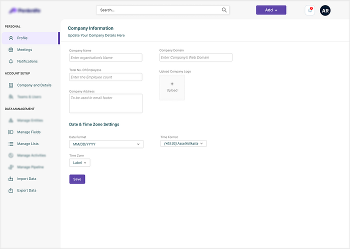
A common similarity for many enterprise apps is that they are incredibly information-dense.
The ideal ways of dealing with similar problems might suggest, hiding all the unnecessary information and revealing only what is needed, but the risk of “hiding the right thing” could be so bizarre that the risk is not worth it.
This often results in incredibly packed screen designs that increase the cognitive load on the user. The usual justification is that it is up to the users to “learn” how to use the software, which is only something that you can get away with in Enterprise software.
Additionally, for many administrative or monitoring solutions, it is important to see information side-by-side for comparison and reference. Complex non-linear workflows make it even more challenging as many options need to be both accessible yet out of the main way.
3a. Users’ Goals & Intent:
As in every other design choice, understanding a person's desires, and workflows is essential to recognizing their desires and priorities. Users don’t want to look at all the information, they want to see the records they want at that point. This aspect is very common between B2b and B2C apps. Knowing your user will give you a better concept of what one's desires are for every point. Trying to wager or making assumptions about the most not unusual or popular tasks might also backfire. If your product has more than one consumer corporation, you need to consider all the one-of-a-kind roles, their dreams, their level of understanding, and their cognitive capacity.
3b. Analyze the statistics:
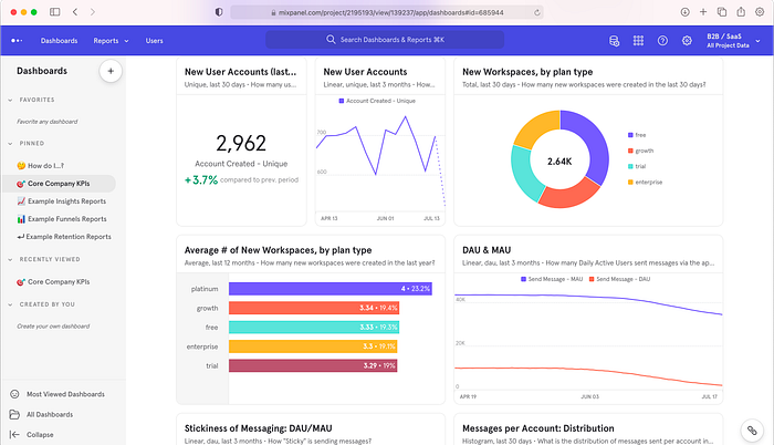
Working with real information and having an accurate estimate of amount (list gadgets, desk rows, article length, and so forth.) & satisfactory statistics facilitate visualizing and bearing in mind all feasible situations and facet instances. Understand the variables, what answers they provide to customers, and the way they are interconnected. We can tools such as mixpanel, and Inspectlet to track your user journey and activities.
3c. Knowing our layout aim:
Have a decided goal for each web page and section earlier than starting the designing procedure. That might assist in figuring out the statistics architecture. If relevant, don’t forget future function additions — design with scalability and adaptability in mind.
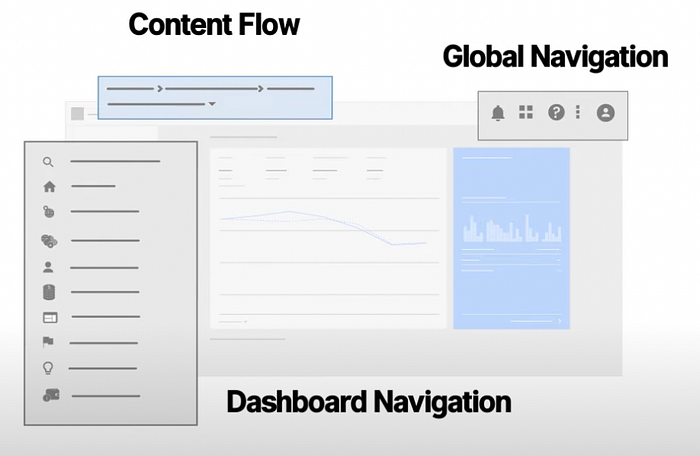
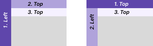
The other important aspect is an arrangement of layout, It decides the user’s eye flow, Time taken, Required attention oriented towards the task, User hesitation, cursor movements, etc. Which navigation panel has to be stacked on top? What to focus on least? and similar use cases have to be analyzed while planning the UX. In 314e we generally try to stick between two layouts which Goes like this,
3d. Know your product implementation:
Lags, ready time, dealing with mistakes, and disconnected workflows may also play a component in layout selections.
As a result, it is not uncommon for enterprise apps to sacrifice white space to pack more information on the page because typically the user simply needs to see more information to complete more complex tasks.
3e. Keep core data available from the pre-scroll area
Users usually decide on staying on the website or leaving it very quickly. It is a matter of minutes or even seconds. That is why all the key information would better be seen in the pre-scroll area, including the value proposition and ability to contact the duty holders.
4. Mind the contrast Ratio & Get CTA elements seen instantly
For most projects, your design system will need 3 button styles; primary, secondary, and tertiary. They need to have a clear visual hierarchy to display actions of varying importance.
- The contrast ratio of the button shape must be at least 3:1 to ensure humans can become aware of it as an actionable & Intractable element.
- A Button or CTA contrast ratio should be at least 4.5:1 to meet WCAG 2.0 level AA accessibility requirements.
- Plugins like “STARK” for Figma lets you quickly check the contrast between your color selections.
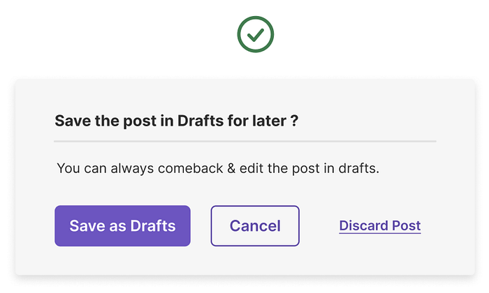
Sometimes UI urgencies are unique and very specific but we believe that there is always a way to pave things up using design. Here is a funny example below,
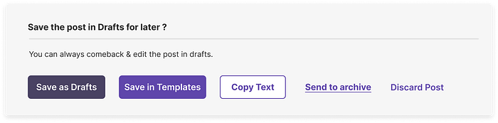
Let's assume you need a modal, which has a requirement of 5 CTA’s with hierarchy, Well in that case we will come up with something like this(Ignore the context).
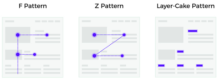
5. Mind the scanning patterns
F-pattern appears mainly on digital pages or screens with a big amount of content such as blogs, news platforms, etc. Users’ eyes move in F-shape: first, they scan a horizontal line at the top of the screen, then move down the page a bit and read across the shorter horizontal line, finishing with the vertical line down on the left side of the copy where people look for keywords in the paragraphs’ initial sentences.
A z-shaped pattern takes place on the pages which are not so heavily concentrated on copy or those which don’t require scrolling down. The pattern is the following: people first scan across the head of the page starting from the top left corner, searching for core information, and then go down to the opposite corner at a diagonal, finishing with the horizontal line at the bottom of the page from its left to right.
Again, the takeaway is to know these patterns, as you might want to use them while designing a particular section. Knowing it helps us in determining the user’s visual navigation, Which is very important while designing interfaces.
6. Mind the Data Tables
I am introduced to a lot of Data tables recently. Also, Data is turning into the raw fabric of global Digital Products and Operations. The pursuit of facts drives the reinvention of antiquated industries. Be its retail operations, Healthcare, Traffic, Finance, Media, or any evolved business, We can’t run away from Data and Information.
In order of figuring out what is the best practice, here is what I have concluded.
Note:-Again these are suggestions that work just fine for what we are dealing with, but in most cases, I believe these tips will enhance the experience.
6a. Fixing the row header or first Column as a user scroll provides context on what column/ Row the user is on.

6b. Horizontal scrolling Can not be avoided while supplying piles and piles of Data. When Data is structured From both Right and top, then there can be many columns, which the horizontal space of the screen can’t accommodate. We can freeze the Label columns and rows.
Always know that the interaction which might be convenient on one device can be frustrating on others. ex- horizontal scroll is common on a laptop’s touchpad but is hardly used with a mouse, if used then it takes more than two-finger swiping.
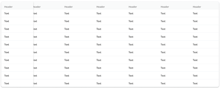
6c. User-friendly patterns
Table design has to be as minimalistic as feasible. Adding elements without motive increases Cognitive load and reduces readability.
Alternating colors or “zebra striping” rows improves legibility, mainly if the table includes many columns of data. The user is less likely to lose their place or interpret the data wrong as this visual queue helps them to stay focused on the line they are analyzing. Keep the contrast between the two colors subtle.
7. Minding the Design System
A design system is a collection of user interface (UI) components, patterns, guidelines, and processes aimed at creating unified digital user experiences.
As a company with a technology team comprised of thousands of team members supporting multiple client-facing applications, keeping our user experience consistent is both crucial and challenging. Unique and one Design system provides all our engineers, designers, and others with a single source of truth for how our applications should look and feel to our clients and Users.
Deciding and putting a decision on a particular design system not only helps in speeding up the development as well as design work, but It also covers most of the generic used components, interactions, icons, and navigations.
Now there is a variety of design systems available online with different features and use cases, many of them are open source and free to use. In the longer run organizations should develop their design system covering only the use cases required by the company, Doing this will make the front-end dev-ops library compact and lite which boosts the speed-dependent on CSS.
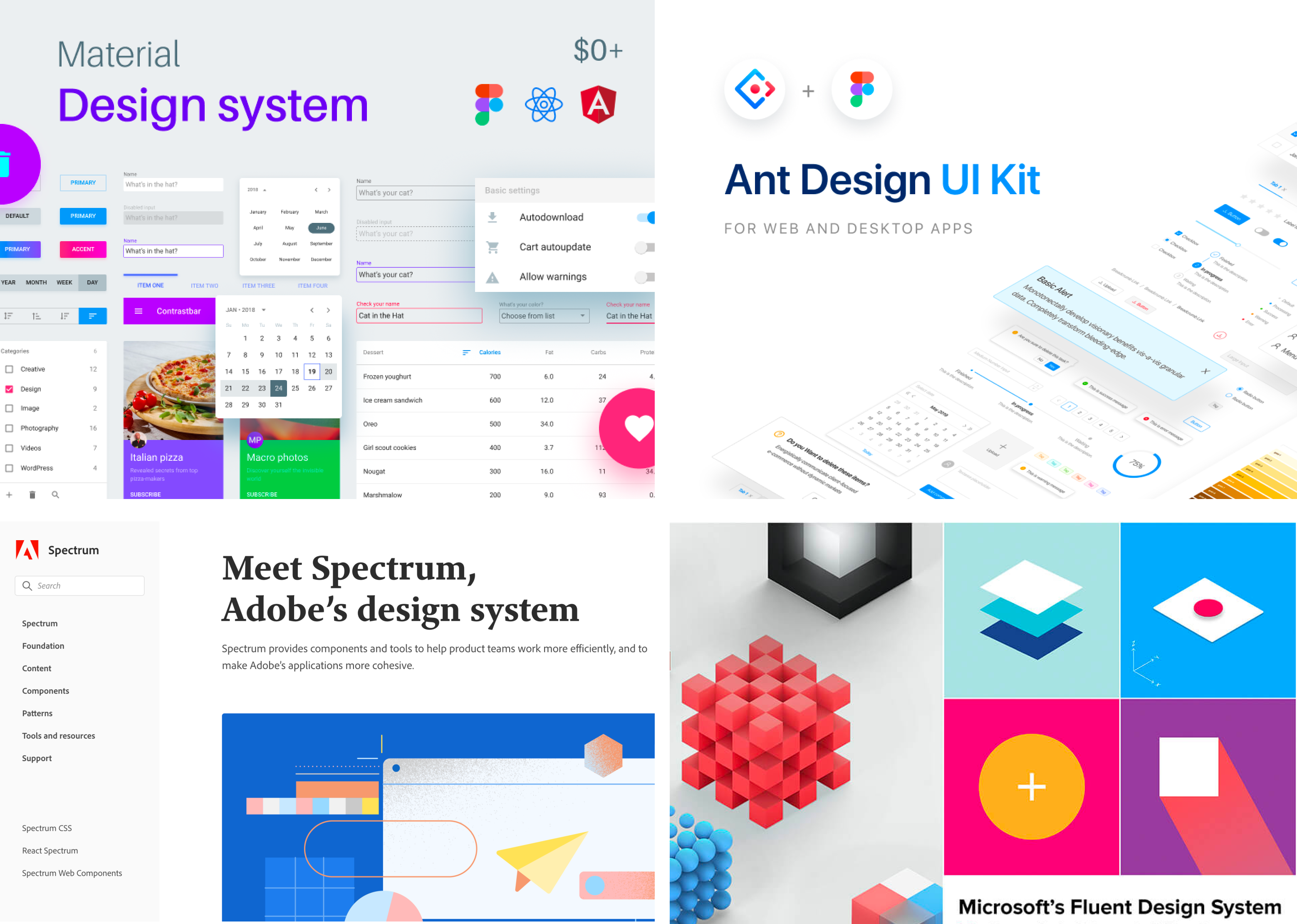
In our organization 314e,” we work primarily with “Ant design by Alibaba group” because of development pros and component variety which primarily comes in handy for enterprise-level app development.
We also wanted to have a non-common visual language and unique identity in our UI along, Considering the team and time it takes to design and develop one’s design library, we mixed the components, interaction, and layouts of Ant with Adobe’s spectrum and came up with our style. (example attached below)
7. Delightful responses & Testimonials with signs of trust
Word-of-mouth is the best advertising, especially in the B2B sphere. Deciding on collaboration, people tend to look for references, testimonials, and other signs of trust from previous clients as positive factors. So, make sure they are available and easily found.
Summary
“The next big thing is the one that makes the last big thing usable.”
— Blake Ross, Co-creator of Mozilla Firefox
User experience design for business is getting more and more expressions today. A great diversity of companies make an important decision to come into play and fight for online presence. All this and more are yet to be fully explored in enterprise space and the space is only growing further.
So write the work on sand, No matter what are you working on or designing, Always leave a scope of coming back and re-iterating things. Make sure that your Every second version of the product should always be better and more efficient than the previous one.
In our next blog, We will be talking about Graphic, Visual Design for Enterprise along with Our Elaborated research methodologies-, We will also be discussing, Power of color psychology, Typography, Ux fallacies & How to build hierarchies in detail.
Thank You For Reading…
Hope This read was insightful.