Progress Trackers in UX Design
by Nick Babich
Guiding users through a complex process by making it easy and intuitive is key to helping increase conversion rates. An easy-to-use stepped process helps users avoid frustration and successfully complete a task. In this article we will overview various uses of progress trackers and see how they can be implemented.
What Are Progress Trackers?
Progress trackers (or progress indicators) display progress through a sequence by breaking it up into multiple logical and numbered steps. They guide the user through a number of steps in order to complete a specified task. Good progress tracker should inform users about following aspects:
- History of actions. What steps (or tasks) they have completed
- Current progress. What is the user’s current location within the process.
- Which and how many steps still remain.

Why Do They Work?
Progress trackers create a clear path to completion. Studies show that offering users a clear idea of how many steps it takes to get to the final target can significantly reduce abandonment. From the psychological point of view, this makes a lot of sense. If you know how many steps you must complete in the process, you’re more likely to complete the process.

Also presenting content in chunks makes scanning easier for users and can improve their ability to comprehend. In practice, chunking is about creating meaningful, visually distinct content units that make sense in the context of the larger whole.
Uses of Progress Trackers
Progress trackers can be used in a variety of contexts. The following three areas are the most common.
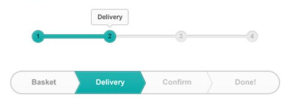
Online Ordering
By far the most common use-case of progress trackers is in conjunction with online purchasing, since this task can be naturally split up into multiple steps.
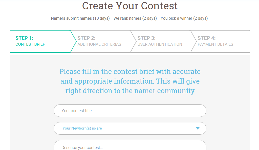
Multi-Step Forms
If a form requires a lot of user input, it may be good to split the form into multiple steps.
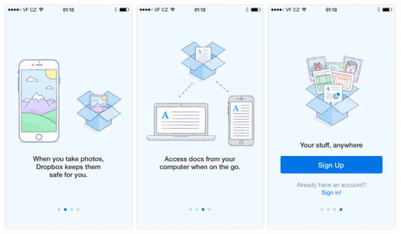
Onboarding
Progress trackers are also used to guide users through the features of apps and services. You can use dots when the number of steps isn’t large (like in Dropbox example below).
Best Practices in Progress Tracker Design
There are no universal solution for creating excellent progress trackers. But one thing for sure — you should always think of how your users interact with the system. Generally speaking, you should design process steps as simple and clear as possible in order not to confuse users.
Setting Users Expectations
When a user is going to take on a complicated process, it is important to manage their expectations up front and tell them how much time and effort it will take. If the user thinks the task will take two minutes, but in reality it takes ten, the user won’t have a positive experience.
Establishing a Logical Flow
The user should feel a sense of progression when they interact with your product.
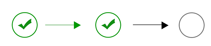
- Show the direction of movement. It’s better to use arrows in order to emphasize the direction, because the lines alone don’t provide much of a “flow.”
- Use icons in conjunction with words to describe the steps in the process. It should be clear for users what step sequence.
- Don’t make the process too long. 3–5 steps will be enough.
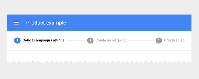
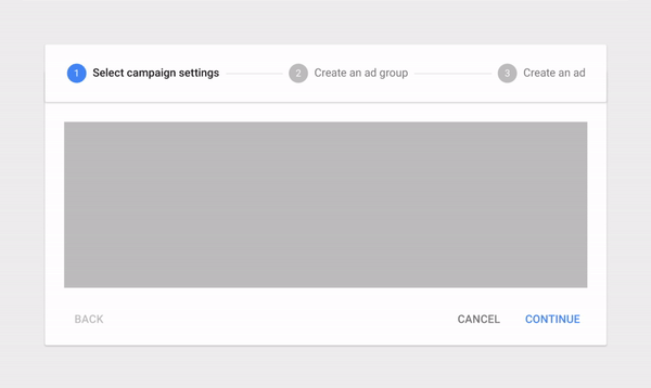
- Use numbers to describe the steps and indicate where in the process the user is (e.g., Step 3 of 5)
Keeping Users Informed of Their Location
“Where am I?” is one of the fundamental questions users need to answer to successfully navigate. That’s why a key aspect of good progress tracker design is keeping the user informed of where the user is within the process. This improves the logical progression because the users will know where they are in relation to where they have been, and what sections are to follow next.
You should offer a good visual representation of progress. Users rely on visual cues from navigation elements to answer this critical question.

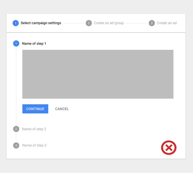
Avoid Nested Progress Trackers
Avoid using steppers multiple times on one page or embed progress trackers within progress trackers. They can create a mess in your UI.
Showing Progress Feedback
Progress trackers may display a transient feedback message after a step is saved. This feedback should only be used if there is a long latency between steps.
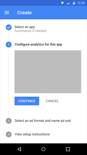
Progress Trackers for Mobile Apps
Since horizontal space is usually limited, a vertical progress tracker might be good solution for mobile apps and sites. Simply ensure the contents for each step are responsive.
Conclusion
Good progress trackers not only make users stick around to finish the task, they also create a more positive impression of your site or application.
Thank you!
Originally published at babich.biz