Prototype for a story-of-use, not fidelity
by George Abraham
We are lead to believe that fidelity is an attribute of the prototype. This belief is bolstered by claims that low fidelity implies paper sketches, and high fidelity implies digitally produced mockups with interactions [1]. Or that fidelity can be defined as “how precisely does this (prototype)represent the final solution [2].” Claims such as these continue to perpetuate the fallacy that fidelity can be decided without any regard for context of use, and in an objective manner.
Our goal should be to deliver the highest fidelity of experience using the cheapest means possible.
In practice, it’s far more effective to focus on designing details that support a story-of-use (experience) as opposed to deciding on fidelity of the artifact objectively.
Take the High or Low Fidelity Test
Can you guess which of the images shown below reflects a high fidelity experience?
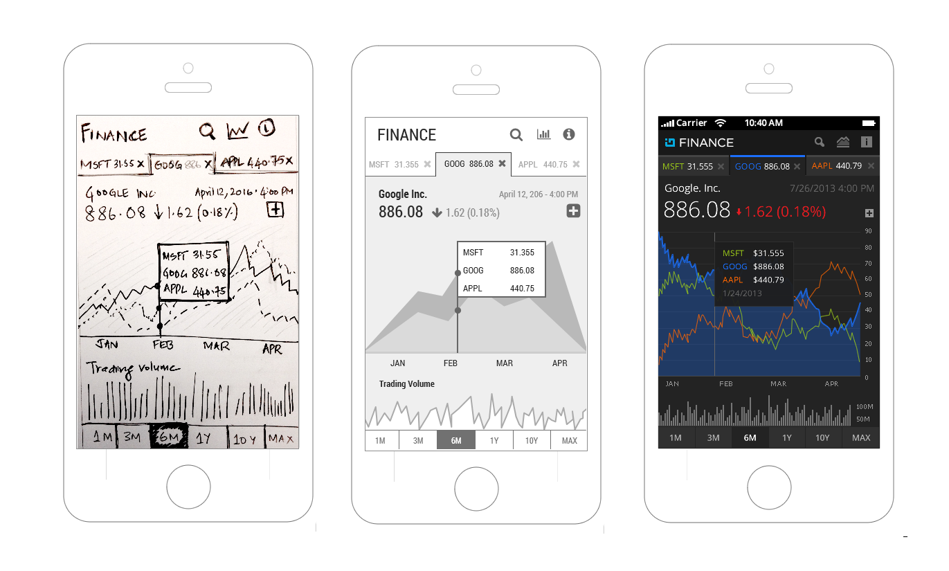
If you think it’s obvious, I’d argue that it’s not. It’s a trick question. In fact, all three may be identical as far as fidelity of experience is concerned. More importantly, looking at a single UI state/screen will not help us decide whether it achieves the high fidelity experience goal. For that we need to experience it in a context of use.

The solution to the problem is NOT producing a detailed art-board showing all possible UI states with connections. Such representations, while helpful to understand the general structure, navigation and interaction patterns, are not amenable for “use” by people who are the target audience.
When was the last time you launched an app and viewed all possible screen states and user flows at the same time?
As users, we only see one UI state at a time, and make our progress based what’s available to us on each UI state. We rely on content, micro-copy, affordances etc. to determine the next step in the task. So being able to use or engage with the prototype is necessary for a high-fidelity experience.
Treating high or low fidelity as an attribute of the prototype is wasteful. It sucks up time and effort on details that may not be required for evaluation. You achieve true proficiency in prototyping when you enable a high-fidelity experience using the cheapest and quickest means available. Getting feedback from users, as soon as possible, is far more important. So given the opportunity, create artifacts that will allow users to participate in the design process.
Confusion about Fidelity in Prototypes
Practitioners familiar with UI prototyping are already aware that decisions about fidelity can make prototyping a long drawn out affair.
Unfortunately, the tools we use for building prototypes can’t make these fidelity decisions for us, and in some cases make it worse. And without a way to resolve the fidelity dilemma, discussing the latest and greatest prototyping tools or frameworks is moot.
The available guidance suggests designers to prototype “just enough.” Such advice while being accurate is still open to interpretation, and not actionable. Design guidance on addressing fidelity can be broadly classified into two kinds. The first kind defines fidelity more granularly into its possible components (i.e., visual fidelity vs. interaction fidelity). The second kind is to provide general guidelines for prototyping, evident in statement like, “its’ a prototype, and not the Mona Lisa” (Warfel, 2009)
Attempts to Categorize Fidelity
Following up on the first kind of guidance, in which fidelity refers to the level of detail in a prototype, one invariably wanders into the territory of content fidelity, interaction fidelity, information fidelity and visual fidelity, as described by Arnowitz [3]. That is, the different ways in which level of detail in a prototype can be described. This leads to confronting questions like the following:
- What is a prototype with high content fidelity, but low interaction and visual fidelity?
- What is a prototype with high interaction and visual fidelity, but low content fidelity?
The above mentioned approach for deciding on fidelity seems thorough and deliberate. However, forcing designers to consider all combinations of such questions, even before prototyping begins, feels tedious. It should beg the question; does it matter? It’s an analytical pursuit, and ends up feeling artificial. While we can argue that it’s the designers job to figure this out because they are paid to, even Arnowitz acknowledges there is a tension between designing content vs. chrome in prototypes. He describes it as follows:
You can also de-emphasize a content type completely, for example by showing all text in greeted text format for your audience to concentrate on the visuals or interactions instead of trying to read editorial content, which usually grabs their attention. However, the issue is more nuanced than it appears. For example, let’s say you want to test the interaction design. Then, if you set the visual design level to lowest and editorial content to lowest fidelity, it will be impossible to really test the interaction; you need just enough editorial and visual design content to test the interaction.
What we need is a structured approach, but one that feels organic, and yet allows us designers to explore the design space, and do what we do — make good design trade-offs.
Arguing for Fidelity as a Fluid Concept
The second kind of guidance is imparted as broad guidelines aimed at reassuring designers that prototypes are not the end goal. That is, not to worry about creating a prototype that will exactly look and feel like the end product nor is it one. The key word here is exactly. There should not be an expectation of completeness.
As Todd Zaki Warfel [4] writes,
Prototypes by their very nature are somewhat incomplete, sketchy version of the final product. They are not perfect. They don’t have to be. They are not meant to be. In fact, a slightly rough and sketchy prototype is often better for getting feedback.
He goes on to say,
What I can tell you with great confidence, however is this — in most cases, your prototype doesn’t have to be Mona Lisa — good enough is good enough. You are not shooting for perfection here…All you need is the right level of fidelity. No more. No less.
The More You Know, the Less You Know about Fidelity
Attempting to recreate the “exact” experience often times contradicts the goal of completing the prototyping exercise cheap and to gather empirical data about use sooner than later. Relaxing the goal from exact to “good enough” yields significant gains. But the question remains — how should designers interpret such forms of guidance? As it stands, it’s not very actionable for deciding how much fidelity to aim for.
To summarize, both kinds of guidance are well-meaning and aim to capture the spirit of prototyping, but less effective because it inadvertently places the emphasis on the prototype. More specifically, fidelity as an attribute of a prototype. Neither forms of advice seems to offers concrete guidance for creating and evaluating your first prototype. And getting to the first meaningful prototype is a major shared milestone for the team, for the designer, and for the stakeholders.
Any guidance that asks designers to design just enough without considering a context of use is an ambiguous one. After all, what does just enough really mean?
Horizontal/Vertical Prototype is a Myth
It would be a shame to go further without discussing the proposal around horizontal vs. vertical prototypes; also referred to as breadth first vs. depth first prototypes.
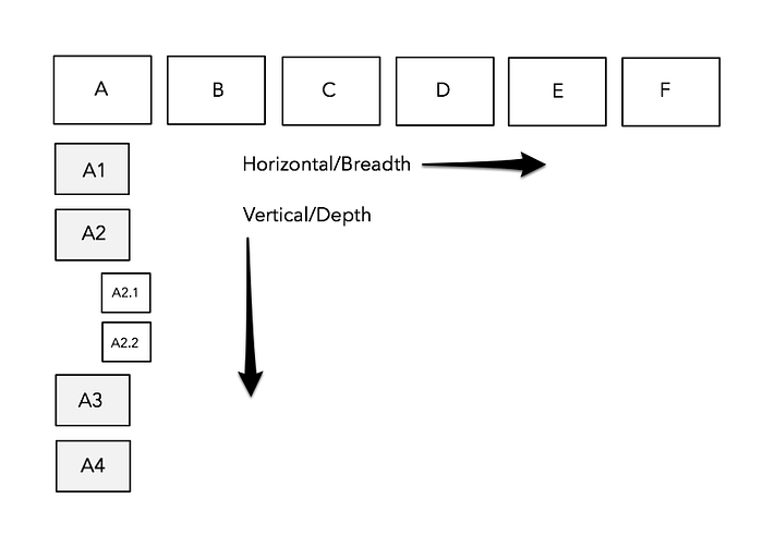
As technologists involved in designing and building software experiences, we obsess over designing structures and layouts. We fanatically try to document the visual UI elements, navigation, and commanding patterns so as to standardize and estimate effort required to build. However, the structure of the UI help support the stories of use, and not the other way around.
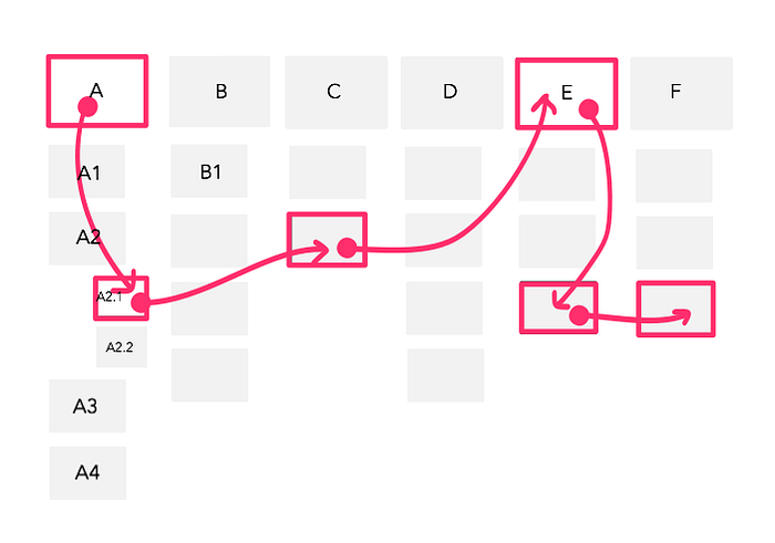
In practice neither vertical nor horizontal prototypes, by itself, are useful for gathering empirical feedback on use.
Such classifications are good to theorize about prototyping. I say theorize, because the user does not care whether it’s a horizontal or vertical prototype. In fact, when you prototype to support a story, it may result in a prototype that’s neither strictly horizontal nor vertical. Stories bring in much needed context, and a better guide for your prototyping efforts.
High-Fidelity Experience using Low-Fidelity Artifacts
By choosing to target a desired experience, the debate is no longer about high or low fidelity prototypes; it’s about whether the artifact created has enough detail to simulate the experience, thus allowing us to understand the implications of our design choices. This does not mean we start prototyping with nothing; instead, align prototyping efforts to support concrete stories-of-use.
To learn quickly, we need to aim for the highest possible fidelity of experience using the lowest possible fidelity of the artifact. As UX matured as a practice, new techniques and methods have emerged. However, what users can give feedback on and how they can easily participate in the design process has not changed much. It’s still realized by letting users experience the design. And we as design professionals can assess and perfect the fit for use. More importantly, users need to be able to “use” your prototype to help them participate in the design process. Without this, we can’t really call it a human-centered design process.
Stories-of-use can serve as a surrogate for communicating the experience and a guide for prototyping. This is also where user research fits in; by providing us with stories that matter in a given context of use and for a given user.
Not everything in your prototype needs to work, but it should work for a story-of-use.
Constrain and focus your prototyping efforts on stories you have picked as important instead of wasting time on making “everything” work.
I present two examples, not directly related to UI prototyping, but are related to evaluating an experience with low-fidelity artifacts.
- Sketch-a-Move puts forth a proposal for toy cars that drive themselves, but you control the path it will take by drawing right on top of them! The options for game play are only limited by your imaginativeness.
- New York vs. New York proposes an app for competitive running groups, and as a way to meet fellow runners in a new city.
The two examples help argue that it is possible to enable a high fidelity experience with low fidelity artifacts. These artifacts can be readily used to engage with users as well as internal team and stakeholders.
In other words, artifacts that can be “used” by your target users is also good for the team and stakeholders.
We can then continue to refine the design vision with more confidence now that we have validated our assumptions.
The examples also highlight that “story-of-use” is a rather flexible concept. A good story is generative by encouraging more discussion. Sketch-a-move communicates an experience with a rather shallow story of how the “product” will be used. NY vs. NY is a richer narrative with a storyline that goes beyond a single moment of use.
Prototype for Use & Evaluate with Users
In summary, approaching fidelity as an attribute of the prototype is a flawed approach. Whether you are explicitly concerned about fidelity or not, you will eventually need to make decisions about it, in your own way, when building a prototype. If every designer begins to answer the questions about fidelity in their own way, it will become impossible to compare design alternatives. We need a starting point, a heuristic, some actionable advice that can allow designers to easily get started with the prototypes, and finish quickly!
Prototyping needs to be treated as a process, and not a deliverable. It’s an activity that’s as much about creating prototypes as it is evaluating them with users.
If you are not using the prototypes to evaluate assumptions, then why build them in the first place? These should serve as research instruments to learn about fit for use. When we approach prototyping from an evaluation perspective, we can begin to define fidelity in more actionable ways. As in, your prototype only needs to do whatever it takes to simulate the experience you wish to evaluate. And to do this cheaply, we need to know the precise set of questions a prototype will answer.
And although it may appear that I too am subscribing to “fidelity as a property of the prototype,” I am not. Instead, I am advocating for enough fidelity so that your prototypes can be “used.” And to do this, rely on concrete stories-of-use.
I suggest you aim for fidelity of the experience and not of the prototype. Actually, it was not me who said this; I heard it first from Bill Buxton.
References
[1] Busche, L. (2014). The Skeptic’s Guide To Low-Fidelity Prototyping — Smashing Magazine. Smashing Magazine. Retrieved 22 June 2016, from https://www.smashingmagazine.com/2014/10/the-skeptics-guide-to-low-fidelity-prototyping/
[2] Prototyping.Usability.gov. Retrieved 22 June 2016, from https://www.usability.gov/how-to-and-tools/methods/prototyping.html
[3] Arnowitz, J., Arent, M., & Berger, N. (2010). Effective prototyping for software makers. Elsevier.
[4] Warfel, T. Z. (2009). Prototyping: a practitioner’s guide. Rosenfeld Media.
This article orginally appeared on the Indigo Studio Blog.
Indigo Studio is a prototyping solution that let’s you design user stories at the speed of thought, and validate instantly with remote usability studies.
Many thanks to David Ismailov and Jim Ross (@anotheruxguy) for their insightful feedback!