Quora - Digging problems and revamping based on real users - UI/UX Case Study
In this case study, I am going to talk about the process, and impact made with the outputs of the changes which enhanced the UX.

Introduction
Quora is a platform that lets users ask questions, find answers, and share knowledge for mutual growth.

It helps people who have the knowledge to the people who need it empowering people to learn more with each other on various topics with numerous languages available.
Since 2015 I have used Quora in many situations to some are to know about life experiences, college selections, competitive exams, film analysis or simply reading out interesting facts.
What led me to start with this
Recently while using the application I experienced some problems navigating, but as an old user we get too comfortable so the problems do not show up well same was the scenario with me then I initiated to look up for the problems
And then I decided to work on them to improve the overall user experience, focusing on the use cases and pain points I started to have a check on what approaches could be taken to refine and enhance the experience by reducing the not alike mark on Quora with trending apps on the charts.
Finding the problem
1. Hands-on with the application 📱
I started out by scrolling throughout the application to understand the platform, user journey, and its information architecture.
How it helped me:
1. To understand the Navigation system to view how users seek to use the application.👣
2. To understand the Search systems of how they look for information within the app.🔍
3. To define Heuristic problems.📳
2. Interface analysis
I took screenshots of all the screens, arranged them according to the subparts, navigation and started by writing off problems simply side by side.
In the process I tried to use other apps as well to test the use cases on how they work on different platforms.
3. Reading reviews
I went out reading the reviews of users keeping the assumptions aside.
Listening to real users and understanding them is the key of giving them the best of their expectations.
Most of the 1⭐ reviews were written in an impulsive reaction because of frustration and direct redirection to the app reviews part being repetitive and from various parts of the product such as development,
content strategy, or basic navigation problems.


1. Home Page

Search discoverability is less with direct action of posting another question through the FAB on the screen.
This can create irrelevant questions and waste time as in the case if your question already exists, most probably the probability is that it can easily be founded as there are already more than 400,000 subjects discussed on Quora.
The solution increases the viewpoint of findability and expectations of the user throughout the product.
In simple words, it is the center of attraction for all of your content.
2. On-Click
Suppose you are going to a supermarket to buy something you have in your mind or let's say just for a casual visit to buy stuff, you have less time and you reach there the next thing you see are these visuals 😣


What are the chances that you will :
Directly reach your product in case you are coming for the first time.
2. Do not get confused among the products if you reach them.
3. Most importantly not get distracted and see different products leading to eating up your time and budget.
4. Lastly not get anxiety in one go.
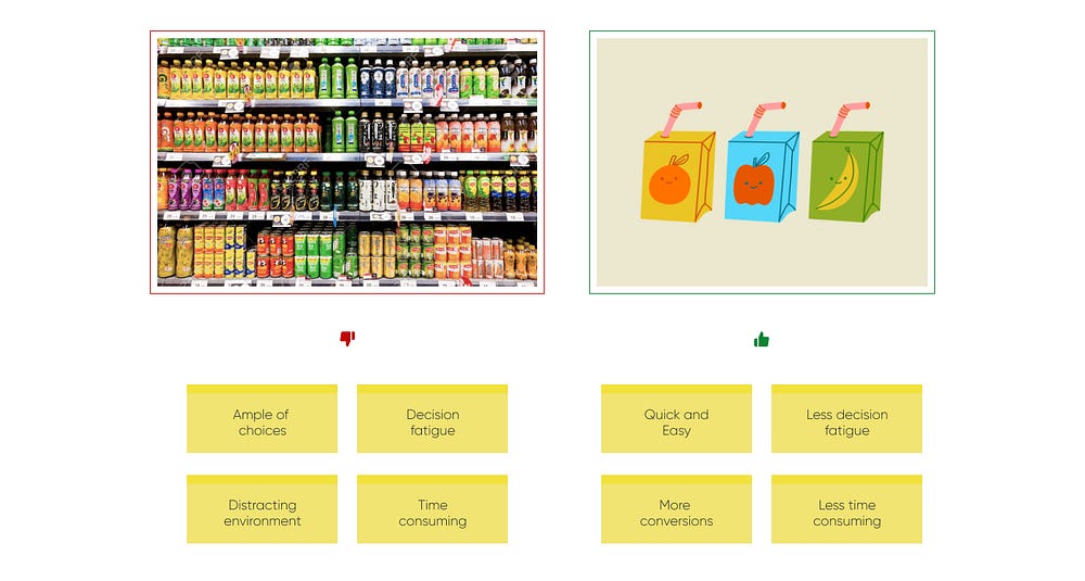
More Isn’t Always Better
Exactly both the things stated above do occur when such amount of content choices are given the amount of overload is massive.
The user can likely switch to a better platform well we can say there is always a competition for everything nowadays.
The most famous Jam experiment conducted by Sheena Iyengar and Mark Lepper proved that with the Choice Paradox indecision can be seen.
This decision fatigue for users can make them redirect so without exhausting the human mind this can be proved that Why less is more.

3. Searching the content
For the first time when you use something new, it is tough to get comfortable but as you start using it you get familiar with it, again if the trend changes and again you think of the changes which were at a time not visible to you.
But Why this happens?
Because of the repetitions, it is the cognitive enhancements in the new generation app UX which are making the processes easy as the middle way is too repetitive and common it does not seem like steps that we follow.
The same happened when I tried to use the application search let me tell you in scenarios: 👀
1. Scenario 1 : Instagram
As soon as someone tells you your username or you try to search there you do not find any late in yourself you simply complete the procedure and there you go here are your results.
2. Scenario 2 : Facebook
The same happened years ago, I mean most people have stopped using Facebook but when it came to using the application/website it was almost an automatic process of consumption
But in the case of Quora, it felt apart of the general trend and using existing mental models of users can directly affect the user experiences in scale.
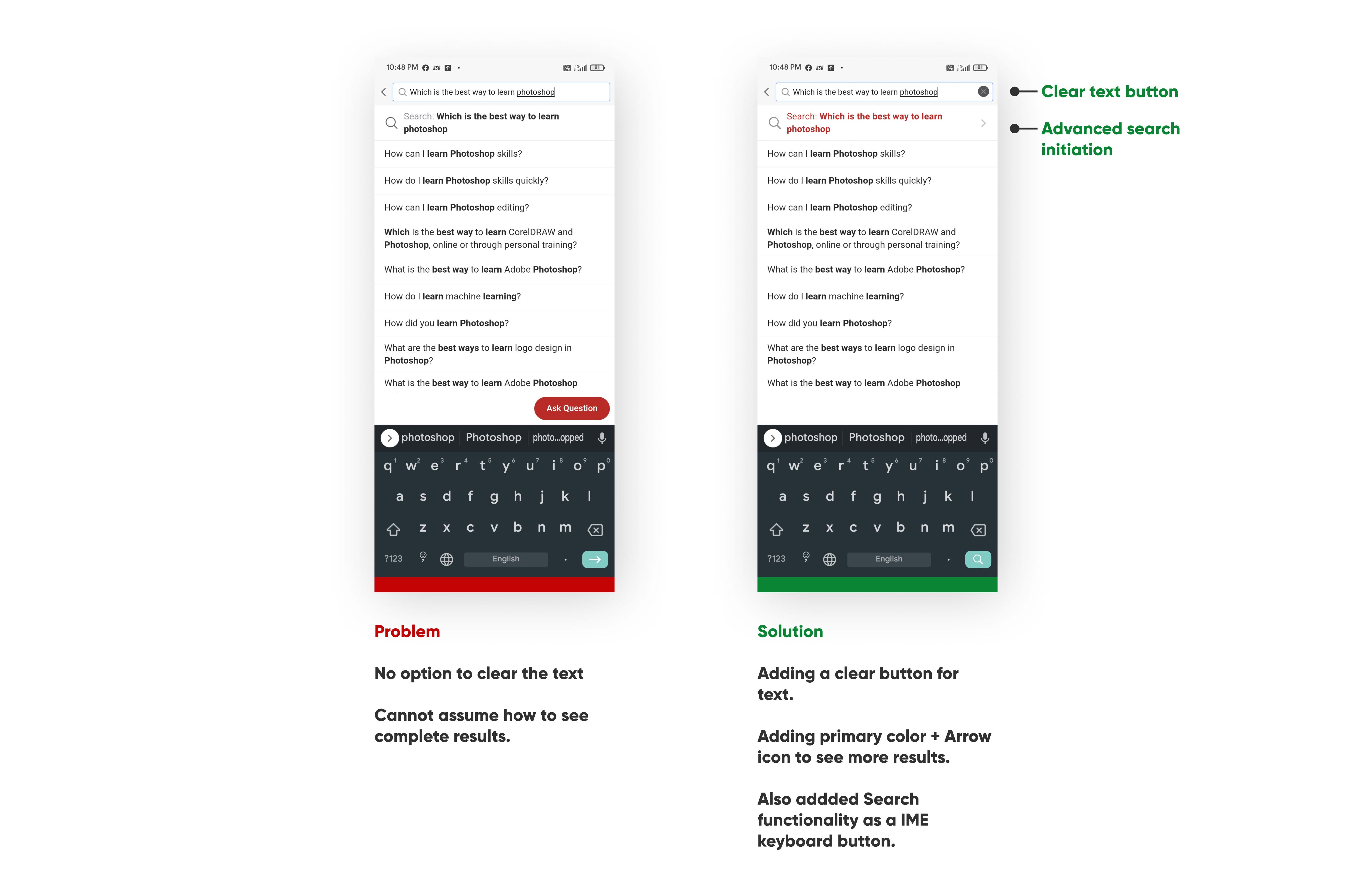
And then coming to Quora I saw the flaw, one needed to touch the bar under the text field which cannot be assumed as there are no signs of doing so.
Another is that why would anyone being in a comfortable phone handling situation go to the near topmost area of the screen to initiate the search.
IME(Input Method Editor) action in the right bottom corner can be unseen most of the times by the user, while input or action taking is used the most.
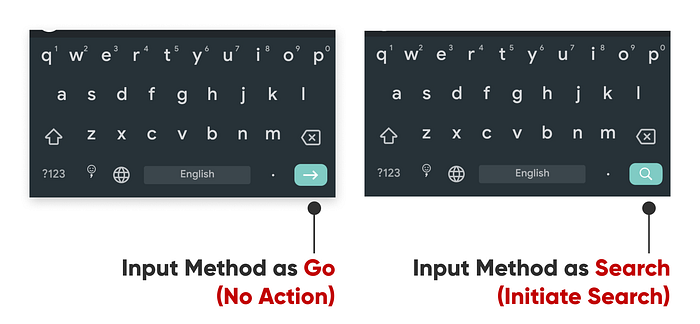
The changes make the search initiation easy a lot of times easier than before.
4. Search Results
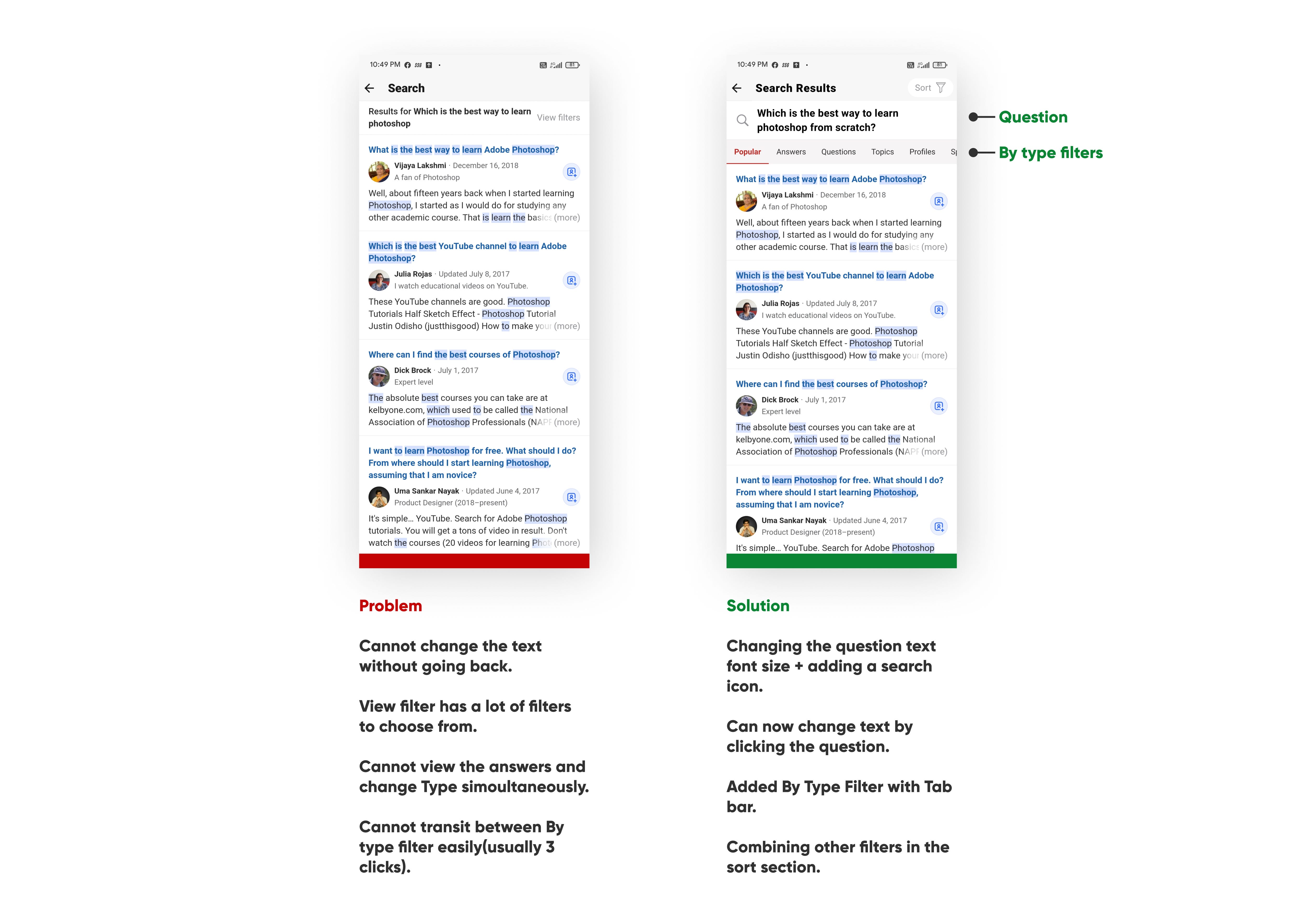
Making these changes enhances the UX as it creates:
1. A better difference between the content available which gets lost inside a filter action.
2. Let the user see the content alongside changing the type of filter.

Quora has a lot of content if you try to put up just a word on search one can easily get more than 10+ answers in one go which means too much information available.
Narrowing down the content to categories expands the view of the user and provide a positive sense of choice and decision making.
Another difference again it makes is that it provides a capability of changing the search text on the same point in comparison to the last one as one had to go back and change the text for another search.
5. Sorting the content on the basis of need
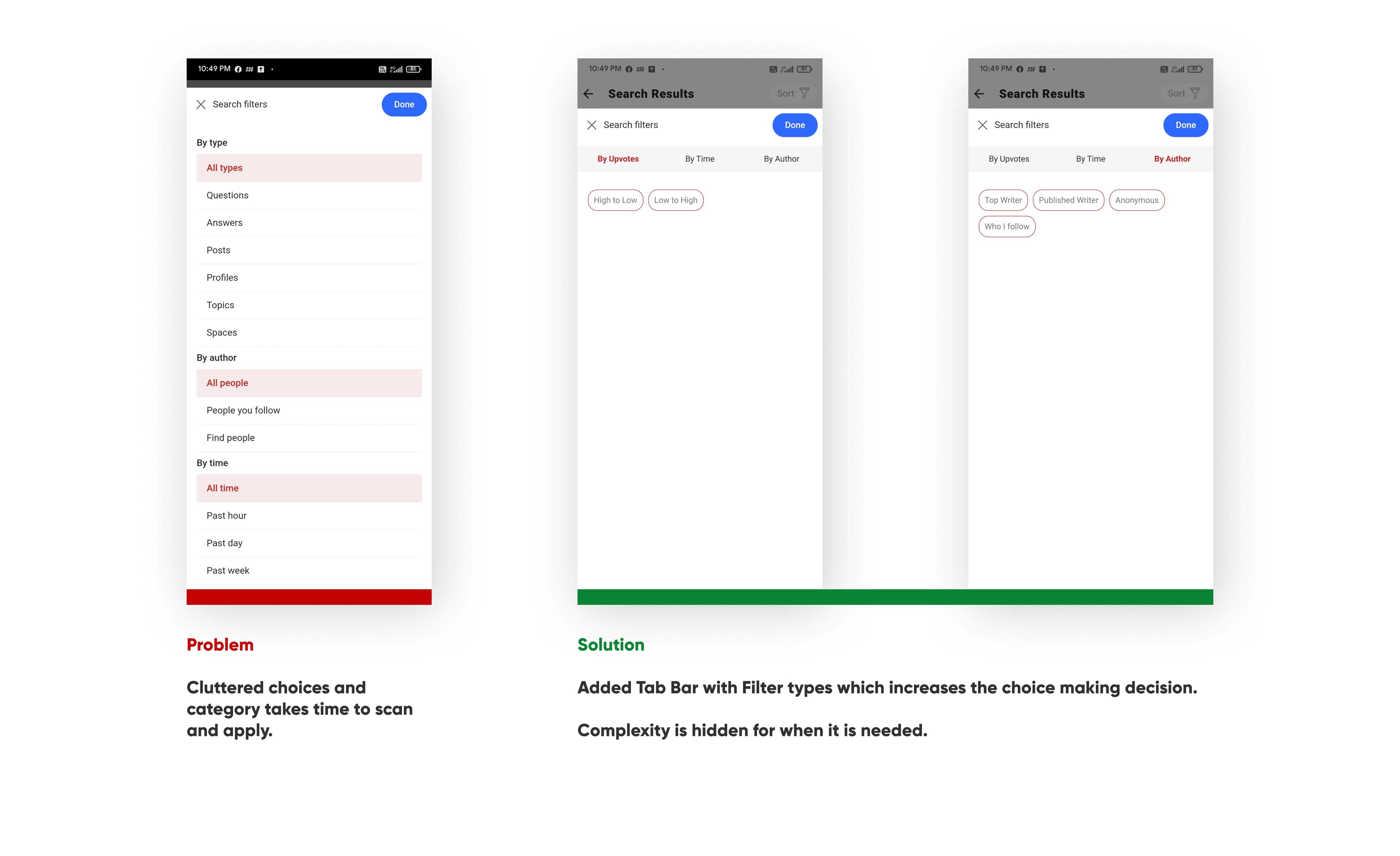
Showing detailed parameters by choice reduces the strain of scanning.
Introduced blocks of sort types which can be opened up to find sort options in that block respectively to fold the complexity for when it is needed.
Also added By author parameter with top writer and anonymity of authors.
Reducing Complexity >>> Reducing clicks
Making ease for the user and increasing the scanning provides a better UX which helps the user get out of confusion.
6. Applied sort
The applied sort state should be very clear in the place if the user chooses an incorrect sort value, or they may simply find that they no longer are interested in the selection they made.
So the process to see the content without closing the search or rewriting is a must in order to make the user experience seamless and completing the use case as fast as possible.



Impact
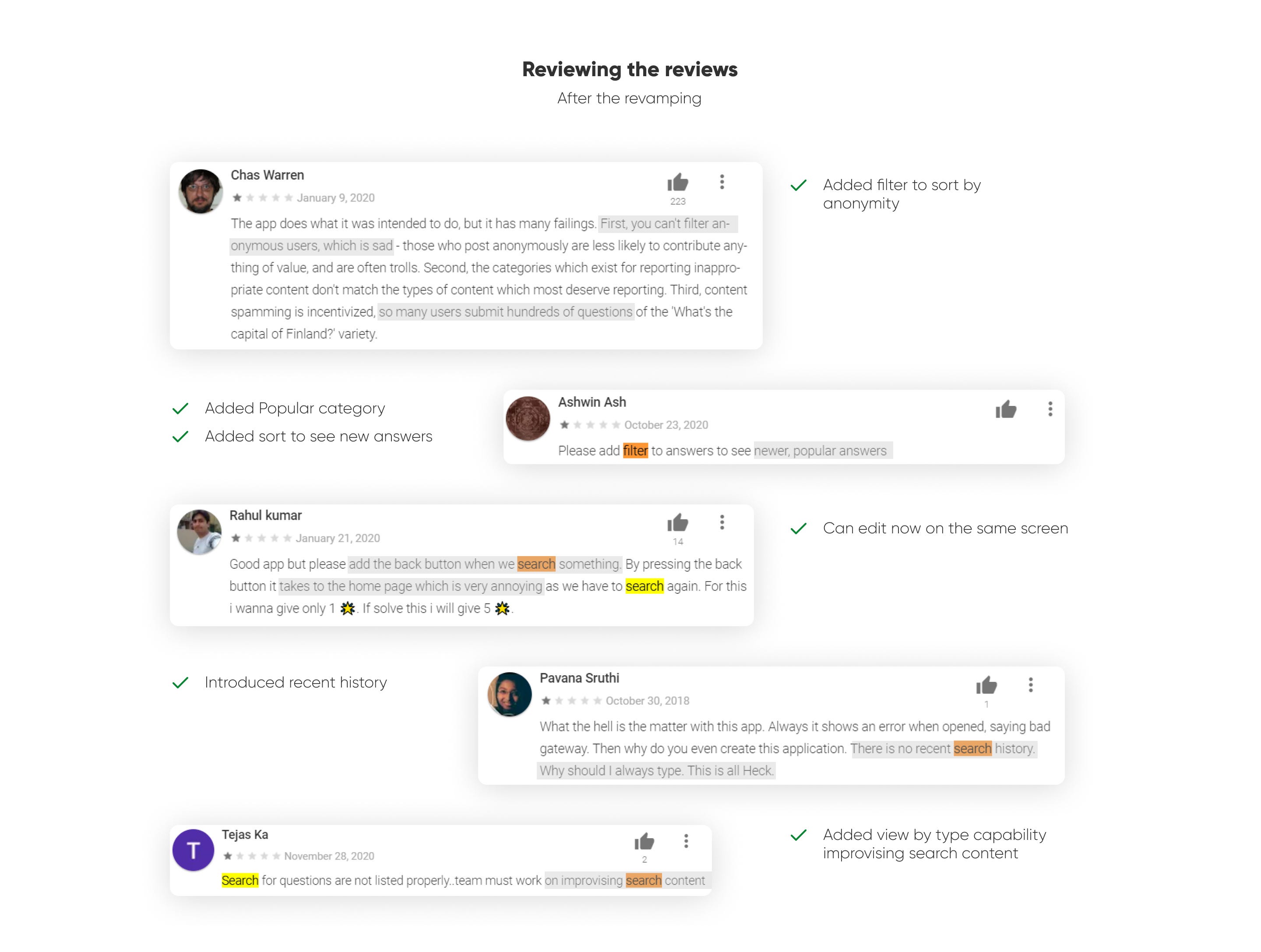
Eventually, with the changes I was able to make out a better output with
7 Improvisations made and reducing the action count by 1
(not a big number but makes a big difference with improvisations made).

The soul of Quora is asking questions, Both kinds of user questioners and answeres mutually get advantages which are massive and this circle gets repeated throughout for the advantages they get.
Advantages can be of different types like some write to earn through the partner program of quora, to boost self-confidence, improve their writing, or as simple as getting fame for all this the competition plays an important role.
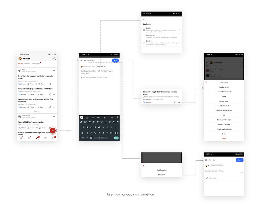
Current Flow
There are two sections when you need to post the content to Quora:

Personal Assumptions
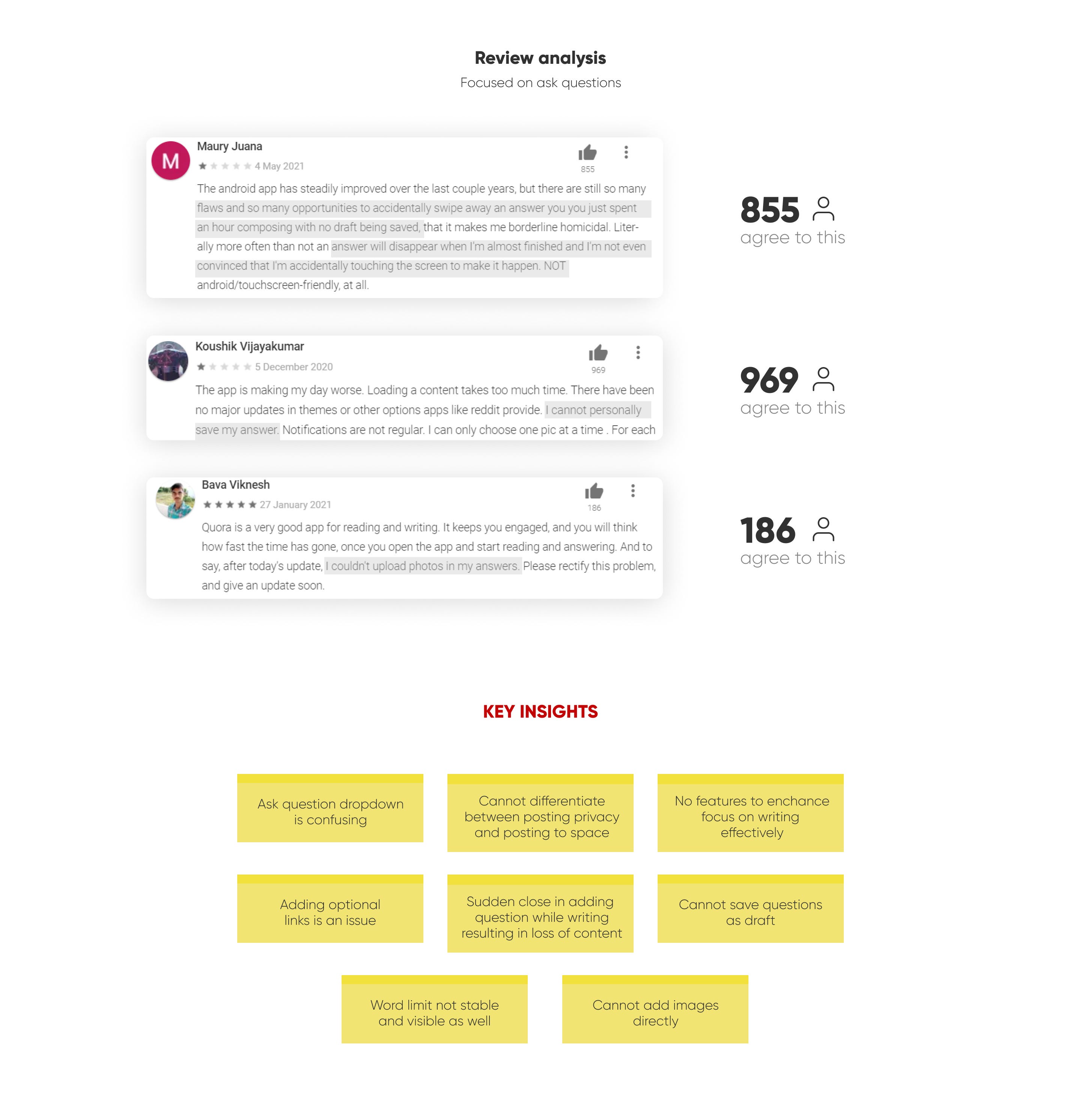
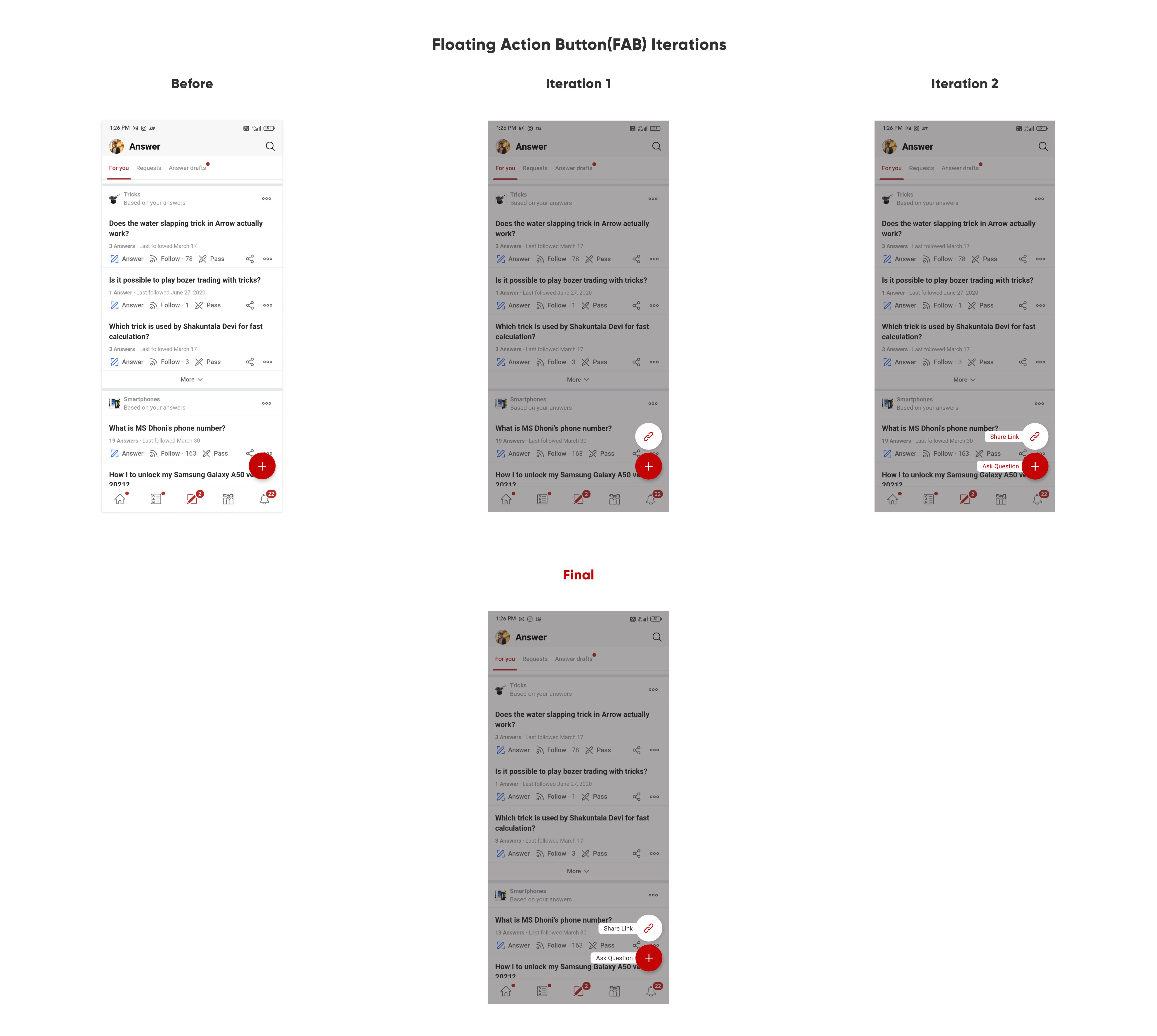
- As soon as the Floating Action Button (FAB) is pressed user is set with an intention of adding something which in this case most probably would be a post in the form of a question but, The problem here is that the add question(dropdown) makes a confusion being at a position which is scanned at a priority level.
- “Name asked Public” is a weak point of copywriting where the user may not know what it does mean there can be two possibilities of thinking
i.) Posting it publicly or with people I know.
ii.)Posting as a public user where people can find my name or posting anonymously.
Problem is that users cannot identify what are the differences.
Note: Quora provides users a possibility where they can ask and answer anonymously as well. - Adding Optional Link, adding links to social media posts has become normal just like pictures for contexts so it adds another hurdle in asking questions.
- Space optimization can be done by adding features for ease of writing answers, also these differences can impact the question stress at a point to make users feel important and know the major part through writing.
Example: These Titles and Subheadings themselves make a difference with attention on different parts of this case study. - Adding images for a user who is not tech-savvy is nearly impossible.
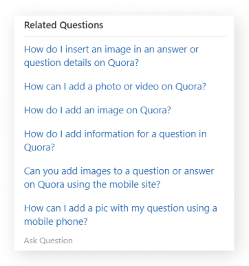
Quora answers itself provided me help in understanding the
The intensity of need of this feature on their own platform.


What is it?
A feature which allow users to re-read the answers which they have already read or opened.

What is the need?
Well not always one is prepared for the actions in the future, there are exceptions on how everything cannot be known or planned.
Unknown need
At a point when users consume content do not always know that they will need to reach it again either when it comes to showing people or you yourself want to see it.
That is when history comes to save us which could increase the findability with ease.
Unexpected need
By reading out some of the app reviews I got to know about the problems which users frequently faced.
I also experienced the same problems before while using the application.
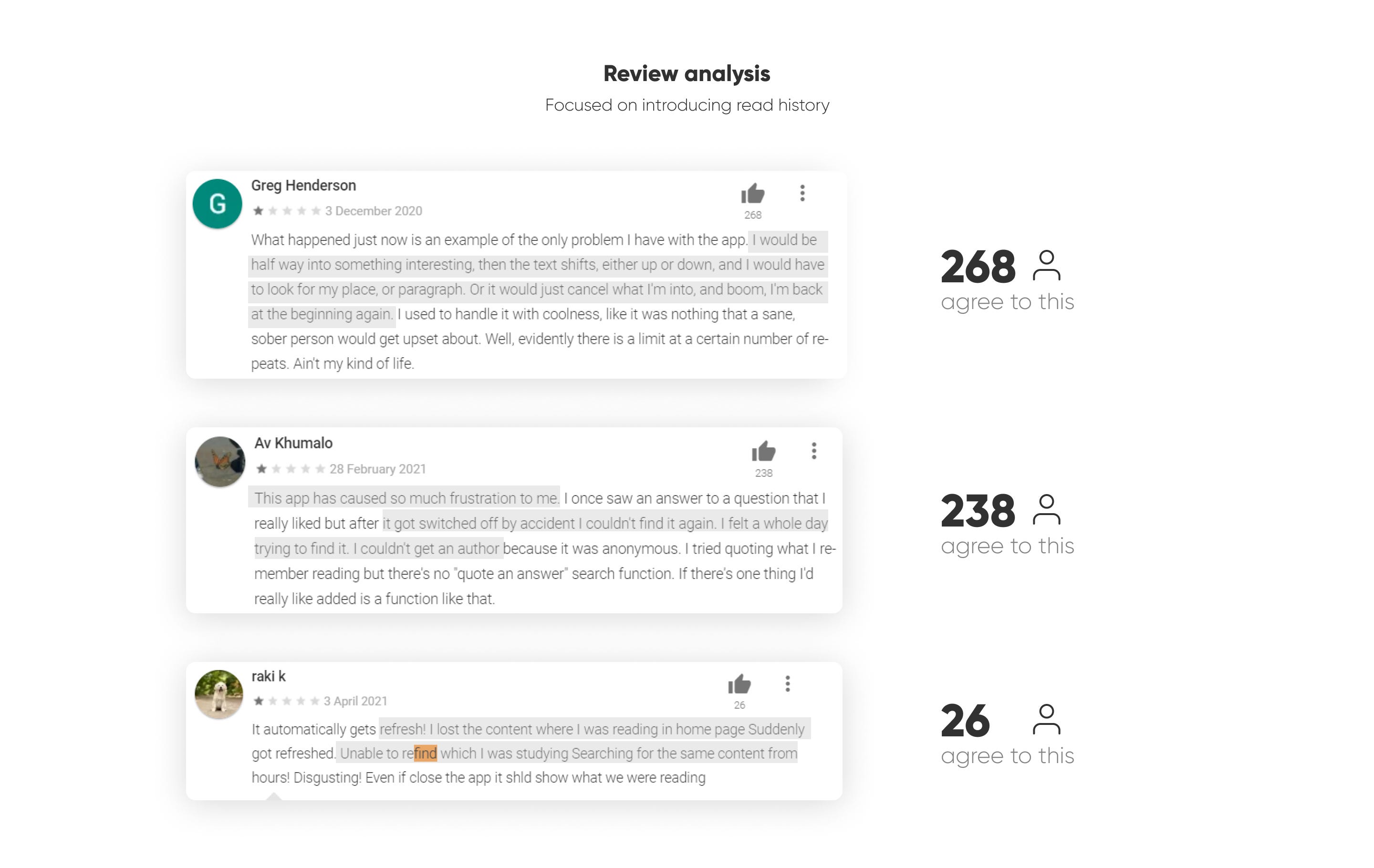
Scenario 1: You are using Quora reading another answer in your room and then suddenly you hear out your mother calling, you cannot wait at that moment for sure as she might get angry at you.😂(In my case)
Scenario 2: You are in a conversation with your friends and in between the talks, you remember to tell a fact to tell everyone you saw on Quora and cannot find it.
There can be 100x scenario’s like these which state the need for this feature.
And being real we somewhere somewhat used our Google and Youtube browsing history for sure in the past.
That’s all for this case study
Thank You For Reading! 👋🏻
To appreciate hit the clap👏🏻 button at the end of this case study.
Quick Fact: It can be tapped 50 times check it out 😁.
Learnings from this project🏫 were:
1. There are some situations when the existing solution cannot be replaced without knowing the whole purpose and scenario which do exist on a lot of research and data-driven factors.
2. Users do not always like the modern way/solution to something as they do not align with the expectations and the way they have been using it for a time.
3. Improvements cannot change the actions in a short period it takes time to digest and understand the way of their working as most of the users seem to be unhappy/uncomfortable with the new roll-overs of the applications.
Sometimes the best way is to use the standards and do not reinvent the wheel.


