WEBSITE REDESIGN
Redesigning a classes website for a better conversion rate & reach — UI/UX Case study
In this case study, I am going to share my recent experience while redesigning a website & the steps which I followed for doing the same!
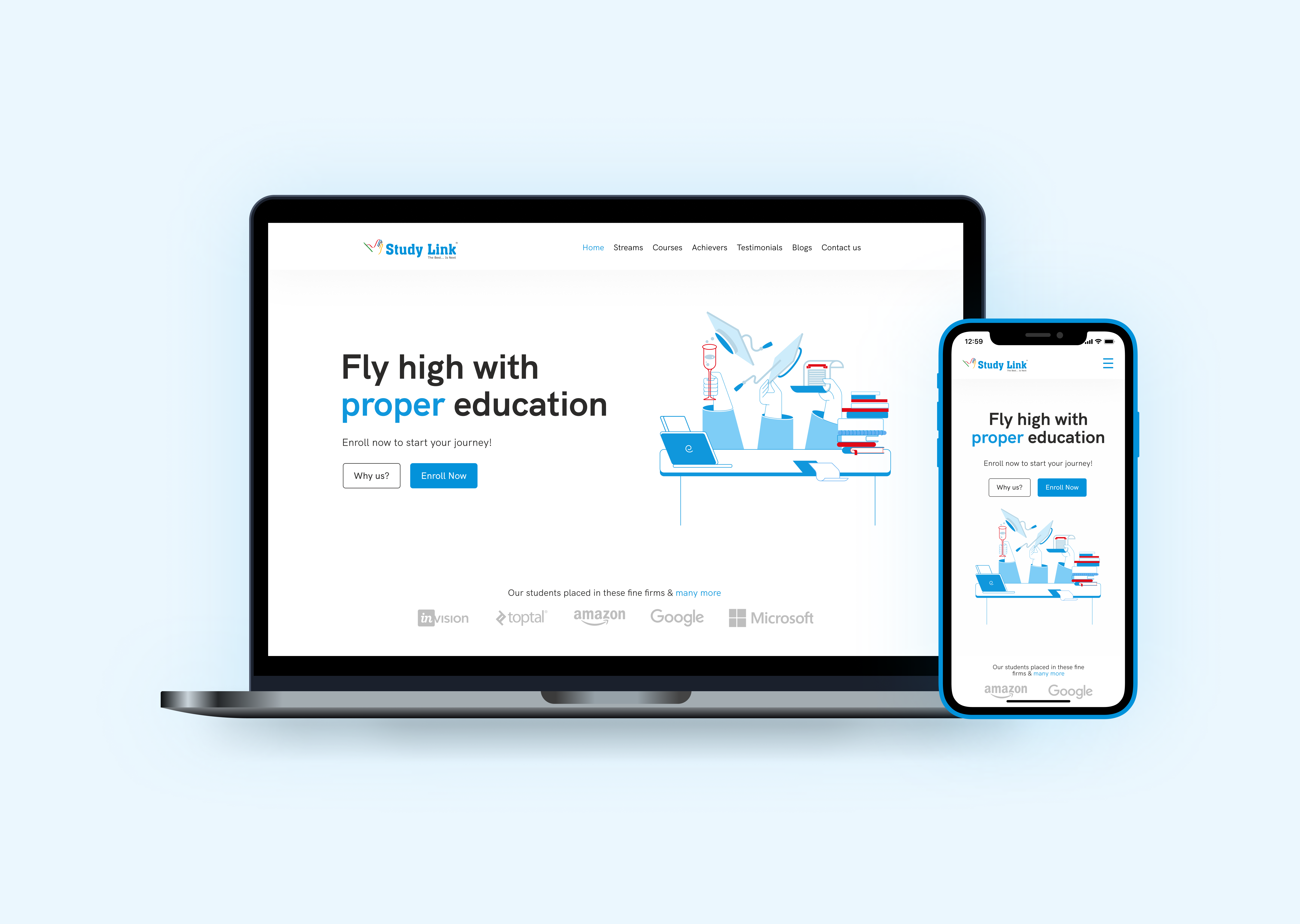
Studylink Classes is a Mumbai based, Engineering & Commerce coaching class founded in 2009 and has been in the business for more than 11 years now.
The prime principle which they follow is:
Fly high with proper education!
Surely.
Why Redesign?
The older website, as mentioned by the founder, was too old & they needed to update the website as the older website was 3 years old now. The main motive was:
- The main motive of the website is to give information to the newcomers about the subjects we teach, our culture & how can students get benefit by learning with us.
- Moving towards digitalization & accepting admissions online instead of typical paper forms.
- Switching to online learning as well as offline learning (Planned). (However, this is not covered in this redesign because they have been planning this and they aren’t sure if they’ll implement it).
Looking deeper into the matter, I found some problems which are:
- The interface had a lot of textual content which sometimes makes it feel very cluttered.
- The information was redundant and there was a need to fix it.
- The older website doesn’t reflect the student’s practical achievements like placement details.
- The older website doesn’t show the class’s achievements.
- The older website is too old and surely needs an update.
User Personas
Attitudes & behaviors of the target audience were gained after looking at the stats of the old website & based on the number & type of inquiries they received.

Information Architecture
The first thing I wanted to change was the information architecture of the website. The old website’s landing doesn’t include a feeling of trust. The other sections are pretty much the same as the older website.

As we are discussing the Landing page, let’s see changes & modifications on the Landing page.

Let’s discuss each section in detail!
Hero Section
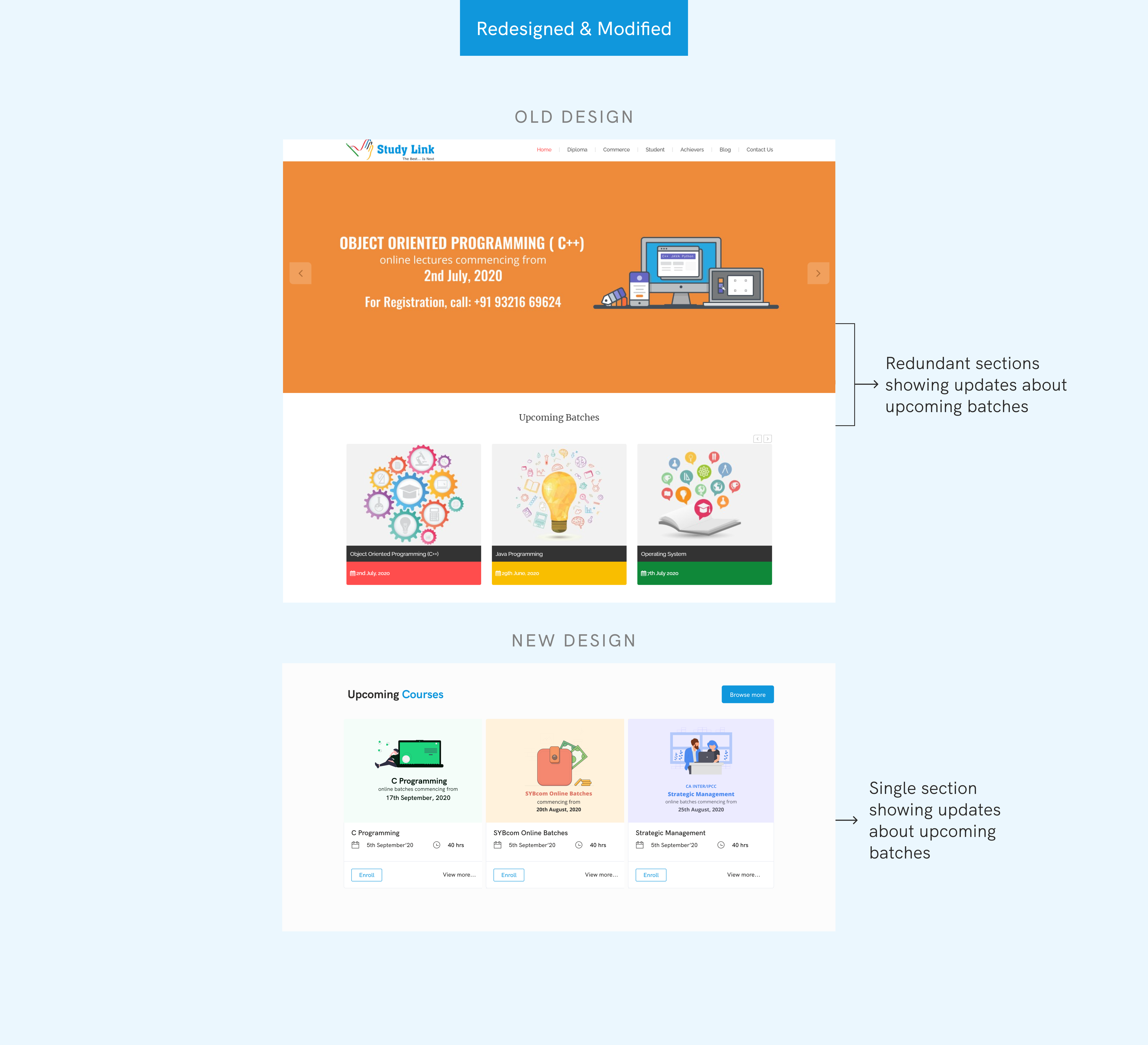
The older website doesn’t have a hero section! Rather it had a carousel that had images of the upcoming batches which was already a separate section very next to the carousel!
So the main concern was to add a Hero section which creates a feeling of trust for all types of users & that keeps them hooked! Also, it should reflect the principle which the classes follows!

Upcoming batches section
As I mentioned, the older website has 2 different sections. So on the current website, it’s merged into one section which shows the upcoming batches.
What makes Studylink different from others?
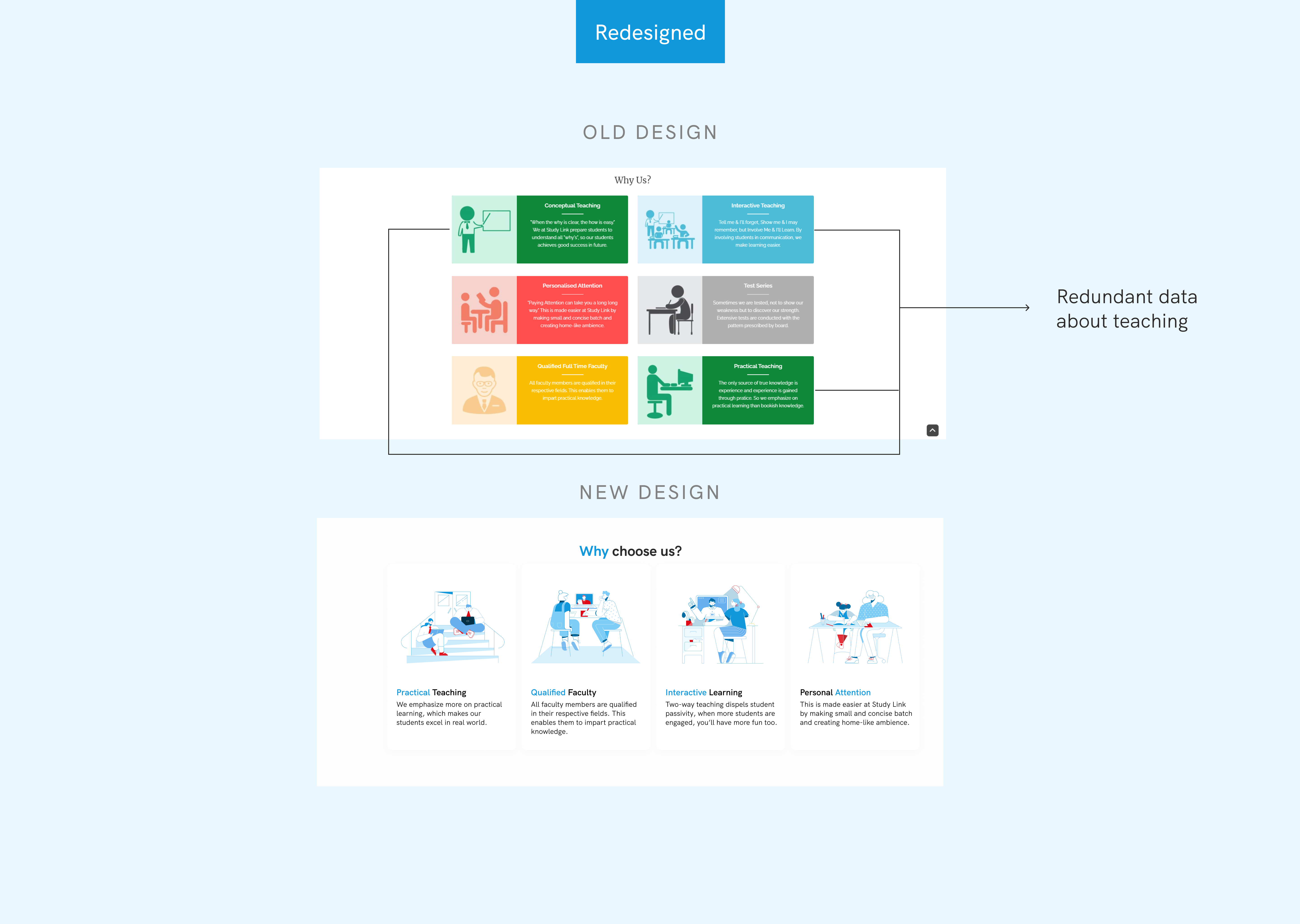
The main qualities & achievements are the main things which people consider before taking admission. The older website has 6 different points out of the 4 were unique and the other 2 could have been merged into a single point.
Class’s achievement section
To give an overview of all achievements, I decided to add this section. This increases encouragement to know more or to join the class.
The older website had only focused upon the academic success of the students & not the practical success

Student’s Testimonial section
The older website doesn’t have this section. People tend to look for reviews & ratings before considering any service. Also, mouth publicity is the prime thing that makes your service more trustworthy!
Mouth publicity is most effective in our field and we haven’t spent much in marketing as people does it themselves!
— Founder, Studylink

This was pretty much about the landing page. Let’s take a look at the visual language!
Visual Language
Color Palette & Typography
The primary color is taken from their logo & red as a secondary color. The logo itself has multiple colors out of which Blue is primary.


Illustrations

Oh, you’re here!
That’s all for this redesign case study. I tried to cover every aspect of it. Do let me know your thoughts & anything else you want to share!
Note: The new website is yet to be launched.
Thanks for watching
I hope it was worth your time 😁


