Redesigning DC 311 with a focus on clarity and ease of use — a UX case study
Streamlining the process between residents & DC Government

Project in a nutshell
Background: Our client DC local government was looking to communicate more effectively with their customers through their non-emergency city services system DC 311.
Problem: DC residents and visitors need a way to understand and access the service request system at their convenience because they want to have their city concerns addressed simply and promptly.
Solution: By redesigning DC 311 website with a focus on clarity & ease of use, we will achieve increased understanding & satisfaction of the 311 service request process.
Team: Cansu Ates, Joelle Price, Kseniya Kenkeremath
Methods Used: User Interviews, Affinity Mapping, Users Testing, Card Sorting, Competitive Analysis, SWOT Analysis, Storyboarding, User Flows, Sketching, Wireframing, Paper Prototype Testing.
Final Design: A clickable mid-high fidelity prototype built in Axure.
The Process: Our design process was as follows. We started with our discovery phase, where we tried to dive deep into the field with our research and figure out the problem. This is followed by the ideation and design process which included all our usability tests and iterations. Finally we came up with our final interactive prototype.

Briefly: What it was & What we have done
BEFORE: Current DC 311 website
AFTER: Redesign of DC 311 website with a focus on clarity and ease of use
Long Story of the Project
Research
Screener Survey:
We started off our research phase with a screener survey to filter DC residents and frequent visitors who had used 311 in DC or in another city. In addition to screening questions, we also asked a couple of introduction questions to understand the general landscape. We got a total of 76 responses.

Main takeaways included:
- a low awareness level of 311 service: 26% of our respondents have never heard 311 service before.
- low level of usage: Only one quarter of people have used DC 311 service before.
- main channel used to reach out 311 is phone/calling, which implies a low level of website and app usage.

In-depth Interviews:
Then we had 16 in depth interviews with people from our screener survey. Our interviewees were in early 30’s to mid 60’s. The questions were focusing more on their general idea of 311, their expectations and last experience with 311. How was the submission and tracking process, what were the outcomes? What were the positives and negatives of their experience?
Synthesis with Affinity Mapping:
When we synthesized all answers in our affinity mapping, we discovered that the general picture was telling:
- People have a general idea of 311 where they can get general information about local services and updates.
- Expectation from 311 is that it takes requests and makes sure they are properly handled. → “They need to have the ability to solve problems.”
- Actually these expectations were fulfilled by the current system because people were generally satisfied with the ongoing process. → “It is simple, easy, straightforward.”

On the other hand, we spotted a couple of difficulties about people’s experience with 311 website. So we decided to zoom in this area to have a broader understanding of ongoing problems with the current DC 311 website.
“I had difficulty in reporting things with no clear category.”
“Finding the service was ok but it looked outdated. There were a lot of extraneous pathways, I remember having to connect to many paths to get to the solution.”
“I could not find trash can replacement.”
Usability tests:
We conducted 5 usability tests to discover the problems with current website. We gave a couple of tasks to our users and observed all the paths that they take to accomplish these tasks. At the end of the process we went though all those paths together and asked about their confusions and what they thought in each phase.

Finally these tests showed us main problems:
- Difficulty to navigate
- Difficulty to find a specific service request due to lack of categories and invisibility of search field
- Trouble to use the service request map
Discovery: Competitive Analysis
In parallel to our user research, we had our competitive analysis which revealed some major shortcomings of DC 311 website compared to other cities.
We included DC 311 websites of some major cities around the US such as New York, Atlanta, Chicago, Houston, San Fransisco, as well as the neighbor city Alexandria in our competitive analysis. Most of the cities in our analysis had the attributes in yellow in the table below in their 311 website, but DC did not have.

So we summarized this table and transferred it into a SWOT analysis where we determined the strengths and weaknesses of DC compared to other cities.
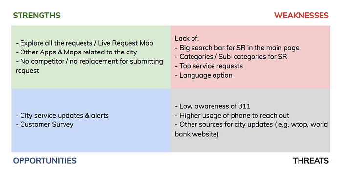
Our main discovery was DC needs a big search bar in the home page, categories for service types, top services, and language option as DC has a quite diverse community (seen in weaknesses quadrant in the table above). We also determined to have city service updates and alerts as an opportunity as some major cities like NYC and Atlanta had.
Storyboarding:
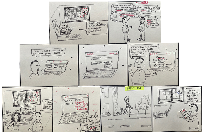
Then we wanted to make this whole story more concrete for everybody and to envision what kind of picture the solution should paint in peoples lives. Therefore, we created a storyboarding.
This couple living on the 13th street have a blinking street light just in front of their bedroom. And because of this they can’t sleep well and don’t know what do. So they hear about 311 from a friend and they start their online service request submission process, which they find very simple at the end of the process. They also have the ability to check the status of their request with the ticket number provided.
Solution:
We believe that by redesigning DC 311 website with a focus on clarity & ease of use, we will achieve increased understanding & satisfaction of the 311 service request process.
Features:

So the main feature of this redesigned website will be service request system which includes straightforward submission process, easy status check and a live map where you can see all the requests in the city.
An additional feature will be city updates and alerts where you can learn about the transportation delays, road closures and so on.
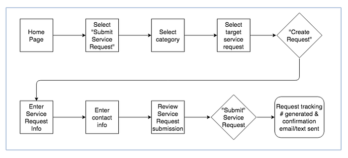
User Flow:
Considering the whole site map, we wanted to focus on service request submission user flow, since it is the most complicated process and will take multiple steps to accomplish the task.

Design Studio: Initial sketches → Whiteboard Wireflows:
Our initial sketches are formed in our Design Studio where all our group members brought their own sketches on the table. By mixing and matching all of them, we created a single set of whiteboard wireframes and wireflows. This was a real team power.

Paper Prototyping: Low Fidelity
Then we came up with our paper prototypes and completed 5 user tests.

Feedbacks and insights: In general, feedback that we received were about to have an easier navigation and some unclarity with the terminology.

- Needs clearer and easier navigation controls. Users had difficulty to go back Home by using the DC 311 logo. → So we decided to add a “Go Back Home” button in all the pages.
- Needs clarity in wording/terminology in many different places:
- “Submit Requests” section in the home page was vague. → Changed to “Submit Service Request”.
- “Submit” in “How We Work” section was again unclear. Some users thought that they can submit a request from here. → Changed the whole text to something that tells the process in steps.
- Users confused by seeing a “Submit” button on a drop down menu, they thought if they click on they will be submitting request immediately. → Changed it “Create a request”
- “Open Status” while checking status was unclear. Users did not understand what the word exactly means and they wanted to see the estimated time for the request to be completed. → Changed it to “In Progress”.
Axure Interactive Prototype: Mid-High Fidelity
7 usability tests are completed with the interactive mid-high fidelity prototype.

Feedbacks and insights: Thanks to our testings with the interactive Axure prototype, we were able to validate our navigation, searchability, categorization and the speed of the process. Plus, we figured out that our live chat feature remains a little dubious, so this is why we decided to exclude it for now.


Final Design: Here you can see our final interactive prototype.
Next Steps:
- User satisfaction and feedback with website redesign
- Additional data gathering to optimize user flow
- Live chat functionality and user necessity
- Building out additional features for user engagement
- Building out “language” for inclusivity and accessibility
- Developing a mobile-friendly platform of our website
- Continue building out content
Reflections:
This was the story of streamlining the process between residents & DC Government. The one and only guide during this whole process was our users. We tried to solve the problem by centering our users, their needs and feelings. In each and every phase, we just consulted to their feedback and provided justification for all our moves in our design. We not only tried to streamline the link to government in terms of functionality, but also tried to engage our users with a smooth and enjoyable experience.


