Making Google Drive’s list view suitable for enterprise applications

The Challenge
Improve the design of an enterprise web application that is heavy on grids (data tables). In particular, change the design of a grid that needs to scale to potentially thousands of rows and support multiple actions for each row.
The first task is researching the common design paradigms, specifically grids that need to scale to large numbers of rows and provide up to 5 actions per each row. Present a few ideas on how you would improve the interaction paradigms to make them better suit a highly scalable enterprise application.
Scenario Assumed
Google wants to change the design of its list view on Drive to make it more suitable for displaying vast amounts of data and to help enable multiple actions for each row. Potential users of this new grid system are users of Google Drive at organizations who manage thousands of files at a time.
My Process
- Conducted background research to understand common grid design paradigms.
- Came up with a list of considerations to be used while designing data tables for enterprise applications (similar to a set of heuristics).
- Conducted a heuristic evaluation to evaluate Google Drive’s list view and came up with major UX problems and recommendations to make it more suitable as a highly scalable enterprise application.
- Sketched designs and created wireframes for Google Drive’s new list view based on the design recommendations to establish the layout, interactions, and functionality.
- Created hi-fidelity mockups of the design.
Background Research
I came across various articles and research studies online by experienced enterprise product designers/researchers talking about paradigms to design better tables for enterprise applications. Based on this, I was able to recognize and compile a list of major design considerations to better display vast amounts of data and allow multiple actions for each row.
Heuristics-I — Design considerations for displaying vast amounts of data
- Pagination or Infinite scroll: There is a lot of discussion online about the advantages of displaying results using pagination over infinite scroll and vice versa. Although infinite scroll enables users to access records while staying on the same page and makes multiple-selection easier, pagination provides users with a better sense of control allowing them to keep track of the location and number of rows viewed. Pagination with the ability to customize the number of rows on each page should be preferred in an enterprise environment where more user control is needed.
- Fixed header while scrolling: Fixed header enables users to scroll through long lists of data without losing context on what column the user is on.
- Interactive visualization summarizing the data: Providing a visual summary can be useful to understand common patterns and outliers in the data. The visualizations can also be interactive and can be used to filter the table more intuitively.
- Search capability: Providing an intelligent universal search or a search for each column would help users easily locate the desired row/rows.
- Data Filtering: Providing filters based on attributes like dates or any other columns that can be assigned parameters can be used to quickly reduce the size of the table depending on user needs.
- Handling a lot of columns: Not only rows, but enterprise tables can also have an unusually large number of columns making it harder for the user to navigate through each row.
- Horizontal Scrolling with fixed primary column: Horizontal scroll is necessary when presenting datasets with a large number of columns. Keeping the primary column fixed while scrolling would allow users to scroll through the row without losing context on what row the user is on.
- Sort based on columns: Sort option for each column (if sortable) can help locate desired rows easily
- Move columns: Ability to reposition columns can help users better compare columns they are interested in
- Hide/Unhide unimportant columns: Ability to hide columns not important to the user can significantly reduce the size of each row.
Heuristics-II — Design considerations to incorporate multiple actions on each row
- Actions on multiple rows at a time visible when rows are selected: Actions that can be performed on multiple rows simultaneously (like deleting multiple rows, downloading rows, etc) should be enabled when the rows are selected. Adding these actions on each row would be redundant and look visually cluttered
- Actions on hover: To make each row less cluttered, enable viewing of actions on hover
- Actions in a menu: If there are a lot more actions hide them inside a menu icon
Heuristic Evaluation
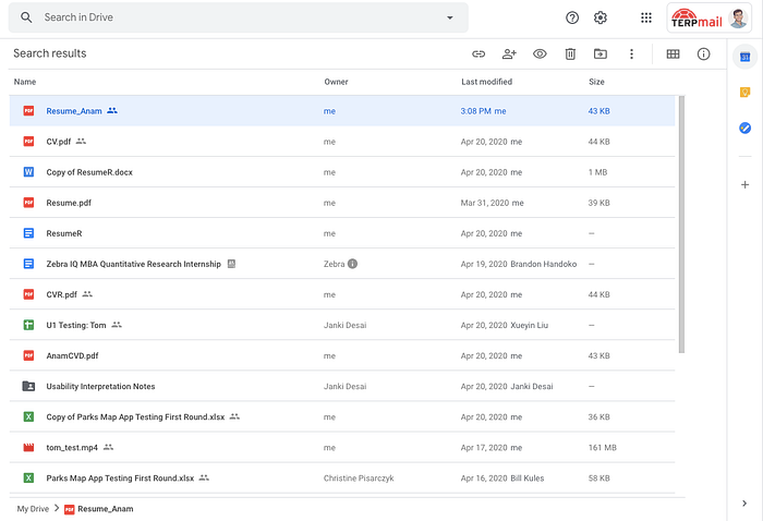
Evaluating Google Drive ’s list view based on the design considerations helped me recognize major UX problems with the app as a highly scalable enterprise application.

Design Ideas
Based on the heuristic evaluation, I came up with multiple design ideas and created rough sketches ~ sorry for my bad sketching skills ~ to better visualize how these features could be integrated into Google Drive’s current list view.


Wireframes
I also designed wireframes to establish the layout and interactions of the data table.


Hi-Fidelity Prototype
Finally, I designed hi-fidelity prototypes using Google Drive’s existing design system to bring the ideas to life and transform Google Drive’s list view into something more suitable for enterprise applications.
Tool Used: Figma
Looking back
If I had more time on my hands, I would like to make the design process more user-centered and actually talk to potential users of the application.
Along with background research, I would conduct contextual inquiries with participants who currently make use of Google Drive (or any other tools) to manage thousands of files at a time. My goals would be to understand what kind of data is important to the users, how they make use of the data tables to find the desired information, and what are the challenges they face while doing so.
Following this research methodology would help me discover insights I missed out on and come up with significantly better design ideas.