Redesigning the AJIO website — a UI/UX case study
Here, I’ll be sharing my detailed process and the reasoning behind the design decisions that I took to redesign the e-commerce website, AJIO.

What is Ajio?
Ajio is a fashion and lifestyle brand, it is Reliance Retail’s first pan-Indian e-commerce venture.

Why did I choose Ajio?
Well, I am a frequent online shopper and I keep browsing through a lot of shopping websites. Ajio happens to be one of those websites that I as a user could not connect to. To buy online, I am always looking for some sort of immersive experience to feel confident about my choice before placing the order. The experience with Ajio felt distant and made me unsure of my decision to make a purchase.
The next thing I know, I was in my first stage of research to see if anyone else shares my problem and if I could make any improvements to the website.
Guess what? I was not the only one.
Hence, I decided to take upon the challenge to fix this issue and also redesign the website from the ground up.
Having said that,
I am a product designer which exactly justifies why just giving a fresh new look does not suffice when I can add so much more to completely revolutionize the shopping experience. Ergo, I also added a ton of new features, such as putting outfits together to create a look and so much more.
We will look at all these one by one!
Disclaimer
I am not going to talk about my research and then show my final outcome. Instead, I am going to dive right into the visuals and explain my reasoning along the way.
So, let’s get started with the exciting features!
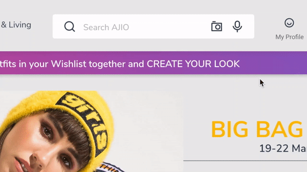
#1 CREATE YOUR LOOK
Imagine you ordered yourself a pair of denim pants and a nice neon jacket which you thought would make you a real show stopper at the next party. But guess what happens when your order finally arrives? The ensemble looks nothing close to how good it looked in your head.
What a bummer!
Sounds relatable, does it?
Now, what if I tell you, that it’s possible for you to mix & match your garments online and then place the order only if you like it! After all, you wouldn’t want such shocks again, or would you?
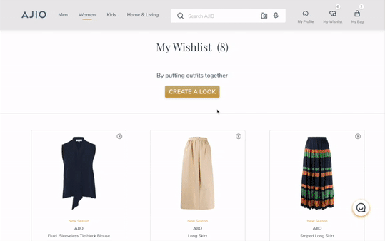
CREATE YOUR LOOK — offers a real-time experience by choosing the shortlisted items in your wishlist, and then doing a mix-and-match of your selections using different color options. You can also select the body frame you want to see the outfit on, and then visualize yourself.
Isn’t that the best thing possible?
Let’s sneak a peek into that.
#2 Image/Voice Search
Moving on from the conventional 1-D Search engine you can now find a very exciting 2-D Image and Voice search that “listens to your heart”.
Now coming to why did I introduce this feature…
It is imperative to make sure that my version has a compelling competitive advantage over others in the marketplace.
So how did I evaluate the competitive edge?
I did secondary research on the up and coming trends that are leading the way and which must be accommodated in a new system to increase the sales and for better user experience.
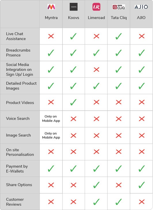
This was important for me as a designer to make sure, I am going with the trend and I incorporate the changes.
#3 Find your size

Sizes differ with brands! This is a common problem that users encounter while shopping across brands. Here’s a new feature that helps you find your “M” size from the “L” of a different brand.
#4 AJIO Chat
In my new version, I also added a floating all-time live chat, for a more personalized shopping experience.
All the features I designed and introduced, I did it after mapping out the user and business goals, to come up with a profitable model for both. I also considered some technical goals to produce realistic outcomes.
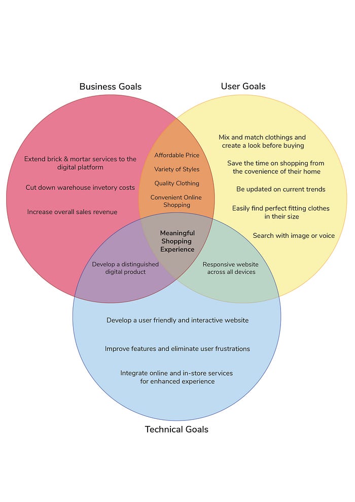
Now, let’s have a look at the original version and my redesigned version.
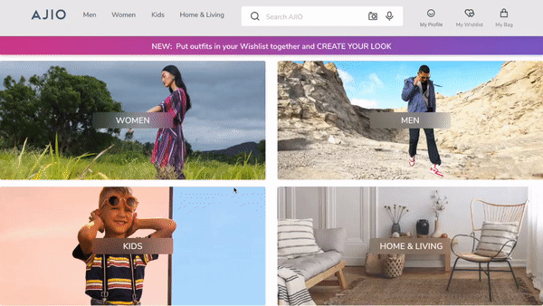
One of the things that users really like about Ajio is when you first open it, the landing page asks, “what do you want to see?”
When shopping in traditional malls, you wouldn’t go around and see everything. Except, you would walk right into the section you want to.

From my user observation research and some self-observation as well I found out, that the layout of the screen was particularly confusing to the users in many ways:
- The logo merges with the background, creating confusions,
- Also, there were users who said,
The background picture talks about the big sale going on the website, hence, it is confusing if “shop women” would take me to the sale section or the women’s page
So here’s my revised version,
Don’t we relate to pictures more than text, that’s what happened above, right?
Therefore, I have distinguished sections with separate images, and for the new feature introduced I have a bright gradient hello bar.
I also added a navigation bar on this page, in case the user quickly wants to search for what they are looking for.
However, you must be wondering by now, why do I have such a big section for home & living and where did the sale go?
Well, let me explain it down here:
Information Architecture
Before beginning to categorize sections of the website, I conducted an in-person as well as an online card sorting exercise using the Optimal Workshop tool to reach out to more users. I ran a task-based card sorting activity.
This helped to create the foundation of developing a Sitemap and also a Task flow which represented how a user would use the website to purchase a product.


Navigation Bar & Menu

The new navigation bar gives a feel of being clean- all items in a single row.
The original hanger icon which represents the wishlist is now a heart icon which stands as a universal symbol for liked items ( thanks to Instagram)
Then again in my new version, you find a very customized “My Profile” section that guides you on the items that you can get access to by signing up/logging in. The old bar simply shows the sign-in/join link like in any other conventional website offering no clue why a user should sign up or log in.
Moreover, the modern-day user also wants to know why should she sign up/log in? After all, who has got the time?
What made the users drop out, even more, was the overlapping categories and brands on hovering in the original version navigation.

One very glaring observation I had in the old version was all the tabs in the navigation bar led to the exact same page. Then why clutter the bar?
I have synced and clubbed the items in my version under similar heads for optimized search results. Thanks to the card sorting activity, it made the process natural and meaningful. My new menu looks cleaner and less crowded with marked sections for easy browsing. I have also removed many repetitive elements from the old menu, for example, Winter wear is thrice repeated in the old one!
Also, let me give you an example of how Must See works, under which I have clubbed the original category tabs.

Let us suppose the user wants to check out INDIE
Who is my user?
Well, let me introduce you to Rollika, the loving mom.


So here’s the situation,
Rollika wants to buy a Saree for her friend's destination wedding in Udaipur.
Her experience is explained through the following user flows


My version depicts all that Indie has to offer with beautiful pictures for seamless navigation.
Setting the navigation bar straight was one of my key priorities from the user insights I had gained as discussed below.
User Insights
I formulated a research plan and did qualitative and quantitative research to determine the demographics of potential consumers — their needs, expectations, and what drives their motivation.
Key Quotes directly from the user while browsing through the website:
“The Navigation is confusing, I keep hovering between Categories and Brands.”
“There’s too much mixed content on the screen, very confusing to my eyes. The page setup is very random”
“Can’t figure out which product is being advertised, the models are too accessorized”
Overall findings from research helped establish:
Pain Points:
- Complex navigation
- Confusing product showcasing
- Unorganized and cluttered content on the screen
- Lack of customization and customer interaction
Moreover, what’s the point of being a designer if I can’t do a heuristic analysis of my own…
- The lost emphasis, super cluttered interface with everything on the screen fighting for attention be it pictures or the text.
- Overlapping context
- Confusing product showcasing with not enough details
- Overall the website’s vibe is happy but lost
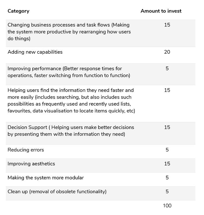
This $100 test gave me the direction for my revised version
I took a hypothetical $100, which represents the total amount of investment resources I can apply in designing and developing a revised application.
Home Page

The old version is cramped up with everything fighting for your attention, all chances that you might miss out on something that you are actually looking for. What happens is, it creates a “halo effect”, and the user assumes the whole website is mixed up.
I had one thing on my mind while redesigning the Homepage, brand personality should come through.
Ajio has carved out a niche that says loudly, good brands at amazing discounts. I have structured the Homepage keeping the brand identity intact, minimal, and easy on eyes.

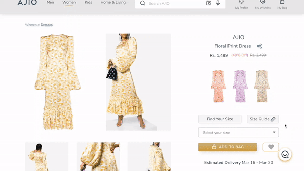
Product Listing Page & Product Detail Page

What are the filter options?
In the simplest terms, it is designed to help the user refine/filter their search results. But what if I don’t know what is meant by a “sheath dress” or a“halter dress” how is the filter useful then?
In my version, you will find the vector icons for clear communication of different filters to enhance the experience.
The models on different color backgrounds make product interpretation and comparison difficult at a glance. Hence, a smart improvisation that I worked upon, I used pictures of the dresses all on the white background and a hover interaction to see the dress on the model to set the context.


I redesigned the product page in a non-traditional manner and my inspiration comes from fashion magazines and editorial layouts to craft a system for creating a product page that tells each one is a unique product also making the layout more interactive and fresh, clearly mentioning all the details which were earlier cramped up and dull.
I also added an option to play the video where you can see the model wearing the outfit, highlighting the details.
“Customer product review plays an instrumental role in a purchase decision.”
I can’t lay more emphasis on how important customer review is. I did not go on adding comments but the stars work well for a clean and minimal layout and convey the message.
Micro-interactions like these make the experience fun and indulging for the user.
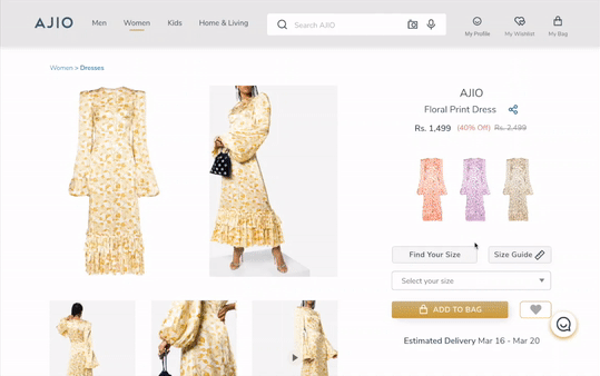
Size Guide
Yet another feature to fast track your purchase. Simply select your size and Add to Bag from the size guide and Get Notified if not available.
With the redesigned version the user can add the item to the bag directly from “Recently Viewed”.
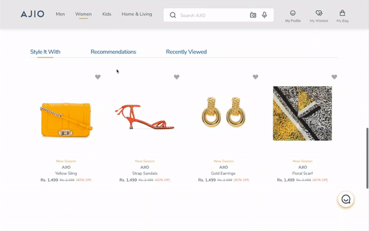
From my user testing, it was clear that users enjoyed smart inclusions like “style it with”.
To make it more relatable,
I would introduce you to Jenny, the fashionista. Who is Jenny?


Jenny saves a lot of time with this new addition on the product page that prompts the best styling option for every product mix. She can now also view the complete look with the new “create a look” feature!
Let us have a look at this user flow for better understanding.
So, Jenny wants to buy a new trending outfit for her friend’s birthday which she can use later for her styling shoots too. With the revised version this is how Jenny will proceed.
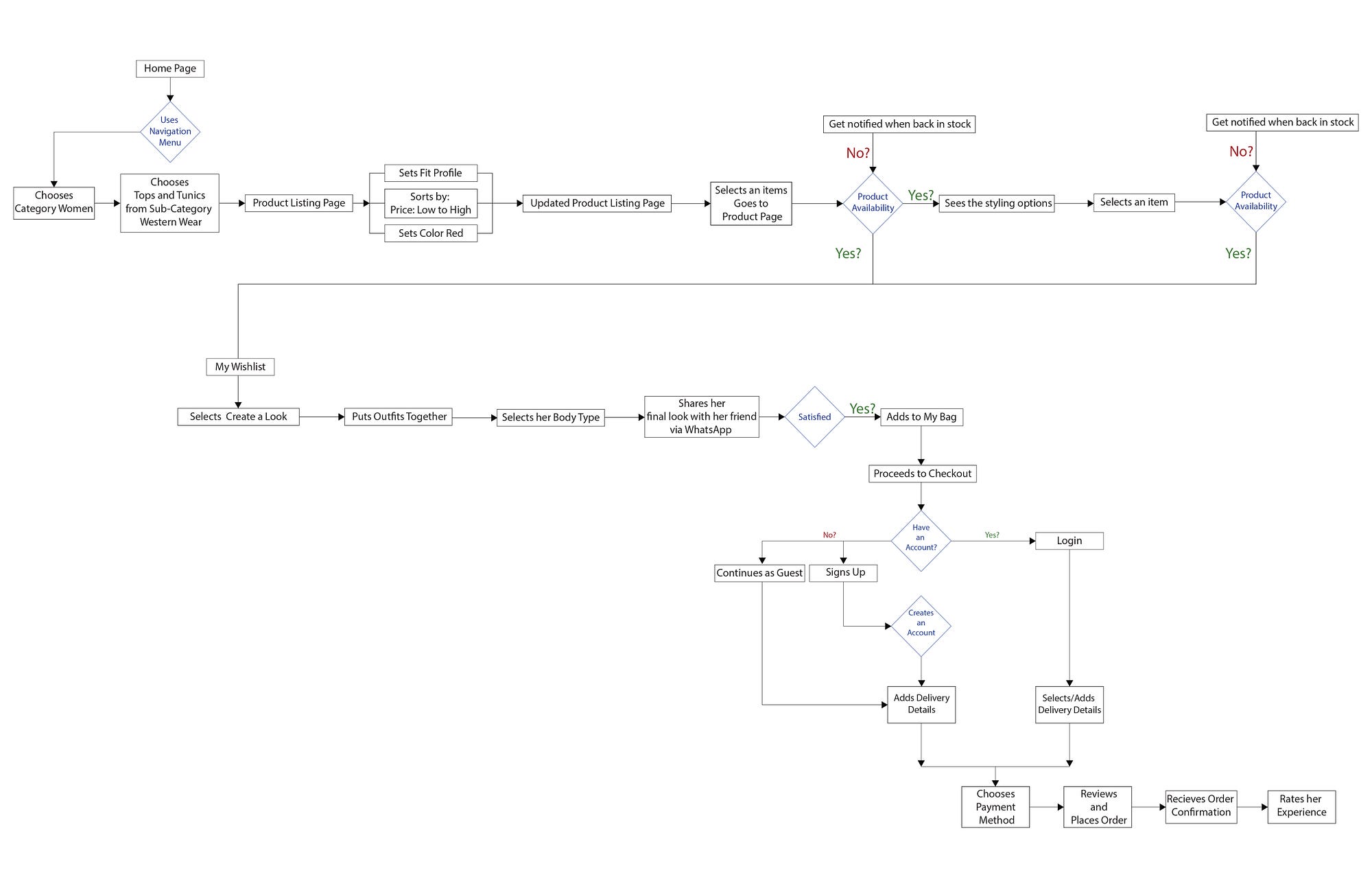
This feature seamlessly accelerated her online shopping experience. She is happy cause she truly rocked the look!
More Pages
Login/ Sign up

Wishlist

Checkout Pages

Details Matter
Call To Action Button
Keeping the primary colors intact, I worked upon making the most important button appear more “clickable”.


Footer
Minor changes include the use of symbols instead of text for clearer communication, an input box for subscribing to the website, information revised in the order of preference in the columns.

Behind the scenes
This is a small picture of a very big picture.


Learning
I’m really proud that I was able to take up the challenge to redesign a complete website. This project gave me the chance to innovate the visual language and apply a lot of critical thinking in the process. I developed new creative solutions and used different techniques. In the end, I established a design pattern and a visual language. It was a long and fascinating process, from which I learned a lot.
And… That’s a wrap!
So that’s pretty much it. This was my entire process of redesigning the website. Hopefully, you found this article very intriguing and insightful. Do reach out to me if you would like to share anything!


