Redesigning Yelp’s user profiles
How Yelp can leverage existing data & behavioral economics to increase engagement
I am a second year Master’s student at UC Berkeley, focusing on product design and behavioral economics. Yelp’s Product Design challenge felt like a great opportunity for me to exercise my skills. I decided to pursue redesigning user profiles since it aligned best with my skills and product thinking.
The problem
Create a new design for the Yelp user profile page. Optimize your design to promote social behavior between existing users and for new users to sign up. You do not have to design a complete flow (for example send a compliment).
My solution
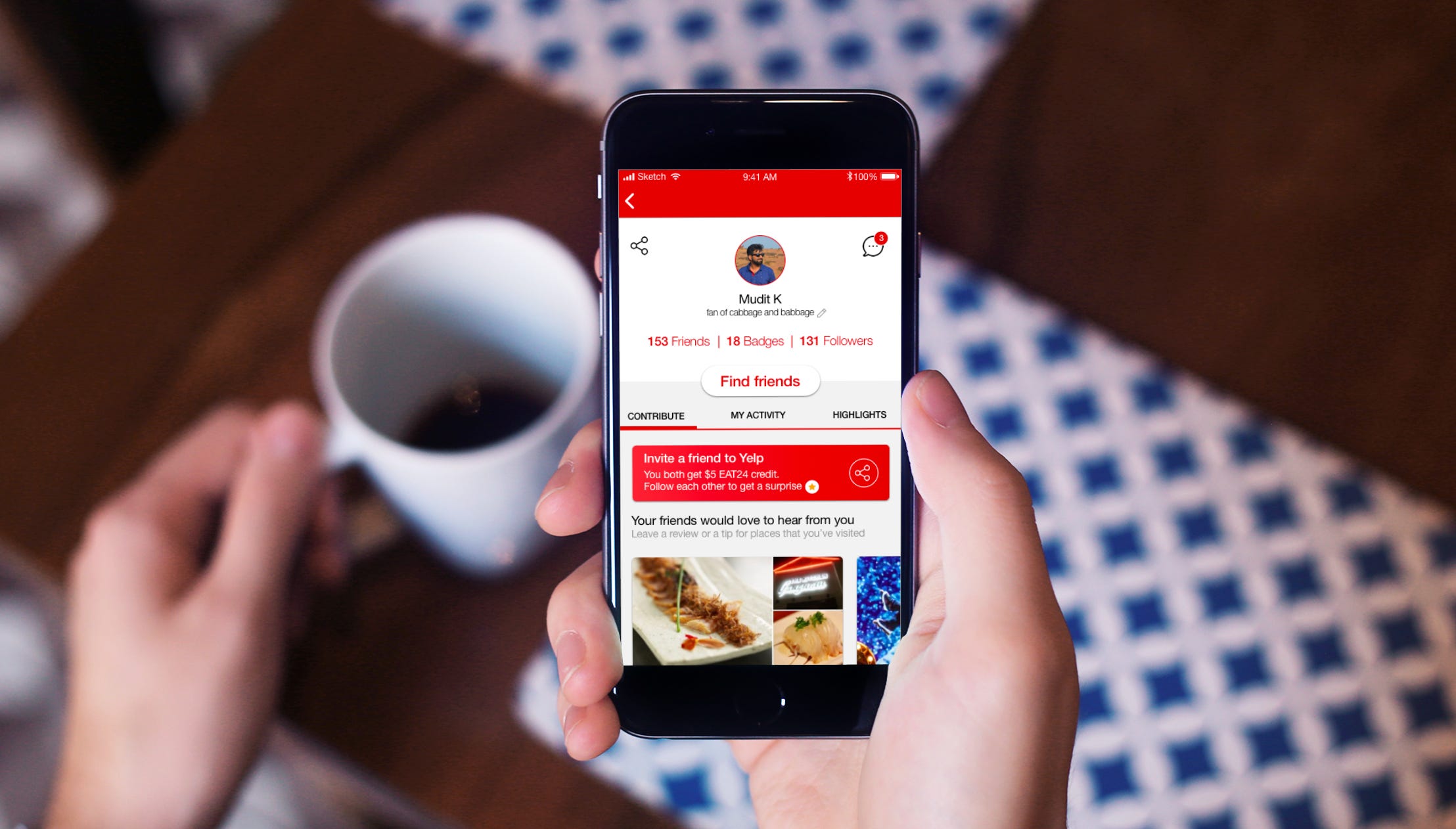
Yelp’s users interact with businesses in a variety of ways. I created a system for users to easily interact with each other’s touchpoints and enrich each others’ experiences on the platform. Here are some of the things I redesigned-

Inline tips
Users can now offer tips on a person’s bookmarks, helpful for someone who may be about to visit the place. Available only when the user has previously checked in at the business.

Don’t just vote. Second.
Users can also second reviews of businesses they have checked in at previously. Seconding lends more credibility to the business than just a vote or compliment that can come from anyone.
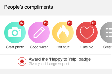
Social badges
Since Yelp’s users love badges, I thought it would be great if they could award each other with a badge. The ‘Happy to Yelp’ badge can only be awarded if the user has received a certain number of compliments
The process
Since the challenge asked me not to perform much user research, I wanted a quick and lightweight method to empathize with Yelp’s users. So I started going through people’s profiles on Yelp and observed them interacting with the platform. I looked at about 40 different profiles, trying to achieve a representative sample of users: some of them were my friends, others weren’t; some of them were based in California; others weren’t; some of them posted mostly about restaurants; others didn’t.
Personas
Drawing from this research, these are the personas I arrived at-

The Seeker
Always trying to maximize for badges. These people use Yelp talk to discuss how to earn elusive badges and some even set one as their profile picture, as a mark of achievement.
The Discoverer
Always on the lookout for new businesses that he/she finds interesting. While some of these would be happy to simply bookmark these, others go to great lengths to create and groom lists of these businesses.
The Commentator
Always meticulous about posting reviews. These users make it a point to post a well-written review as soon as possible and feel motivated to answer others’ questions or offer tips for businesses they have visited previously.
The Spectator
Always engaged with the platform in a passive way. This persona may not post a lot but has enough friends and follows enough discoverers and commentators to get a pulse on what’s happening around him.
Drawing from these insights, I set out to find ways to promote social behavior between existing users and for new users to sign up.
Since Yelp has many intertwined features and components, I wanted to unpack them and start from the ground up.
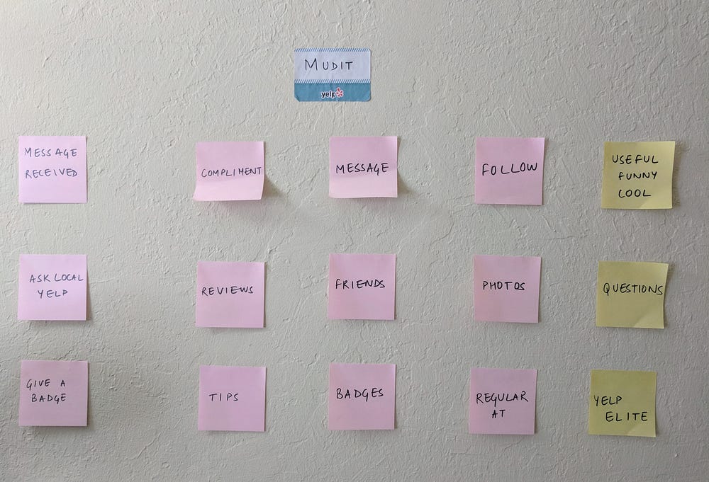
Business goals
Here are the business goals I wanted to optimize for, and their underlying assumptions-
Leveraging existing components to build new features
I assumed that Yelp is willing to tap into it’s features and troves of data to design something that provides significant gains in engagement.
Lowering the perceived cost of interaction
I assumed that Yelp is open to altering it’s information architecture, if it reduces friction in the tasks that the user wants to perform.
Spending money to acquire users
I assumed that Yelp is willing to spend money in the form of credits, if it results in more people signing up to use Yelp.
User goals
Here are the user goals I wanted to optimize for, and their underlying assumptions-
Increasing interaction with other users
I assumed that I can incentivize users to interact with both friends and strangers, if they get enough value out of it.
Getting a richer experience by learning new interactions
I assumed that users would be open to learning how to use a redesigned Yelp, if it helps them accomplish their goals more quickly.
Feeling inclined towards earning badges
I assumed that since badges encourage users to be more engaged on Yelp, it could be helpful to open more avenues for them to earn badges.
Ideating
Keeping these goals in mind, I started ideating.
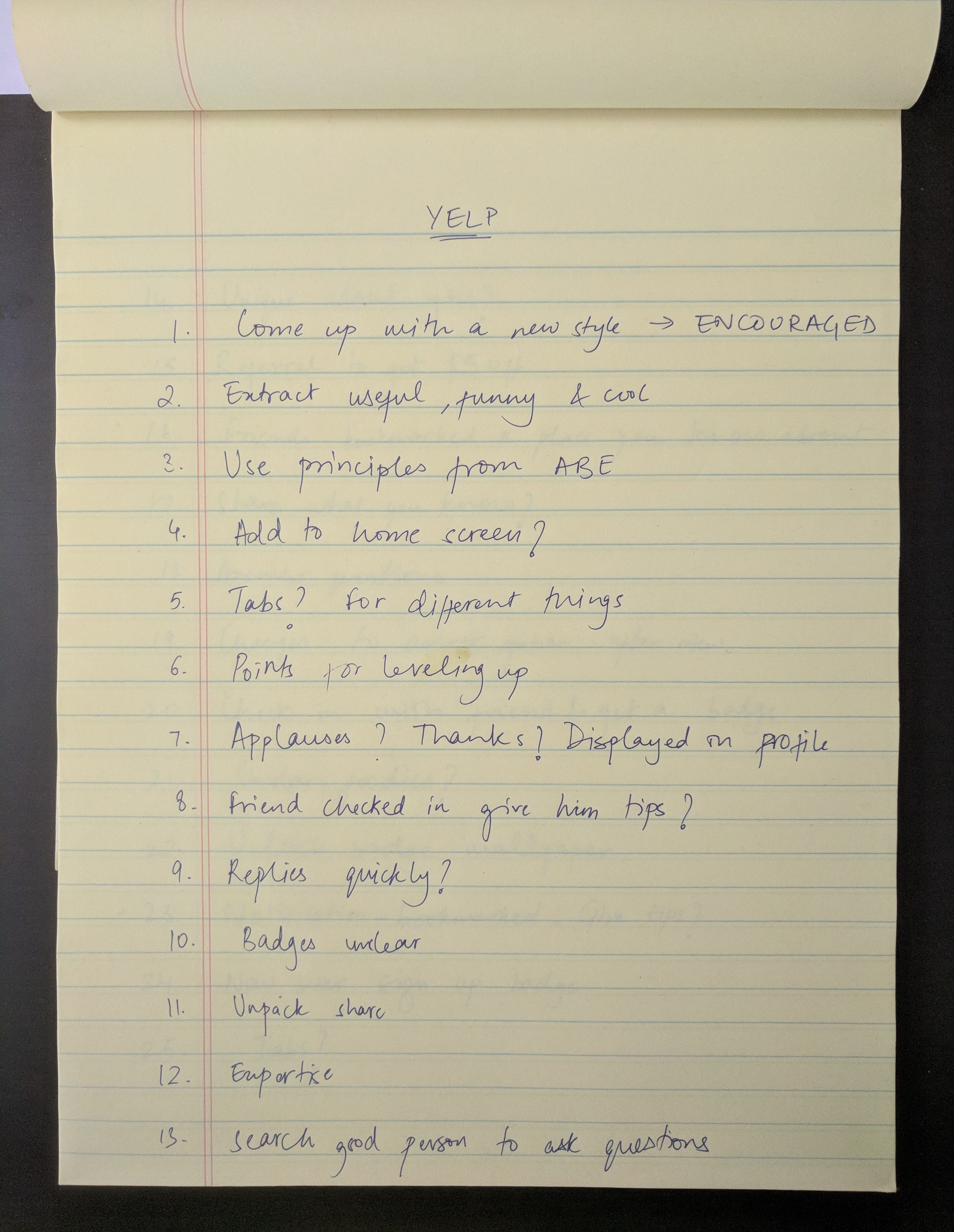
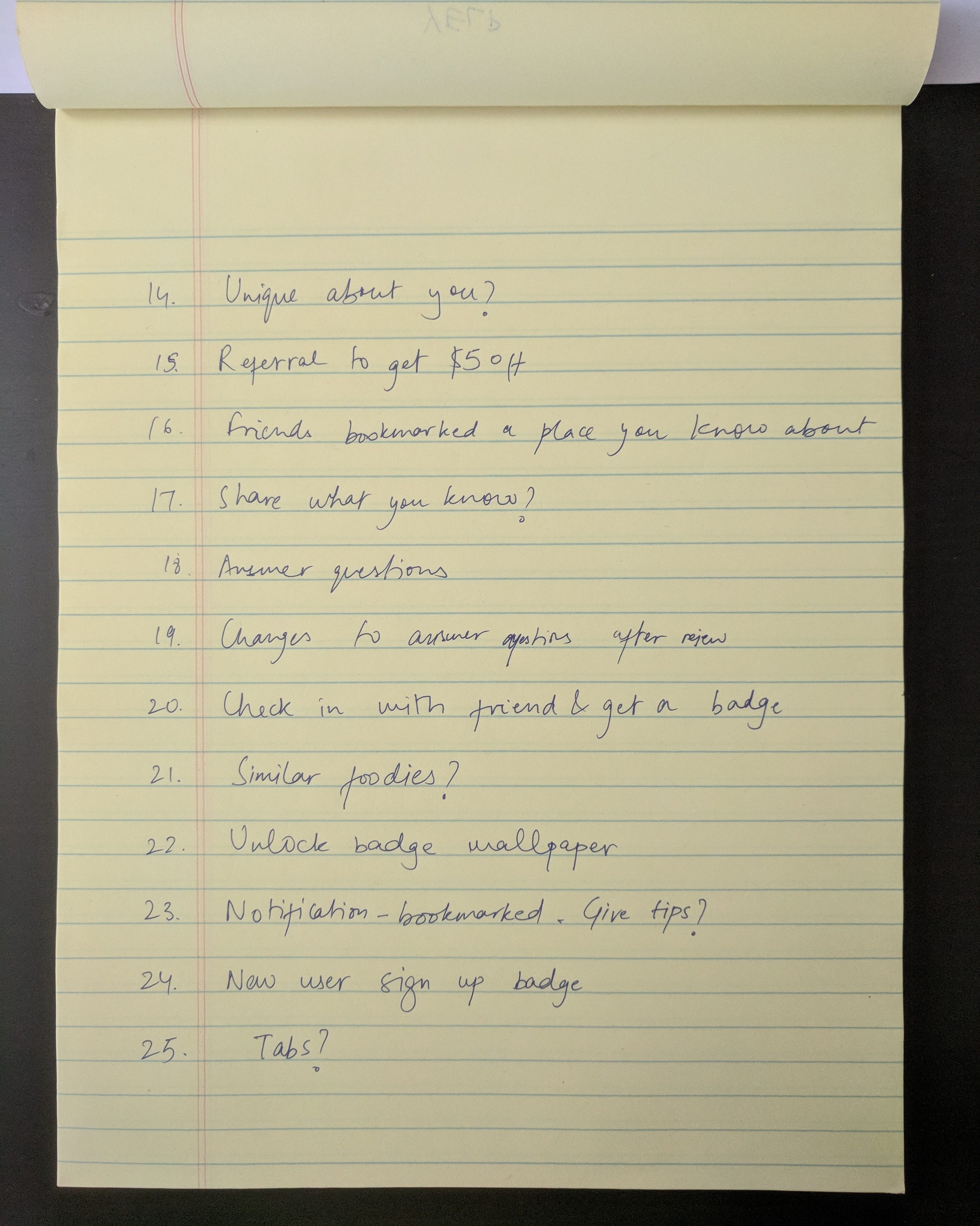
Sketching
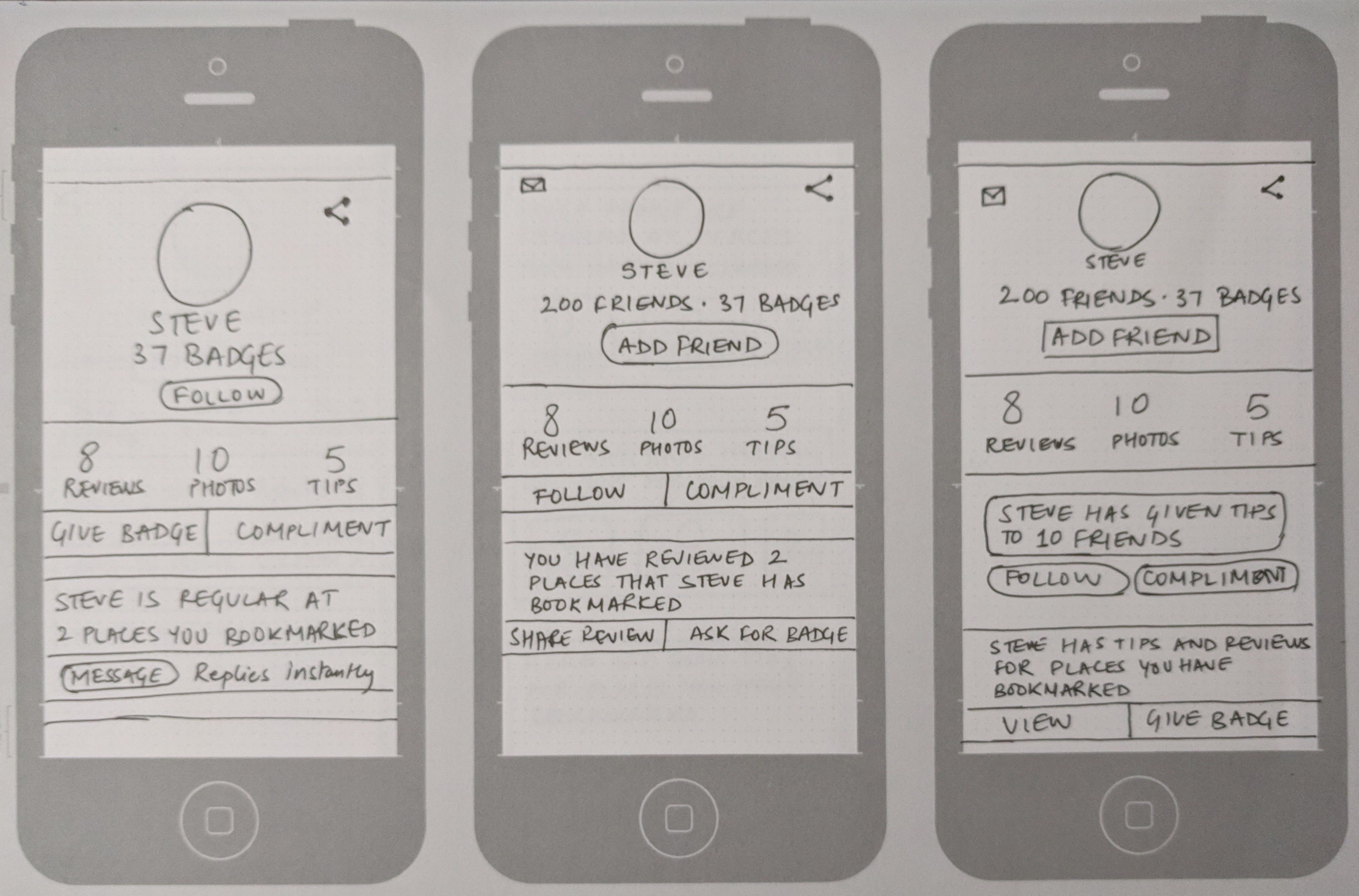
Next, I translated these ideas into sketches. On the left is my sketch for how I may see my own profile, while the sketch on the right illustrates how I might see another user’s profile on the Yelp app.

The redesign
I redesigned both my own profile and how I would see another user’s profile.
User profile

Design principles
- I used a card-based interface since I feel it helps keep information organized and focused. Goal-driven users might find it useful in translating intents into actions.
- I used the existing color scheme for buttons and around pictures as I feel red does a good job of drawing the user’s eye towards desired buttons and touch targets.
- My design employs horizontal scrolling on multiple places. To make sure that the user understands this interaction, I ensured that the right-most element is always peeking into the edge of the screen.
Design decisions
- The first step in my redesign was to rethink the information architecture of user profiles. I felt that the current profile gives me little context about a person unless I dive deep into their reviews or photos.


Other than pulling information from people’s bio, my design also displays mutually relevant information that could be helpful in sending a friend request. Effectively, this design lowers the interaction cost of getting to know a person while increasing the perceived value of having the person as a friend. The big, red call-to-action button to add a friend makes it a highly focused interaction to increase social behavior.
2. I also reorganized things that represent similar information into tabs. So “Reviews and Votes” became one tab since it represents the user’s reviews and the votes they have received. “Bookmarks and Check-ins” became another since it gives the viewer a good idea of where the user has been and where they are going next. Likewise, “Photos and Lists” and “Tips and Answers” also exhibit relevant information.
3. Wherever possible, I compressed long lists of reviews, bookmarks or check-ins into digestible chunks so the viewer can see some of that information in brief and then tap ‘View all’, if need be.
My own profile

Both the redesigned user profile and my own profile follow the same design principles with the similarly considered design decisions. They also have some more decisions in common-
Behavioral decisions
As a product designer, it’s also helpful to think about how our design can help influence behavior. In doing this, these are some of the decisions that I had to make-
- Nudging
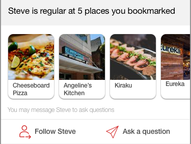

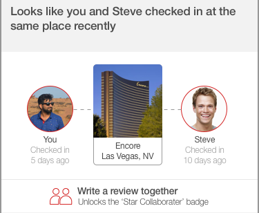
These interactions take advantage of existing data to influence and redirect their behavior towards desired interactions. By providing context around decisions like following, asking a question or writing a review, I reduced the cognitive gap between the action and the intent, encouraging the user to complete the action.
2. Priming

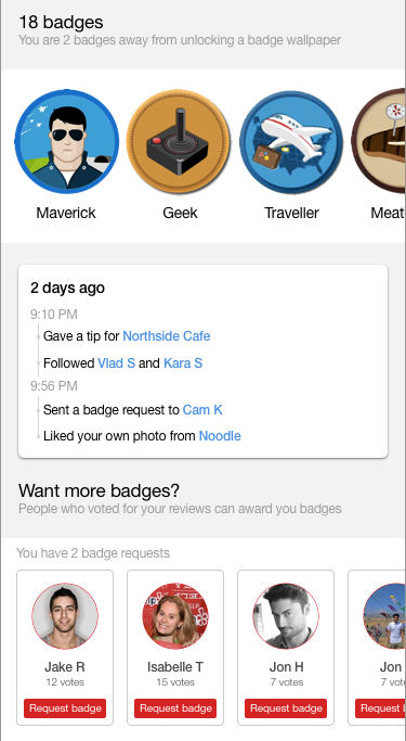
In my design, I prime the user by presenting existing votes or badges that they have received, setting implicit expectations. Following a brief interlude, I key the user in by the same association to either award a badge to a highly voted user, or request one from people who have voted for them previously.
3. Reciprocity
Both in priming and nudging, I also utilize the premise of reciprocity. For instance, after reading a review from another person about a business they have bookmarked, the user might feel obliged to write a review about a business they have visited, especially when it starts off as, “Your friends would love to hear from you”. I use the same principle to encourage awarding badges and giving compliments as well.
New user acquisition
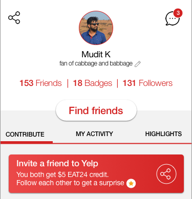
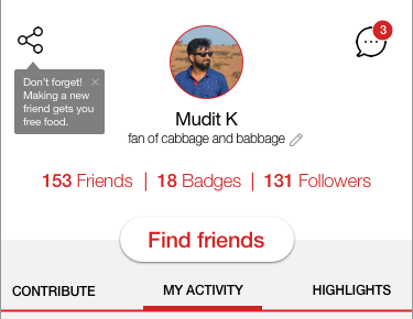
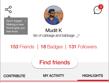
To encourage new users to sign up, I incentivize existing users to bring them onto the platform. “Invite a friend to Yelp” is displayed as a big message on the first tab of the user’s own profile. It is accompanied by a clear value proposition of earning EAT24 credit and getting a surprise badge if the two follow each other. The user can tap the share button to complete the action.
But I didn’t want this message to be intruding on every tab. So when the user moves away from the “Contribute” tab, the message changes position and is displayed below the the share button on the profile.
Reflections
- I jumped on this challenge as soon as I received it but didn’t start designing until 3 days later. I spent that time understanding how Yelp’s profiles work, brainstorming and sketching. I thoroughly enjoyed the process!
- While red is the primary color here, I wanted to explore using blue as secondary color but after a couple explorations, it felt like the extra color was adding more clutter than value.
- I still think there’s more I could have done in terms of encouraging social behavior in the moment (maybe by sending notifications). However, I ran out of time to explore that.
Note: None of the icons in my design are my own work. They are borrowed from Flaticon, Iconfinder and The Noun Project.


