Redesigning iOS notification badges and assessing its impact on user’s task engagement
Abstract
Notifications form a fundamental way with how users interact with their smartphones. With notifications branching out as local and push notifications, no user-specific category helps in classifying notifications in the manner of priority. This paper focusses on one key area of visual representation of notifications in Apple’s iOS — Badges, and proposes a redesign considering the effects of badges on user’s task engagement. The methods for designing were based on user’s ranking of applications for categories like critical, important and inferior notifications and customizable badges for blending in with the preference in which users click on a notification badge. The prototypes designed were tested among focus groups, and further improvements to the design have been implemented. For tangible results, the design is implemented in a programming base to replicate it in real-time.
Keywords: Notifications; Badges; task engagement; ranking; customizable.
1 Introduction
1.1 Apple’s iOS
Apple’s mobile operating system, the so-called iOS (Unix based) is one of the leading operating systems in the smartphone section. It was officially launched with the first iPhone back in 2007, and since then, there have been many versions of it, where Apple has incrementally optimized the software depending on the user’s requirements. Apple’s policy of producing own hardware for their software has given them a slight edge over how smart their gadgets can be when it comes to performance. So much so that, iOS is often considered to be the benchmark against which other operating systems are compared. However, Apple has extended iOS to support other devices like the iPod Touch and iPads because they fall under the same category of a mobile operating system.
The iOS 12th generation has evolved significantly from that of its previous versions bringing more stability and security to the handsets. With the recent launch of ‘Digital Health’ initiative by Apple, users are now able to manage their interaction with their smartphones.
The effectiveness of iOS was undoubtedly the most driving reason for its popularity, and since it is powering many of Apple’s devices, it is part of a large user-base who are locked-in to the iOS ecosystem.
1.1.1 Notifications and Badges:
The visual interaction aside from the touch feature of iPhones is mainly subjected to two main features of iOS:
· Notifications
· Badges — Visual aid for notifications
Notifications:
A notification is an alert that indicates there is something about an app/product/service that needs a user’s attention. Apple provides three different types of notification structures:
1. NSNotification Centre:
This is an invisible notification where the interaction takes place between two apps, and an action is executed if necessary. It is a focus hub in which any segment of an application is notified of changes in any other part of the application.
2. UILocalNotification:
These are the notifications that occur within an application. Whenever there is a notification of this type, there is an entry added for that app by iOS.
3. Remote Notifications:
The Apple Push Notifications or APN is a notification that is used to tell an application that there is something outside the device that has occurred. The app will then respond to that information with the help of two servers:
· Apple Push notification Servers or APNS.
· The app developer’s server.
Apple’s Push Notification or APN:
These kinds of notifications allow developers to keep engaging their users. It is here that even when the users are not using the application, developers can reach out to them and make small tweaks. Functions of APN are:
· Allow the application to wake up in the background and conduct a task.
· Show a badge on the app’s icon — usually associated with push notifications.
· Display a short text message.
· Display media — images and videos.
Apple’s design based notification services can be classified into two types:
· Status bar notification — Notification centre on iOS.
· Icon Notification — Badges.
Badges:
A badge is a visual extension in the notification domain to direct the user to a new message, a missed call, push notification or an email which is still waiting to be read/answered. It also maintains a count of such notifications for each application. This is one of the critical areas that application developers focus on because it creates excitement and engagement when the notifications are cleared off from the notification center. There have been UX case studies on Notification centers (Choi, 2018), but none have considered the usefulness of the badges which is the basis for this paper.
1.2 Effects of notifications on task engagement
Users admit to notifications seeking attention but eventually sign in for its benefits as it creates potential cognizance (Iqbal & Horvitz, 2010). Notifications form the basis of mobile interactions because it is through that users react with their smartphones. This, in turn, results in interruption of the primary task of a user. Push notifications and badges give an extra nudge for interaction, and this amounts to two-thirds of user engagement for a single application.
The interconnection between humans and smartphones is so strong that there is a necessary change to break that bond for a more productive culture to exist. According to Turner et al. (2017, p. 480), “While mechanisms exist for controlling notifications (e.g. silent mode), managing these can be complex to set up and maintain, as the user needs to consciously reflect on their own behaviour and preferences”. This inevitably raises a question from the design point of view for notifications, the very reason being; it is a visual cue that triggers the reaction. For the same, companies like Apple and Google have come up with terms like digital health and digital well-being respectively. However, with the presence of notification being necessary, users will have little choice unless to disable the notifications thereby, missing out on important emails or texts. Kim (2015)clarifies that push notifications did have a direct effect on the frequency of visits to a mobile application. Engaging in a primary task requires full focus, and thus mobile notifications are one key distraction. This forms the basis of the research where the proposal is to redesign the dynamic and active notification badges that do not have to be tied up with push notifications (Centofante, 2017). The effect of notifications on tasks brings about a total change in the work culture as well as hinders the productivity of an individual (Pejovic & Musolesi, 2014). Therefore, giving the user the control to manage incoming notifications will provide customization options and user-friendly experience, a long-awaited feature from mobile-OS providers.
Users have the option of individually turning on and turning off the notifications, which include banners, badges and displaying it in the notification centre. However, this may lead to the fear of missing out (FOMO) critical information and messages from closed groups. Maintaining a balance between information delivery and its benefits of awareness at the expense of interrupting users is a key design challenge (Paul, et al., 2015). Therefore, proposing a redesign in a way that will not hinder the current structure and also provide a feature update for notification badges is a crucial consideration of this research.
2 Research Design and Methods
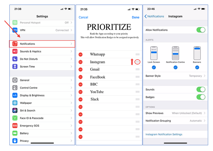
This section of the research consists of the research methodology which includes Try it yourself and Error analysis methods. As previously mentioned in the introduction, Apple’s iOS 12 will be used for study and redesign purpose taking into consideration their standard notification badges. iOS has a long history of providing no customizable features to the users. Unlike its competitor, Apple provides restricted access to controlling their software resulting in the difficulty of handling notifications even with the latest update to iOS 12. Some users, therefore, tend to move to the hot side to tweak their iPhones, more commonly termed as jailbreaking that voids the warranty of the handset purchased. The primary requirement considered here is to provide user customization of the notification badges for better understanding and digestion of information based on user’s prioritization of notifications.
2.1 Try it Yourself
This method involves testing the feature first hand looking at a different scenario which one might consider to be useful for a prototype. The opportunity to understand how to go about with this method involves two simple steps: Ideation and Sketch.
2.1.1 Ideation and Sketch
For the ideation task, multiple ideas were generated considering the customization required for the notification badges following the user’s ranking of applications. Different variations were taken into consideration that would suit the requirement of the user. Some of the ideas were sketched in a wireframe layout provided by design-UI software Sketch.
There are three specific improvements addressed in the paper-prototype — the use of different coloured badges, different shapes and different indicators to represent a notification that is of importance to the user.
Consider: Figure 1.
The basis of user-customization lies in software’s ability not to limit users with strict anchors. In the case of the badges, providing an option to choose different colours will give users the control of their handset thereby, being responsive for a specific kind of notification. Colours give users a unique identity and have a strong correlation with emotions. It is significantly involved in a user’s decision making about a product/service and arouses emotional feelings like excitement, energy, calmness (Ou, et al., 2004). This will enable a user to be attentive to a suitable notification based on the coloured badge they had selected in the first place.

Consider: Figure 2.
This is a design based change, where the notification badges take the form of basic shapes to denote certain types of notifications. However, at first glance, it was found that, this method of representing badges will effectively reduce the uniformity and homepage aesthetics, and therefore the badge shape was restricted to the two default ones provided by Apple with two others that included a star-stamp and a star inside a circle.

Consider: Figure 3.
A third change deals with two key improvements of the notification badges.
• Badge count:
The partial replacement of the default badge count that directs a user to check the number of notifications for a particular application. Instead of just a number (1, 2, 3,…, 999+), notifications badges from those applications that are considered to be important/critical will be represented by the exclamatory mark.
• Multiple Badges:
Few applications like WhatsApp, Facebook’s Messenger, Telegram have more than one primary function to serve their users. In this instance, applications like these have notifications for messages, calls and video calls. The very reason for the use of badges is to make the users aware of certain types of notifications. The latest update to the software — iOS 12 allows only one badge for each application, moderating it to be used in an optimised way. Thus, the introduction of multiple badges for applications with that functionality will help allow users to see more meaning and understanding of their pattern to click on selective badges according to their priority.

2.2 Error Analysis
This part of the research mainly concentrates on error analysis concerning the initial design requirements based on the try it yourself method. Self-testing is one key method to analyse the product/prototype for any possible weakness or difficulties. One may call it as the zeroth review of a model. Since the design requirements were stated in the first half of this section, the need for analyzing errors as to what might go wrong will substantiate the significance of design flow based on end-user interest.
These are the few things to consider before designing an actual prototype:
1. Selection of colours would result in a too much complexity. Taking time as the main factor, users might find it difficult to mix and match the colour combination for their badge design.
2. Transparent notification badges will hardly be visible if there is a contrasting wallpaper used by the user. Different users will have different wallpapers on their home screen. This may range from a family photo to just a plain black background. While promoting customization of notification badges, allowing the user to engage with a transparent badge will be a challenge.
3. Ranking applications by priority would be tedious for the users.
To address these shortcomings, three independent solutions are proposed that can be added as a feature update to future iOS versions. They include:
1. Providing finite presets which will allow the user to choose one of the options quickly.
2. The opacity of the badges will be reduced to 50%, with the badge count strikingly visible to the user once clicked upon. There exists a need to provide a significant difference between the badge count (word naming) and the badge background (colour naming), for reduced task interference/Stroop effect on a specific notification, with performance dependent on the degree of transparency levelling at 50% (Harrison, 1995).
3. A single settings page which will allow the user to rank applications according to their priority embedded with an additional feature for selecting a colour combination for that application’s badge.
3 Findings
3.1 Prototyping
Over the years, notifications are called the UX mosquitoes. Sometimes people are relieved, and they feel happy by tapping on them, other times, they leave an ugly stain on our mobile wall. They are referred to as Call to Actions (CTA). So with each click, we engage more with them, and hence it becomes a habit. Here, the methodology applied is a simple sketch displaying how notification badges can be customized by considering the priorities of the user. According to Apple’s design guidelines (Apple Inc., 2018), Badging is used as a tailpiece to support notifications and not to symbolize for critical information. Not all notifications are essential. User prioritization, starting with categorizing notifications into general and critical will help declutter the system and users will be able to assimilate information accordingly. A visual prompt from a handset persuades a user to see notifications even at a later stage (Mashhadi, et al., 2014). Therefore, considering the user’s priority, prototyping will consist of UI design from digital design toolkits like Sketch and Photoshop for visualization purposes along with few HTML/CSS code snippets for a more familiar and tangible approach to redesign. The prototype will also address the shortcomings that were found in the error analysis section of this research, thereby developing a model for a real-life test. Keeping in mind the design aspects, since the final aim of the research is to provide tangible results for real-life implementation, code snippets based on HTML/CSS have been attached to the Appendix section of this paper along with the outcome (in the form of a screenshot).
3.1.1 Prioritization of Notifications
The previous study shows that applications can be categorized by user’s positive and negative emotional responses (Pielot, et al., 2014). The most viewed recent application suggestion (existing iOS feature) by Siri provides useful data for a user to rank their applications according to their usage. This will allow such application’s notification to be split into two categories:
3.1.1.1 Important and Critical Notifications
A priority notification is one where users have to attend and respond to it within a short period. By default, priority notifications are human connection related information such as emails, messages and missed calls. This means that there can’t be a delay in displaying the notification and its corresponding badge count. However, here, there is a problem of identification and clustering of information as in iOS; badges are the same red dots with counts that specify the number of notifications for a specific application and study shows that just by seeing them can trigger dopamine, in a way to keep users engaged. A redesign in this particular case involves badges to convey more meaning to the user in a way that, at first glance, they will come to know that it is a priority notification.
Proposed Redesign:
For type 1 notification, an easy way to grab user’s attention to an important notification is to provide badges with stars (figure 1) that resonate a definite meaning to the information withheld by an application. This helps users to declutter the notifications on their screen and thereby act preferentially.

Another visually appealing technique of informing type 2 (a critical notification) is by an exclamatory (!) symbol. This is an existing method in the reminder application of iOS where, the priority of the remainder can be scaled from none to very very important denoted by (!!!). A similar approach to designing badges (figure 2) will make it easier for the users to clearly understand the difference between a critical and an inferior notification and thus can adjust the response rate to a received notification.

3.1.1.2 Inferior Notifications
The notifications that fall under this category are generally called as push notifications. Although they provide value and convenience to users, their primary function is to promote products and offers, converting unknown application users to known customers and drive other actions. These notifications never end up in spam as it is a direct way for application developers to get in contact with their users. Push notifications, unlike regular SMS, can be selective in targeting a user base and when there is a new user who signed up for an application, for an app’s success, there is a concern of opt-in rates, the loyalty of the new user and proper onboarding. This will result in many push notifications that end up getting piled up as group notifications in the latest iOS 12 update unless the user wishes to switch them off. However, these notifications seldom provide useful information for the user to digest, and the operating system should be wise enough to categorize these by asking the user, which will play a significant role in customer lock-in over the long run. A solution for visually differentiating an inferior notification is to design badges with a transparent background. The degree of transparency is reduced to 50% to resolve the issue of divided attention. An immediate reaction to such transparent badges will be less, and the will delay the user to seeing these notifications at a later stage thereby giving priorities to other tasks.

3.1.2 Revisiting Notifications
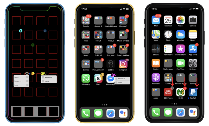
Users receive few notifications that they care more about than other notifications. Although these can be categorized under important notifications, a technique to allow a revisit to a missed notification, tells the user that it has been some time since the notification got delivered, thereby allowing the user to digest and respond to the information provided by an application. The term ‘revisit’ here, means to allow the user to see the missed notification as a separate entity differentiating it from a critical notification that has just been received. The time limit that classifies these missed notifications can be selected by the user which will then be designated to be displayed as a star-stamp above the application icon. This will indicate that the phase of notification to be represented as important as passed and as a way to display it to the user, the star-stamp will be used.

3.1.3 Customizations
3.1.3.1 Different Coloured Badges
This is the representation of an operating system that provides flexibility and user-friendly approach to their users. Nowadays, smartphones reflect on an individual’s identity (in terms of aesthetics) and giving the users the right to choose their way of representing it is a great way of telling them that software manufacturers do care. Android is already in that race and for the loyal Apple fans, to retain and increase the user-base, iOS must include such feature updates in the near future.

3.1.3.2 Multiple Badges
The idea behind providing two or more badges is due to the 3-D/haptic touch features available in the flagship phones starting from iPhone 6s. Although the previous versions may not support this due to its hardware limitations, providing multiple badges will be helpful to the users.

3.1.3.3 A single settings page for ranking applications
This will allow users to select the applications according to their priority. Instead of going to each application, providing a list of apps and grading them accordingly will help save time. Apple’s iOS as of its 12th version has provided the much-needed group notification feature but still hesitates from providing useful ways of customizing notifications which are crucial to the users. Taking into consideration the current web-app technology, individual pages consists of Single Page Applications (SPA), which on a user’s response will be reloaded on the same page with additional options, thereby increasing responsiveness and user- satisfaction (Joseph, 2015). Therefore, directing the user to multiple pages will, in turn, produce negative results.
Existing Design:

Proposed Design: Tool Used: Photoshop
3.1.3.4 Provision of presets
One of the significant shortcomings analysed from the try it yourself method was the lack of time for a user to mix and match colours for a particular notification badge. Providing them with presets along with mix and match option on a single page will be beneficial from the design point of view. As shown in figure 12, once the badges are enabled, the user is presented with a drop-down menu comprising of a preset and a mix-and-match option. There are four default presets that will be selected, if not, the user is provided with a mix-and-match option, where they have the freedom to choose any colour combination for individual applications. The presets are designed keeping in mind the readability of the notification badge with high a degree of contrast (Bruce, 1982).
Tool Used: Photoshop.

3.2 Split Testing
Split testing is a way to test the retention level of the audience by showing them two versions of a design or Call to Action (CTA) button for a webpage simultaneously using a set of rules to evaluate an independent variable to measure its performance. The set which provides a better conversion rate will be the winner of that particular test. In this particular case, there are two variables namely, a control variable and an experimental variable also known as the challenger. The control variable is the Apple’s existing notification badges represented by a red dot with its corresponding badge count in white font.
The challenger would be the preset notification badges as mentioned in the prototyping section of this research paper. Isolating one independent variable for a single A/B test is important to measure its performance and analyse the results.
3.2.1 Procedure
The procedure involved here is identifying a variable to A/B test, the variable being colour and style since they are not mutually exclusive in this case, followed by comparing the control and challenger variations. The sample consisted of focus groups (8 members) split equally in a random fashion and were familiar with the iOS ecosystem with one or more Apple devices updated to the latest software — iOS 12. The members of the focus group were presented with layouts that represented both the control and the challenger variables. The two groups were given the same set of app icons and correspondingly had to sign up for one. Furthermore, they were given a situation and were asked a few questions based on them (See Table 1).

Table:
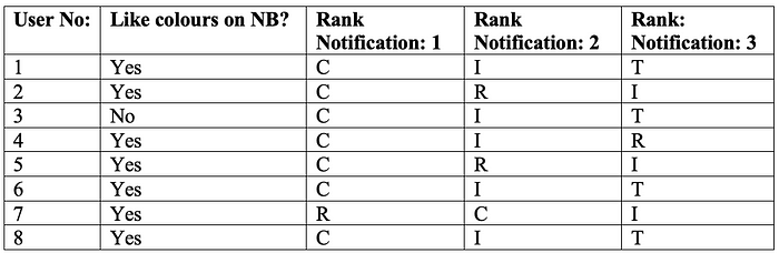
The situation is consistent among the focus group with one change in the notification they received. To provide a mock-up of A/B test, users imagined receiving three notifications that being: a critical notification(C), an important notification(I) and revisit(R)/transparent(T) notification. Seven out of eight users said that they liked the colours in the badges as they were easily recognizable and compared it to custom notification sounds on WhatsApp for different chats. Version: B is thereby visually more compelling to tap on and more suitable regarding customization. Different styles of notifications were also presented as a part of this test and users ranked it according to their priority taps. This concludes that colour-style being an independent variable does induce more performance in terms of user-satisfaction and selective response to a particular notification.
The mock A/B test provided key insights on further design related improvements. Few of the key findings from the test results involve:
1. Use of blur effect in the badge selection page will improve the legibility of the foreground texts.
2. Use of saturated colours to be more visually appealing.
3. Providing shades and tints will add an immersive view to the badges thereby improving the aesthetics of the home screen.
Experience Prototype:
4 Discussion
As (Mehrotra, et al., 2016)observe that, there is a requisite to develop personal models for notifications considering personal traits of an individual. Moreover, the need for mobile OS (iOS) to be more flexible in terms of defining notifications based on user’s priority of applications will ensure overall benefit on interruptibility management (IM) systems (Mehrotra, et al., 2016). This research directs the readers towards the area where Apple’s mobile operating system limits users to strict anchors regarding notification badges. It also instigates a redesign considering various factors like, priority notifications (high/low), colour/style, personal traits, multiple badges and most importantly giving the user more flexibility and ease of use of such features by providing it as a single page application layout.
Mobile operating systems, in general, are the fundamentals that drive hundreds of applications that users download on their smartphones. At the time of writing this research article, a report from Android authority (Duino, 2018)states that iOS displays notifications in such a way that a user has to constantly keep checking for them to not miss anything. Thereby, providing them with priority notifications will help them switch tasks less frequently. The research helps in furnishing a redesign for the notification badges in iOS. To let users, focus more on the primary task, the redesigns will help them engage selectively to critical and important notifications thereby improving productivity. Although the research addresses the underlying changes that can be made from the design point of view, it lacks real-time testing on a global scale. Since the scalability of iOS is limited (iOS is not open-source), making use of such designs will increase the user-base and will bring back a user-friendly approach to all iOS devices.
The purpose of this research is to provide various possibilities for Apple to improve their existing design of notification badges. The redesign is done under the framework provided by Apple’s Human Interface Guidelines and uses a combination of both hardware and software features to enhance the visual cue and reduce the focus of users on low-priority notifications. The figure shown above (figure 14) is an actual depiction of how the redesign of notification badges are simulated in a real iPhone, bringing changes to specific functionality of a mobile handset. Android is long known for user-customization, and its way of managing notifications is better than iOS, thereby, providing such simple UI related enhancement on the future versions of iOS, will have a push towards Apple’s Digital Health initiative.
Few limitations of this research include:
1. A/B testing done in a mock-up environment without using specific tools.
2. Also, the test was in an environment that included focus groups who were familiar with the iOS ecosystem. Therefore, the results obtained in the table — 1 are localised.
3. The test was subjected to only one independent variable.
5 Conclusion
This research enquires into the usability and requirement analysis of the iOS notification badges and proposes a redesign keeping the user-customization and user-prioritization of applications into consideration. It also analyses the notification interruptions on task engagement and how selective attention will be helpful for users to focus on their primary task. With a chronological method followed, the redesign involved a step-by-step refinement based on multiple factors like colour preferences, emotionally connected apps, 3D/Haptic touch. The categorization of notifications was an essential part of this research as it helps the OS to scan in a demanding way based on user’s priority provided by the single page application (SPA) layout. The research paper also provided tangible results for the redesign by implementing programming in an HTML/CSS base. While this work illustrates the design-oriented aspect of notification badges, further real-life testing on iOS will reassure the requirement on a global scale. This research also encourages future work on the basis of A/B testing in established platforms like Google Analytics and Google Optimize, and cover wider audience to measure more than two independent variables for in-depth analysis of notifications and its effects on task engagement.
6 Bibliography
Apple Inc., 2018. [Online]
Available at: https://developer.apple.com/design/human-interface-guidelines/ios/overview/themes/
[Accessed 20 November 2018].
Bruce, M. a. F. J. J., 1982. The visibility of colored characters on colored backgrounds in viewdata displays.. Visible Language, XVI(4), pp. 382–390.
Centofante, P., 2017. Best practices for driving engagement with iOS app notification badges. [Online]
Available at: https://willowtreeapps.com/ideas/best-practices-for-driving-engagement-with-ios-app-notification-badges
[Accessed 8 November 2018].
Choi, S., 2018. iOS Notification redesign concept — a UX case study. [Online]
Available at: https://uxdesign.cc/ios-notification-redesign-concept-b51be406cb60
[Accessed 8 November 2018].
Duino, J., 2018. iOS notifications have been improved, but Android’s are still better.[Online]
Available at: https://www.androidauthority.com/android-vs-ios-notifications-926016/
[Accessed 01 December 2018].
Harrison, B. ,. H. K. &. B. W., 1995. Transparent Layered User Interfaces: An Evaluation of a Display Design Space to Enhance Focused and Divided Attention. Proceedings of CHI’95.
Iqbal, S. T. & Horvitz, E., 2010. Notifications and Awareness: A Field Study of Alert Usage and Preferences., ACM, pp. 27–30.
Joseph, R. J., 2015. Single Page Application and Canvas Drawing. International Journal of Web & Semantic Technology (IJWesT), 6(1), pp. 29–37.
Kim, M., 2015. The effect of push notification alerts on mobile application usage habit. Society for Journalism and Communication Studies, pp. 358–387.
Mashhadi, A., Mathur, A. & Kawsar, F., 2014. The Myth of Subtle Notifications., ACM, pp. 111–114.
Mehrotra, A. et al., 2016. My Phone and Me: Understanding People’s Receptivity to Mobile Notifications., ACM.
Ou, L.-C., Luo, M. R., Woodcock, A. e. & Wright, A., 2004. A study of colour emotion and colour preference. Part I: Colour emotions for single colours. 29(3), pp. 232–240.
Paul, C. L., Komlodi, A. & Lutters, W., 2015. Interruptive notifications in support of task management. International Journal of Human — Computer Studies, Volume 79, pp. 20–34.
Pejovic, V. & Musolesi, M., 2014. InterruptMe: designing intelligent prompting mechanisms for pervasive applications., ACM.
Pielot, M., Church, K. & de Oliveira, R., 2014. An In-Situ Study of Mobile Phone Notifications., ACM, pp. 233–242.
Turner, L. D., Allen, S. M. & Whitaker, R. M., 2017. Reachable but not Receptive: Enhancing Smartphone Interruptibility Prediction by Modelling the Extent of User Engagement with Notifications. Pervasive and Mobile Computing, Volume 40, pp. 480–494.
Disclaimer:
This disclaimer informs readers that the views, thoughts, and opinions expressed in the text belong solely to the author, and not necessarily to the author’s employer, organization, committee or other group or individual.
All rights reserved. No part of this publication may be reproduced, distributed, or transmitted in any form or by any means, including photocopying, recording, or other electronic or mechanical methods, without the prior written permission of the publisher/author.

