
Responsive Design Best Practices
by Nick Babich
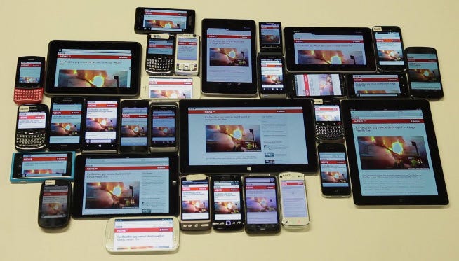
Responsive design is a design that that responds to the user’s environment (user’s device screen size, orientation and platform).The core thing about responsive design is flexible layout. Flexible layouts have flexible image and flexible text blocks that looks good on any screen.
Now let’s focus on the keyrules of responsive design:
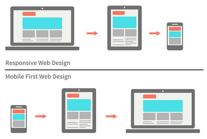
Pick Major Breakpoints
Design should look great on three type of device (mobile, tablet, and desktop). A breakpoint is the media query values that will mark the transition to a new class of devices. While there is no universal set of breakpoints or best practices, you should use at least 3 breakpoints for the most device flexibility (see illustration).

When designing for specific breakpoints, consider the content you have. Don’t build media queries for devices, built it for content.
Optimize images for different breakpoints
Images are not naturally fluid. But you should modify them to different resolutions.

Tips:
- On smaller screens, crop some images so they retain their impact. Great tutorial from Ethan Marcotte has answers on the most technical related questions.
- Try Scalar Vector Graphics (SVG). Unlike raster graphics which has fixed resolution, SVGs alter their resolution based on image paths, not pixels, so they remain the same at any size.
- Generate the optimal responsive image dimensions using tools like Responsivebreakpoints

Pay Attention to Font Sizes
Typography is the cornerstone of the web making up approximately 95% of all content. When choosing a typeface, be sure that your font selection works well both on large or small displays.

Tips:
- Use real text in rather than text within graphics. Text can also be enlarged without any loss of quality.
- Make big headlines responsive. Make headings clearly headings, at least 1.6 times as large as the text they support.
- Make body text responsive. Ethan Marcotte wrote an excellent article on the Adobe Typekit blog explaining why using em (and rem, coming in the next section) is a lot better than using pixels to size your fonts.
Design the Smallest Views First
Designing with the mobile (smartphone) layout first will help you prioritize your content (distinguish essential elements from the secondary elements). Once the mobile design questions are answered, designing for other devices will be easier.
Tips:
- Avoid large graphics. Large file sizes means longer loading for mobile users.
- Test how your design looks and works on a real device. Try your site on a real phone or tablet.
Design scalable navigation
Ensure navigation works well on all types of devices. It’s recommended to use Priority+ navigation pattern because it grantees that the top-priority options will always be visible for the user. Other options will be revealed based on their importance.
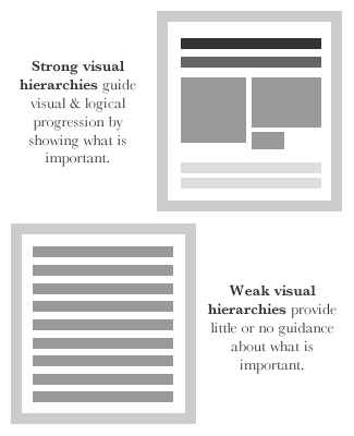
Create solid visual hierarchy on all screen resolutions
Visual hierarchies take center stage for all types of devices. Some content should be viewed first, some second, some third, etc. Conduct content inventory, prioritize the content and try to display the most important elements accordingly— the users shoudn’t need to scroll to find the content.
Follow UX Planet: Twitter | Facebook
Learn how to design better products
Interactions between computers and humans should be as intuitive as conversations between two humans. Interaction Design Foundation will help you to learn how to design for efficiency and persuasion.
