Revolut assignment UX study (version 1)
In this article I am sharing detail process of my Design journey and entire UX case study of the assignment
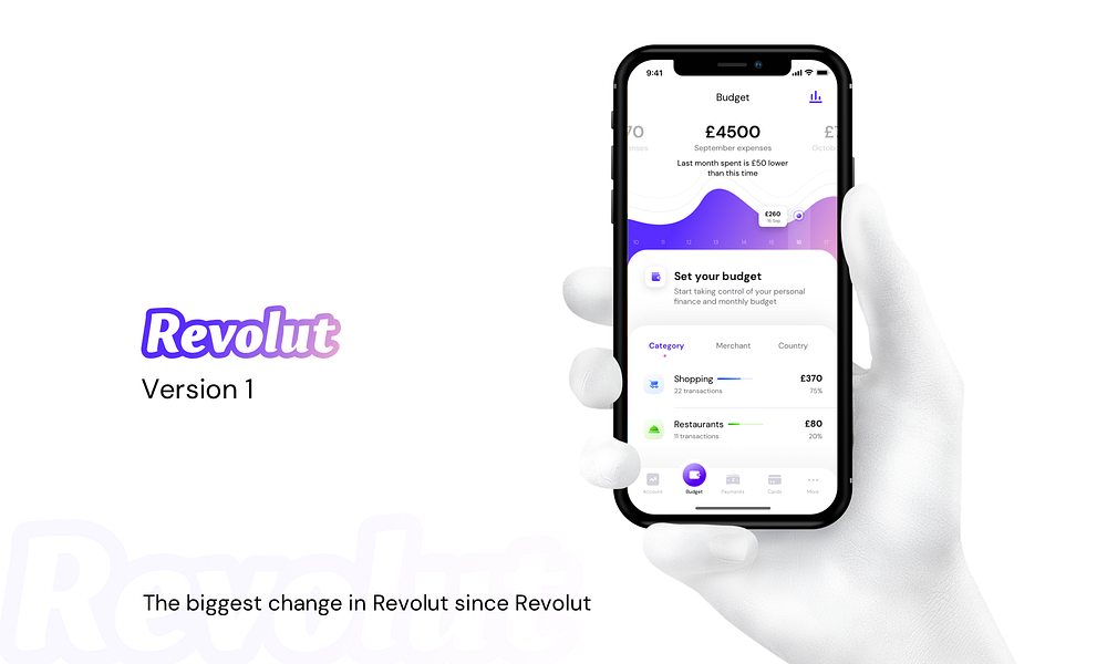
I am fortunate to get a chance to create two versions of prototype for Revolut. I was approached by Revolut to create an assignment. Because of some reason things won’t work out. But I really enjoy the overall journey from scratch to the final result. In this article I am talking about the 1st version mainly. I am sharing the entire user journey of what lead me to the results and what’s my design approach. I hope you find it useful. Before we start, I regularly post my creations on different social communities. Follow me to get updates regularly:
I am thankful to Revolut for giving me this opportunity to work on prototypes for Budget set up module. First of all, I am sharing Design Process roadmap below:

I am taking you step by step from scratch to final solution.
1. Task
Identify weak points of the old budgeting and analytics tool of the Revolut App. Create a better solution and present it either in sketch file or keynote. Be as precise as possible — we want to see how you would build a real product.

2. Introduction
I started my process with researching similar platforms like Acorns, Pocketguard, Goodbudget, Spendee etc etc. For me its very important to analyse how things work in different products. So I tried to grab my hands on as many products as I could, to get an overview of different methodologies and flows. I spent almost a day, just observing and get to know about flows of different products and write down(Using Sticky Notes) points that I found very distinctive in particular product and what I didn’t enjoy.
3. Quick Overview
I will take you through the entire design process, my thoughts while creating it and an interactive prototype. I also detected problems in the current flow, visuals and anatomy, and suggested ways of how to improve it and make it better. Basically I created two versions, one that is different (in term of look and feel, and little bit of functionality) from the current module and second one that is pretty similar (in terms of color) but I improved(UI, UX, user flows) elements to make it look more smoother and user friendly. As I got this chance to redesign/improve the current flow and visuals so I tried to make it feel intriguing at the same time immediately familiar.
Innovation is easy but improving over the existed is difficult
4. Pain Points (My observation)

5. User testing for pain points
Its very vital for me to cross check and validate whatever be the problems I detected in the current flow is actually a problem or not? User testing to detect pain points clear my misconceptions if I had any during my observation. It also helps me to get to know even more about the current situation of the product and where the product is lacking.
I chose 5 users who are using similar use case or products (budget related product) so they could better understand the pain points or problems in the current flow. Among them I confront 4 of them and 1 on phone call. And the insights from them are listed below:

6. Wireframes Prototypes
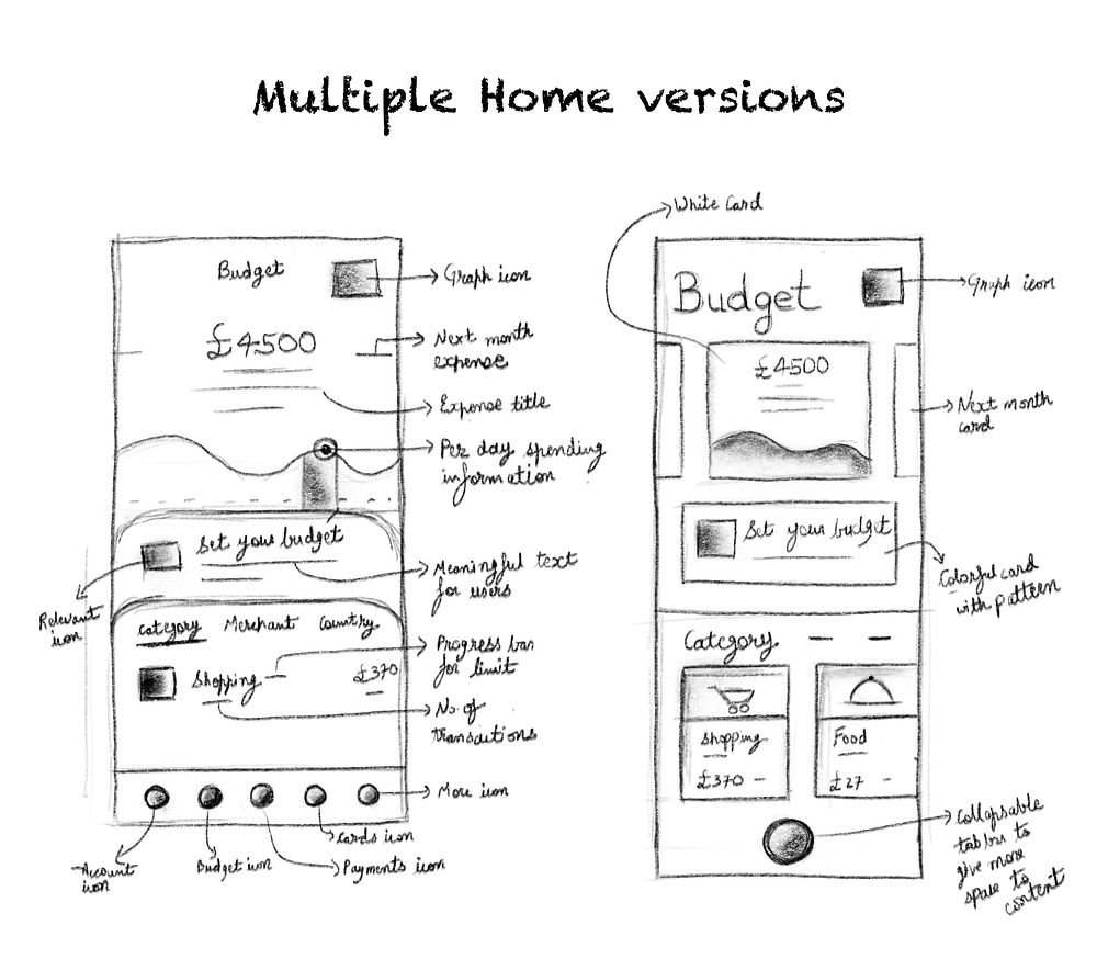
After gathering all the pain points from the users and my observations. I am able to move forward to wireframes. I wrote all the information regarding improvements and mix it with my thoughts to create some rough drafts of wireframes. I tried many different versions of wireframes with different layouts and elements placement. I am sharing below some rough initial wireframes for home screen, this is how I usually experiments with different layouts and variations to make sure user will get the best experience and easy to use product solution:
7. Finalising one wireframe prototype
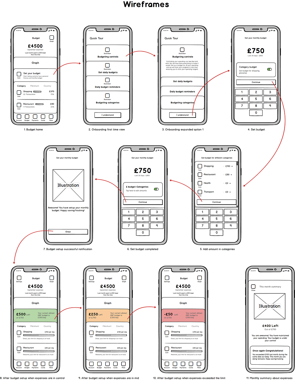
After sketching many wireframes prototypes, I picked one that is easy to use and make user journey more meaningful. Below is the wireframe that I finalised:
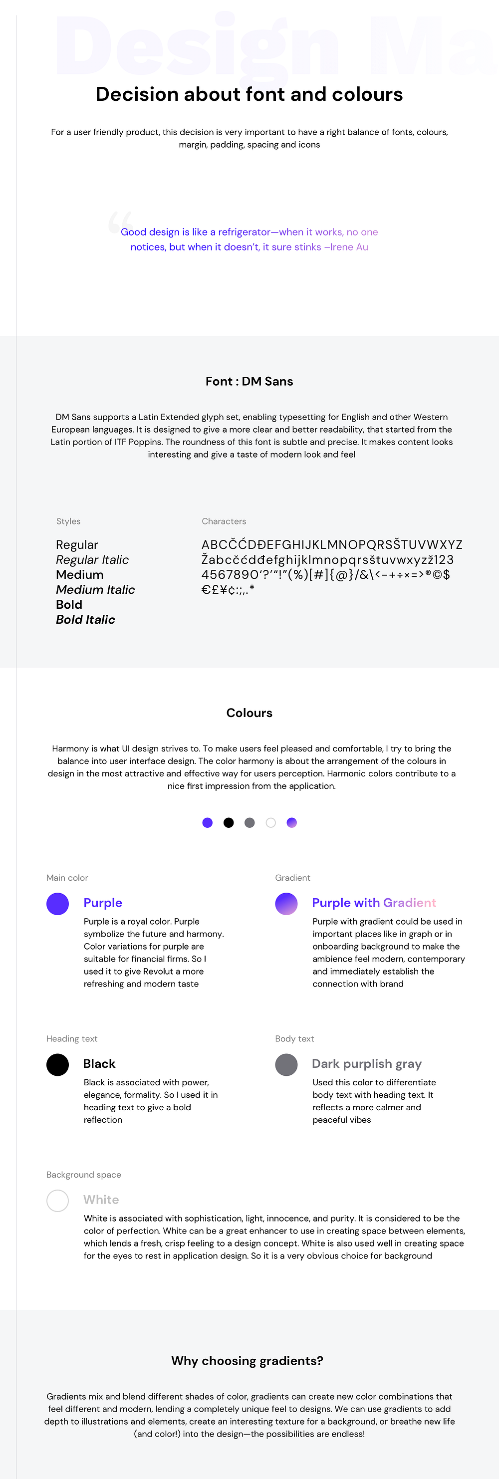
8. Decision about choosing fonts, colours, gradients etc
9. Assumptions / Hypothesis

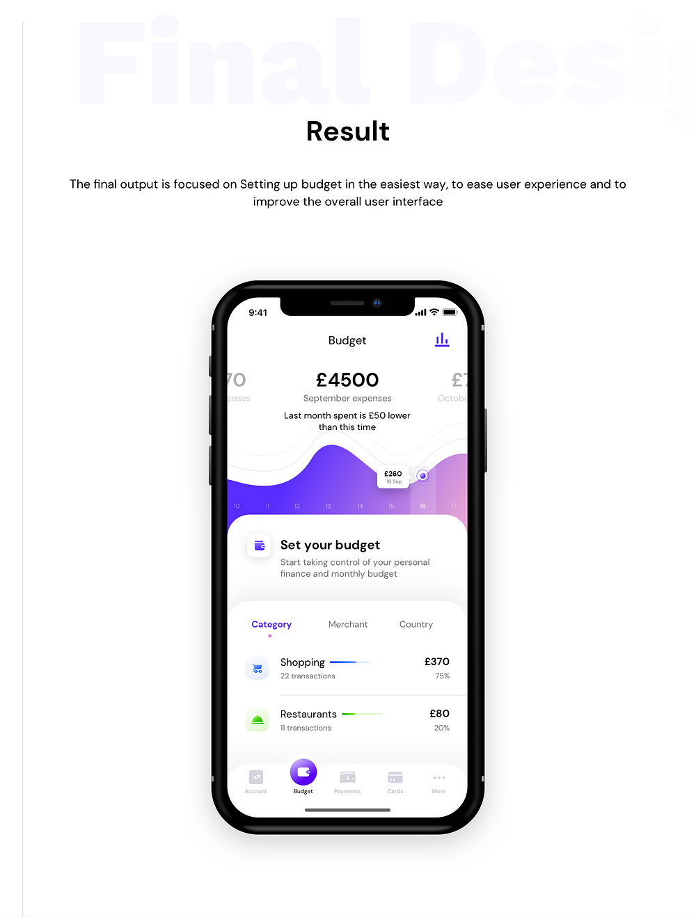
10. Result / Final Design
11. Design Screen Flow
This is the screen by screen flow for the whole feature designed by me. It gives quick navigation overview for the entire flow.

12.1. Design screen analysis
I am giving brief explanation about each and every element I used in the design screens. It helps me to tell my decisions about different assets I used in the designs and what they are doing?

12.2. Dark mode exploration

13. Entry points exploration
The main question is how user get to know that there is a budget setup module existed in the product? How meaningfully we could convey user that there is a new add-on or update in the existed product. I explored on it and found these three entry points for users:

14. Design Validation (User Feedback)
It's my favourite part to check designs with users, who are actually going to use it. It gives me opportunity to see where my design are standing and what improvements I could make. In this feedback session I put into consideration about choosing between version 1 and version 2(I will give a separate case study for version 2) from the assignment and other valuable feedback I received from the users. 5 Users are same who were with us at the time of testing of pain points in the initial stage and I added 5 more users to get more precise feedback on my new designs:


15. Usability testing conclusion

16. Making decisions with data
One of the best parts about data is that it’s almost always possible to collect more. I always prefer to collect and analyze data, make decisions based on it, and then test those decisions by collecting and analyzing more data. If I get chance in my projects or assignments to collect real time data and make design decisions based on it, I always go for it. It allow me to understand real time improvements in the product and how I could craft a product which could be more user friendly and simple to use.
Constantly designing new iterations of a product with improvements made based on data rather than intuition allows me to craft better experiences for the people using products designed by me.
In the end I would like to conclude by saying, I prefer to work in the systematic process to get the most accurate design based on the real time data. Fuse of creativity and Data could take design to next level. Many thanks for reading this. I am very thankful to all the designers out there who continuously inspire me to work harder.
To Download assets of the case study like Mobile screens in retina size, unused elements from RnD, User feedback on design, presentation in PDF format, wireframes etc, please follow the link below :
